

 Preview
 Send
Send Share
Share
 Details
 Guide
Guide

 Download
 Similars
 X-Ray
X-Ray Diaporama
 Stats
StatsHarmony in Blue = Orange


 Read More
Hand Made Oil Reproduction
Hand-painted oil on canvas in your size and frame, made to order by our artists. ( Switch to Print Switch to Digital Image)




P118B $10

P118H $10

P118W $10

P438Z $10

P508JH $12

P508YH $12

P805H $10

P805Z $10

P919BZ $10

P919G $10

P919XJ $10

P959ZH $10

P968JZ $12

W106C $8

W218G $10

W218JH $8

W218Y $10

W307PJ $10

W316G $10

W316PJ $8

W316Y $10

W398PJ $8

W4111J $10

W500HY $15

W500JH $15

W692G $12

W849H $8

W940BG $15

W953PJ $8




Pick from our preset sizes that match the artwork's original proportions.

Type the width and the height you need, to fit your frame or your wall. This is hand-painted, so for a size with a different shape the artist can paint a bit more around the picture, or cut a bit — you choose. We send you a digital mockup to approve before the painting starts. The picture shown on this page does not show the real result — only the mockup does.
After order, OriginalUniqueArt.com team will email client for instructions and provide a mockup preview
Worldwide Delivery () in 3/4 weeks instead of standard 5 weeks. (25 October). No compromise on quality.

Free Worldwide Express Shipping

High-Quality Linen Canvas

Full Shipping Insurance

Customs Tax Refund Guarantee

True Color Matching Guarantee

100-Day Return Policy (Defects Only)

100% Money-Back Guarantee

Bulk Discount Offer
 Glass option is only available in size under 110 CM

Harmony in Blue = Orange
Reproduction Medium
Reproduction Size
-


Total Price
$ 300
A Symphony of Geometry and Color
In the vast landscape of twentieth-century modernism, few works capture the delicate equilibrium between chaos and order as poignantly as Paul Klee’s “Harmony in Blue = Orange.” Created during a period of profound artistic experimentation between 1923 and 1930, this masterpiece serves as a window into the soul of geometric abstraction. At first glance, the viewer is met with a rhythmic mosaic of irregular blocks and fractured panels, a composition that feels less like a static image and more like a visual melody. Klee, whose deep connection to music often dictated his brushwork, utilizes these shapes to create an asymmetrical balance that draws the eye in a continuous, dancing motion across the canvas. It is a work that does not merely ask to be seen, but invites the observer to participate in a silent dialogue of perception.
The true magic of this piece lies in its sophisticated use of color theory and tactile depth. While the title suggests a striking duality, the actual palette is a masterclass in subtlety, dominated by earthy tones of ochre, tan, and deep brown. These warm, grounded hues provide a foundation for the more ethereal shifts in light that dance within each geometric cell. Through a masterful application of impasto, Klee lends a physical presence to the abstraction; the visible brushstrokes and layered pigments create a textured surface that catches the light, offering a sense of movement even in its stillness. For the discerning collector or interior designer, this texture provides an incredible organic quality, allowing the artwork to breathe within a room and interact with the ambient lighting of a sophisticated living space.
Historical Resonance and Emotional Depth
To understand “Harmony in Blue = Orange,” one must look toward the turbulent era of the Weimar Republic and the revolutionary spirit of the Bauhaus movement. As a teacher at the Bauhaus, Klee was at the epicenter of a movement that sought to unify the functional with the beautiful, stripping art down to its essential elements: line, color, and form. This painting embodies that very ethos, rejecting the need for recognizable subjects in favor of a universal visual language. The fragmentation seen in the canvas—the way the blocks seem to break away from one another—can be viewed as a reflection of the political and social instability of the time, yet within this fragmentation, Klee finds a profound sense of peace.
Ultimately, the emotional impact of the work is one of quiet contemplation. It evokes a sense of finding structure amidst uncertainty, much like the mathematical precision found in nature. For those looking to adorn a home or gallery with a high-quality reproduction, this piece offers more than mere decoration; it provides an intellectual anchor. Whether placed in a minimalist contemporary setting or a classic study, Klee’s work brings an air of sophisticated mystery and timelessness. It is a testament to the idea that true harmony is not found in perfect symmetry, but in the beautiful, complex tension between opposing forces.
Questions & Answers
Where is the portrait format of "Harmony in Blue = Orange" recommended to be displayed?
The portrait format of "Harmony in Blue = Orange" by Paul Klee is recommended for an office. Format and space together guide the placement of a reproduction.
How do I discover artworks close to "Harmony in Blue = Orange" by Paul Klee?
The Similars page of "Harmony in Blue = Orange" by Paul Klee presents related artworks.
What technique was used for "Harmony in Blue = Orange" by Paul Klee?
The medium of "Harmony in Blue = Orange" by Paul Klee is oil on canvas. Reproductions aim to render the appearance of this technique.
Artist Biography
A Life of Line and Lyricism
Born in Münchenbuchsee, Switzerland, on December 18, 1879, Paul Klee entered a world shaped by the rhythms of music. His father, Hans Wilhelm Klee, was a German music teacher, and his mother, Ida Marie, was a Swiss singer. This early immersion in sound provided a foundation for a visual language that often mirrored musical arrangement. While he initially pursued the violin with great talent, eventually deciding that modern music lacked the creative pull he craved, he turned his focus toward the Academy of Fine Arts in Munich. His studies there between 1898 and 1901 were marked by an early mastery of drawing, though he famously struggled with color during those first cold winters.
The transition from a draftsman to an abstract thinker was not immediate. Klee’s early years involved exploring the boundaries of Symbolism and Art Nouveau, often working in black and white or through experimental techniques like needle drawing on blackened glass. A significant shift occurred in 1914 during a visit to Tunisia. The intense light of North Africa allowed him to detach color from physical description, using it instead as an independent force. This period provided the necessary push toward abstraction, moving his work away from mere representation and toward a more personal, symbolic vocabulary.
The Bauhaus Years and Political Shadows
Klee’s career reached a period of intense theoretical and creative activity during his time at the Bauhaus. From 1920 to 1930, he joined the faculty of this influential school of design and architecture, working alongside figures like Wassily Kandinsky. It was here that much of his prolific output occurred, particularly small-scale watercolors and drawings on paper. His teaching allowed him to explore the relationship between color and form with scientific precision, a subject he documented extensively in his notebooks. These writings, which examined the mechanics of design, are now regarded as essential texts for understanding modern composition.
The stability of this era was abruptly interrupted by the rise of National Socialism. In 1933, Klee was dismissed from his position at the Academy of Fine Arts in Düsseldorf because the Nazi regime classified his work as “degenerate.” Forced to return to his native Bern, his later years were marked by a shift in tone. As political turmoil grew and his own health declined, his lines became heavier, turning into black bars, and his forms grew more generalized. The whimsicality of his earlier years gave way to a more somber, melancholic perspective, reflecting the gravity of the era.
A Lasting Visual Language
The breadth of Klee’s output is immense, totaling some 10,000 works that range from delicate sketches to larger, more structured compositions. His ability to blend influences from Cubism, Expressionism, and Surrealism resulted in a style that felt both childlike and deeply intellectual. He utilized a variety of media, including:
- Zinc-plate etchings
- Watercolor on gauze and paper
- Lithographs
- Charcoal and pencil drawings
His work remains a study in balance, where titles often provided the necessary context for his often cryptic imagery. Whether through the use of simple stick figures or complex, colorful grids, he sought to express the inner world of ideas rather than the surface of reality. He died on June 29, 1940, in Muralto, Switzerland, leaving behind a body of work that bridged the gap between the figurative and the abstract.

Paul Klee
1879 - 1940 , Switzerland
Quick Facts
- Artistic Movement Or Style:
- Expressionism
- Cubism
- Surrealism
- Artists Who Influenced This Artist:
- Pablo Picasso
- Georges Braque
- Robert Delaunay
- Vincent van Gogh
- Paul Cézanne
- Full Name: Paul Klee
- Nationality: German and Swiss
- Notable Artworks:
- Hammamet with Its Mosque
- Ships in the Dark
- Walpurgis Night
- The Protector
- Place Of Birth: Münchenbuchsee, Switzerland
- Date Of Birth: 1879
- Date Of Death: 1940
Related Articles
Geometric Abstraction's 10 Defining Masterpieces | Art for Your Home - OriginalUniqueArt
Explore 10 defining masterpieces of Geometric Abstraction! Discover Kandinsky, Mondrian & Malevich’s iconic works. Find museum-quality art reproductions and curated decor ideas to elevate your home at OriginalUniqueArt.com.
Cézanne's Masterpieces: 25 Iconic Artworks to Transform Your Space
Journey through 25 iconic artworks by Paul Cézanne – a master of Impressionism and Post-Impressionism. Explore his landscapes, still lifes, and the stories behind these timeless masterpieces. Discover museum-quality reproductions & curated decor at OriginalUniqueArt.com.
Slate Blue Masterpieces: 10 Iconic Paintings & Timeless Home Decor Ideas
Immerse yourself in the captivating world of slate blue! Explore 10 iconic paintings by Monet, Van Gogh & Renoir. Discover their stories, techniques & find museum-quality art reproductions for your home at .
Kandinsky's Masterpieces: 25 Paintings That Define Abstract Art | OriginalUniqueArt
Journey through Wassily Kandinsky's 25 most iconic abstract paintings. Explore his revolutionary use of color, form & spiritual expressionism. Find museum-quality Kandinsky reproductions and elevate your home decor with OriginalUniqueArt.com. Discover all masterpieces on OriginalUniqueArt.com!
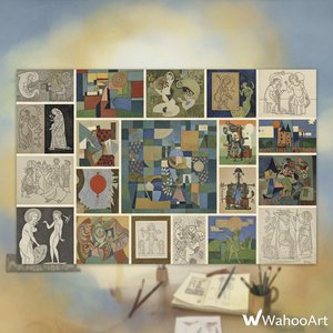
Paul Klee's Masterpieces: Explore 25 Iconic Paintings & Prints | OriginalUniqueArt
Journey through Paul Klee's 25 most iconic paintings & prints. Explore his abstract style, Bauhaus influence, and vibrant color palettes. Find museum-quality art reproductions & decor ideas at OriginalUniqueArt.com. Discover all masterpieces online.


