 Preview
 Send
Send Share
Share
 Details
 Guide
Guide

 Download
 Similars
 X-Ray
X-Ray Diaporama
 Stats
StatsNo. 9


 Read More
The artwork displayed on this page is protected by copyright law, which means we cannot legally create or sell an identical reproduction. This protection is enforced under international agreements such as the Berne Convention and by national laws, including those outlined by the U.S. Copyright Law - Title 17.
This method fully complies with copyright regulations because it does not involve copying or duplicating the protected artwork. Instead, it is a creative reinterpretation - a new painting that is influenced by the original but not identical to it.
Giclée / Art Print
Museum-quality giclée or canvas print with fast production and flexible finish options. ( Buy Hand Made Painting Switch to Digital Image)




P118B $10

P118H $10

P118W $10

P438Z $10

P508JH $12

P508YH $12

P805H $10

P805Z $10

P919BZ $10

P919G $10

P919XJ $10

P959ZH $10

P968JZ $12

W106C $8

W218G $10

W218JH $8

W218Y $10

W307PJ $10

W316G $10

W316PJ $8

W316Y $10

W398PJ $8

W4111J $10

W500HY $15

W500JH $15

W692G $12

W849H $8

W940BG $15

W953PJ $8




Pick from our preset sizes that match the artwork's original proportions.

Type the width and the height you need, to fit your frame or your wall. A print can only be cut, never made bigger than the picture, so a size with a different shape loses a part of the image. We send you a digital mockup to approve before we print anything. The picture shown on this page does not show the real cut — only the mockup does.
Worldwide Delivery () in 2 weeks instead of standard 4/5 weeks. (19 October)

Free Worldwide Express Shipping

High-Quality Linen Canvas

Full Shipping Insurance

Customs Tax Refund Guarantee

True Color Matching Guarantee

100-Day Return Policy (Defects Only)

100% Money-Back Guarantee

Bulk Discount Offer
 Glass option is only available in size under 110 CM

No. 9
Giclée / Art Print
Reproduction Size
-


Total Price
$ 81
A Meditation on Color and Absence: Examining Mark Rothko’s “No. 9”
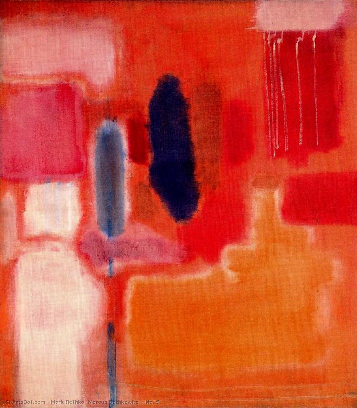
“No. 9,” painted in 1948, stands as a cornerstone of Abstract Expressionism and embodies the profound emotional resonance that characterizes Mark Rothko's oeuvre. More than just pigment on canvas, it represents an attempt to distill experience into its purest form—a deliberate stripping away of detail to reveal the underlying essence of feeling. The artwork’s deceptively simple composition consists of stacked rectangles of crimson and tangerine hues, punctuated by subtle bands of azure. These shapes aren't merely decorative; they are carefully calibrated to create a visual rhythm that draws the viewer inward, fostering contemplation rather than active observation.The Genesis of Color Field Painting
Rothko’s approach to painting—often termed “Color Field”—was revolutionary for its time. Rejecting traditional representational art, he sought to bypass intellectual analysis and tap directly into primal emotions. Influenced by Zen Buddhism and Eastern philosophy, Rothko believed that color itself could convey spiritual truths. He meticulously layered thin washes of pigment onto the canvas, achieving a velvety surface texture that seemed to absorb light rather than reflect it. This technique—a deliberate departure from brushstrokes—was painstakingly developed over years of experimentation, prioritizing tonal harmony and luminosity above all else. The resulting canvases are less about depicting a scene or subject matter and more about presenting an immersive experience for the viewer.Symbolism Within Minimalism
Despite its apparent lack of visual complexity, “No. 9” is laden with symbolic significance. Rothko himself famously described his paintings as "windows onto eternity," suggesting that they aspire to transcend the limitations of human perception and access a realm beyond the tangible world. The dominant reds and oranges evoke feelings of warmth, passion, and vitality—colors associated with life force and primal instinct. Simultaneously, the blues introduce an element of melancholy and introspection, representing sorrow, contemplation, and perhaps even transcendence. These contrasting hues coexist in equilibrium, mirroring the complexities of human experience itself.Historical Context: The Postwar Landscape
“No. 9” emerged from the aftermath of World War II, a period marked by disillusionment and uncertainty. Artists like Rothko responded to the trauma of the conflict with an earnest desire for spiritual renewal. Color Field painting arose as a reaction against the anxieties of Surrealism and Cubism, offering solace in its quiet contemplation and prioritizing emotional expression over intellectual precision. The canvas embodies the spirit of this era—a yearning for beauty amidst darkness, a belief in the transformative power of art to communicate profound truths about human existence.Emotional Resonance: An Invitation to Reflection
Ultimately, “No. 9” succeeds in eliciting an emotional response that transcends mere visual stimulation. Its subtle gradations of color invite viewers to linger before it, allowing them to immerse themselves in its contemplative atmosphere. The absence of discernible form encourages a surrender to feeling—a recognition that art can communicate truths beyond the realm of rational thought. Like many of Rothko’s paintings, “No. 9” remains an enduring testament to the power of color and silence to provoke introspection and inspire awe. It serves as a poignant reminder that beauty can reside in simplicity and that profound emotion can be conveyed without resorting to elaborate imagery.Questions & Answers
How well known is "No. 9" by Mark Rothko?
"No. 9" is classified as iconic.
What does "No. 9" share with the rest of Mark Rothko's output?
Within Mark Rothko's output, "No. 9" sits in the Color Field style, alongside the themes of rothko’s color field expressionism, existential reflection, spiritual depth, minimalist aesthetic, legacy.
Is "No. 9" by Mark Rothko a bright or a dark artwork?
The perceived brightness of "No. 9" by Mark Rothko is bright. It can be matched to the light of the intended space.
Artist Biography
A Life Shaped by Displacement
Mark Rothko arrived in the United States as a young boy, part of a family moving from Dvinsk, Latvia, to Portland, Oregon, in 1913. His early years were marked by the heavy atmosphere of the Pale of Settlement, where his family lived amidst political unrest and the fear of pogroms. This sense of instability followed him across the ocean. The loss of his father, Jacob, shortly after their arrival in America added a layer of personal grief to the challenges of settling in a new culture. While he studied at Yale University, the pull of New York City eventually led him to leave formal academics behind for the Art Students League.
His upbringing was one of intellect and debate. His father, a pharmacist with socialist leanings, fostered a home where learning was central. This environment, combined with the hardships of the immigrant experience, created a deep sensitivity to human suffering. These early experiences of loss and the struggle to find a place in a chaotic world became the quiet foundation for everything he would later paint.
From Figures to Fields of Color
In his early years in New York, Rothko focused on realism, painting portraits and urban scenes with careful attention to detail. As the 1940s brought the horrors of World War II, his work began to shift. He moved away from recognizable objects, looking instead toward Surrealism and mythology to find a way to express universal human emotions. During this period, his canvases featured biomorphic shapes that seemed to float between being figures and being abstract forms.
By the late 1940s, he had developed the style that would define his career. He stripped away all imagery, leaving only large-scale canvases with rectangular blocks of color. These forms appeared to hover and resonate against one another. He used thin washes of paint to create subtle changes in tone and texture, making the edges of his shapes appear blurred. He often avoided titles, using simple numbers like No. 1 or No. 6 so that viewers could face the work without any preconceived ideas.
The Search for Emotional Truth
Rothko’s mature period is associated with Color Field painting. His goal was to use color to speak directly to the human soul, bypassing the intellect to reach deep emotions such as tragedy, ecstasy, and despair. He meticulously layered paint to create a sense of depth and light that seemed to come from within the canvas itself. These large works were intended to envelop the viewer in an immersive experience.
His commitment to this emotional honesty led to several significant projects:
- The Seagram Murals, which he originally intended for a New York restaurant but later donated to the Tate Gallery after feeling the setting would compromise the work.
- The Rothko Chapel in Houston, Texas, a non-denominational space containing fourteen of his paintings in varying shades of black, designed as a place for quiet reflection.
- The Harvard Mural series, which were donated to a dining room at the Holyoke Center.
Despite his immense influence on Abstract Expressionism and the later Minimalist movement, Rothko struggled with depression throughout his life. He died by suicide in 1970. His work remains a central part of modern art history, found in permanent collections such as the Museum of Modern Art in New York and the Tate Modern in London.

Mark Rothko
1903 - 1970 , Latvia
Quick Facts
- Artistic Movement Or Style: Abstract Expressionism, Color Field Painting
- Artists Or Movements Influenced By This Artist: ['Minimalist art']
- Full Name: Markus Yakovlevich Rothkowitz
- Nationality: American
- Notable Artworks:
- No. 10
- Seagram Murals
- Untitled
- Place Of Birth: Daugavpils, Latvia
- Date Of Birth: 1903
- Date Of Death: 1970
Related Articles
Chromatic Atmospheres: Exploring the Philosophical Foundations of Color Field Painting
Explore the philosophical and aesthetic foundations of Color Field painting with OriginalUniqueArt. Discover key artists like Rothko & Newman, its spiritual influences, and lasting impact on modern art. Expert insights for collectors.
Beyond the Brushstroke: A Definitive Guide to the Emotional Power of Color Field Painting
Explore the profound history and emotional depth of Color Field painting. From Mark Rothko to Barnett Newman, discover how pure color redefined modern art through our expert-led guide for students and collectors alike.
Abstract Expressionism's 10 Defining Masterpieces |
Explore 10 defining Abstract Expressionism masterpieces by Pollock, Rothko & de Kooning. Discover the stories behind these iconic paintings and find museum-quality art reproductions to elevate your home decor on .

The Sublimity of Color: Exploring the Emotional Landscapes of Mark Rothko's Abstract Expressionism
Explore the profound emotional depth of Mark Rothko's abstract expressionism. Discover the history, techniques & lasting impact of this pivotal Color Field painter. Expert insights for collectors and art enthusiasts.
Mark Rothko's Masterpieces: 25 Paintings That Define Abstract Expressionism | OriginalUniqueArt
Explore 25 iconic Mark Rothko paintings that define Abstract Expressionism. Discover the stories, colors & emotions behind these masterpieces. Find museum-quality art reproductions and curated decor ideas at OriginalUniqueArt.com.