Preview
 Send
Send Share
Share
 Details
 Guide
Guide

 Download
 Similars
 X-Ray
X-Ray Diaporama
 Stats
StatsNo. 21


 Read More
The artwork displayed on this page is protected by copyright law, which means we cannot legally create or sell an identical reproduction. This protection is enforced under international agreements such as the Berne Convention and by national laws, including those outlined by the U.S. Copyright Law - Title 17.
This method fully complies with copyright regulations because it does not involve copying or duplicating the protected artwork. Instead, it is a creative reinterpretation - a new painting that is influenced by the original but not identical to it.
Giclée / Art Print
Museum-quality giclée or canvas print with fast production and flexible finish options. ( Buy Hand Made Painting Switch to Digital Image)




P118B $10

P118H $10

P118W $10

P438Z $10

P508JH $12

P508YH $12

P805H $10

P805Z $10

P919BZ $10

P919G $10

P919XJ $10

P959ZH $10

P968JZ $12

W106C $8

W218G $10

W218JH $8

W218Y $10

W307PJ $10

W316G $10

W316PJ $8

W316Y $10

W398PJ $8

W4111J $10

W500HY $15

W500JH $15

W692G $12

W849H $8

W940BG $15

W953PJ $8




Pick from our preset sizes that match the artwork's original proportions.

Type the width and the height you need, to fit your frame or your wall. A print can only be cut, never made bigger than the picture, so a size with a different shape loses a part of the image. We send you a digital mockup to approve before we print anything. The picture shown on this page does not show the real cut — only the mockup does.
Worldwide Delivery () in 2 weeks instead of standard 4/5 weeks. (21 October)

Free Worldwide Express Shipping

High-Quality Linen Canvas

Full Shipping Insurance

Customs Tax Refund Guarantee

True Color Matching Guarantee

100-Day Return Policy (Defects Only)

100% Money-Back Guarantee

Bulk Discount Offer
 Glass option is only available in size under 110 CM

No. 21
Giclée / Art Print
Reproduction Size
-


Total Price
$ 81
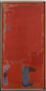
A Chromatic Labyrinth: Decoding Mark Rothko’s No. 21
Mark Rothko's *No. 21*, painted in 1949, stands as a pivotal work within the artist’s transition towards his signature Color Field style—a moment where figuration dissolves and pure emotional resonance takes hold. The painting isn’t simply an arrangement of colors; it is an immersive experience, a visual poem built from layers of pigment and subtle variations in tone. Rather than depicting objects or scenes, Rothko sought to evoke fundamental human emotions through the direct application of color. *No. 21* exemplifies this pursuit, presenting blocks of red, blue, orange, and hints of green that seem to float and interact on the canvas surface. The composition isn’t rigidly defined; edges are soft, blurred, allowing colors to bleed into one another, creating a sense of atmospheric depth and an almost meditative quality. It's a painting that demands contemplation, inviting viewers to lose themselves within its chromatic depths.The Birth of a Style: Rothko’s Artistic Journey
To understand *No. 21*, it is essential to consider Mark Rothko’s artistic evolution. Born Marcus Yakovlevich Rothkowitz in Latvia in 1903, he immigrated to the United States with his family as a child. His early work, dating from the 1920s and 30s, was largely figurative, depicting urban scenes and portraits. However, influenced by the anxieties of World War II and a growing interest in mythology and Surrealism, Rothko began experimenting with more symbolic imagery during the 1940s. This period served as a crucial bridge towards his eventual abstraction. The year 1949, when *No. 21* was created, marks a turning point. It’s a moment where he consciously distances himself from recognizable forms and embraces the power of color to convey meaning directly. The influence of Matisse's *The Red Studio*, with its enveloping field of red, is particularly notable; Rothko himself acknowledged the painting’s profound impact on his own work, describing how it allowed him to “become” the color itself.Technique and Emotional Resonance
Rothko’s technique in *No. 21* is deceptively simple yet profoundly effective. He employed thin washes of oil paint, often diluted with turpentine or other mediums, applied in multiple layers. This layering creates a luminosity and depth that draws the viewer in. The edges aren't sharply defined but rather feathered and blurred, contributing to the painting’s ethereal quality. He wasn’t interested in brushstrokes as expressive marks; instead, he sought to eliminate any trace of his hand, creating surfaces that appear almost seamless. This deliberate removal of painterly gesture is key to Rothko’s intention: he wanted the color itself to be the subject, unmediated by technique. The emotional impact of *No. 21* is deeply personal and subjective. The interplay of warm reds and cooler blues can evoke feelings of passion, tranquility, or even melancholy. It's a painting that doesn’t dictate emotion but rather provides a space for viewers to experience their own inner landscape.A Legacy of Color and Contemplation
Mark Rothko’s work continues to resonate with audiences today, not only for its aesthetic beauty but also for its profound emotional depth. His paintings are held in major museums worldwide, including the Metropolitan Museum of Art and the Menil Collection, and his most ambitious project, the Rothko Chapel in Houston, remains a powerful site of contemplation and spiritual experience. *No. 21* embodies the core principles that define Rothko’s artistic vision: the power of color to evoke emotion, the importance of creating immersive experiences, and the belief that art can offer solace and meaning in a chaotic world. A reproduction of this work offers not just a visual statement but an invitation to quiet reflection—a chance to bring a piece of profound emotional resonance into any space.Questions & Answers
What technique and style characterize "No. 21" by Mark Rothko?
"No. 21" is made in acrylic on canvas, in the Color Field Painting style.
Where can I find artworks similar to "No. 21" by Mark Rothko?
The Similars page of "No. 21" by Mark Rothko presents related artworks.
Can I watch "No. 21" as a full-screen slideshow?
"No. 21" by Mark Rothko can be viewed as a slideshow on the artwork's Diaporama page.
Artist Biography
A Life Shaped by Displacement
Mark Rothko arrived in the United States as a young boy, part of a family moving from Dvinsk, Latvia, to Portland, Oregon, in 1913. His early years were marked by the heavy atmosphere of the Pale of Settlement, where his family lived amidst political unrest and the fear of pogroms. This sense of instability followed him across the ocean. The loss of his father, Jacob, shortly after their arrival in America added a layer of personal grief to the challenges of settling in a new culture. While he studied at Yale University, the pull of New York City eventually led him to leave formal academics behind for the Art Students League.
His upbringing was one of intellect and debate. His father, a pharmacist with socialist leanings, fostered a home where learning was central. This environment, combined with the hardships of the immigrant experience, created a deep sensitivity to human suffering. These early experiences of loss and the struggle to find a place in a chaotic world became the quiet foundation for everything he would later paint.
From Figures to Fields of Color
In his early years in New York, Rothko focused on realism, painting portraits and urban scenes with careful attention to detail. As the 1940s brought the horrors of World War II, his work began to shift. He moved away from recognizable objects, looking instead toward Surrealism and mythology to find a way to express universal human emotions. During this period, his canvases featured biomorphic shapes that seemed to float between being figures and being abstract forms.
By the late 1940s, he had developed the style that would define his career. He stripped away all imagery, leaving only large-scale canvases with rectangular blocks of color. These forms appeared to hover and resonate against one another. He used thin washes of paint to create subtle changes in tone and texture, making the edges of his shapes appear blurred. He often avoided titles, using simple numbers like No. 1 or No. 6 so that viewers could face the work without any preconceived ideas.
The Search for Emotional Truth
Rothko’s mature period is associated with Color Field painting. His goal was to use color to speak directly to the human soul, bypassing the intellect to reach deep emotions such as tragedy, ecstasy, and despair. He meticulously layered paint to create a sense of depth and light that seemed to come from within the canvas itself. These large works were intended to envelop the viewer in an immersive experience.
His commitment to this emotional honesty led to several significant projects:
- The Seagram Murals, which he originally intended for a New York restaurant but later donated to the Tate Gallery after feeling the setting would compromise the work.
- The Rothko Chapel in Houston, Texas, a non-denominational space containing fourteen of his paintings in varying shades of black, designed as a place for quiet reflection.
- The Harvard Mural series, which were donated to a dining room at the Holyoke Center.
Despite his immense influence on Abstract Expressionism and the later Minimalist movement, Rothko struggled with depression throughout his life. He died by suicide in 1970. His work remains a central part of modern art history, found in permanent collections such as the Museum of Modern Art in New York and the Tate Modern in London.

Mark Rothko
1903 - 1970 , Latvia
Quick Facts
- Artistic Movement Or Style: Abstract Expressionism, Color Field Painting
- Artists Or Movements Influenced By This Artist: ['Minimalist art']
- Full Name: Markus Yakovlevich Rothkowitz
- Nationality: American
- Notable Artworks:
- No. 10
- Seagram Murals
- Untitled
- Place Of Birth: Daugavpils, Latvia
- Date Of Birth: 1903
- Date Of Death: 1970
Related Articles
Slate Blue Masterpieces: 10 Iconic Paintings & Timeless Home Decor Ideas
Immerse yourself in the captivating world of slate blue! Explore 10 iconic paintings by Monet, Van Gogh & Renoir. Discover their stories, techniques & find museum-quality art reproductions for your home at .
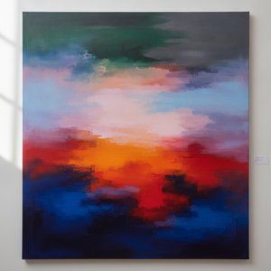
Color Field Painting: The Emotional Power of Pure Abstraction and Chromatic Depth
Explore the profound emotional depth of Color Field painting. Discover the history of mid-century abstraction, from Rothko to Newman, and learn how pure color transforms the viewer's experience through our expert art history guide.
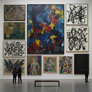
Abstract Expressionism's 10 Defining Masterpieces |
Explore 10 defining Abstract Expressionism masterpieces by Pollock, Rothko & de Kooning. Discover the stories behind these iconic paintings and find museum-quality art reproductions to elevate your home decor on .
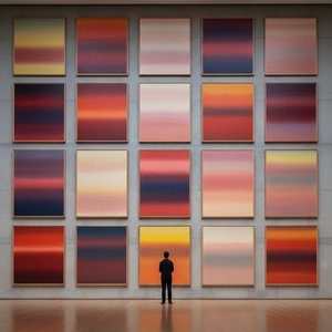
Mark Rothko's Masterpieces: 25 Paintings That Define Abstract Expressionism | OriginalUniqueArt
Explore 25 iconic Mark Rothko paintings that define Abstract Expressionism. Discover the stories, colors & emotions behind these masterpieces. Find museum-quality art reproductions and curated decor ideas at OriginalUniqueArt.com.

The Sublimity of Color: Exploring the Emotional Landscapes of Mark Rothko's Abstract Expressionism
Explore the profound emotional depth of Mark Rothko's abstract expressionism. Discover the history, techniques & lasting impact of this pivotal Color Field painter. Expert insights for collectors and art enthusiasts.