Preview
 Send
Send Share
Share
 Details
 Guide
Guide

 Download
 Similars
 X-Ray
X-Ray Diaporama
 Stats
StatsPlace de la Concorde


 Read More
Giclée / Art Print
Museum-quality giclée or canvas print with fast production and flexible finish options. ( Buy Hand Made Painting Switch to Digital Image)




P118B $10

P118H $10

P118W $10

P438Z $10

P508JH $12

P508YH $12

P805H $10

P805Z $10

P919BZ $10

P919G $10

P919XJ $10

P959ZH $10

P968JZ $12

W106C $8

W218G $10

W218JH $8

W218Y $10

W307PJ $10

W316G $10

W316PJ $8

W316Y $10

W398PJ $8

W4111J $10

W500HY $15

W500JH $15

W692G $12

W849H $8

W940BG $15

W953PJ $8

Pick from our preset sizes that match the artwork's original proportions.

Type the width and the height you need, to fit your frame or your wall. A print can only be cut, never made bigger than the picture, so a size with a different shape loses a part of the image. We send you a digital mockup to approve before we print anything. The picture shown on this page does not show the real cut — only the mockup does.
Worldwide Delivery () in 2 weeks instead of standard 4/5 weeks. (24 October)

Free Worldwide Express Shipping

High-Quality Linen Canvas

Full Shipping Insurance

Customs Tax Refund Guarantee

True Color Matching Guarantee

100-Day Return Policy (Defects Only)

100% Money-Back Guarantee

Bulk Discount Offer
 Glass option is only available in size under 110 CM

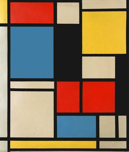
Place de la Concorde
Giclée / Art Print
Reproduction Size
-


Total Price
$ 81
A Symphony of Balance: Deconstructing Mondrian’s ‘Place de la Concorde’
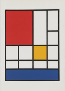
Piet Mondrian's *Place de la Concorde*, painted between 1938 and 1943, is far more than a geometric arrangement of color and line; it’s a distillation of an artistic philosophy, a visual poem born from a period of profound change and upheaval. While titled after the famed Parisian square, Mondrian doesn't offer a representational depiction. Instead, he presents us with an abstraction that *embodies* the energy and dynamism of modern urban life – a pulsating grid of black lines containing blocks of primary colors—red, yellow, and blue—set against a stark white background. This wasn’t merely about depicting a place; it was about capturing its essence, its underlying structure, and translating it into a universal visual language. The painting's evolution is particularly fascinating. Begun in Paris before Mondrian fled the looming threat of World War II, it continued to be reworked after his arrival in New York City, absorbing the influence of a new environment—a faster pace, bolder energy—resulting in adjustments to line weight and color placement that lend the work an even greater sense of vitality.The Path to Neoplasticism: A Life Dedicated to Abstraction
To truly appreciate *Place de la Concorde*, one must understand its place within Mondrian’s artistic journey. Born Pieter Cornelis Mondriaan in 1872, he initially trained as a teacher while simultaneously pursuing his passion for art. His early works were steeped in the traditions of Dutch landscape painting, reflecting the influence of the Hague School and Impressionism. Paintings like *The Red Mill* demonstrate this formative period, showcasing a naturalistic style that gradually gave way to experimentation with Pointillism and Fauvism. However, it was his move to Paris in 1912 that proved pivotal. Immersed in the avant-garde scene and captivated by Cubism, Mondrian began to deconstruct forms, moving away from representational art towards a more abstract vocabulary. This exploration culminated in the development of Neoplasticism – also known as De Stijl – a style predicated on the belief that pure abstraction could express universal harmony. Mondrian believed that through reducing painting to its most fundamental elements—horizontal and vertical lines, primary colors, and black, white, and gray—he could reveal the underlying structure of reality and achieve a spiritual ideal.Decoding the Composition: Beyond Form and Color
The seemingly simple composition of *Place de la Concorde* is deceptively complex. The grid structure isn’t arbitrary; it represents Mondrian's attempt to create a harmonious balance between opposing forces – horizontal versus vertical, static versus dynamic, individual elements versus the unified whole. The black lines act as boundaries and connectors, defining spaces while simultaneously creating a sense of flow and interconnectedness. The carefully placed blocks of color aren’t merely decorative; they represent specific energies and emotions. Red often symbolizes passion and intensity, blue evokes tranquility and spirituality, and yellow embodies joy and intellect. The white background isn't simply empty space but an essential element that allows the colors to breathe and resonate. It is important to note that Mondrian didn’t view these elements as isolated components but rather as integral parts of a larger, interconnected system—a microcosm of the universe itself. He saw his art not just as aesthetic expression but as a spiritual practice, a means of revealing underlying cosmic truths.A Lasting Legacy: The Enduring Influence of Mondrian
*Place de la Concorde*, and indeed all of Mondrian’s Neoplastic work, has had an immeasurable impact on the course of 20th-century art and design. His reductive aesthetic profoundly influenced movements like Minimalism, Color Field painting, and Abstract Expressionism. Beyond the realm of fine art, his principles have permeated architecture, graphic design, fashion, and interior decoration. The clean lines, geometric forms, and bold color palettes found in Mondrian’s paintings continue to inspire designers seeking a sense of order, clarity, and modern elegance. A reproduction of *Place de la Concorde* isn't just an acquisition; it’s an invitation to embrace a philosophy—a commitment to simplicity, balance, and the pursuit of universal beauty. It is a statement piece that transcends trends, offering a timeless aesthetic that will continue to resonate for generations to come.Questions & Answers
How is the mood of "Place de la Concorde" by Piet Mondrian described?
"Place de la Concorde" by Piet Mondrian is described as serene in mood. This classification can help match the work to a setting.
How does the style of "Place de la Concorde" relate to its creator's era?
In "Place de la Concorde" by Piet Mondrian, the Neoplasticism movement meets the Modern era.
Does "Place de la Concorde" have an augmented reality preview?
"Place de la Concorde" by Piet Mondrian can be previewed on your own wall with the artwork's AR Preview page, using augmented reality on a compatible device.
Artist Biography
The Architecture of Order
To look at a Mondrian today is to see the blueprint of modern visual culture. We encounter his logic every time we interact with a clean graphic layout or a minimalist building facade. He stripped away the unnecessary until only the essential remained. This was not an act of destruction, but one of extreme distillation. By reducing his vocabulary to straight lines, right angles, and a strict palette of red, blue, and yellow, he removed the distraction of reality to reveal a structural truth.
His early work in the Netherlands followed much more traditional paths. He began with landscapes that captured the windmills and rivers of the Dutch countryside, heavily influenced by the Hague School and Impressionism. Pieces like The Red Mill show an artist focused on naturalistic detail and the soft light of his homeland. However, even in these early years, a drive toward simplification was present. He moved through Pointillism and Fauvism, testing how much color and form could be compressed before the subject disappeared entirely.
The Parisian Shift and Neoplasticism
The move to Paris in 1912 changed everything. Encountering Cubism forced him to deconstruct objects into geometric components. He stopped trying to depict what he saw and began exploring how he saw it. This period was deeply tied to his interest in Theosophy, a mystical philosophy that sought universal principles beneath surface appearances. He believed art could express these hidden truths through pure abstraction.
By 1917, this search resulted in Neoplasticism, or "pure plastic art." Alongside Theo van Doesburg, he co-founded the De Stijl movement to promote a rigid aesthetic of horizontal and vertical lines. The rules were absolute:
- The use of primary colors: red, blue, and yellow.
- The use of primary values: black, white, and gray.
- A focus on right angles and straight lines.
This reduction was a deliberate attempt to manifest spiritual order through visual balance. Works like Composition with Red, Blue and Yellow demonstrate this commitment to geometric purity.
New York and the Final Rhythm
The arrival of World War II forced Mondrian to flee Europe for New York City in 1940. The transition from the organic landscapes of his youth to the rigid grid of Manhattan provided a new, unexpected energy. His late works, such as Broadway Boogie Woogie, show a shift in rhythm. While he maintained his core principles, the lines began to dance with a new, syncopated movement inspired by the city's pulse and jazz music.
His death in 1944 ended a career that had fundamentally altered the trajectory of 20th-century art. He left behind a legacy that moved far beyond the canvas, influencing everything from architecture to fashion, including the famous 1965 collection by Yves Saint Laurent. His work remains a standard for anyone seeking clarity and structural integrity in a chaotic visual age.

Piet Mondrian
1872 - 1944 , Netherlands
Related Articles
Theo van Doesburg: Pioneering De Stijl & the Evolution of Neo-Plasticism
Explore the revolutionary De Stijl movement & Neo-Plasticism with our expert guide. Discover Piet Mondrian, Theo van Doesburg, and the lasting impact of this influential art style. Learn about collecting & investing in De Stijl masterpieces.
De Stijl: Mastering the Art of Pure Abstraction and Geometric Harmony for the Modern Collector
Explore the profound elegance of De Stijl. Discover how Piet Mondrian and the masters of Neoplasticism utilized geometric harmony and primary colors to redefine modern abstraction. An authoritative guide for the discerning collector seeking timeless, structured beauty.
Geometric Abstraction's 10 Defining Masterpieces | Art for Your Home - OriginalUniqueArt
Explore 10 defining masterpieces of Geometric Abstraction! Discover Kandinsky, Mondrian & Malevich’s iconic works. Find museum-quality art reproductions and curated decor ideas to elevate your home at OriginalUniqueArt.com.
Beyond Form: Exploring the Philosophical Foundations of Geometric Abstraction
Explore the philosophical roots & artistic evolution of geometric abstraction with OriginalUniqueArt. Discover Mondrian, Malevich, De Stijl & more. Expert insights for collectors and art enthusiasts.
Pure Harmony: Discover the Bold Geometry and Spiritual Order of De Stijl Art
Explore the profound beauty of De Stijl art. Discover how masters like Piet Mondrian used bold geometry and primary colors to seek universal harmony through Neoplasticism. A deep dive into the spiritual order behind the world's most iconic abstract movements.