Preview
 Send
Send Share
Share
 Details
 Guide
Guide

 Download
 Similars
 X-Ray
X-Ray Diaporama
 Q&A
Q&A Stats
StatsComposition with Red, Yellow and Blue 1


 Read More
Giclée / Art Print
Museum-quality giclée or canvas print with fast production and flexible finish options. ( Buy Hand Made Painting Switch to Digital Image)




P118B $10

P118H $10

P118W $10

P438Z $10

P508JH $12

P508YH $12

P805H $10

P805Z $10

P919BZ $10

P919G $10

P919XJ $10

P959ZH $10

P968JZ $12

W106C $8

W218G $10

W218JH $8

W218Y $10

W307PJ $10

W316G $10

W316PJ $8

W316Y $10

W398PJ $8

W4111J $10

W500HY $15

W500JH $15

W692G $12

W849H $8

W940BG $15

W953PJ $8




Pick from our preset sizes that match the artwork's original proportions.

Type the width and the height you need, to fit your frame or your wall. A print can only be cut, never made bigger than the picture, so a size with a different shape loses a part of the image. We send you a digital mockup to approve before we print anything. The picture shown on this page does not show the real cut — only the mockup does.
Worldwide Delivery () in 2 weeks instead of standard 4/5 weeks. (9 November)

Free Worldwide Express Shipping

High-Quality Linen Canvas

Full Shipping Insurance

Customs Tax Refund Guarantee

True Color Matching Guarantee

100-Day Return Policy (Defects Only)

100% Money-Back Guarantee

Bulk Discount Offer
 Glass option is only available in size under 110 CM

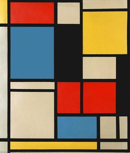
Composition with Red, Yellow and Blue 1
Giclée / Art Print
Reproduction Size
-


Total Price
$ 81
A Universe Within Lines: Deconstructing Mondrian’s Composition with Red, Yellow, and Blue
Piet Mondrian's *Composition with Red, Yellow, and Blue* isn’t merely a painting; it is a visual manifesto, a distillation of the artist’s lifelong pursuit of spiritual harmony through abstraction. Emerging from the vibrant artistic ferment of early 20th-century Europe, this work embodies the core principles of Neoplasticism – an aesthetic philosophy Mondrian co-founded with Theo van Doesburg and articulated in their journal *De Stijl*. To gaze upon its stark geometry is to encounter a radical departure from representational art, a deliberate rejection of the natural world in favor of universal forms. The painting’s power resides not in what it depicts, but in how it *is* – a carefully calibrated arrangement of black grid lines defining rectangles of primary colors and neutral tones. These aren't arbitrary choices; they are the building blocks of Mondrian’s visual language, intended to express underlying cosmic order.From Dutch Landscapes to Pure Abstraction
Mondrian’s artistic journey was one of gradual but relentless simplification. He began his career painting traditional landscapes, influenced by the Hague School and Dutch Impressionism. Early works like *The Red Mill* reveal a skilled hand at rendering naturalistic detail, yet even then, hints of his future direction can be detected in his fascination with form and color. His move to Paris in 1912 proved pivotal, exposing him to the revolutionary ideas of Cubism. While initially embracing aspects of this new style, Mondrian soon began to push beyond its representational constraints, seeking a purer form of abstraction. He believed that by stripping away all traces of the objective world, he could access a deeper, more spiritual reality. This quest led him to develop Neoplasticism, where art wasn’t about imitating nature but about revealing its essential structure – a structure based on vertical and horizontal lines representing opposing forces in dynamic equilibrium. He sought not to depict the world as we see it, but rather to reveal its underlying principles of harmony and balance.The Language of Lines and Color
The technique employed in *Composition with Red, Yellow, and Blue* is deceptively simple. Mondrian applied oil paint to canvas with precision, creating clean, sharp edges that define the geometric shapes. The black grid isn’t merely a structural element; it acts as a dynamic force, holding the composition together while simultaneously creating tension between the colored rectangles. The choice of primary colors – red, yellow, and blue – is also significant. These are considered fundamental hues, irreducible elements from which all other colors derive. By limiting his palette to these primaries along with white, black, and gray, Mondrian aimed to create a universal visual language, free from subjective interpretation. The asymmetrical arrangement of the rectangles further enhances the sense of dynamic balance, preventing the composition from becoming static or predictable. It’s a carefully orchestrated interplay of opposing forces – vertical versus horizontal, color versus neutrality, tension versus harmony.A Lasting Legacy: Beyond the Canvas
The impact of Mondrian's Neoplasticism extends far beyond the realm of painting. His aesthetic principles have profoundly influenced graphic design, architecture, and fashion. The clean lines, geometric forms, and primary colors that define his work are instantly recognizable and continue to inspire contemporary artists and designers. *Composition with Red, Yellow, and Blue* is more than just a beautiful object; it’s an invitation to contemplate the fundamental principles of order, balance, and harmony – concepts that resonate deeply in our increasingly complex world. Owning a reproduction of this iconic work isn't simply acquiring a piece of art history; it's embracing a philosophy, inviting a sense of calm clarity into your space, and connecting with a legacy of artistic innovation that continues to shape our visual landscape.Questions & Answers
Does "Composition with Red, Yellow and Blue 1" by Piet Mondrian use strong contrasts or soft harmonies?
In "Composition with Red, Yellow and Blue 1", a statement contrast is paired with a strong color unity harmony.
Is "Composition with Red, Yellow and Blue 1" available as a fine art print?
"Composition with Red, Yellow and Blue 1" is available as a fine art print on cotton canvas or archival canvas paper. Orders are placed on its Fine Art Print page, in the size of your choice.
From which era does "Composition with Red, Yellow and Blue 1" date?
The historical period of "Composition with Red, Yellow and Blue 1" by Piet Mondrian is Modern. This classification situates the work in art history.
Artist Biography
The Architecture of Order
To look at a Mondrian today is to see the blueprint of modern visual culture. We encounter his logic every time we interact with a clean graphic layout or a minimalist building facade. He stripped away the unnecessary until only the essential remained. This was not an act of destruction, but one of extreme distillation. By reducing his vocabulary to straight lines, right angles, and a strict palette of red, blue, and yellow, he removed the distraction of reality to reveal a structural truth.
His early work in the Netherlands followed much more traditional paths. He began with landscapes that captured the windmills and rivers of the Dutch countryside, heavily influenced by the Hague School and Impressionism. Pieces like The Red Mill show an artist focused on naturalistic detail and the soft light of his homeland. However, even in these early years, a drive toward simplification was present. He moved through Pointillism and Fauvism, testing how much color and form could be compressed before the subject disappeared entirely.
The Parisian Shift and Neoplasticism
The move to Paris in 1912 changed everything. Encountering Cubism forced him to deconstruct objects into geometric components. He stopped trying to depict what he saw and began exploring how he saw it. This period was deeply tied to his interest in Theosophy, a mystical philosophy that sought universal principles beneath surface appearances. He believed art could express these hidden truths through pure abstraction.
By 1917, this search resulted in Neoplasticism, or "pure plastic art." Alongside Theo van Doesburg, he co-founded the De Stijl movement to promote a rigid aesthetic of horizontal and vertical lines. The rules were absolute:
- The use of primary colors: red, blue, and yellow.
- The use of primary values: black, white, and gray.
- A focus on right angles and straight lines.
This reduction was a deliberate attempt to manifest spiritual order through visual balance. Works like Composition with Red, Blue and Yellow demonstrate this commitment to geometric purity.
New York and the Final Rhythm
The arrival of World War II forced Mondrian to flee Europe for New York City in 1940. The transition from the organic landscapes of his youth to the rigid grid of Manhattan provided a new, unexpected energy. His late works, such as Broadway Boogie Woogie, show a shift in rhythm. While he maintained his core principles, the lines began to dance with a new, syncopated movement inspired by the city's pulse and jazz music.
His death in 1944 ended a career that had fundamentally altered the trajectory of 20th-century art. He left behind a legacy that moved far beyond the canvas, influencing everything from architecture to fashion, including the famous 1965 collection by Yves Saint Laurent. His work remains a standard for anyone seeking clarity and structural integrity in a chaotic visual age.

Piet Mondrian
1872 - 1944 , Netherlands
Related Articles

Neoplasticism Unveiled: The Power of Pure Color and Geometric Form in Modern Abstract Art
Explore the profound essence of Neoplasticism. Discover how Piet Mondrian and De Stijl masters used pure color and geometric form to redefine modern art. An essential guide for collectors seeking to understand the enduring power of abstract harmony and universal order.
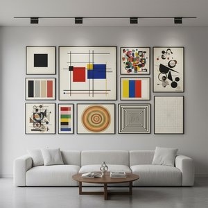
Geometric Abstraction's 10 Defining Masterpieces | Art for Your Home - OriginalUniqueArt
Explore 10 defining masterpieces of Geometric Abstraction! Discover Kandinsky, Mondrian & Malevich’s iconic works. Find museum-quality art reproductions and curated decor ideas to elevate your home at OriginalUniqueArt.com.
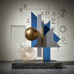
Beyond Form: Exploring the Philosophical Foundations of Geometric Abstraction
Explore the philosophical roots & artistic evolution of geometric abstraction with OriginalUniqueArt. Discover Mondrian, Malevich, De Stijl & more. Expert insights for collectors and art enthusiasts.
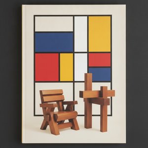
De Stijl: Mastering the Art of Pure Abstraction and Geometric Harmony for the Modern Collector
Explore the profound elegance of De Stijl. Discover how Piet Mondrian and the masters of Neoplasticism utilized geometric harmony and primary colors to redefine modern abstraction. An authoritative guide for the discerning collector seeking timeless, structured beauty.
Beyond Form & Color: Geometric Abstraction's Evolution in 20th/21st Century Art
Explore the evolution of geometric abstraction from Cubism to contemporary art. Discover key artists like Malevich & Mondrian, investment insights, and expert collecting advice at OriginalUniqueArt.