Color-blocking is thought of as the exploration of taking colors that are opposites on the color wheel and pairing them together to make complementary color combinations. It is commonly associated in fashion as a trend that originated from the artwor...
To understand color blocking, one must first look past the surface of a single hue to see how boundaries create meaning. At its simplest, this technique involves grouping large, solid areas of color together, often using contrasting or complementary tones that sit side by side without the softening effect of gradients. It is a method of organization where the focus shifts from what a color represents—such as a blue sky or a green leaf—to what the color is in its purest form. By removing the subject matter, the artist or designer forces the eye to engage directly with the tension between different weights and temperatures of light.
This practice finds an early echo in the foundational techniques of plein air painting. Artists like Camille Przewodek use color blocking as a primary lay-in, applying distinct blocks of color to establish the different light keys within a landscape before any fine detail is added. This stage is essential for understanding how light affects a subject; by treating a shadow or a sunlit patch as a solid block of pigment, the painter builds an illusion of depth through structural accuracy rather than mere imitation. Thus, what appears to be a modern, bold trend is actually rooted in the disciplined preparation required to master natural light.
The Geometric Blueprint: Mondrian and Neo-Plasticism
A Fragmented World: Exploring Piet Mondrian’s “Oval Composition with Light Colors” Piet Mondrian's "Oval Composition with Light Colors," a deceptively simple yet profoundly complex work, stands as a cornerstone of early 20th-century abstraction. Pain...
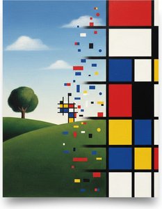
The most recognizable ancestor of the color-blocking movement is found in the rigid, mathematical precision of Piet Mondrian. Through his movement known as Neo-Plasticism, Mondrian sought to strip away the complexities of the visible world to reveal a universal, underlying order. His works, such as Oval Composition with light colors, utilize straight horizontal and vertical lines to compartmentalize primary colors within a structured framework. In these compositions, color is not used to decorate a shape but to define it, creating a balanced equilibrium where every square and stripe holds equal visual weight.
This pursuit of pure geometry finds its parallel in the development of modern graphic design and even certain architectural motifs. Just as Mondrian used orthogonal lines to reconcile the organic world with rational order, contemporary designers use similar geometric constraints to create stability in visual communication. The logic remains the same: by limiting the palette and strictly defining the boundaries of each color, one can achieve a sense of clarity that transcends individual objects, turning a simple arrangement of shapes into a profound statement on balance and structure.
From Lines to Planes: The Emeruration of Color Field Painting
Color field painting (Colour field painting in Commonwealth English) is a style of abstract painting that emerged in New York City during the 1940s and 1950s. It was inspired by European modernism and closely related to abstract expressionism, while ...
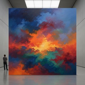
As art moved through the mid-20th century, the sharp, contained lines of Neo-Plasticism began to expand into something more expansive and atmospheric. This evolution led to the emergence of Color Field painting in New York during the 1940s and 1950s. Unlike the structured grids of Mondrian, painters like Mark Rothko and Clyfford Still moved toward large, unbroken surfaces of color that seemed to bleed into or stain the canvas itself. In these works, color is freed from any objective context; it does not represent a thing, but becomes the subject in its own right, often intended to provoke deep, existential responses in the viewer.
We see the structural echo of this expansion in the way Rothko utilized "multiforms"—large areas of color that appear to hover or breathe. While Mondrian used lines to separate colors, Rothko used soft, blurred boundaries to create a sense of depth and vibration. This transition from the hard edge to the soft field mirrors the shift from observing a shape to experiencing an environment. The goal remains a shared one: to use the weight and luminosity of color to move beyond mere sight and into a state of emotional immersion.
Sartorial Structure: The Influence of Art on Fashion History
The impact of these artistic movements extends far beyond the canvas, finding a powerful second life in the world of fashion. One of the most famous intersections of fine art and clothing occurred in 1965, when Yves Saint Laurent debuted his Mondrian-inspired sack dresses. By translating the stark, primary-colored grids of Neo-Plasticism into wearable fabric, Saint Laurent brought the logic of abstraction to the streets of Paris. This moment helped define the "Mod" era, where fashion embraced the bold, mismatched, and solid color separates that mirrored the energy of contemporary art.
This sartorial use of color blocking also draws from the work of designers like Stephen Burrows, who popularized even more dynamic uses of color in the disco era. Burrows utilized undulating edges and vibrant, unexpected combinations to celebrate movement and culture. Whether it is the 1960s mini-skirts in primary colors or the neon-heavy blocks of the 1980s, fashion has consistently used the principles of color blocking to create intentional, high-contrast looks. The clothing becomes a mobile composition, using the same rules of weight and contrast that an artist uses to balance a painting.
Architectural Hue: Using Color Blocks in Interior Design
In the realm of interior design, color blocking serves as a tool for defining space and creating "architecture" within a room without the need for physical walls. Designers use large swaths of paint to delineate a reading nook or to extend a specific hue from a wall onto the ceiling, effectively creating a room within a room. This technique can be used boldly, with intense colors spanning across architectural details to emphasize their shape, or subtly, by using monochromatic blocks of varying shades to add depth to a hallway.
This approach finds its historical resonance in the way classical painters used light and shadow to suggest structure. Just as a painter uses dark blocks to create the illusion of a recessed corner, an interior designer uses color to trick the eye into perceiving new dimensions. By pairing colors with no concern for traditional "matching," but rather focusing on how they interact, modern interiors achieve a refreshing atmosphere that feels both intentional and structurally sound.
The Science of Perception: Color Psychology and Human Response
Color psychology is the study of colors and hues as a determinant of human behavior. Color influences perceptions that are not obvious, such as the taste of food. Colors have qualities that may cause certain emotions in people. How color influences i...
At its core, the power of color blocking relies on our innate psychological response to different hues. The study of color psychology explores how specific wavelengths can influence human behavior and emotion. For instance, Johann Wolfgang von Goethe noted in his 1810 Theory of Colors that yellow could evoke a sense of serenity, while blue carries a mixture of excitement and repose. These are not merely subjective opinions but observations of how the brain processes the energy of different light frequencies.
This scientific understanding is echoed in the early neurological research of Kurt Goldstein, who studied how colors like red might increase physiological arousal or attention. When we engage with a color-blocked composition—whether it is a massive Rothko canvas or a modern graphic advertisement—we are participating in a biological dialogue. The tension created by placing a high-saturation "pop" color against a neutral base is a calculated use of human perception, designed to direct the eye and trigger an emotional or cognitive response through the fundamental language of light.
Explore the philosophical and aesthetic foundations of Color Field painting with OriginalUniqueArt. Discover key artists like Rothko & Newman, its spiritual influences, and lasting impact on modern art. Expert insights for collectors.
Explore the revolutionary art of Piet Mondrian and the principles of Neo-Plasticism. Discover De Stijl's influence, iconic compositions like 'Composition with Red, Yellow and Blue,' and Mondrian’s lasting legacy on modern design.
Unlock the secrets of visual impact with our expert guide to color theory. Learn how warm, cool, and bold hues drive emotion and prestige, helping art collectors curate high-impact, sophisticated spaces through professional chromatic mastery.
Explore the fascinating evolution of color theory in art history! Discover Impressionism, Neo-Impressionism & beyond with expert insights for collectors and enthusiasts. Learn about Seurat's techniques & the psychology of color.

 Oval Composition with light colors
 Color psychology