Introduction: The Enduring Power of Neutrality
The allure of black, white, and gray extends far beyond mere aesthetic preference; it’s a fundamental dialogue with space itself. These aren't simply *colors* in the traditional sense, but rather states of being – absence and presence, light and shadow, definition and dissolution. For the discerning hotel designer, mastering this palette isn’t about restriction, but liberation—a pathway to creating environments that resonate with quiet sophistication, timeless elegance, and a profound emotional depth. The power lies in their ability to amplify form, texture, and the subtle nuances of light, transforming spaces into havens of calm contemplation or dynamic visual experiences.
The Historical Roots of Black, White & Gray in Art
Monochromatic painting has played a significant role in modern and contemporary Western visual art, originating with the early 20th-century European avant-gardes. Artists have explored the non-representational potential of a single color, investigati...
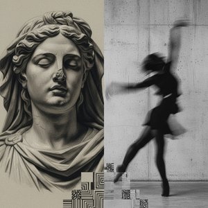
To understand the contemporary impact of these shades, one must look back. The earliest explorations weren’t about color at all, but about value – the interplay of light and dark that defines form. Renaissance masters like Caravaggio wielded chiaroscuro with dramatic effect, using stark contrasts to sculpt figures and evoke powerful narratives. Later, in the early 20th century, artists began stripping away representation entirely. Kazimir Malevich’s “White on White” (1918) – a radical gesture of pure abstraction – wasn't an absence of content, but a declaration of the inherent power of the canvas itself. This pursuit of essential form paved the way for movements like De Stijl and Russian Constructivism, where geometric precision and limited palettes became hallmarks of a new aesthetic. The Bauhaus school further refined this approach, emphasizing functionality and reducing design to its most basic elements. These historical precedents demonstrate that black, white, and gray aren’t simply trends; they represent a continuous exploration of the fundamental building blocks of visual experience.
Spatial Perception and Minimalism: A Dialogue with Absence
In visual arts, music, and other media, minimalism is an art movement that emerged in the post-World War II era in Western art. It is often interpreted as a reaction to abstract expressionism and modernism. The movement anticipated various post-minim...
The mid-20th century witnessed the rise of Minimalism, an art movement profoundly shaped by this historical lineage. Artists like Donald Judd and Agnes Martin sought to eliminate subjective expression, focusing instead on the object itself and its relationship to the surrounding space. Judd’s stacked boxes, often rendered in industrial materials and solid colors, forced viewers to confront the physicality of form and the inherent qualities of light and shadow. Martin's subtle grids, delicate washes of color, and quiet surfaces invited contemplation and a heightened awareness of spatial dimensions. This wasn’t about *what* was there, but about *how* it existed within the room. Lucio Fontana took this exploration further with his “Spatial Concept” series, slashing canvases to reveal the infinite void beyond—a powerful metaphor for the boundless nature of space itself. These works weren't merely paintings; they were interventions in the surrounding environment, challenging our perception of depth and form. The interplay between the canvas, the slash, and the ambient light created a dynamic tension that continues to inspire contemporary designers.
Monochrome’s Emotional Resonance: Beyond the Visual
 The Subtleties of Shade: Exploring Monochrome's Enduring Power in Art History & Contemporary Practice
Explore the captivating world of monochrome painting! Discover its rich history, from Renaissance chiaroscuro to contemporary minimalism. Uncover the emotional power and artistic techniques behind this enduring art form.
The power of monochrome extends beyond purely visual considerations; it taps into deeply rooted psychological associations. Black often evokes sophistication, mystery, and authority, while white represents purity, clarity, and tranquility. Gray, as a nuanced intermediary, offers a sense of balance and calm. However, these associations aren’t fixed—the emotional impact is profoundly influenced by texture, context, and the surrounding environment. A rough-hewn black stone wall might evoke a sense of ruggedness and grounding, while a smooth, polished white surface could convey elegance and refinement. Ralph Humphrey, bridging Abstract Expressionism and Minimalism, masterfully explored these subtleties in his evolving work—monochromes, shaped canvases, and constructed paintings that focused on the interplay of color, space, and light. His ability to create depth and emotional resonance with such a limited palette is a testament to the power of nuanced execution.
Applying Abstraction: Integrating Shade into Hotel Design
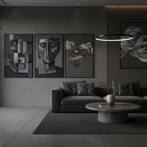
For hotel design, the strategic use of black, white, and gray offers unparalleled versatility. In public spaces, these shades can create a sense of grandeur and sophistication—a neutral backdrop that allows architectural details to take center stage. Consider using varying textures – polished concrete floors, textured wall panels, and plush upholstery – to add depth and visual interest. In guest rooms, a monochromatic palette promotes relaxation and tranquility. Layering different shades of gray creates a calming atmosphere, while strategic pops of color—a single piece of artwork or a carefully chosen accent chair—can add personality and warmth. The key is to avoid starkness; introduce natural materials like wood and stone to soften the edges and create a sense of grounding. Thoughtful lighting is also crucial – warm ambient light can enhance the feeling of intimacy, while cool, focused light can highlight architectural features.
Case Studies: Exemplary Use of Neutral Palettes in Hospitality Spaces
Several hotels exemplify the successful integration of black, white, and gray abstraction. The minimalist aesthetic of The Edition Hotels utilizes a sophisticated palette of grays and blacks to create a sense of understated luxury. Architectural details are emphasized through strategic lighting and carefully chosen materials. Similarly, many boutique hotels employ monochrome schemes in guest rooms to promote relaxation and tranquility. These spaces often feature textured walls, plush bedding, and subtle pops of color—a single piece of artwork or a carefully chosen accent chair. Günther Förg’s work, with its abstract geometric forms and reflections on art history, provides inspiration for incorporating artistic elements into these designs. His paintings combine materials and explore spatial relationships, offering a compelling example of how abstraction can enhance the overall aesthetic.
Conclusion: Cultivating Atmosphere Through Subtlety
Ultimately, mastering black, white, and gray in interior design is about cultivating atmosphere—creating spaces that resonate with quiet sophistication, timeless elegance, and profound emotional depth. It requires a nuanced understanding of history, symbolism, and technique, as well as a willingness to embrace the power of absence. At OriginalUniqueArt.com, we offer a curated selection of museum-quality reproductions and custom artwork—from the iconic slashed canvases of Lucio Fontana to the subtle grids of Agnes Martin—to help you transform your hotel spaces into havens of calm contemplation or dynamic visual experiences. Our expert art advisors are available for free consultations, providing personalized guidance to help you choose artworks that match your vision and elevate your design aesthetic. Explore our collection today and discover the enduring power of neutrality.