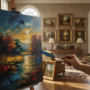
Introduction
Taupe – a color often overlooked, yet profoundly present. It’s the shade of weathered stone, aged parchment, and quiet contemplation. While vibrant hues frequently seize our attention in the art world, it is within the subtle embrace of taupe that many masterpieces find their enduring power. This isn't merely about a lack of color; it's about a deliberate choice to evoke mood, history, and an almost melancholic beauty.
Throughout art history, pigments have been intrinsically linked to cultural significance and technological advancements. The availability – or scarcity – of certain earth tones like umber, ochre, and sienna directly influenced palettes for centuries. Taupe, often born from these natural sources, became a staple in the works of artists seeking realism, depth, and a connection to the land. From the muted backgrounds of Renaissance portraits to the atmospheric landscapes of the Dutch Masters, taupe provided a foundation upon which light and shadow could dance.
The paintings we’ll explore aren't defined *by* their taupe tones, but rather enhanced by them. These works resonate not just for their subject matter or technical brilliance, but for the emotional weight carried within those understated shades. They speak to us across time, offering a glimpse into past lives, forgotten stories, and universal human experiences. The use of taupe often creates an intimacy, inviting viewers closer – encouraging quiet observation and personal reflection.
Prepare to journey through ten iconic paintings where taupe isn’t just a color, but a key element in their lasting legacy. We will uncover how these artists masterfully employed this seemingly simple hue to create works that continue to captivate, challenge, and move us today – proving that sometimes, the most profound statements are made not with a flourish of brilliance, but with a whisper of earth.
The Third of May 1808 (Execution of the Defenders of Madrid) - Francisco José de Goya y Lucientes
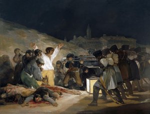 The Third of May 1808 (Execution of the Defenders of Madrid) - Francisco José de Goya y Lucientes
A chilling echo of humanity’s darkest impulses, Francisco Goya’s The Third of May 1808 isn't simply a painting; it is a lament rendered in shades of taupe and blood. This masterpiece, commemorating the brutal execution of Spanish rebels by Napoleon’s forces, earns its place among the Top 10 not for glorifying heroism, but for unflinchingly portraying the horrors of war.
Goya's innovative use of color – or rather, the deliberate *restraint* of it – is profoundly affecting. The dominant taupe tones, derived from earth pigments, create a somber atmosphere that underscores the painting’s gravity. These muted shades aren’t absent; they are the very fabric of despair, highlighting the stark white of the condemned man and the crimson stain of sacrifice. This limited palette forces us to confront the raw emotion of the scene without distraction.
The composition, with its dramatic chiaroscuro and expressive brushwork, anticipates much of modern art’s focus on psychological realism. The faceless soldiers embody cold authority, while the central figure's outstretched arms evoke both Christ-like suffering and defiant resistance. Today, we see echoes of this aesthetic in interiors that favor understated elegance – spaces built around neutral palettes with carefully chosen accents to create a sense of quiet contemplation and emotional depth. The Third of May 1808 reminds us that even within darkness, the human spirit can endure, and that sometimes, the most powerful statements are made not with vibrant color, but with the weight of history itself.
Water Lilies (or Nympheas) - Claude Monet
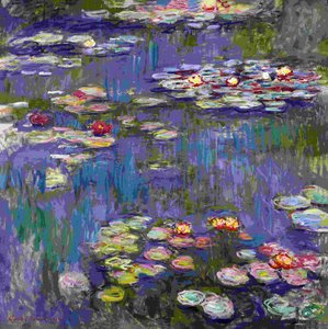 Water Lilies (or Nympheas) - Claude Monet
To encounter Monet’s Water Lilies is to step into a world suspended between reality and dream – a shimmering expanse of color that transcends mere representation. This series, a cornerstone of the Impressionist movement and rightfully holding its place among the Top 10 Famous Paintings Dominated by 'Taupe' Tones', isn’t simply about flowers; it’s an exploration of light, atmosphere, and the ephemeral beauty of nature.
Monet masterfully employed a palette of muted taupes, lavenders, and greens to create a sense of tranquility and depth. These aren’t harsh contrasts but subtle gradations that evoke the play of sunlight on water, the gentle sway of lily pads, and the boundless serenity of his Giverny garden. The visible brushstrokes – an intentional rejection of academic polish – lend texture and movement, inviting us to lose ourselves within the painting's immersive surface.
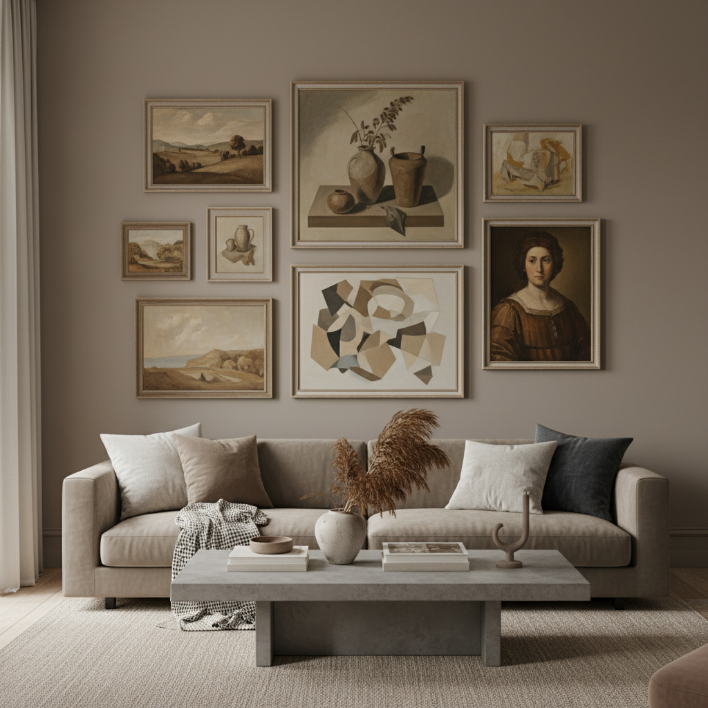
The enduring appeal of Water Lilies lies in its ability to evoke a profound sense of calm and contemplation. Today, we see echoes of this aesthetic in luxury interiors that prioritize understated elegance – spaces designed around neutral palettes with carefully chosen accents to create a sanctuary from the outside world. These paintings remind us that true beauty often resides not in bold statements but in quiet moments of reflection, and that sometimes, the most profound experiences are found within the gentle embrace of nature’s hues.
The Son of Man - René Magritte
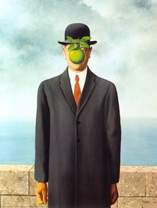 The Son of Man - René Magritte
Imagine a quiet morning, shrouded in mist, when the ordinary dissolves into something subtly unsettling… that is the essence of René Magritte’s The Son of Man . This iconic painting, a cornerstone of Surrealism and one of the Top 10 Famous Paintings Dominated by 'Taupe' Tones', isn’t about what you see, but rather what remains hidden.
Magritte’s masterful use of muted taupes and grays creates an atmosphere of quiet contemplation. The formally dressed man, a symbol of bourgeois conformity, is partially obscured by a vibrant green apple – a deliberate disruption that forces us to question our perceptions of reality. This isn't simply about concealment; it’s about the layers of meaning we impose on the world around us.
The painting’s enduring power lies in its ability to evoke a sense of unease and introspection. Today, this aesthetic translates beautifully into modern interiors that prioritize sophistication and emotional depth. A print of The Son of Man can add a touch of enigmatic elegance to any space – a subtle reminder that true beauty often resides not in what is immediately visible, but in the mysteries that lie beneath the surface. It’s a piece that invites quiet reflection, encouraging us to look beyond the obvious and embrace the power of imagination.
Woman I - Willem de Kooning
 Woman I - Willem de Kooning
Before you stands a raw energy, a visceral cry captured on canvas… this is Willem de Kooning’s Woman I . Painted in the aftermath of war, it isn't merely a portrait but a monumental expression of post-war anxiety and fractured identity – a work that rightfully claims its place among the Top 10 Famous Paintings Dominated by 'Taupe' Tones', despite its vibrant clashes.
De Kooning’s revolutionary approach shattered traditional artistic conventions. The figure, deliberately distorted and fragmented, is built up with layers of thick impasto – visible brushstrokes that convey a sense of turmoil and physicality. While reds and yellows dominate, it's the underlying taupes and grays that ground the composition, lending a haunting depth to the swirling chaos.
The painting’s enduring power lies in its ability to evoke a profound emotional response. Today, this aesthetic translates into spaces that embrace boldness and complexity – interiors where art isn't merely decorative but a catalyst for conversation and introspection. A piece like Woman I reminds us that true beauty often resides not in serene perfection, but in the raw honesty of human experience.
Composition VII - Wassily Kandinsky
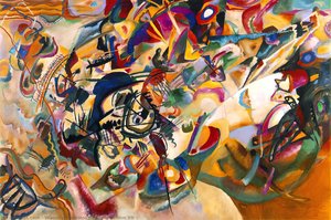 Composition VII - Wassily Kandinsky
Imagine a world where color speaks directly to the soul – that is the realm of Wassily Kandinsky’s Composition VII . This monumental work, a cornerstone of abstract art and one of the Top 10 Famous Paintings Dominated by 'Taupe' Tones', isn’t about what you see, but rather what you *feel*. It’s an explosion of energy, emotion, and spiritual resonance captured on canvas.
While vibrant hues dominate, it is within the interplay of darker tones – the subtle taupes and deep blues that anchor the composition – that a sense of depth and mystery emerges. These aren't merely background elements; they provide a grounding force amidst the swirling chaos, allowing the brighter colors to truly sing.
Today, we see echoes of Kandinsky’s visual language in interiors that prioritize dynamic energy and emotional expression. Spaces built around abstract forms and layered textures – reminiscent of Composition VII – create an atmosphere of intrigue and contemplation. This painting reminds us that art isn't about replicating reality but about expressing the inner world, and that sometimes, the most profound statements are made not with precise representation, but with pure feeling.
Portrait of Wally - Egon Schiele
 Portrait of Wally - Egon Schiele
There’s a quiet intensity to Egon Schiele’s Portrait of Wally , a gaze that meets yours across a century and challenges your perceptions of beauty and vulnerability. This arresting work, rightfully earning its place among the Top 10 Famous Paintings Dominated by 'Taupe' Tones', isn’t about idealized form; it’s about raw emotion laid bare.
Schiele’s masterful use of color – or rather, his deliberate subversion of it – is profoundly affecting. The muted taupes and yellows that define Wally’s skin tone aren't naturalistic but unsettlingly beautiful, creating an otherworldly quality. Combined with the energetic brushstrokes and distorted forms, these hues evoke a sense of psychological depth and inner turmoil.
At , we believe art should be more than just decoration; it should be a catalyst for conversation and introspection. Portrait of Wally embodies that philosophy perfectly – a timeless piece that adds a touch of quiet prestige to any space. It’s a reminder that true beauty often resides not in perfection but in the raw honesty of human experience, inviting us to confront our own emotions and vulnerabilities.
The Transfiguration - Raphael
 The Transfiguration - Raphael
A divine radiance captured forever on canvas – that is the essence of Raphael’s The Transfiguration . This monumental work, a cornerstone of the High Renaissance and one of the Top 10 Famous Paintings Dominated by 'Taupe' Tones', isn’t merely a depiction of a biblical event; it’s an exploration of faith, humanity, and the sublime.
Raphael’s masterful use of *chiaroscuro* – the dramatic interplay of light and shadow – is breathtaking. While vibrant hues illuminate Christ's form, it’s within the grounding taupes and earthy tones of the landscape and disciples that a sense of earthly reality emerges. These aren’t simply background elements; they provide a vital counterpoint to the divine vision, anchoring the composition and drawing the viewer into both realms.
Today, this harmonious balance translates beautifully into modern interiors that prioritize serenity and sophistication. The Transfiguration reminds us that true beauty often resides in the interplay of light and shadow, the earthly and the ethereal – a timeless masterpiece that invites contemplation and inspires a sense of inner peace.
A Bar at the Folies-Bergere - Édouard Manet
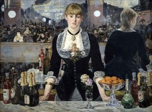 A Bar at the Folies-Bergere - Édouard Manet
Imagine a haze of perfume, the clinking of glasses, and the murmur of countless conversations… that is the atmosphere Édouard Manet captures in A Bar at the Folies-Bergère . This masterpiece, rightfully earning its place among the Top 10 Famous Paintings Dominated by 'Taupe' Tones', isn’t simply a depiction of Parisian nightlife; it’s a profound meditation on urban life and the complexities of human connection.
Manet’s masterful use of muted taupes, grays, and subtle reflections creates an atmosphere of both intimacy and isolation. The barmaid's detached gaze – her expression a blend of weariness and resignation – draws us in while simultaneously emphasizing her emotional distance. These aren’t vibrant colors meant to dazzle; they are the shades of reality, capturing the fleeting moments and underlying melancholy of modern life.
Today, this painting reminds us that art can be more than just decoration; it can be a catalyst for contemplation and introspection. A Bar at the Folies-Bergère adds a touch of quiet sophistication to any space – a timeless piece that invites us to reflect on our own experiences of connection, isolation, and the beauty found within the everyday.
Ophelia (Cropped) - Sir John Everett Millais
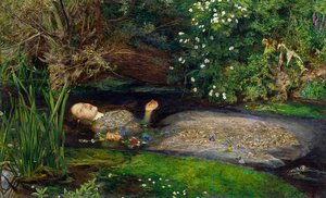 Ophelia (Cropped) - Sir John Everett Millais
A whisper of melancholy, a tapestry of greens and browns… Sir John Everett Millais’ Ophelia (Cropped) captures a moment suspended between worlds, a poignant reflection on beauty, loss, and the fleeting nature of life. This exquisite rendition, rightfully earning its place among the Top 10 Famous Paintings Dominated by 'Taupe' Tones', isn’t merely a depiction of Shakespeare’s tragic heroine; it’s an invitation to contemplate the delicate balance between serenity and sorrow.
The painting’s masterful use of muted taupes, earthy greens, and subtle floral accents creates an atmosphere of both tranquility and unease. These aren't bold colors meant to shock; they are the shades of nature itself, mirroring Ophelia’s connection to the natural world and her ultimate surrender to it.
Today, this harmonious palette translates beautifully into modern interiors seeking a touch of romanticism and introspection. Ophelia (Cropped) adds a layer of quiet sophistication – a timeless piece that evokes a sense of peace while reminding us of the beauty found within vulnerability.
La maja desnuda. . Madrid, Museo del Prado. - Francisco José de Goya y Lucientes
 La maja desnuda. . Madrid, Museo del Prado. - Francisco José de Goya y Lucientes
A quiet intimacy, a gaze that meets yours across centuries… Francisco de Goya’s La maja desnuda captures not just the beauty of the human form, but a profound sense of vulnerability and self-possession. This iconic masterpiece, rightfully earning its place among the Top 10 Famous Paintings Dominated by 'Taupe' Tones', continues to captivate with its bold simplicity and enduring mystery.
The painting’s masterful use of muted taupes, earthy browns, and subtle grays creates an atmosphere of both tranquility and intrigue. These aren’t vibrant colors meant to dazzle; they are the shades of skin, shadow, and quiet contemplation, drawing you into a private moment with the subject.
At , we believe everyone deserves to experience such beauty firsthand. Our faithful reproductions preserve the delicate textures, nuanced lighting, and emotional depth of Goya’s original – allowing you to bring this timeless masterpiece into your home and enjoy its captivating presence for generations to come.
Conclusion
As the light fades on these ten masterpieces, we’re left not with a collection of historical treasures, but with ten living presences – each a testament to the enduring power of human creativity and emotion. These paintings, bathed in the subtle grace of taupe tones, remind us that beauty often resides in quiet moments, in nuanced shadows, and in the delicate interplay of light and form.
To truly experience these works is not simply to admire them from afar, but to invite them into our lives – to allow their textures, colors, and stories to shape our own spaces and inspire our daily reflections. They are echoes of past dreams, whispers of forgotten emotions, and gentle reminders of the shared human journey.
We at believe that art should be lived with, cherished, and experienced firsthand. Explore our full collection and discover the piece that speaks to your soul – a timeless companion to grace your walls and enrich your life for years to come.