Introduction: The Sensory Symphony – Beyond Taste
The act of dining is rarely a purely physiological experience. It’s a complex interplay of senses, memories, and expectations—a carefully orchestrated symphony where taste is but one instrument in the ensemble. While chefs dedicate themselves to perfecting flavor profiles, a subtler yet equally powerful force shapes our perception of food: visual aesthetics. From the vibrant hues of ingredients to the deliberate choice of plateware, every element contributes to an overall impression that can elevate or diminish even the most exquisite culinary creations. This exploration delves into the fascinating realm where color psychology and composition converge, revealing how a thoughtful understanding of these principles can transform a restaurant’s ambiance and profoundly impact the diner's experience.
The Psychology of Color in Appetite & Perception
 Chromatic Resonance: Exploring the Psychological & Aesthetic Impact of Vibrant Colors in Art History
Explore the fascinating relationship between color & emotion in art history. Discover how master artists used vibrant hues to evoke feelings, cultural meanings, and psychological responses. A deep dive for classic art enthusiasts.
Throughout history, cultures have imbued colors with symbolic meaning, often directly linked to sustenance. Red, for instance, has long been associated with energy, passion, and—crucially—appetite stimulation. This isn’t merely anecdotal; studies demonstrate that red hues can physiologically increase heart rate and trigger a primal response related to hunger. Conversely, cooler tones like blue and green evoke feelings of calm and serenity, potentially suppressing appetite but fostering a sense of freshness and healthfulness. The masterful use of color extends beyond individual ingredients. Consider the Dutch Masters’ still lifes, where rich, saturated reds in fruits and meats draw the eye, signaling abundance and indulgence. The strategic placement of these colors wasn't accidental; it was an intentional manipulation of perception designed to entice the viewer—and ultimately, the consumer. White plates, a staple in modern fine dining, function as a neutral canvas, allowing the natural vibrancy of the food to take center stage. However, even white isn’t without nuance – warmer whites can create a sense of comfort, while cooler whites project sophistication and minimalism. Research has shown that plate color can even alter our perception of sweetness; snacks served on red or blue plates were perceived as saltier by picky eaters, highlighting the powerful influence of visual cues.
Plate Shape & Form: Influencing Satiety & Enjoyment
Beyond hue, the very shape of the plateware subtly influences our dining experience. Round or curved plates often evoke a sense of comfort and familiarity, reminiscent of traditional family meals and fostering a feeling of warmth. These shapes are particularly well-suited for classic dishes where nostalgia plays a key role. Square or angular plates, on the other hand, introduce a modern aesthetic, suggesting innovation and sophistication. A chef’s choice to present a delicate sushi arrangement on a rectangular slate plate, for example, communicates a commitment to artistry and precision. Interestingly, studies have revealed that the shape of food itself can impact perceived flavor; wine is often described using terms like “rounded” or “pointed,” demonstrating how our brains associate form with taste sensations. Furthermore, the size of the plate plays a crucial role in satiety. Serving smaller portions on larger plates can create an illusion of abundance, potentially leading to greater satisfaction with less food—a subtle yet effective technique for mindful dining. The interplay between shape and color is also significant; contrasting colors can enhance visual interest, while complementary palettes contribute to a harmonious presentation.
Cultural Significance: How Color and Plateware Reflect Dining Traditions
 Chromatic Narratives: Exploring the Psychological & Cultural Significance of Color in Art History
Explore the fascinating intersection of color, emotion & culture in art history. Discover how master artists used hue to evoke feelings and learn how to select artwork that resonates with your personal aesthetic – a guide for discerning collectors.
The relationship between color, plateware, and cuisine isn’t universal—it's deeply rooted in cultural traditions. In many Asian cultures, porcelain plates are revered not only for their aesthetic beauty but also for their symbolic association with refinement and status. The delicate floral patterns often found on Chinese porcelain represent prosperity and good fortune. Similarly, the use of specific colors during festive occasions holds profound meaning; red is prominently featured during Lunar New Year celebrations to ward off evil spirits and attract luck. In contrast, Mediterranean cultures often favor earthenware plates in earthy tones, reflecting a connection to nature and rustic simplicity. The vibrant ceramics of Mexico showcase bold, geometric designs that celebrate indigenous heritage and artistic expression. Understanding these cultural nuances allows restaurants to create more authentic and immersive dining experiences, demonstrating respect for diverse traditions and appealing to a wider range of palates.
Optimizing Presentation for Specific Cuisines & Courses
The principles discussed thus far aren’t abstract concepts; they can be directly applied to optimize presentation based on the cuisine and course being served. For example, lighter-colored plates with minimalist designs are often ideal for showcasing delicate seafood dishes, emphasizing freshness and purity. Conversely, darker, more textured plates can complement richer, heartier fare like roasted meats or stews, creating a sense of warmth and indulgence. Appetizers benefit from smaller plates that encourage sampling and conversation, while desserts often shine on elegant white porcelain, allowing the intricate details to take center stage. The use of garnishes also plays a crucial role; strategically placed herbs can add vibrant color and aroma, enhancing both visual appeal and flavor perception. Consider the presentation of a Japanese Kaiseki meal—each dish is meticulously arranged on unique plateware designed to complement its specific ingredients and seasonal theme. This attention to detail elevates the dining experience beyond mere sustenance, transforming it into an art form.
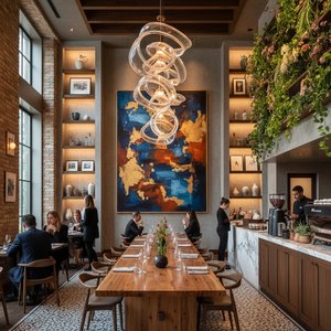
Practical Applications: Leveraging Color Theory in Restaurant Design
Implementing these principles extends beyond individual plates; color theory should inform the overall restaurant design. Wall colors, lighting, and even upholstery can subtly influence mood and appetite. Warm tones like reds and oranges create a lively atmosphere, ideal for casual dining establishments, while cooler blues and greens foster a sense of calm and sophistication in more upscale settings. The choice of tableware should complement the overall aesthetic; sleek, modern plates pair well with minimalist décor, while rustic earthenware complements a farmhouse-style ambiance. Furthermore, consider the impact of digital presentation—high-quality food photography is essential for attracting customers online. Bold, well-balanced compositions are more likely to be shared on social media, generating buzz and driving traffic. At OriginalUniqueArt.com, we offer a vast selection of museum-quality reproductions and custom artwork that can seamlessly integrate into your restaurant’s design scheme, creating a cohesive visual experience that resonates with your brand identity. From selecting the perfect color palette to commissioning unique pieces that reflect your culinary vision, our team of experts is dedicated to helping you transform your space into an unforgettable dining destination. Ultimately, understanding the psychological impact of color and composition isn’t just about aesthetics—it's about creating a sensory symphony that delights the diner on every level.