 Preview
 Send
Send Share
Share
 Details
 Guide
Guide

 Download
 Similars
 X-Ray
X-Ray Diaporama
 Q&A
Q&A Stats
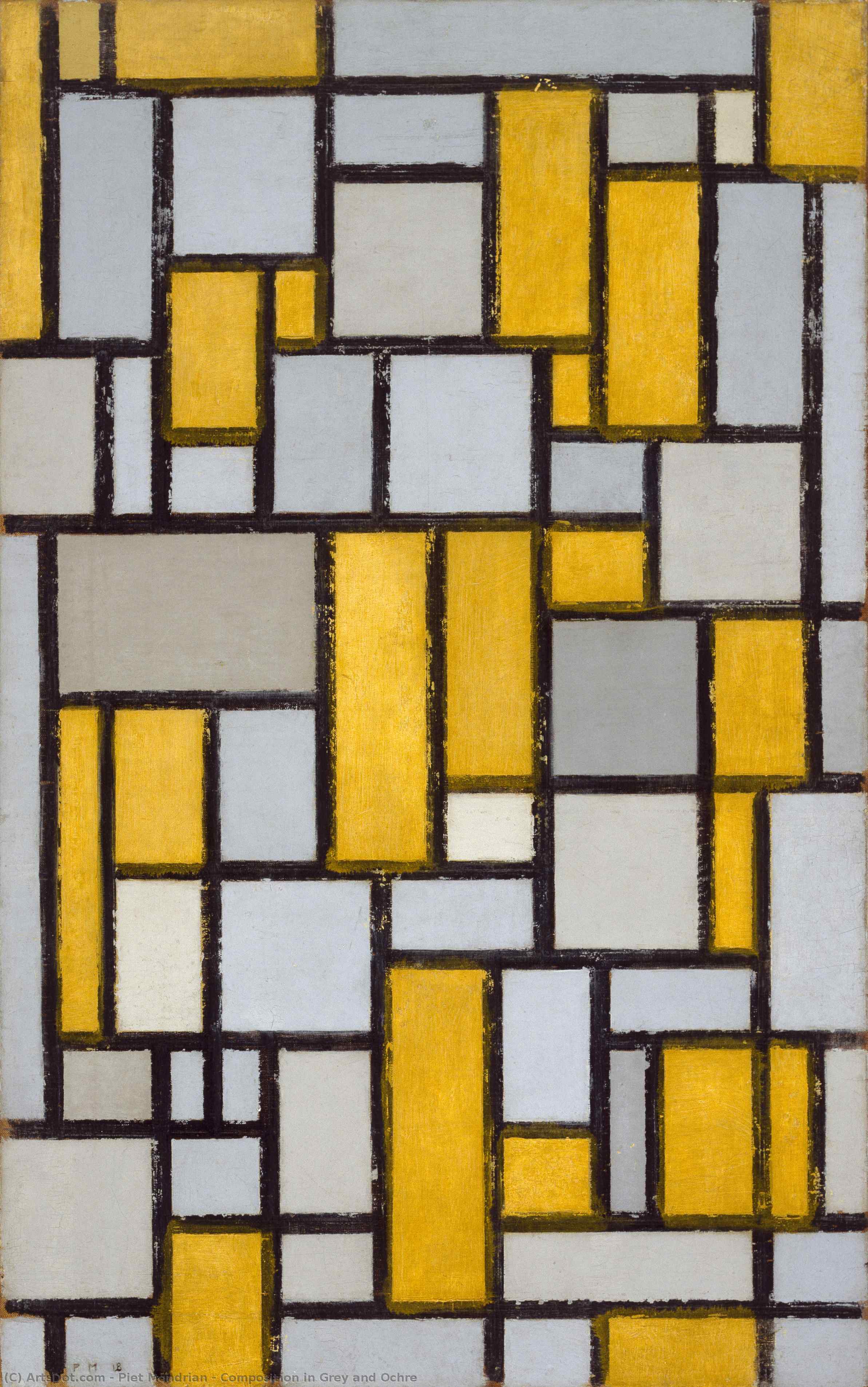
StatsComposition in Grey and Ochre


 Read More
Get a print-ready file that goes far beyond the web preview. Every digital image we sell comes from a high-resolution master in our stock database — usually 5,000 to 15,000 pixels wide — so you can print large, crop tightly, or reproduce fine detail with confidence.
No file leaves our studio untouched. A digital expert checks the colors against the original painting and corrects them if needed, then improves clarity and detail with professional retouching tools — always staying faithful to the artist's brushwork and style. The result is an image that looks like the painting, not like a filtered scan.
You approve before you're done: our expert sends the image by e-mail within 72 hours for your review. Not satisfied? Ask for improvements or corrections, or request a refund if the quality falls short.
This is the quality relied on by publishers, design studios, galleries and print shops.
Digital Image
Download a high-resolution file for personal display, printing, and creative projects. ( Switch to Print Buy Hand Made Painting)
Included in Every Digital Image Order
Expert Digital Delivery, Guaranteed
When you choose OriginalUniqueArt.com, you're not just getting an image - you're receiving a professionally enhanced digital artwork, crafted with precision and backed by a satisfaction guarantee. Here's everything that comes with your order, automatically:

Fast Email Delivery
Your high-resolution digital image file will be emailed to you within 72 hours of ordering - ready for immediate use.

AI-Enhanced Digital File
Your artwork is professionally optimized using advanced AI tools and manual editing, ensuring maximum detail, clarity, and color accuracy.

Free Lifetime Re-Delivery
Accidentally deleted or lost your file? No worries - we'll resend it to you anytime, free of charge.

No Import Fees - Ever
Enjoy your artwork instantly with zero customs, duties, or delivery fees - digital downloads are always tax-free.

Color Accuracy Guarantee
We ensure your digital image reflects the original colors as closely as possible using professional tools and color management.

100-Day Satisfaction Guarantee
If you're not satisfied with your digital image, we'll revise it or refund 100% within 100 days - no questions asked.

100% Money-Back Guarantee
Not satisfied? Get a full refund within 100 days of receiving your digital file - no questions asked.

Bulk Order Discounts
Buy 3 images, save 10% - Buy 5, save 15% - Buy 10+, save 20%. Great for creative projects, galleries, and agencies.
Composition in Grey and Ochre: A Cornerstone of Neoplasticism
Piet Mondrian, born Pieter Cornelis Mondriaan in 1872 amidst the tranquil Dutch landscape of Amersfoort, embarked on an artistic journey far removed from immediate acclaim. His familial connection to Frits Mondriaan, a respected painter himself, initially guided him toward landscapes steeped in Impressionistic influences – canvases like *The Red Mill*, diligently capturing the nuances of Dutch scenery. Yet, beneath this surface mastery lay a persistent desire for simplification; Mondrian wasn’t merely replicating nature's beauty but striving to distill its core essence into pure geometric form. This early experimentation encompassed Pointillism and Fauvism, each offering distinct perspectives on color and composition—styles that probed the boundaries of artistic expression without fully resonating with his evolving vision.- Style: Neoplasticism – Mondrian’s revolutionary approach sought to transcend representational art by reducing visual elements to their fundamental building blocks: straight lines, rectangles, and primary colors (red, yellow, blue).
- Technique: Executed in oil on canvas, Composition with Grid No. 1 demonstrates meticulous attention to detail—particularly the application of dark grey pigment to delineate rectangular areas against a subtly textured ochre background.
The Genesis of Geometric Harmony
The painting’s creation coincided with Mondrian's fervent belief in De Stijl, an artistic collective founded alongside Theo van Doesburg in 1917. This movement championed the unification of material and spiritual realms through geometric abstraction, profoundly impacting art, architecture, and design. The guiding principle was to transform societal perception by reshaping environments—a bold ambition fueled by a conviction that visual harmony could foster intellectual clarity and emotional balance. X-ray photography revealed an astonishing secret: the grid pattern wasn’t accidental but meticulously calculated using the golden ratio – a mathematical proportion considered aesthetically pleasing throughout history.Symbolism Beyond Representation
Composition with Grid No. 1 transcends mere visual beauty; it embodies profound symbolic significance. The absence of organic forms—no trees, no flowers, no human figures—reflects Mondrian’s rejection of illusionistic depiction in favor of conveying universal truths through abstract geometry. Each rectangle represents a building block of existence, symbolizing stability and order – concepts central to De Stijl's utopian aspirations for a harmonious society. The restrained color palette—primarily grey and ochre—further underscores this ethos, prioritizing clarity and purity over sensory stimulation.A Legacy Enduring Through Reproduction
Displayed initially at an exhibition organized by the Dutch Artists’ Circle in Amsterdam in 1919, Composition with Grid No. 1 gained prominence after being acquired by Pierre Schlumberger and subsequently donated to The Museum of Fine Arts, Houston in 1963. Its enduring appeal lies not only in its artistic merit but also in its role as a pivotal milestone in the history of modern art—a testament to Mondrian’s unwavering commitment to simplifying visual experience and achieving sublime geometric harmony. Today, OriginalUniqueArt offers exceptional reproductions that allow collectors and enthusiasts alike to appreciate this masterpiece's timeless elegance and intellectual depth.Questions & Answers
What does "Composition in Grey and Ochre" by Piet Mondrian depict, and in what mood?
"Composition in Grey and Ochre" by Piet Mondrian combines geometric form, grid pattern, primary colors, color harmony, abstraction, minimalism, balance with a minimalist atmosphere.
What mood would "Composition in Grey and Ochre" bring to a space?
"Composition in Grey and Ochre" by Piet Mondrian has a minimalist atmosphere and is recommended for a living room. The mood is what the work brings to the space around it.
What is the dominant hue of "Composition in Grey and Ochre" by Piet Mondrian?
An ochre to sepia hue runs through "Composition in Grey and Ochre" by Piet Mondrian.
Artist Biography
The Architecture of Order
To look at a Mondrian today is to see the blueprint of modern visual culture. We encounter his logic every time we interact with a clean graphic layout or a minimalist building facade. He stripped away the unnecessary until only the essential remained. This was not an act of destruction, but one of extreme distillation. By reducing his vocabulary to straight lines, right angles, and a strict palette of red, blue, and yellow, he removed the distraction of reality to reveal a structural truth.
His early work in the Netherlands followed much more traditional paths. He began with landscapes that captured the windmills and rivers of the Dutch countryside, heavily influenced by the Hague School and Impressionism. Pieces like The Red Mill show an artist focused on naturalistic detail and the soft light of his homeland. However, even in these early years, a drive toward simplification was present. He moved through Pointillism and Fauvism, testing how much color and form could be compressed before the subject disappeared entirely.
The Parisian Shift and Neoplasticism
The move to Paris in 1912 changed everything. Encountering Cubism forced him to deconstruct objects into geometric components. He stopped trying to depict what he saw and began exploring how he saw it. This period was deeply tied to his interest in Theosophy, a mystical philosophy that sought universal principles beneath surface appearances. He believed art could express these hidden truths through pure abstraction.
By 1917, this search resulted in Neoplasticism, or "pure plastic art." Alongside Theo van Doesburg, he co-founded the De Stijl movement to promote a rigid aesthetic of horizontal and vertical lines. The rules were absolute:
- The use of primary colors: red, blue, and yellow.
- The use of primary values: black, white, and gray.
- A focus on right angles and straight lines.
This reduction was a deliberate attempt to manifest spiritual order through visual balance. Works like Composition with Red, Blue and Yellow demonstrate this commitment to geometric purity.
New York and the Final Rhythm
The arrival of World War II forced Mondrian to flee Europe for New York City in 1940. The transition from the organic landscapes of his youth to the rigid grid of Manhattan provided a new, unexpected energy. His late works, such as Broadway Boogie Woogie, show a shift in rhythm. While he maintained his core principles, the lines began to dance with a new, syncopated movement inspired by the city's pulse and jazz music.
His death in 1944 ended a career that had fundamentally altered the trajectory of 20th-century art. He left behind a legacy that moved far beyond the canvas, influencing everything from architecture to fashion, including the famous 1965 collection by Yves Saint Laurent. His work remains a standard for anyone seeking clarity and structural integrity in a chaotic visual age.

Piet Mondrian
1872 - 1944 , Netherlands