- Home

- Oil Painting Reproduction
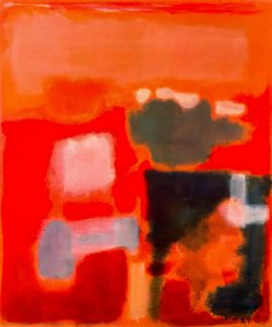
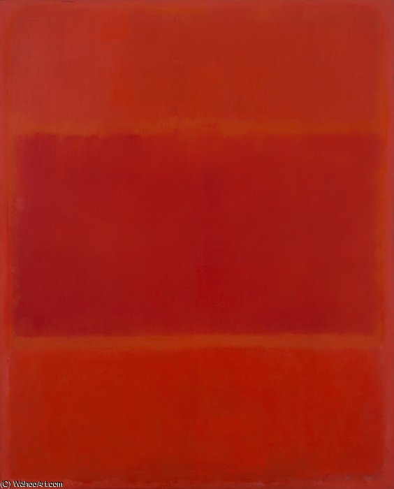
- Mark Rothko
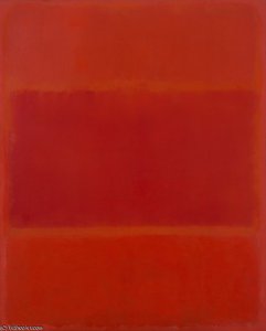
- Red and Orange
 Send
SendRed and Orange


Hand Made Oil Reproduction
Hand-painted oil on canvas in your size and frame, made to order by our artists.


P118B $10

P118H $10

P118W $10

P438Z $10

P508JH $12

P508YH $12

P805H $10

P805Z $10

P919BZ $10

P919G $10

P919XJ $10

P959ZH $10

P968JZ $12

W106C $8

W218G $10

W218JH $8

W218Y $10

W307PJ $10

W316G $10

W316PJ $8

W316Y $10

W398PJ $8

W4111J $10

W500HY $15

W500JH $15

W692G $12

W849H $8

W940BG $15

W953PJ $8


Pick from our preset sizes that match the artwork's original proportions.
You may enter your own dimensions to fit a specific frame or space. If your selected size does not match the original image's proportions, we will either crop the artwork or extend the painting with additional hand-painted elements. A digital mockup will be sent for your approval before production begins.
Please note that the on-screen preview does not reflect the actual cropping or extension. Only the mockup will accurately show the final composition.
While custom sizes are available, we recommend selecting a dimension from the predefined list to preserve the original proportions.
After order, OriginalUniqueArt.com team will email client for instructions and provide a mockup preview
Worldwide Delivery () in 3/4 weeks instead of standard 5 weeks. (16 July). No compromise on quality.

Free Worldwide Express Shipping

High-Quality Linen Canvas

Full Shipping Insurance

Customs Tax Refund Guarantee

True Color Matching Guarantee

60-Day Return Policy (Defects Only)

100% Money-Back Guarantee

Bulk Discount Offer
 Glass option is only available in size under 110 CM

Red and Orange
Reproduction Medium
Reproduction Size
-


Total Price
-
Artwork Description
Red and Orange: A Journey Through Rothko’s Emotional Landscape
Mark Rothko, one of the towering figures of 20th-century art, didn't simply paint pictures; he crafted portals into the depths of human emotion. His work, particularly pieces like ‘Red and Orange,’ invites a profound engagement, demanding that we surrender to its quiet intensity rather than seeking immediate visual gratification. This painting, a cornerstone of his mature style, exemplifies Rothko’s revolutionary approach to color field abstraction – a deliberate move away from representational imagery towards pure feeling expressed through the luminous interaction of hues. It's a piece designed not to be ‘looked at,’ but *felt*. The genesis of ‘Red and Orange’ lies within the vibrant, yet turbulent, context of Abstract Expressionism, a movement that emerged in post-war America as artists sought new ways to grapple with the anxieties and uncertainties of the time. Rothko, however, forged his own distinct path within this broad movement. He wasn't interested in grand gestures or dramatic narratives; instead, he focused on distilling emotion into its most elemental form – color itself. His technique involved applying layers upon layers of oil paint, often mixed with turpentine to achieve a remarkable luminosity and subtle textural variations. The canvas isn’t merely a surface for pigment; it becomes an active participant in the creation of atmosphere, absorbing and reflecting light in ways that subtly shift the painting's mood throughout the day. Notice the delicate blending at the heart of the composition – a deliberate ambiguity that encourages contemplation rather than definitive interpretation. The painting’s structure is deceptively simple: two dominant rectangles of color—a rich, pulsating red on the left and an equally vibrant orange on the right—are juxtaposed within a larger field of muted tones. However, this apparent simplicity belies a complex interplay of visual and emotional forces. Rothko wasn't simply placing colors side-by-side; he was creating a dynamic tension between them, suggesting both harmony and discord. The red, often associated with passion, energy, and even danger, dominates the left portion of the canvas, while the orange—linked to warmth, optimism, and vitality—takes precedence on the right. This division isn’t rigid or absolute; rather, it creates a sense of movement and flow as the eye travels across the surface, drawn into the merging point where the two colors meet. The subtle gradations within each rectangle, achieved through meticulous layering and blending, add depth and complexity to the composition, preventing it from feeling flat or static. Rothko’s intention wasn't to depict a specific scene or object but to evoke universal human emotions – tragedy, ecstasy, doom—as he famously articulated in his writings. In ‘Red and Orange,’ the bold hues can be interpreted as symbols of these fundamental experiences. The intensity of the red might represent moments of profound sorrow or struggle, while the warmth of the orange suggests hope, joy, or a sense of transcendence. It’s important to recognize that Rothko deliberately avoided providing viewers with easy answers; he wanted them to project their own feelings and associations onto the canvas, creating a deeply personal experience. The painting becomes a mirror reflecting our own inner landscape. The legacy of ‘Red and Orange,’ and indeed of Mark Rothko's entire body of work, is undeniable. His color field paintings have profoundly influenced generations of artists, from abstract expressionists to contemporary painters exploring the expressive potential of color. Reproductions of this piece offer a remarkable opportunity to bring Rothko’s emotional intensity into any space, transforming interiors into contemplative sanctuaries. Consider how the rich hues interact with your existing décor – will they enhance the sense of warmth and tranquility, or add a touch of dramatic tension? The choice is yours, but one thing is certain: ‘Red and Orange’ remains a powerful testament to the transformative power of art.The Artistic Movement: Abstract Expressionism and Rothko's Place Within It
Rothko’s work stands as a pivotal contribution to Abstract Expressionism, a movement that fundamentally shifted the focus of American art away from representational imagery towards subjective experience and emotional expression. Emerging in the aftermath of World War II, Abstract Expressionism was characterized by its emphasis on spontaneity, gesture, and the artist's inner world. Artists like Jackson Pollock, Willem de Kooning, and Barnett Newman sought to capture the raw energy and anxieties of the post-war era through large-scale canvases and unconventional techniques. However, Rothko distinguished himself from his contemporaries with his deliberate restraint and focus on color as a primary means of communication. Unlike the gestural brushstrokes favored by Pollock or the fragmented figures of de Kooning, Rothko’s paintings are defined by their smooth, almost meditative surfaces. He rejected the notion of the artist's hand as a visible element in the work, striving instead to create an illusion of seamlessness and luminosity. This pursuit of pure color was deeply influenced by his interest in spirituality and Eastern philosophy, which he believed could provide access to profound emotional states. Rothko’s paintings aren’t about depicting something; they *are* the feeling itself – a distillation of experience rendered in pigment and light. The influence of earlier artistic traditions is also evident in Rothko's work. He drew inspiration from Byzantine icons, which are characterized by their flattened forms, luminous colors, and symbolic content. Similarly, he was fascinated by the color theories of Goethe, who proposed that colors could be understood as having specific psychological effects. Rothko’s use of complementary colors – red and orange in ‘Red and Orange,’ for example – is a deliberate attempt to create visual tension and evoke particular emotional responses. He wasn't simply arranging colors on a canvas; he was conducting an experiment in color psychology, seeking to harness the power of hue to communicate profound human experiences.The Painting: 'Red and Orange' - A Detailed Examination
‘Red and Orange’ is a prime example of Rothko’s distinctive technique and his unwavering commitment to expressing emotion through color. The painting measures approximately 39 ½ x 31 ¾ inches (100.5 x 80.6 cm), a size that allows the colors to dominate the viewer's field of vision, creating an immersive experience. As mentioned previously, the composition is built around two rectangular fields of color: a deep, saturated red on the left and a vibrant orange on the right. These rectangles are not sharply defined; rather, they bleed into one another at their edges, creating a sense of fluidity and ambiguity. The layering technique employed by Rothko is crucial to understanding the painting’s luminosity. He applied multiple thin layers of oil paint, often mixed with turpentine to achieve a translucent effect. This process allowed light to penetrate through the pigments, creating an almost ethereal glow. The texture of the canvas itself plays a significant role in this effect – it's subtly uneven and slightly rough, adding depth and complexity to the surface. Notice how the red seems to vibrate and pulsate within its rectangular frame, while the orange radiates warmth and vitality. The subtle variations in color intensity are also noteworthy. Rothko didn’t simply apply a uniform shade of red or orange; he carefully modulated the hues throughout each rectangle, creating areas of lighter and darker tones. This technique adds depth and dimension to the composition, preventing it from feeling flat or static. The blending at the point where the two colors meet is particularly intriguing – it creates a sense of ambiguity and suggests that the painting is in a state of constant flux. It’s as if the red and orange are merging and separating simultaneously, reflecting the complexities of human emotion.Emotional Resonance: Rothko's Pursuit of Universal Feeling
Rothko believed that color possessed the power to evoke profound emotional responses in viewers – tragedy, ecstasy, doom—as he himself articulated. He wasn’t interested in creating beautiful or aesthetically pleasing paintings; his primary goal was to communicate these fundamental human experiences directly and without mediation. This conviction stemmed from his belief that art could serve as a bridge between individuals, fostering empathy and understanding. The success of ‘Red and Orange,’ and indeed of Rothko's entire body of work, lies in its ability to tap into these universal emotions. The painting doesn’t require any specific interpretation or explanation; it simply *is* – a luminous field of color that invites the viewer to contemplate their own feelings and associations. It’s not uncommon for people to experience tears or a sense of profound emotion when viewing Rothko's paintings, suggesting that he has succeeded in creating works that resonate deeply with our shared human condition. Rothko’s approach was radical for its time, challenging traditional notions of art as representation and inviting viewers to engage with the work on an emotional level. His paintings are not meant to be ‘looked at’; they are meant to be *felt*. They are a testament to the transformative power of color and a profound exploration of the human psyche.Artist Biography
Early Life and the Seeds of Artistic Vision
Mark Rothko, born Markus Yakovlevich Rothkowitz in Dvinsk, Latvia, in 1903, carried within him from the outset a sense of displacement that would profoundly shape his artistic journey. His early years were marked by the anxieties of a Jewish family living within the Pale of Settlement, shadowed by pogroms and political unrest. This atmosphere instilled a deep sensitivity to human suffering, a theme that would resonate throughout his oeuvre. The 1913 immigration to Portland, Oregon, represented not just a geographical shift but a cultural upheaval for the young Rothko. While his father, a pharmacist and intellectual with socialist leanings, fostered a home filled with debate and learning, the loss of Jacob Rothkowitz shortly after their arrival cast a long shadow. This early experience of loss, coupled with the challenges of assimilation, fueled a lifelong exploration of existential themes – mortality, trauma, and the search for meaning in a chaotic world. Though he excelled academically at Yale University, Rothko found himself drawn more to the vibrant energy of New York City, abandoning formal studies to pursue his passion for art at the Art Students League. These formative years laid the groundwork for an artistic vision that would ultimately challenge conventional notions of painting and redefine the emotional power of color.From Figurative Beginnings to Abstract Expressionism
Rothko’s initial artistic explorations were firmly rooted in realism, depicting urban scenes and portraits with a keen eye for detail. However, these early works already hinted at the psychological depth that would become his hallmark. As the 1940s unfolded, and the world grappled with the horrors of World War II, Rothko’s art underwent a dramatic transformation. Influenced by Surrealism and mythology, he began to move away from representational imagery, seeking instead to express universal human emotions through symbolic forms. This period saw the emergence of multi-form paintings – canvases populated by ambiguous, biomorphic shapes that seemed to hover between figuration and abstraction. These works were not merely experiments in form; they were deeply felt responses to the anxieties and uncertainties of a world at war. By the late 1940s, Rothko had arrived at his signature style: large-scale canvases featuring rectangular blocks of color that appeared to float and resonate with one another. He stripped away all vestiges of recognizable imagery, focusing instead on the pure emotional impact of color and form. This marked a pivotal moment in the development of Abstract Expressionism, and established Rothko as a leading figure in this groundbreaking movement.The Color Field and the Pursuit of Transcendence
Rothko’s mature work is defined by what came to be known as “Color Field” painting – vast expanses of luminous color that envelop the viewer in an immersive experience. These paintings are not about *what* they depict, but rather *how* they make you feel. Rothko believed that art should engage the viewer viscerally, bypassing intellectual analysis and speaking directly to the emotions. He meticulously layered thin washes of paint, creating subtle variations in tone and texture that seemed to emanate from within the canvas. The edges of his rectangular forms are often blurred, allowing them to blend and interact with one another, creating a sense of depth and movement. Rothko deliberately avoided titles beyond numbers – “No. 1,” “No. 6” – encouraging viewers to confront the paintings without preconceived notions and allow their own emotional responses to guide their experience. He sought to create a space for contemplation, a sanctuary where viewers could connect with something larger than themselves. His ambition was nothing less than to evoke profound spiritual experiences through the language of color.Major Achievements and Lasting Legacy
Among Rothko’s most significant achievements are “No. 10 (1950),” a pivotal work that exemplifies his evolving style, and the Seagram Murals (1958). Commissioned for the Four Seasons Restaurant in New York City, these murals were ultimately rejected by Rothko, who felt they would be compromised by their intended environment. He instead donated them to the Tate Gallery in London, where they continue to inspire awe and contemplation. Perhaps his most ambitious project was the Rothko Chapel (1971) in Houston, Texas – a non-denominational sanctuary housing fourteen of his paintings. Designed as a space for quiet reflection, the chapel is considered a sacred place by many, embodying Rothko’s belief in the spiritual power of art. Rothko's influence on subsequent generations of artists has been immense. He paved the way for Minimalist art and continues to inspire contemporary painters who explore the emotional possibilities of abstraction. Despite struggling with depression throughout his life, culminating in his tragic suicide in 1970, Mark Rothko remains one of the most important and influential artists of the 20th century – a master of color whose work continues to resonate with audiences around the world.The Enduring Power of Emotional Resonance
- Rothko’s paintings are celebrated for their ability to convey universal human emotions—tragedy, ecstasy, despair, and hope.
- His exploration of color as a vehicle for emotional expression revolutionized abstract painting.
- The Rothko Chapel stands as a testament to his belief in the spiritual power of art.
- He remains a pivotal figure in Abstract Expressionism and a major influence on contemporary artists.

Mark Rothko
1903 - 1970 , Latvia
Quick Facts
- Artistic Movement Or Style: Color Field Painting
- Artists Or Movements Influenced By This Artist:
- Minimalism
- Abstract Expressionism
- Date Of Birth: September 25, 1903
- Date Of Death: February 25, 1970
- Full Name: Mark Rothko
- Nationality: American
- Notable Artworks:
- No. 10 (1950)
- Seagram Murals
- Rothko Chapel
- White Center
- Place Of Birth: Daugavpils, Latvia
Related Articles

The Sublimity of Color: Exploring the Emotional Landscapes of Mark Rothko's Abstract Expressionism
Explore the profound emotional depth of Mark Rothko's abstract expressionism. Discover the history, techniques & lasting impact of this pivotal Color Field painter. Expert insights for collectors and art enthusiasts.

Beyond Representation: Emotional Depth & Formal Innovation in Abstract Expressionism
Explore the profound emotional depth & formal innovation of Abstract Expressionism. Discover key artists, collecting insights, and investment potential with expert guidance. Learn more now.
Abstract Expressionism's 10 Defining Masterpieces |
Explore 10 defining Abstract Expressionism masterpieces by Pollock, Rothko & de Kooning. Discover the stories behind these iconic paintings and find museum-quality art reproductions to elevate your home decor on .
Beyond Representation: Exploring the Emotional Landscape of Abstract Expressionism
Explore the profound emotional world of Abstract Expressionism with OriginalUniqueArt. Discover key artists like Pollock & Rothko, learn about collecting, and find museum-quality reproductions to inspire your space.

Morris Louis: Pioneering Color Field Painting & Abstract Expressionism's Legacy
Explore the groundbreaking abstract expressionism of Morris Louis, a pioneer of Color Field painting. Discover his innovative techniques, influential series & lasting legacy in post-war American art. Learn more at OriginalUniqueArt.