Introduction Close your eyes for a moment and imagine the scent of damp earth after a summer rain, or the way the golden light of a setting sun dissolves the sharp edges of a distant forest into a soft, amber haze. To gaze upon a landscape is to do m...
When we step into a room, our senses immediately begin to interpret the temperature of the light and the weight of the colors surrounding us. There is a profound difference between a space that feels merely occupied and one that feels inhabited. This distinction often lies in the subtle psychological cues provided by a warm palette. Colors such as red, orange, and yellow evoke the fundamental elements of our existence: the heat of fire and the life-giving energy of sunshine. These tones do not simply sit upon a wall; they interact with our mood, inviting a sense of comfort and familiarity.
In the history of art, these hues have been used to communicate much more than mere temperature. A landscape bathed in amber light suggests a moment of peace, a pause in the day where the world feels safe and settled. When we bring these tones into our homes, we are essentially inviting that same sense of seasonal stability indoors. While cool colors like blue or violet might offer a sense of calm, they can also introduce a certain chill or distance if not balanced. Warmth, by contrast, acts as a host, welcoming us with an embrace that feels both energetic and deeply restorative.
Advancing Toward the Eye: The Visual Impact of Reds, Oranges, and Yellows
Color theory, or more specifically traditional color theory, is a historical body of knowledge describing the behavior of colors — namely in color mixing, color contrast effects, color harmony, color schemes and color symbolism. Color theory and colo...
To understand how to place art within a room, one must grasp a fundamental principle of color theory: the way certain hues interact with our perception of space. Warm colors possess a unique physical quality; they tend to advance toward the eye. This means that a painting featuring bold reds or deep oranges can appear to move forward in a composition, creating a focal point that commands attention. Conversely, cool tones like blue and green tend to recede, providing a sense of depth and distance.
This movement is particularly evident when we look at the works of artists who mastered the interplay of light. Consider the way a painter might use a bright, golden yellow to highlight a sunlit patch of meadow, making that specific area pop against a darker, more shadowed background. In an interior setting, utilizing these advancing colors can help define specific zones within a room. A lighter red tone used in a cushion or a lampshade acts as a spot color, drawing the eye to detail without overwhelming the viewer. By understanding this push and pull between advancing warmth and receding coolness, we can curate a space that feels three-dimensional and dynamic.
Creating Sanctuary: Using Earthy Tones to Enhance Room Coziness
The Soulful Resonance of Color: The Life and Art of Wayne Bennett To understand the visual language of Wayne Bennett , one must first listen to the rhythm of the blues. Born in Memphis, Tennessee, on December 13, 1932, Bennett’s early life was define...
The true goal of a well-designed home is often the creation of a sanctuary—a place where the noise of the outside world fades into the background. To achieve this, many look toward the earthy, grounded tones found in classical landscape painting. Deep ochres, terracottas, and rich browns provide a sense of permanence and weight. These colors are not flighty or transient; they feel as though they have been part of the earth for centuries.
Using fuller, darker oranges such as rust or grapefruit can make a large, open room feel significantly more welcoming. These shades wrap around a space, reducing the feeling of emptiness and replacing it with a sense of snugness. This is particularly effective in larger living areas where an excess of open space might otherwise feel intimidating or cold. By incorporating the textures found in works like those of Wayne Bennett—where heavy impasto and thick layers of paint create a tactile, physical presence—we can mirror this earthiness in our decor. The goal is to create a room that feels as solid and reliable as an ancient stone formation.
The Balance of Light: Integrating Warm Landscapes with Neutral Foundations
A Golden Light on the Italianate Landscape: The Life and Art of Jan Dirksz Both Jan Dirksz Both, a name perhaps less immediately recognizable than some of his Dutch Golden Age contemporaries, nevertheless occupies a pivotal position in the developmen...
While the allure of warmth is undeniable, a home filled entirely with intense reds and oranges risks becoming overstimulating. A sophisticated interior relies on the balance between these energetic tones and a stable foundation of neutrals. The secret lies in the undertones. Even the most basic whites and beiges are never truly neutral; they possess subtle hints of red, yellow, or blue.
To maintain a harmonious atmosphere, one might pair a vibrant landscape with warm whites—whites that contain a hint of yellow or red. These warmer neutrals will advance alongside the artwork, creating a cohesive visual language. If one were to use a cool white with blue undertones next to a golden-hued painting, the contrast might feel jarring and disconnected. Instead, by selecting neutrals that share the same thermal DNA as your art, you create a seamless transition from the frame to the wall. This approach allows the artwork to remain the star of the show while ensuring the surrounding environment supports its emotional resonance.
From Sunlit Meadows to Living Rooms: Practical Applications for Large Spaces
Jake Arnold is an AD100 British interior designer based in Los Angeles, known for his work with celebrity clients and as the co-founder of the digital design platform The Expert. == Career == Arnold began his design career after moving from London to...
When decorating larger rooms, such as lounges or dining halls, the use of warm tones can serve a structural purpose. As mentioned, warmth helps to mitigate the vastness of an open floor plan, making the space feel more intimate and less hollow. For instance, in a kitchen, pale yellow tones can provide a cheerful, energizing start to the morning, while in a lounge, richer shades like mustard or honey can foster a sense of sophisticated relaxation.
For those looking to introduce these elements through art, consider the impact of scale. A large-format landscape, perhaps a reproduction of a scene featuring the golden light of the Italian countryside, can act as an anchor for a room. When paired with fluid shapes—such as rounded sofas or curved lampshades—the warmth of orange and gold tones feels even more natural and integrated. The key is to use these colors to guide the eye through the room, much like a painter uses light to guide the viewer through a forest or across a river.
Curating Depth: Layering Texture and Color through Masterful Reproductions
Introduction Imagine stepping into a quiet, sun-drenched garden just as the morning mist begins to lift, where the air feels soft and the world seems to hold its breath in perfect harmony. This is the feeling you encounter when you stand before the w...
The final layer of a truly soulful room is texture. A flat image lacks the life found in a hand-painted canvas. When we choose a reproduction that honors the original brushstrokes—the visible impasto and the subtle variations in pigment—we bring a sense of history into the modern home. This tactile depth allows the light in your room to catch the surface of the painting in unpredictable ways, mirroring the dynamic shifts found in nature itself.
Whether you are drawn to the misty, silver-toned forests of Corot or the dramatic, textured landscapes of the Dutch Golden Age, the choice of art should be a reflection of the atmosphere you wish to cultivate. By layering these masterful works with thoughtful color choices and textures, you do more than decorate; you compose a living environment. It is an opportunity to revisit the beauty of the past and integrate it into the rhythm of your daily life, creating a space that is as much a sanctuary for the soul as it is a home for the body.
At OriginalUniqueArt.com, we believe that every home deserves its own piece of history. Whether you are looking to transform a modern photo into a classical masterpiece or seeking the perfect golden landscape to anchor your living room, our collection is designed to help you discover art that speaks to you.
Explore the profound impact of warm color palettes in art history. From Renoir's luminous landscapes to Impressionist light studies, discover how golden hues evoke emotion and transform spaces with our museum-quality, hand-painted oil reproductions.
Unlock the secrets of visual impact with our expert guide to color theory. Learn how warm, cool, and bold hues drive emotion and prestige, helping art collectors curate high-impact, sophisticated spaces through professional chromatic mastery.
Immerse yourself in the serene landscapes of Jean-Baptiste-Camille Corot. Explore 25 iconic masterpieces of the Barbizon school, from misty forests to golden light. Find inspiration for museum-quality art reproductions and decor. Discover all masterpieces on OriginalUniqueArt.com.

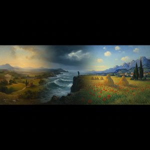 10 Breathtaking Masterpieces That Redefine the Landscape Genre
 Color theory
 Wayne Bennett
 Jan Dirksz Both
 Jake Arnold (interior designer)
 Mastering Light: The 25 Most Iconic Landscapes by Jean-Baptiste-Camille Corot


