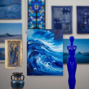
Blue pigments are natural or synthetic materials, traditionally made from minerals. Being water-insoluble by definition, blue pigments used to make the blue colors in inks and paints. Some major blue pigments are indigo, Prussian blue, and copper pht...
The history of color is often a history of chemistry and conquest. Long before the advent of modern laboratories, the pursuit of a stable blue was a matter of intense mineralogical effort. The earliest known synthetic pigment, Egyptian blue, emerged from the deliberate heating of quartz sand, lime, and copper to create calcium copper silicate. This substance was not merely a decorative choice but a state-sponsored achievement, promoted by pharaohs to adorn alabaster bowls and funerary goods with a permanence that natural dyes could never promise. It provided a sense of continuity between the earthly realm and the divine.
This ancient technical precision finds an echo in the structural integrity of historical architecture. Consider the Liverpool Blue Coat School, where Victorian Gothic Revival grandeur relies on the weight of stone and the filtered light of stained glass to establish its presence. Just as the Egyptian artisans used mineral stability to anchor their visual identity, this institution uses its physical permanence to bridge three centuries of history. Both the pigment and the building rely on a foundation of material durability to communicate authority across generations.
The Cost of Devotion: Lapis Lazuli and the Rise of Synthetic Ultramarine
Captivating Subject and Tranquil Scene This enchanting artwork captures a charming rural scene centered around a distinctive blue-painted wooden house nestled along a peaceful riverside. The scene exudes a sense of serenity and simplicity, inviting v...
For much of the Renaissance, the most profound blue was a matter of geography and extreme expense. Derived from the semi-precious stone lapis lazuli, imported from the mines of Sar-e-Sang in modern-day Afghanistan, ultramarine was a pigment of high status. Its cost was so prohibitive that it was often reserved for the most sacred subjects, such as the robes of the Virgin Mary in the works of Pietro Perugino. To use ultramarine was to perform an act of economic devotion, layering expensive mineral dust over cheaper bases like azurite to achieve a celestial depth.
The tension between scarcity and accessibility changed forever with the invention of synthetic ultramarine in the 1820s by Jean Baptiste Guimet. This breakthrough democratized the hue, allowing artists to move away from purely liturgical uses toward the exploration of atmosphere and light. We see this shift reflected in the works of Claude Monet, particularly in his depiction of The Blue House in Zaandam. Here, the blue is no longer a precious relic of the altar but a tool for capturing the fleeting, everyday tranquility of a Dutch riverside. The transition from the rare to the reachable allowed the Impressionists to treat blue as a living element of the landscape rather than a static symbol of wealth.
Accidental Depth: Prussian Blue and the Architecture of Shadow
Introduction To step into a gallery dominated by the deep, nocturnal depths of Prussian Blue is to enter a world where light and shadow engage in their most profound dialogue. There is a specific, haunting gravity to this pigment—a color that does no...
Innovation in the palette often arrives without intention. In 1704, the discovery of Prussian blue by Johann Leonhard Frisch and Gottfried Wilhelm .Leibniz provided the art world with its first modern synthetic pigment. This deep, nocturnal shade possessed a haunting gravity, capable of pulling the viewer into velvety recesses of shadow. Unlike the bright, expensive ultramarine, Prussian blue offered a stable, dark intensity that allowed for the rendering of complex chiaroscuro and the atmospheric haze of distant mountains.
This ability to define depth through darkness finds a parallel in the way light interacts with heavy textures. In the contemporary study Rhythmic Depths of Midnight Blue by David Moreau, the artist uses a monochromatic palette of navy and cerulean to create sculptural ridges. The shadows within these impasto peaks do not merely obscure; they provide the structural weight necessary for the composition to exist. Just as Prussian blue gave painters the means to invent shadow, modern abstraction uses the absence of light to build form.
Luminous Stability: Cobalt Blue and the Impressionist Light
Cobalt blue is a blue pigment consisting principally of cobalt(II) aluminate, CoAl2O4, made by sintering cobalt(II) oxide with aluminium(III) oxide (alumina) at high temperatures. It is used as a ceramic color, in automotive and industrial coatings, ...
The nineteenth century brought a new era of chemical stability with the arrival of cobalt blue. First described in 1777 and later refined as an alumina-based pigment by Louis Jacques Thénard, cobalt blue offered a brilliance that was both lightfast and highly saturated. It became a staple for artists seeking to capture the sun-drenched effects of the natural world. Vincent van Gogh utilized both French ultramarine and cobalt blue in The Starry Night to create a sky that feels both turbulent and luminous, demonstrating the pigment's capacity for expressive movement.
This pursuit of capturing light through specific color temperatures is mirrored in the landscape traditions of the Russian Post-Impressionists. In Igor Grabar’s February Azure, the artist worked in a snow-filled trench to observe the precise gradations of blue from light-green to ultramarine. The painting is a synthesis of long observations, using the stability of his palette to freeze a specific moment of winter clarity. The technical reliability of cobalt and its counterparts allowed Grabar to translate the ephemeral chill of a Moscow February into a permanent visual record.
The Psychology of Hue: From Picasso’s Grief to Modern Abstraction
The Blue Period (Spanish: Período Azul) comprises the works produced by Spanish painter Pablo Picasso between 1901 and 1904. During this time, Picasso painted essentially monochromatic paintings in shades of blue and blue-green, only occasionally war...
By the turn of the twentieth century, blue had moved beyond the realm of landscape and liturgy to become a language of the psyche. Pablo Picasso’s Blue Period, spanning from 1901 to 1904, utilized monochromatic shades of blue and blue-green to articulate profound sorrow and social isolation. Following the suicide of his friend Carles Casagemas, Picasso used these cool tones to depict the marginalized—beggars, drunks, and the lonely—transforming a color into an emotional state. The pigment became a vessel for mourning, stripped of its decorative pretense.
This use of blue as a psychological conduit reaches its zenith in the mid-century works of Mark Rothko. In his piece Untitled (Blue Divided by Blue), the artist rejects representational imagery entirely, using expansive blocks of azure to evoke existential contemplation. The color is no longer describing an object or a person; it is the subject itself. From the grief of Picasso to the meditative voids of Rothko, the history of blue proves that a single hue can carry the weight of the human condition, moving from the external world of minerals and trade to the internal landscape of the soul.
At OriginalUniqueArt.com, we understand the technical importance of these historical pigments in creating authentic reproductions. Whether you require a large-scale mural for a hotel project or a custom portrait transformed into a Van Gogh-style impasto, our artists use traditional methods to ensure every brushstroke respects the depth and tonal range of the original masters. We provide professional logistics, including VAT-compliant invoicing and global shipping via DHL/FedEx, ensuring that your procurement process is as reliable as the pigments we replicate.
Explore the rich history of blue in art! Discover its symbolism, from ancient pigments to modern masterpieces by Kandinsky & Seurat. Uncover the psychological impact and cultural meanings behind this captivating hue.
Journey through the historical majesty of blue in fine art. From rare lapis lazuli to celestial symbolism, explore how this serene hue defines masterpieces. Expert insights for discerning collectors and designers seeking timeless elegance and prestige.
Immerse yourself in the depth of Prussian blue. Explore 10 iconic masterpieces, from moody landscapes to classic oil paintings, through their stories and techniques. Find museum-quality art reproductions and decor inspiration. Discover all masterpieces on OriginalUniqueArt.com.

 Blue pigments
 The Blue House in Zaandam
 Deep Blue Magic: 10 Iconic Masterpieces Defined by Prussian Blue
 Cobalt blue