Understanding Color Theory & Art's Role
Color is more than just a visual element; it’s the emotional backbone of any space. As freelance decorators, you understand this intuitively. But strategically leveraging color theory – and how art interacts with it – can elevate your designs from good to exceptional. This section explores foundational principles and how they apply specifically to artwork selection.- The Color Wheel Basics: Complementary colors create contrast, analogous colors offer harmony, and triadic schemes provide vibrancy. Understanding these relationships is crucial for selecting art that either enhances or intentionally disrupts the existing color palette.
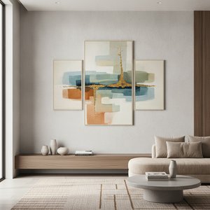
- Art as a Focal Point: A bold piece of artwork can serve as an anchor in a room, drawing the eye and establishing a visual hierarchy. Consider how the colors within the artwork will interact with the surrounding walls, furniture, and accessories.
- Beyond Hue: Value & Saturation: Don't just focus on color names (red, blue, green). Pay attention to value (lightness/darkness) and saturation (intensity). A muted painting can soften a vibrant room, while a saturated piece can energize a neutral space.
Selecting Artwork: Style, Scale, and Personalization
Choosing the right artwork isn't just about aesthetics; it’s about reflecting the client’s personality and complementing the architectural style of the home.- Style Alignment: A modern minimalist room calls for abstract or geometric art, while a traditional space might benefit from landscapes or portraits. Consider the overall design aesthetic when making your selection.
- Scale & Proportion: Artwork size matters! Too small and it gets lost; too large and it overwhelms. Measure the wall space carefully and consider furniture placement to ensure proper scale. A general rule is that artwork above a sofa should be roughly two-thirds to three-quarters of the sofa's width.
- Personalization & Storytelling: Encourage clients to share their interests, hobbies, or travel experiences. Artwork can tell a story and create a personal connection within the space. A piece reflecting a cherished memory is far more impactful than generic decor.
Matching Art to Existing Room Colors (Strategies & Examples)
This section dives into practical strategies for harmonizing artwork with existing room colors, providing concrete examples you can adapt for your clients.- Complementary Harmony: If a room is predominantly blue, consider introducing artwork featuring warm oranges or yellows. This creates a dynamic contrast that’s visually stimulating.
- Analogous Accents: For rooms with green walls, select art incorporating shades of yellow-green or blue-green to create a soothing and harmonious atmosphere.
- Monochromatic Magic: A monochromatic color scheme (variations of a single hue) can be incredibly chic. Choose artwork that incorporates subtle tonal variations within the same color family for added depth and interest.
- Neutral Ground: Neutral-toned rooms (beige, gray, white) offer incredible flexibility. You can introduce bold colors through artwork without overwhelming the space. Consider using a statement piece with vibrant hues to add personality.
Beyond Matching: Using Art to Introduce New Accents
Sometimes, the most impactful design choices involve *not* perfectly matching existing colors but strategically introducing new accents.- The Pop of Color: A room dominated by neutrals can be revitalized with a single piece of artwork featuring a bold accent color. This adds visual interest and prevents the space from feeling bland.
- Creating Flow Between Rooms: Use recurring colors in artwork to create a sense of continuity between adjacent rooms. For example, if one room features a blue accent wall, incorporate similar shades of blue into the artwork in the connecting room.
- Unexpected Combinations: Don't be afraid to experiment! Sometimes, an unexpected color combination can result in a truly unique and memorable design. Just ensure there’s a visual connection – perhaps through texture or style – to tie it all together.
Pro Tips for Freelance Decorators: Client Communication & Presentation
Your expertise extends beyond color theory; effective communication is key to client satisfaction.- Visual Mockups: Before committing to a piece, create visual mockups showing how the artwork will look in the space. This helps clients visualize the final result and reduces the risk of disappointment.
- Explain Your Reasoning: Don't just present options; explain *why* you’ve selected them. Discuss the color theory principles at play and how the artwork complements the overall design scheme.
- Consider Lighting: Artwork looks different under various lighting conditions. Advise clients on appropriate lighting to showcase their investment effectively.
- Build a Portfolio of Color Palettes: Curate examples of successful art-and-color pairings to inspire your clients and demonstrate your expertise.