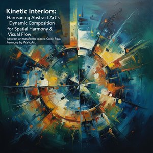
The Central Painting as Visual Anchor: Establishing Mood & Composition
The heart of any compelling interior lies not merely in its furnishings, but in the carefully considered interplay of space, light, and art. A central painting – particularly an abstract work – serves as more than just decoration; it functions as a visual anchor, establishing mood, dictating color palettes, and shaping the overall narrative of a room. This isn’t simply about filling a wall; it's about creating a resonant emotional experience. The power of this focal point stems from its ability to command attention without relying on representational imagery. Unlike figurative art which directs the eye towards specific subjects, abstraction invites contemplation and personal interpretation. This freedom allows the artwork to become deeply integrated with the viewer’s own emotional landscape.
The size of the piece is paramount; too small, and it risks being lost within the room's architecture, becoming a mere accent rather than a defining element. Too large, and it can overwhelm the space, creating a sense of claustrophobia or imbalance. A well-proportioned abstract painting creates a focal point that draws the eye and establishes a sense of balance – a quiet authority that grounds the entire composition. Color plays an equally crucial role. Warm tones (reds, oranges, yellows) inject energy and intimacy, making them ideal for living rooms or dining areas where connection and conversation are valued. Cool tones (blues, greens, violets) foster tranquility and focus, suitable for bedrooms or studies where respite and concentration are paramount. The interplay of color within the artwork should complement – not necessarily match – the existing palette of the room; a harmonious discord can be far more compelling than strict replication. Consider the emotional weight of different hues; as explored in research on chromatic narratives, blue often evokes calmness and serenity, while orange can stimulate conversation and creativity.
The composition itself is also key. Dynamic compositions with bold brushstrokes or geometric forms create a sense of movement and excitement, perfect for spaces designed for social interaction. Whereas more restrained compositions offer a feeling of peace and stability, ideal for areas dedicated to relaxation or introspection. The subtle dance between order and chaos within the abstract form mirrors the complexities of life itself, inviting viewers to engage with the artwork on a deeper level.
Kandinsky's Legacy: Color, Emotion, and the Power of Abstraction
Wassily Kandinsky, a pioneer of abstract art, understood the profound relationship between color, form, and emotion. His works, particularly those from his Bauhaus period, exemplify how abstraction can transcend mere aesthetics to become a spiritual experience. Examining his approach provides valuable insights into selecting artwork that resonates on a deeper level. Kandinsky’s early abstract paintings were often rooted in synesthesia – the blending of senses. He believed colors possessed inherent emotional qualities and could evoke specific responses in the viewer, a concept he explored extensively in his writings.
Interior (My Dining Room), for example, showcases his bold use of color and geometric forms to create a sense of depth and spiritual resonance. The seemingly simple arrangement of shapes and colors belies a complex emotional landscape, inviting viewers to contemplate the interplay between form and feeling. His later works, such as Yellow-Red-Blue, demonstrate a more systematic exploration of color relationships and their impact on spatial perception. The dynamic interplay of these primary colors creates a vibrant energy that draws the eye and stimulates contemplation – a visual symphony that transcends literal representation. Kandinsky’s work wasn't simply about aesthetics; it was an attempt to express inner states through visual language, a quest for a universal artistic vocabulary rooted in emotion rather than objective reality. This principle is crucial when selecting artwork for your own space. Consider what emotions you wish to evoke – tranquility, excitement, introspection – and choose pieces that align with those feelings. En el Cuadrado Negro represents a radical departure from representational art, focusing on the pure power of form and color. While seemingly minimalist, it’s a deeply emotive work that challenges conventional notions of beauty.
Kandinsky's legacy lies in his ability to elevate abstraction beyond mere decoration, transforming it into a powerful medium for emotional expression. His works serve as a reminder that art should not simply look beautiful but also feel meaningful.
Chromatic Equilibrium: Harmonizing Art with Interior Design
The concept of ‘chromatic equilibrium’ – achieving balance and harmony through color selection – is fundamental to successful interior design. This isn’t about rigid rules, but rather a sensitive understanding of how colors interact and influence one another. This section delves into the practical application of color theory, exploring how artwork can be used to create a cohesive and visually pleasing space.
Color palettes are rarely created in isolation; they exist within the context of existing architectural elements and furnishings. When selecting an abstract painting, consider the undertones of your walls, flooring, and furniture. Warm-toned rooms benefit from cooler accents, providing visual relief and preventing the space from feeling overly saturated. Cool-toned rooms can be enlivened with warmer pops of color, injecting energy and personality. The principle of complementary colors – those opposite each other on the color wheel – can create a dynamic contrast, but it’s essential to use them judiciously. Too much contrast can be overwhelming; instead, consider using muted variations or incorporating complementary hues as accents. Value (lightness/darkness) and saturation (intensity) are also crucial considerations. A painting with high value contrast will naturally draw the eye, while a more subdued palette creates a sense of calm. As discussed in Chromatic Equilibrium: Leveraging Art as a Tool for Color Balance and Spatial Harmony in Interior Design, bespoke commissions allow for complete control over color selection, ensuring that the artwork perfectly complements your existing décor.
Furthermore, consider the texture of the painting itself. A heavily textured canvas will absorb more light than a smooth surface, influencing its perceived brightness and depth. The interplay between color, value, saturation, and texture creates a complex visual experience that can transform an entire space.
The Psychology of Color: Evoking Feelings Through Abstract Forms
The emotional response to color is deeply ingrained in human psychology. Understanding these associations allows for the intentional selection of artwork that evokes specific moods and feelings within an interior space. Different colors trigger different physiological responses. Blue, as previously mentioned, is often associated with calmness and serenity, lowering heart rate and promoting relaxation – a perfect choice for bedrooms or meditation spaces. Red, on the other hand, stimulates energy and excitement, increasing blood pressure and alertness, making it suitable for dining rooms or areas dedicated to social interaction. Yellow can evoke optimism and creativity, but too much yellow can be overwhelming or even anxiety-inducing.
The context in which color is presented also matters. A vibrant red painting in a minimalist white room will have a different impact than a muted red accent within a richly textured space. The Emotional Palette: How Color Influences Mood & Meaning in Art explores these nuances in detail, highlighting how master artists throughout history have used color to manipulate emotional responses. Personal associations also play a role; a particular shade of blue might evoke fond memories for one person but hold negative connotations for another. It’s important to choose artwork that resonates with your own personal aesthetic and evokes feelings you wish to experience within the space.
Beyond individual colors, consider the overall tonal quality of the painting. A predominantly dark palette can create a sense of mystery and sophistication, while a lighter palette fosters openness and airiness. The key is to create a balance that reflects your personal preferences and desired atmosphere.
Beyond Representation: A Brief History of Abstract Painting’s Impact
Abstract art, by its very nature, challenges conventional notions of representation. This section explores the historical context of abstract painting and its evolution as a distinct artistic movement. Prior to the 19th century, Western art was largely underpinned by the logic of perspective and an attempt to reproduce visible reality. However, with the advent of new technologies, scientific discoveries, and philosophical shifts, artists began to question these conventions.
Abstract art emerged as a response to this changing landscape, seeking to express inner states and spiritual concepts beyond the limitations of representational imagery. The movement encompassed diverse approaches, from Wassily Kandinsky’s lyrical abstractions to Piet Mondrian’s geometric compositions and Jackson Pollock’s gestural expressionism. While seemingly disparate, these artists shared a common desire to create art that was independent of visual references in the world (See: Abstract Art on Wikipedia). This freedom allowed them to explore pure form, color, and texture as expressive elements.
The impact of abstract art extended beyond the realm of painting, influencing architecture, design, and even music. Its emphasis on non-objective forms paved the way for new ways of seeing and experiencing the world, challenging viewers to engage with art on a deeper, more intuitive level.
Bespoke Commissions: Creating a Truly Personalized Artwork Experience
Beyond the selection of existing artwork, commissioning a custom piece offers unparalleled control over size, color, and composition. This section explores the benefits of bespoke commissions and how to collaborate effectively with an artist. A bespoke commission allows you to create a painting that perfectly complements your space and reflects your personal aesthetic. You can specify the desired dimensions, colors, and overall style, working closely with the artist throughout the process.
This is particularly valuable when dealing with