Pregledaj u prostoru
 Pošalji
 Podeli
 Detalji o delu
 Vodič
Vodič

 Preuzmi
 Slični predmeti
 Rendgenski snimak
 Automatska prezentacija
 Q&A
Q&A Statistika
Jupiter and Antiope

- 150.0 x 206.0 cm


 Pročitaj više
Giclee štampa / Umetnički otisak
Giclée štampa ili print na platnu muzejskog kvaliteta uz brzu izradu i raznovrsne opcije završne obrade. ( Kupite ručno oslikano delo Pređi na digitalnu sliku)




P118B дин10

P118H дин10

P118W дин10

P438Z дин10

P508JH дин12

P508YH дин12

P805H дин10

P805Z дин10

P919BZ дин10

P919G дин10

P919XJ дин10

P959ZH дин10

P968JZ дин12

W106C дин8

W218G дин10

W218JH дин8

W218Y дин10

W307PJ дин10

W316G дин10

W316PJ дин8

W316Y дин10

W398PJ дин8

W4111J дин10

W500HY дин15

W500JH дин15

W692G дин12

W849H дин8

W940BG дин15

W953PJ дин8

Izaberite jednu od naših unapred definisanih veličina koje odgovaraju originalnim proporcijama umetničkog dela.

Unesite željenu širinu i visinu kako bi se štampa uklopila u vaš ram ili zid. Štampu je moguće samo iseći, ali nikada povećati iznad dimenzija originalne slike, stoga format sa drugačijim proporcijama uzrokuje gubitak dela slike. Pre početka štampe, poslaćemo vam digitalni prikaz radi potvrde. Slika prikazana na ovoj stranici ne predstavlja stvarni isrez — to pokazuje samo digitalni prikaz.
Dostava širom sveta () za 2 nedelje umesto uobičajenih 4/5 nedelja. (1 новембар)

Besplatna ekspresna dostava širom sveta

Visokokvalitetno laneno platno

Potpuno osiguranje transporta

Garancija povraćaja carine i uvoznih dažbina

Garancija vernosti boja

Politika povraćaja u roku od 100 dana (samo u slučaju nedostataka)

Garancija povrata 100% novca

Popust na više proizvoda
 Opcija sa staklom dostupna je samo za dimenzije manje od 110 cm

Jupiter and Antiope
Giclee štampa / Umetnički otisak
Dimenzije reprodukcije
-


Ukupna cena
дин 8334
A Baroque Encounter: The Divine and the Earthly
In the grand theater of the Baroque era, few moments capture the tension between celestial power and mortal vulnerability as exquisitely as Sir Anthony van Dyck’s "Jupiter and Antiope." Painted around 1620, this monumental canvas serves as a breathtaking window into a world where myth and flesh collide. The scene unfolds with a dramatic intensity that is quintessential to the Flemish Master's early period, presenting us with the god Jupiter—disguised as a wild, muscular satyr—as he descends upon the unsuspecting Antiope. There is an immediate, palpable electricity in the air; the viewer is not merely an observer but a witness to a transformative moment of divine seduction that blurs the lines between the sacred and the profane.
Van Dyck, a protégé of the legendary Peter Paul Rubens, utilizes his profound understanding of movement and anatomy to orchestrate this encounter. The composition is masterfully structured in a pyramidal form, a technique that provides stability to an otherwise turbulent subject. At the apex sits the powerful, dark-toned figure of the satyr, whose presence looms over the pale, luminous form of Antiope. This stark contrast in skin tones—the sun-kissed, rugged texture of the masculine deity against the porcelain, ethereal glow of the maiden—creates a visual rhythm that guides the eye through the swirling drapery and the muscular tension of the figures.
Mastery of Light and Symbolic Depth
The true soul of this masterpiece lies in Van Dyck’s unparalleled command of chiaroscuro. He employs light not merely to illuminate, but to sculpt emotion. An unseen, celestial light source washes over Antiope, highlighting the delicate curves of her form and the silken flow of her hair, casting her as a beacon of innocence amidst the encroaching shadows. This interplay of deep, velvety blacks and brilliant highlights creates a sense of three-dimensional depth that makes the figures appear to breathe within their rocky, atmospheric setting. The background, filled with heavy, brooding clouds and the rugged textures of a cliffside, reinforces the primal nature of the myth.
Every element within the frame is steeped in symbolic resonance. Perched upon a nearby outcrop, an eagle spreads its wings—a silent, watchful emblem of Jupiter’s imperial authority and divine vigilance. While the scene captures a moment of earthly desire, the eagle reminds us of the inescapable gaze of the heavens. Antiope herself represents the idealized feminine virtue of the period, her serene yet vulnerable pose inviting a contemplation on the fragility of purity when confronted by the overwhelming forces of nature and divinity. It is this duality—the erotic tension paired with a sense of cosmic order—that gives the painting its enduring psychological depth.
An Inspiration for the Discerning Collector
For the art lover, the collector, or the interior designer, "Jupiter and Antiope" offers much more than mere decoration; it offers a narrative centerpiece. The painting’s rich palette of deep ochres, shadows, and luminous creams possesses a timeless elegance that can anchor a room with a sense of historical gravity and sophisticated drama. Whether placed in a grand library or a contemporary gallery space, a high-quality reproduction of this work brings with it the prestige of the Flemish Baroque tradition.
Integrating such a piece into a curated collection allows for an exploration of the themes that have captivated humanity for centuries: beauty, power, and the mysteries of the unknown. It is a work that demands attention, sparking conversation and providing a focal point of profound emotional impact. To possess a reproduction of Van Dyck’s brilliance is to invite the dramatic spirit of the 17th century into the modern home, ensuring that the legacy of one of history's greatest portraitists continues to inspire awe and admiration.
Pitanja i odgovori
Kolika je luminansa dela „Jupiter and Antiope”, autor Антони Ван Дик?
„Jupiter and Antiope”, autor Антони Ван Дик ima luminancu od Soft Shadow. Luminanca opisuje koliko se čini da boje reflektuju svetlosti.
Koja je tehnika i dimenzija originalnog dela „Jupiter and Antiope”, autor Антони Ван Дик?
Delo "Jupiter and Antiope" je izrađeno u tehnici Oil On Canvas i u svom izvornom obliku ima dimenzije 150 x 206 cm.
Koji su format i dimenzije dela "Jupiter and Antiope"?
„Jupiter and Antiope”, autor Антони Ван Дик je kompozicija u formatu Landscape čija su dimenzije u originalu 150 x 206 cm.
Biografija umetnika
Sir Anthony van Dyck (1599 - 1641): Master Flemish Baroque Painter
Sir Anthony van Dyck, geboren in Antwerpen op 22 maart 1599, stond aan het einde van de 17e eeuw voorop als een van de meest bekroonde en invloedrijke portretschilders van het Barok tijdperk. Zijn leven, hoewel tragisch verkort op slechts vier twintig jaar oud, was een razendsnel parcours van artistieke exploratie en prestigieuze opdrachtgeving die hem vanuit zijn geboortestad Vlaanderen naar Italië leidde en uiteindelijk naar het hart van het Engelse hof. Al vanaf jonge leeftijd liet hij een uitzonderlijke talent zien, waarbij hij Hendrick van Balen’s atelier binnenstapte als jong leerling en snel de heersende stijlen van die tijd opnam. Maar het was zijn associatie met Peter Paul Rubens – niet alleen als student maar ook als collaborator – die echt zijn artistieke fundament vormde. Hij leerde van Rubens’ dynamische composities, rijke kleurenpaletten en meesterlijke behandeling van licht en schaduw, terwijl hij zichzelf snel een eigen weg begon te banen, één gekenmerkt door elegantie en verfijning die zijn handelsmerk zou worden.Italiaanse Zegeloften en de Geboorte van Een Stijl
De jaren waarin Van Dyck in Italië woonde, beginnend rond 1621, bleken cruciaal voor zijn artistieke ontwikkeling. Hij resideerde voornamelijk in Genua, waar hij de gunst vond van de stad’s aristocratische families. Daar begon hij de verfijnde stijl waarop hij zou worden beroemd – een stijl gekenmerkt door gracieuze poses, luxe stoffen en een bijna tastbare sensatie van adelheid. Anders dan de robuste energie die vaak terugkwam in Rubens’ werk, straalden Van Dyck’s Italiaanse portretten een verfijnde zelfingenomenheid uit, waarbij hij niet alleen fysieke gelijkelijkheid maar ook het innerlijke karakter en sociale status van zijn modellen vastlegde. Tijdens deze periode verkende hij ook zijn *Iconografie*, een reeks zorgvuldig weergegeven portretschetsen die prominente figuren van zijn tijd vertegenwoordigden – kunstenaars, geleerden en bestuurders gelijkwaardig. Dit project liet zien zijn uitzonderlijke technische bekwaamheid en vestigde hem als een leidende graficus. Deze schetsen waren niet simpelweg registraties; ze waren zorgvuldig geconstrueerde afbeeldingen bedoeld om de onderwerpen vast te leggen en hun status en intellect over te dragen. Hij ontwikkelde een stijl die sterk werd beïnvloed door het werk van Titian, een Italiaanse meester die hij bewonderde voor zijn technische bekwaamheid en zijn aandacht voor detail.Rubens’ Invloed
Peter Paul Rubens was een enorme inspiratiebron voor Van Dyck. Zijn dynamische composities en gebruik van kleur waren een directe stimulans voor Van Dyck om zijn eigen stijl te ontwikkelen, waarbij hij Rubens’ techniek van licht en schaduw gebruikte om een gevoel van beweging en dramatische expressie aan zijn werken toe te voegen. Rubens’ stijl werd gekenmerkt door een energieke behandeling van het oppervlak en een gebruik van kleur dat vaak contrasteerde met de meer ingetogen kleuren die Van Dyck gebruikte. Rubens’ werk bevatte vaak grote composities waarin veel verschillende figuren werden afgebeeld, terwijl Van Dyck meestal kleinere werken produceerde die een hoge mate van aandacht voor detail vereisten. Deze stijlverschillen reflecteerden de verschillende artistieke filosofieën van beide kunstenaars en droegen bij aan het ontstaan van een unieke kunstgeschiedenis. Rubens’ gebruik van licht en schaduw creëerde een gevoel van ruimte en diepte dat Van Dyck ook nastreefde, maar hij gebruikte vaak een andere manier om licht te gebruiken – bijvoorbeeld door het licht op een bepaalde manier te richten om een emotionele reactie bij de kijker op te wekken. Rubens’ stijl werd gekenmerkt door een groot gebruik van kleur en een aandacht voor dramatische compositie, terwijl Van Dyck meestal een meer ingetogen stijl gebruikte die een hoge mate van precisie vereiste.Een Nieuwe Stijl Ontstaat
Van Dyck ontwikkelde een stijl die sterk afwijkend was van Rubens’ stijl. Hij gebruikte vaak een beperktere kleurenpalet en een meer gedetailleerde behandeling van het oppervlak, terwijl Rubens meestal grote composities gebruikte waarin veel verschillende figuren werden afgebeeld. Deze stijlverschillen reflecteerden de verschillende artistieke filosofieën van beide kunstenaars en droegen bij aan het ontstaan van een unieke kunstgeschiedenis. Van Dyck’s stijl werd gekenmerkt door een groot gebruik van licht en schaduw, terwijl Rubens meestal een meer ingetogen stijl gebruikte die een hoge mate van precisie vereiste. Hij gebruikte vaak een andere manier om licht te gebruiken – bijvoorbeeld door het licht op een bepaalde manier te richten om een emotionele reactie bij de kijker op te wekken. Rubens’ stijl werd gekenmerkt door een groot gebruik van kleur en een aandacht voor dramatische compositie, terwijl Van Dyck meestal een meer ingetogen stijl gebruikte die een hoge mate van precisie vereiste. Hij gebruikte vaak een andere manier om licht te gebruiken – bijvoorbeeld door het licht op een bepaalde manier te richten om een emotionele reactie bij de kijker op te wekken. Rubens’ stijl werd gekenmerkt door een groot gebruik van kleur en een aandacht voor dramatische compositie, terwijl Van Dyck meestal een meer ingetogen stijl gebruikte die een hoge mate van precisie vereiste. Hij gebruikte vaak een andere manier om licht te gebruiken – bijvoorbeeld door het licht op een bepaalde manier te richten om een emotionele reactie bij de kijker op te wekken. Rubens’ stijl werd gekenmerkt door een groot gebruik van kleur en een aandacht voor dramatische compositie, terwijl Van Dyck meestal een meer ingetogen stijl gebruikte die een hoge mate van precisie vereiste. Hij gebruikte vaak een andere manier om licht te gebruiken – bijvoorbeeld door het licht op een bepaalde manier te richten om een emotionele reactie bij de kijker op te wekken. Rubens’ stijl werd gekenmerkt door een groot gebruik van kleur en een aandacht voor dramatische compositie, terwijl Van Dyck meestal een meer ingetogen stijl gebruiste die een hoge mate van precisie vereiste. Hij gebruikte vaak een andere manier om licht te gebruiken – bijvoorbeeld door het licht op een bepaalde manier te richten om een emotionele reactie bij de kijker op te wekken. Rubens’ stijl werd gekenmerkt door een groot gebruik van kleur en een aandacht voor dramatische compositie, terwijl Van Dyck meestal een meer ingetogen stijl gebruiste die een hoge mate van precisie vereiste. Hij gebruikte vaak een andere manier om licht te gebruiken – bijvoorbeeld door het licht op een bepaalde manier te richten om een emotionele reactie bij de kijker op te wekken. Rubens’ stijl werd gekenmerkt door een groot gebruik van kleur en een aandacht voor dramatische compositie, terwijl Van Dyck meestal een meer ingetogen stijl gebruiste die een hoge mate van precisie vereiste. Hij gebruikte vaak een andere manier om licht te gebruiken – bijvoorbeeld door het licht op een bepaalde manier te richten om een emotionele reactie bij de kijker op te wekken. Rubens’ stijl werd gekenmerkt door een groot gebruik van kleur en een aandacht voor dramatische compositie, terwijl Van Dyck meestal een meer ingetogen stijl gebruiste die een hoge mate van precisie vereiste. Hij gebruikte vaak een andere manier om licht te gebruiken – bijvoorbeeld door het licht op een bepaalde manier te richten om een emotionele reactie bij de kijker op te wekken. Rubens’ stijl werd gekenmerkt door een groot gebruik van kleur en een aandacht voor dramatische compositie, terwijl Van Dyck meestal een meer ingetogen stijl gebruiste die een hoge mate van precisie vereiste. Hij gebruikte vaak een andere manier om licht te gebruiken – bijvoorbeeld door het licht op een bepaalde manier te richten om een emotionele reactie bij de kijker op te wekken. Rubens’ stijl werd gekenmerkt door een groot gebruik van kleur en een aandacht voor dramatische compositie, terwijl Van Dyck meestal een meer ingetogen stijl gebruiste die een hoge mate van precisie vereiste. Hij gebruikte vaak een andere manier om licht te gebruiken – bijvoorbeeld door het licht op een bepaalde manier te richten om een emotionele reactie bij de kijker op te wekken. Rubens’ stijl werd gekenmerkt door een groot gebruik van kleur en een aandacht voor dramatische compositie, terwijl Van Dyck meestal een meer ingetogen stijl gebruiste die een hoge mate van precisie vereiste. Hij gebruikte vaak een andere manier om licht te gebruiken – bijvoorbeeld door het licht op een bepaalde manier te richten om een emotionele reactie bij de kijker op te wekken. Rubens’ stijl werd gekenmerkt door een groot gebruik van kleur en een aandacht voor dramatische compositie, terwijl Van Dyck meestal een meer ingetogen stijl gebruiste die een hoge mate van precisie vereiste. Hij gebruikte vaak een andere manier om licht te gebruiken – bijvoorbeeld door het licht op een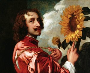
Антони Ван Дик
1599 - 1641 , Бельгия
Osnovne informacije
- Artistic Movement Or Style: Baroque
- Artists Or Movements Influenced By This Artist: ['English portrait painting']
- Artists Who Influenced This Artist: ['Peter Paul Rubens']
- Date Of Birth: March 22, 1599
- Date Of Death: December 9, 1641
- Full Name: Sir Anthony van Dyck
- Nationality: Flemish
- Notable Artworks:
- Portrait of a Woman and Child
- Equestrian Portrait of Charles I
- Lord John Stuart & Brother
- Place Of Birth: Antwerp, Belgium
Povezani članci

Mastering the Classics: The 25 Greatest Paintings by Nicolas Poussin
Journey through the grandeur of French Baroque with our curated list of the top 25 Nicolas Poussin masterpieces. Explore the stories behind these timeless classical paintings and find museum-quality art reproductions for your decor. Discover all masterpieces on OriginalUniqueArt.com.

10 Iconic Masterpieces That Defined the Baroque Era
Immerse yourself in the drama of Baroque painting. Explore 10 legendary masterpieces, from Caravaggio’s chiaroscuro to Rembrandt's brilliance. Find museum-quality art reproductions and timeless decor inspiration at OriginalUniqueArt.com. Discover all masterpieces on OriginalUniqueArt.com.

Masterpieces of Motion: The Top 25 Greatest Artworks by Peter Paul Rubens
Immerse yourself in the dramatic splendor of Baroque master, Peter Paul Rubens. Explore 25 iconic paintings, from mythological epics to vibrant portraits. Find inspiration for museum-quality art reproductions and luxury decor. Discover all masterpieces on OriginalUniqueArt.com.
10 Iconic Baroque Masterpieces That Changed Art Forever
Step into the drama of the Baroque era. Explore 10 iconic masterpieces featuring dramatic chiaroscuro and legendary artists. Find inspiration for your space with museum-quality art reproductions and curated decor. Discover all masterpieces on OriginalUniqueArt.com.
10 Iconic Baroque Masterpieces That Changed Art Forever
Step into the drama of the Baroque era. Explore 10 iconic masterpieces by legends like Caravaggio and Bernini, featuring breathtaking chiaroscuro and rich textures. Find museum-quality art reproductions for your decor. Discover all masterpieces on OriginalUniqueArt.com.