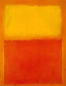
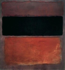
Ulje na platnu
 Sve o delu Untitled 4

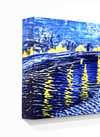
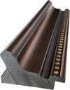
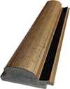
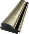
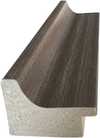
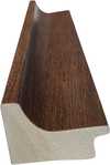
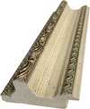
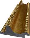
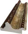
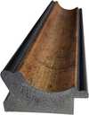
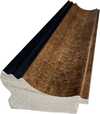
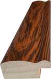
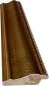
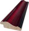
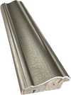
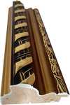
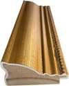
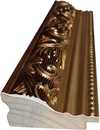
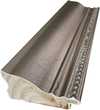
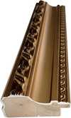
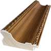
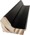
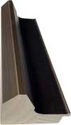
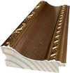
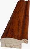
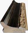
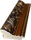
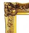
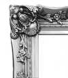
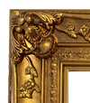
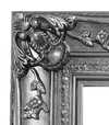


 Za umetnička dela ili reprodukcije čija je bilo koja strana veća od 105 cm (približno 41 inč), okvir će biti isporučen u obliku rastavljenog seta za sklapanje. Ovaj metod osigurava bezbednu dostavu i sprečava oštećenja tokom transporta.


A Symphony in Color: Exploring Mark Rothko’s No. 4
The painting known simply as “No. 4” by Mark Rothko is more than just pigment on canvas; it's an invitation into a realm of profound contemplation and emotional resonance. Created in 1964 during his prolific period, this monumental work embodies the core tenets of Rothko’s signature style – Color Field Painting – a movement that revolutionized abstract art and continues to captivate audiences worldwide.- Subject Matter: At first glance, “No. 4” presents itself as deceptively simple. It consists of five rectangular blocks of color—primarily deep crimson, cadmium orange, and slate blue—layered atop one another. These rectangles are not sharply delineated; instead, they bleed into each other subtly, creating an ethereal haze that obscures precise boundaries.
- Style: Rothko’s approach transcends mere representation. He eschewed traditional artistic conventions, rejecting illusionistic depth and perspective altogether. Instead, he sought to convey emotion directly through color alone—a radical departure from the prevailing aesthetic sensibilities of his time.
Historical Context: Minimalism and Existential Anxiety
“No. 4” emerged during a period marked by significant cultural upheaval. The rise of Minimalism in the mid-1960s challenged the dominance of figurative art, advocating for austere compositions and unadorned surfaces as expressions of intellectual seriousness. Simultaneously, anxieties surrounding nuclear proliferation and the Cold War fueled existential concerns about humanity’s place in the cosmos—themes that resonated deeply with Rothko's artistic vision. He wasn’t attempting to depict a specific scene or narrative; rather, he aimed to tap into universal human experiences – grief, joy, transcendence – feelings conveyed through pure color.Symbolism and Emotional Impact
Rothko deliberately avoided explicit symbolism, believing that color itself possessed inherent expressive power. However, scholars have interpreted the hues within “No. 4” as representing a spectrum of emotions—crimson symbolizing passion and vulnerability, orange conveying warmth and optimism, and blue embodying serenity and contemplation. The layering effect contributes to this emotional depth, suggesting an unfolding process of feeling rather than a static depiction. Viewing No. 4 is said to induce a state of calm introspection; it encourages the viewer to surrender to the painting's immersive quality and allow themselves to be carried away by its evocative beauty.A Legacy of Color
“No. 4” stands as a testament to Rothko’s unwavering commitment to exploring the expressive potential of color—a legacy that continues to inspire artists and collectors alike. Its enduring appeal lies in its ability to bypass intellectual analysis altogether, communicating directly with the viewer's subconscious mind. A high-quality reproduction captures not only the visual splendor of this masterpiece but also its profound emotional core – a reminder that art can transcend language and offer access to realms of feeling beyond words.Pitanja i odgovori
Da li je Untitled 4 ručno oslikano ili odštampano?
Ručno oslikano: profesionalni umetnik kopira Untitled 4 uljanim bojama na platnu od lana.
Koju veličinu treba da odaberem za Untitled 4?
Dimenzije se kreću od 36.5 x 27.4 cm (дин21026) do 243.2 x 182.3 cm (дин172410); tabela na ovoj stranici navodi glavne korake i njihove cene.
Koliko dugo traje dostava?
Isporuka traje od 4 do 5 nedelja, uz besplatnu ekspresnu dostavu širom sveta; na ovoj stranici je ponuđena opcija hitne proizvodnje. Možete ga vratiti u roku od 100 dana uz pun povraćaj sredstava, bez ikakvih uslova.
Koji je medij koristio/la Марк Ротко za delo Untitled 4?
Acrylic On Canvas
 Pregledaj u prostoru

 Pošalji
 Podeli
 Detalji o delu
 Informativni list


 Preuzmi
 Slični predmeti
 Rendgenski snimak
 Automatska prezentacija
 Pitanja i odgovori

 Statistika