
 設置イメージを確認
 送る
送る シェア
シェア
 詳細情報
詳細情報 ガイドを表示

 画像をダウンロード
 似ている作品
 X線調査
X線調査 スライドショー
 統計情報
統計情報No. 2 (No. 7 and No. 2)


 続きを読む
続きを読む
このページに掲載されている作品は著作権法によって保護されており、当社の許可なく同一の複製物を制作または販売することは法律で禁じられています。この保護は、以下のような国際条約に基づき執行されます。 ベルヌ条約 および、以下の条項に定められたものを含む各国の法律により、 米国著作権法 第17編。
敬意を払った法的な代替手段として、私たちはオリジナルにインスピレーションを与えられた、カスタムの手描きアートワークを提供しています。私たちの熟練したプロのアーティストは、元の作品が持つスタイル、情緒、そして芸術的なエッセンスを注意深く研究し、独自の創作物でありながら、同じ感性を呼び起こすような、新しくユニークな作品を作り上げます。
この手法は、著作権で保護された作品の複製や複写を伴わないため、著作権法に完全に準拠しています。これは単なる模倣ではなく、創造的な再解釈です。元の作品からインスピレーションを受けつつも、それとは異なる、全く新しい絵画を生み出すものです。
手描き油彩複製画
当社のアーティストが、お客様のご希望のサイズと額縁に合わせて、キャンバスに手描きで制作する油彩画です。 ( プリント版に切り替え デジタル画像販売へ切り替え)




P118B ¥10

P118H ¥10

P118W ¥10

P438Z ¥10

P508JH ¥12

P508YH ¥12

P805H ¥10

P805Z ¥10

P919BZ ¥10

P919G ¥10

P919XJ ¥10

P959ZH ¥10

P968JZ ¥12

W106C ¥8

W218G ¥10

W218JH ¥8

W218Y ¥10

W307PJ ¥10

W316G ¥10

W316PJ ¥8

W316Y ¥10

W398PJ ¥8

W4111J ¥10

W500HY ¥15

W500JH ¥15

W692G ¥12

W849H ¥8

W940BG ¥15

W953PJ ¥8




作品のオリジナル比率に合わせた、当店の規定サイズからお選びください。

フレームや壁のスペースに合わせて、ご希望の幅と高さを入力してください。本作品は手描きのため、異なる比率のサイズをご希望の場合、絵画の周囲を少し広げて描くか、あるいは端を少しカットして調整することが可能です。お客様のご要望に合わせます。制作を開始する前に、仕上がりを確認するためのデジタルモックアップをお送りいたします。このページに表示されている画像は完成品の実物ではなく、あくまでモックアップによるイメージです。
ご注文後、OriginalUniqueArt.com チームより詳細な指示をお送りするとともに、仕上がりイメージ(モックアップ)をご提供いたします。


 ガラスオプションは、110cm未満のサイズでのみご利用いただけます。

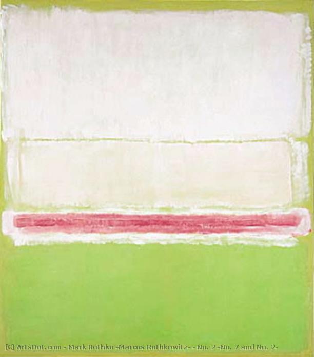
No. 2 (No. 7 and No. 2)
再現技法
複製画サイズ一覧
-


合計金額
¥ 47438
A Meditation on Color and Absence: Examining Mark Rothko’s “No. 2 (No. 7 and No. 2)”
The painting "No. 2 (No. 7 and No. 2)" by Mark Rothko stands as a cornerstone of Color Field painting, embodying the profound exploration of emotion and spirituality that characterized Abstract Expressionism in its formative years. Created in 1951 during a period of intense artistic experimentation, this deceptively simple composition—a rectangular block of muted green overlaid with horizontal bands of crimson—commands attention not through visual complexity but through its ability to evoke visceral responses within the viewer. It’s a piece that invites contemplation and resists easy categorization, reflecting Rothko's unwavering commitment to conveying inner experience rather than depicting external reality.The Genesis of Minimalism: Contextualizing Rothko’s Vision
Rothko’s artistic journey began in Latvia amidst the turbulent backdrop of post-war Europe and Jewish diaspora. Shaped by formative experiences—the anxieties surrounding pogroms, the loss of his father—he developed a preoccupation with themes of suffering and mortality that would permeate his entire oeuvre. Influenced by Surrealism and Expressionism, he moved towards abstraction as a means of bypassing representational conventions and accessing deeper psychological truths. The American expatriate experience solidified this trajectory, exposing him to new influences and fostering collaborations with fellow artists like Josef Albers and Barnett Newman, who championed similar reductive approaches to painting. This intellectual milieu encouraged Rothko to distill his artistic vision down to its purest form—the rectangle of color—a deliberate rejection of illusionistic technique in favor of direct emotional impact.Technique and Texture: Layers of Subtle Expression
Rothko’s method was painstakingly meticulous, prioritizing texture and layering to achieve a luminous effect that transcends mere pigment application. He employed thin washes of oil paint applied in multiple horizontal layers, allowing each stripe to bleed into the adjacent one, creating an ethereal haze that softens the boundaries between color fields. This technique—often described as “incubation”—was born from experimentation with staining methods and aimed to capture not just visual appearance but also the intangible qualities of feeling. The subtle variations in hue and tone within each stripe contribute to a sense of depth and movement, subtly hinting at an inner landscape rather than presenting a static image. Careful consideration was given to the canvas surface itself, preparing it with gesso to maximize reflectivity and ensuring that light interacted harmoniously with the paint layers.Symbolism Beyond Representation: Exploring Emotional Resonance
While Rothko vehemently denied any intention to imbue his paintings with symbolic meaning beyond their immediate emotional impact, scholars have interpreted “No. 2 (No. 7 and No. 2)” as a visual representation of existential concerns—the confrontation with death, the yearning for transcendence. The dominant green hue is often associated with tranquility and renewal, yet its juxtaposition with the crimson bands evokes feelings of passion, vulnerability, and perhaps even pain. Critics have noted similarities between Rothko’s work and Eastern Orthodox iconography, suggesting that he sought to capture a spiritual dimension inaccessible through rational thought. Ultimately, however, the painting's power resides in its ability to bypass intellectual analysis and communicate directly with the viewer's subconscious—a testament to Rothko’s unwavering belief in art as a vehicle for profound emotional experience.A Legacy of Quiet Intensity: Impact on Contemporary Art
“No. 2 (No. 7 and No. 2)” profoundly influenced subsequent generations of artists, establishing Color Field painting as a dominant aesthetic within Abstract Expressionism and paving the way for minimalist tendencies in art history. Its influence extends beyond painting itself, impacting sculpture and installation art alike. The piece continues to resonate with audiences today, offering an enduring invitation to engage in meditative contemplation and explore the complexities of human emotion—a timeless achievement of artistic vision and technical mastery.よくあるご質問
「No. 2 (No. 7 and No. 2)」の色味は、鮮やかですか、それとも落ち着いていますか?
マーク・ロスコ作「No. 2 (No. 7 and No. 2)」の色調は、Balanced Softの彩度とVividの強さを備えています。
「No. 2 (No. 7 and No. 2)」のダウンロードは可能ですか?
マーク・ロスコ作「No. 2 (No. 7 and No. 2)」の画像は、作品のダウンロードページからダウンロードいただけます:高解像度デジタル画像のダウンロード。
「No. 2 (No. 7 and No. 2)」は、いつ、どのような技法と素材で制作されましたか?
「No. 2 (No. 7 and No. 2)」は、1951年にAcrylic On Canvasで制作されました。
アーティストについて
マーク・ロスコ:色彩の深淵と魂の叫び
1903年、ラトビアのダウガフピルスでマルクス・ヤコヴレヴィチ・ロトコヴィッチとして生まれたマーク・ロスコは、その生涯を色彩という言葉で人間の存在と感情の深淵を探求することに捧げた。幼少期から政治不安や迫害に晒されたユダヤ人家庭環境は、彼の中に深い感受性と苦悩の種を植え付けた。1913年のアメリカへの移民は、新たな文化との出会いをもたらす一方で、故郷との断絶という喪失感も与えた。ポートランドでの生活を経てニューヨークへ移り、当初は都市風景や人物を描いていたロスコだが、第二次世界大戦の激動期を迎え、その芸術は劇的な変貌を遂げる。
シュルレアリスムの影響を受けながら、ロスコは象徴的な形を通して普遍的な人間の感情を表現しようと試みた。1940年代後半には、彼の画業における転換点となる、純粋な色彩領域による作品群が誕生する。それらは単なる色の配置ではなく、深遠な精神性を帯びた、瞑想的な空間へと誘う力を持っていた。次第に、ロスコは具象表現から完全に脱却し、巨大なキャンバス上に不規則な矩形の色面を配置することで、見る者を圧倒的な色彩の海へと引き込むような作品を生み出した。このスタイルこそが、後のカラーフィールド絵画と呼ばれるものであり、抽象表現主義運動における重要な位置を占める。
色彩の交響曲:ロスコの芸術的探求
ロスコの成熟期作品は、色彩そのものが感情と直接的に結びつくという信念に基づいている。彼は、色の微妙なニュアンスや重ね合わせによって、喜び、悲しみ、絶望、希望といった人間の複雑な感情を表現しようとした。彼の絵画は、しばしば静寂の中に潜む激しいエネルギーを感じさせる。それは、色彩が互いに共鳴し合い、まるで音楽のように響き渡るかのような感覚である。ロスコは、作品にタイトルを与えることを避け、「No. 1」や「No. 6」といった番号のみを付与することで、鑑賞者が先入観なしに作品と向き合い、自身の感情を通して作品の意味を受け止めることを望んだ。
セagram美術館の壁画プロジェクトは、ロスコにとって重要な出来事であった。しかし、彼の作品が単なる装飾品として扱われることへの嫌悪感から、依頼を断り、これらの作品を Tate Gallery に寄贈した。この行為は、彼が芸術を商業主義から切り離し、純粋な精神的価値を守ろうとした姿勢を示すものだった。そして、ヒューストンにあるロスコ礼拝堂は、彼の芸術的探求の集大成と言えるだろう。14枚の絵画が配置されたこの聖域は、静寂と瞑想の中で、人間の魂を深く揺さぶる体験を提供する。
遺産:抽象表現主義を超えた影響力
マーク・ロスコの死後も、彼の作品は世界中の人々に深い感銘を与え続けている。彼の芸術は、ミニマリズムや現代絵画に多大な影響を与え、色彩を通して感情を表現する可能性を広げた。ロスコの作品は、単なる視覚的な体験を超え、鑑賞者の内面へと深く入り込み、自己と向き合い、存在の意味を探求することを促す力を持っている。彼の遺産は、抽象表現主義という芸術史上の重要な潮流を代表するだけでなく、人間の感情と精神性を探求する普遍的な芸術の力を体現していると言えるだろう。
ロスコの作品群は、色彩が持つ無限の可能性を示し、私たちに心の奥底にある感情と向き合う勇気を与えてくれる。それは、言葉では表現できない、人間の魂の叫びであり、永遠に人々の心に響き続けるであろう。

マーク・ロスコ
1903 - 1970 , ラトビア
アーティスト情報
- フルネーム: マーク・ロスコ
- 主な作品:
- No. 10 (1950)
- セagramの壁画
- ロスコ礼拝堂
- 出生地: ラトビア、ダウガフピルス
- 国籍: アメリカ合衆国
- 影響を与えたアーティスト: ['ミニマリズム']
- 死亡年月日: 1970年2月25日
- 生年月日: 1903年9月25日
- 芸術運動またはスタイル: 抽象表現主義、カラーフィールド
関連記事
マーク・ロスコ傑作25選:色彩が織りなす深遠な世界|OriginalUniqueArt
マーク・ロスコの傑作25選。抽象表現主義を代表する巨匠、色彩が織りなす深遠な世界を探求します。絵画の背景や技法、感動的なストーリーを紐解き、OriginalUniqueArtで高品質なアートプリントをお楽しみください。リビングやオフィスにモダンアートを飾るなら!
抽象表現主義を定義する十大傑作:芸術と装飾の深遠な旅
抽象表現主義を定義する10の傑作。ポロック、ロスコら巨匠たちの情熱と色彩の世界へ。各作品に込められた物語と技法を紐解き、至高のアート体験を。OriginalUniqueArt.comで、ミュージアムクオリティの複製画や洗練されたインテリアアイデアを発見してください。

The Sublimity of Color: Exploring the Emotional Landscapes of Mark Rothko's Abstract Expressionism
Explore the profound emotional depth of Mark Rothko's abstract expressionism. Discover the history, techniques & lasting impact of this pivotal Color Field painter. Expert insights for collectors and art enthusiasts.
Color Field Painting: The Emotional Power of Pure Abstraction and Chromatic Depth
Explore the profound emotional depth of Color Field painting. Discover the history of mid-century abstraction, from Rothko to Newman, and learn how pure color transforms the viewer's experience through our expert art history guide.
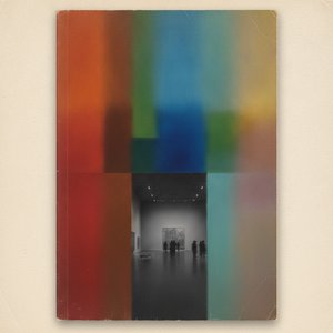
The Essence of Abstraction: A Definitive Guide to the Power and History of Color Field Painting Masterpieces
Explore the profound emotional depth of Color Field painting. Our expert guide delves into the post-war origins of Abstract Expressionism, analyzing masterpieces by Rothko and Newman. Discover museum-grade, hand-painted oil reproductions that bring art history to your walls.


