Vaihda tulosteeseen
 Lue lisää




































 Teoksille tai reproduktioille, joiden mikä tahansa sivu on suurempi kuin 105 cm (noin 41 tuumaa), kehys toimitetaan osina purettuna sarjana. Tämä menetelmä varmistaa turvallisen toimituksen ja ehkäisee vaurioita kuljetuksen aikana.


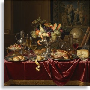
A Quiet Arrangement of Objects
In this 1552 composition, we find ourselves looking closely at a collection of everyday items that seem to occupy the immediate foreground. A vase rests on the left, balanced by a bowl situated in the middle of the scene. Near the center-left area, a bottle is placed alongside a cup toward the right. At the top left corner, a piece of meat provides a heavy, tactile presence among the more delicate vessels. The arrangement feels deliberate, almost as if the objects were set down moments ago for our inspection.
Beyond these inanimate subjects, several people are present within the scene. Two individuals are located on the left side, while another person can be seen near the center-right area. A fourth person is visible towards the right edge of the painting. Their presence introduces a sense of life and depth to the composition, suggesting that this collection of objects exists within a larger, inhabited space.
Technique and Symbolic Resonance
The artist utilizes an oil on panel medium to render these textures with great care. The light catches the surfaces of the ceramic and glass, creating a sense of weight and volume. This approach belongs to the Northern Renaissance style, where the focus remains on the tangible reality of the physical world. Each object is rendered with enough detail to invite a closer look at its form and material. There is an underlying tension in how these elements are organized. The arrangement of items within such a still life often carries weight, representing the relationship between earthly possessions and deeper meanings. By placing human figures alongside these domestic objects, the work blurs the lines between a simple depiction of goods and a narrative involving the people who interact with them. It is a quiet study of presence and absence.
Kysymykset ja vastaukset
Miten teosta Pieter Aertsen:n "Still-Life" voidaan käyttää sisustuksessa?
"Still-Life" sopii erinomaisesti Accent-käyttöön, ja suositeltu tila teokselle on Living Room.
Onko teoksessa "Still-Life" voimakkaita valon ja varjon kontrasteja?
Teoksen Pieter Aertsen:n "Still-Life" kontrastitaso on Statement.
Mihin huoneeseen "Still-Life" sopisi parhaiten sen väripaletin perusteella?
Earthy väripalettinsa ansiosta Pieter Aertsen:n "Still-Life" on suositeltava Living Room-tilaan. Värit ovat yksi tämän suosituksen perusteista.
 Esikatselu
 Jaa teos
 Jaa
Jaa
 Tiedot
 Opas
Opas

 Lataa kuva
 Samanlaisia kohteita
 Röntgenkuvaus
 Diaesitys
 Q&A
Q&A Tilastot