

 发送
发送 分享
分享
 详情
详情 指南
指南

 下载图片
下载图片
 相似作品
相似作品 幻灯片播放
幻灯片播放 统计数据
统计数据Architecture in Japan
 Digital
- Digital
- Postmodernism
 1984
1984- Contemporary
 55.0 x 55.0 cm
 Vignelli Center for Design Studies
 阅读全文
阅读全文
手工油画复制品
由我们的艺术家按需定制,为您提供您所选尺寸及画框的布面手工油画。 ( 切换至版画销售渠道 切换至数字图像销售渠道)

































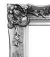

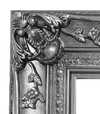
您可以从与原作比例一致的预设尺寸中进行选择。

请输入您需要的宽度和高度,以适配您的画框或墙面。由于作品为手工绘制,若您选择不同的尺寸比例,艺术家可能会在画面边缘多画一些或稍作裁剪 —— 由您决定。在开始绘画之前,我们会为您发送一份数字效果图供您确认。本页面上展示的图片并非最终实物 —— 只有效果图才能反映真实结果。
下单后,OriginalUniqueArt.com 团队将通过电子邮件联系客户获取具体要求,并提供效果预览图


 玻璃选项仅适用于110厘米以下的尺寸。

Architecture in Japan
复制品材质
复刻品尺寸说明
-


总计金额
¥ 2017
A Visionary Intersection of Typography and Structure
In the realm of graphic design, few works capture the profound dialogue between cultural heritage and modern abstraction as elegantly as Michael Bierut’s Architecture in Japan. Created in 1984, this striking piece serves as more than just a promotional poster for an architectural program; it is a masterclass in visual communication that bridges the gap between the structural rigidity of the built environment and the fluid grace of typographic expression. The artwork presents a captivating interplay of light and shadow, utilizing a bold, high-contrast palette that commands immediate attention. Through his meticulous arrangement of red lettering against a deep, dark background, Bierut invites the viewer into a space where language and form become indistinguishable, echoing the very essence of architectural design—where structure meets meaning.
The composition is a testament to the influence of the Swiss Style, a movement that prioritizes clarity, geometric precision, and the functional beauty of sans-serif typography. As a prominent figure at Pentagram, Bierut utilizes these principles to create a sense of rhythmic movement across the canvas. The red lettering does not merely sit upon the surface; it dances through the composition, acting as both information and ornament. This technique mirrors the way architectural elements—beams, pillars, and eaves—interact with space in Japanese design. There is a profound sense of balance achieved here, where the weight of the typography provides a structural anchor, much like the foundation of a temple, while the negative space allows the viewer's eye to wander through an imagined landscape of modern and traditional forms.
To possess a reproduction of this work is to bring a piece of design history into one's personal sanctuary. For the discerning collector or interior designer, Architecture in Japan offers a sophisticated focal point that complements both minimalist and contemporary interiors. The stark contrast and vibrant crimson accents provide a rhythmic energy that can breathe life into a neutral-toned room, while its intellectual depth provides a conversation starter for any guest. It is an evocative piece that evokes the spirit of the avant-garde, reminding us of a time when design was at the forefront of architectural discourse. Whether displayed in a professional studio or a private gallery, this artwork stands as a timeless tribute to the enduring beauty of structural harmony and the power of the graphic line.
问答详情
原件"Architecture in Japan"的尺寸是多少?
原作 Michael Bierut 的《Architecture in Japan》 的尺寸为 55 x 55 cm。
是否有面向学生的 Michael Bierut 的《Architecture in Japan》 详情页?
Michael Bierut 的《Architecture in Japan》 的 指南 页面提供了一份可打印的两页式学生资料单:包含作品及其身份信息表、将其置于艺术家生平中的年代轴、艺术家的其他作品、经测量的色板,以及四种格式的即用型引用文献。
Michael Bierut 的《Architecture in Japan》 的创作年代与艺术风格是什么?
Michael Bierut 的《Architecture in Japan》创作于1984年,属于Postmodernism流派。
艺术家简介
Michael Bierut: Clarity and Helvetica – Shaping Visual Culture
Michael Bierut (b. 1957) stands as a towering figure in contemporary graphic design, recognized globally for his unwavering commitment to clarity, masterful use of typography—particularly Helvetica—and astute contributions to the field’s critical discourse. Born in the United States, Bierut's artistic journey began with an early fascination for visual communication and evolved into a distinguished career at Pentagram, one of America’s leading design firms since 1990. This partnership has yielded an astonishing portfolio encompassing branding identities, editorial layouts, packaging designs, and monumental public artworks, cementing his reputation as a visionary innovator. His formative years were marked by exposure to influential designers like Josef Müller-Brockmann and Armin Hofmann, whose principles of Swiss Style—characterized by geometric precision, sans-serif fonts, and restrained color palettes—deeply resonated with Bierut’s aesthetic sensibilities. These influences instilled in him a belief that design should serve as a conduit for conveying information effectively while simultaneously elevating its visual impact. This philosophy is evident throughout his work, where simplicity reigns supreme alongside meticulous attention to detail. Bierut's breakthrough came with the iconic 2016 logo for Hillary Clinton’s presidential campaign—a project lauded for its understated elegance and strategic use of Helvetica. The design prioritized readability and conveyed a sense of calm confidence amidst the turbulent political landscape, demonstrating Bierut’s ability to harness typography as a tool for shaping perception. Beyond client commissions, Bierut has actively championed design education and criticism, lecturing extensively at Yale School of Art since 1989 and fostering a generation of designers who embrace intellectual rigor alongside creative experimentation. Throughout his career, Bierut has garnered numerous awards recognizing his exceptional talent and dedication to the craft—a testament to his enduring influence on the field. He’s been honored by organizations like AIGA (American Institute of Graphic Arts) for his contributions to design excellence and continues to inspire artists worldwide with his unwavering belief in the power of thoughtful visual communication. His work transcends mere aesthetics; it embodies a profound understanding of how design can shape culture and communicate complex ideas with grace and precision.- Notable Achievements: Pentagram Partner (1990-Present), Logo Design for Hillary Clinton Campaign (2016)
- Education: Yale School of Art Lecturer (Since 1989)
- Affiliations: Alliance Graphique Internationale, American Institute of Graphic Arts

Michael Bierut
1957 - , United States of America
快速概览
- Artistic Movement Or Style: Swiss Style
- Artists Or Movements Influenced By This Artist: ['Graphic Design']
- Artists Who Influenced This Artist: ['Helvetica']
- Date Of Birth: 1957
- Full Name: Michael Bierut
- Nationality: American
- Notable Artworks:
- IDCNY welcomes the 1988 AIA Convention
- Architecture in Japan
- Place Of Birth: United States of America
相关文章
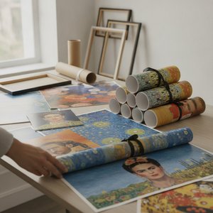
OriginalUniqueArt.com F.A.Q.: Premium Art Poster Prints – Vivid Colors & Versatile Sizing
Discover OriginalUniqueArt.com's premium art poster prints. Featuring 12-color archival pigments for vivid color fidelity and versatile sizing for bespoke decor. Expertly crafted museum-quality reproductions designed for discerning collectors and professional decorators.