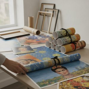
切换至版画销售渠道
 展开全文
展开全文


































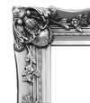

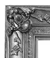


 对于任何边长超过 105 厘米(约 41 英寸)的艺术品或复制品,画框将以拆解后的组件形式发货。此方法可确保安全送达并防止运输过程中的损坏。


The Genesis of a Dialogue: Massimo Vignelli’s “Oppositions”
Massimo Vignelli's "Oppositions 5, 6, 7, 8," created in 1975 for the Institute for Architecture and Urban Studies (IAUS), isn’t merely a poster; it’s a carefully constructed visual argument. Born from a period of intense architectural theory and critique – a time grappling with the shifting landscape of urban design and the role of the architect – this work embodies the IAUS's commitment to fostering rigorous debate and challenging established norms. The piece, designed by Vignelli himself, immediately establishes a sense of controlled chaos, a deliberate juxtaposition of seemingly disparate elements that speaks volumes about the journal’s core mission: to explore the tensions and contradictions within contemporary architecture.
The design's stark simplicity is its most striking feature. A grid-based layout, dominated by bold, sans-serif typography – Vignelli’s signature choice – presents a list of book titles, each meticulously arranged against a muted background. The numbers 5 through 8 are not simply identifiers; they function as anchors, grounding the viewer within the specific issues addressed in that particular iteration of the journal. The subtle use of crossed-out books hints at critical engagement and the inherent limitations of any single perspective – a key tenet of the IAUS’s approach.
A Masterclass in Graphic Minimalism
Vignelli's genius lies not just in his aesthetic choices, but in their profound impact. The limited color palette—primarily shades of gray and white—forces the viewer to focus entirely on the content and the arrangement of the text. The geometric precision of the layout mirrors the principles of modernist architecture, reflecting a belief in clarity, functionality, and rational design. This isn’t decoration; it's an exercise in visual communication, prioritizing information delivery over superfluous embellishment. The use of Helvetica, a typeface chosen for its legibility and neutrality, further reinforces this commitment to clarity – a deliberate rejection of the ornate typography prevalent at the time.
The poster’s design also reflects Vignelli's broader philosophy regarding graphic design: that it should be invisible, serving as a vehicle for the content rather than competing with it. He famously stated, “Design is not about making things beautiful; it’s about making things useful.” This principle is perfectly embodied in "Oppositions," where the visual elements are subordinate to the intellectual discourse they represent.
Historical Context and Architectural Critique
To understand the significance of “Oppositions,” one must consider the context in which it was created. The 1970s were a turbulent period for architecture, marked by debates surrounding postmodernism, deconstructivism, and the role of the architect in shaping urban environments. The IAUS, founded by Peter Eisenman, served as a vital forum for these discussions, bringing together leading architects, theorists, and critics to challenge conventional thinking. “Oppositions” functioned as a visual representation of this intellectual ferment – a condensed distillation of the complex ideas being explored within the journal.
The inclusion of figures like Kenneth Frampton, Mario Gandelsonas, and David Morton highlights the diverse range of perspectives engaged in by the IAUS. These were architects and thinkers who questioned established hierarchies and advocated for a more critical approach to design. The crossed-out books subtly acknowledge that even within this vibrant intellectual community, there would inevitably be disagreements and competing viewpoints.
Symbolism and Enduring Legacy
Beyond its immediate function as a promotional piece, “Oppositions” carries a deeper symbolic weight. The arrangement of the book titles—each representing a specific issue—suggests a complex web of interconnected ideas. The use of numbers creates a sense of order and structure, while the crossed-out books represent the inherent contradictions and unresolved questions within architectural theory. Ultimately, the poster invites viewers to engage in their own critical analysis – to consider the challenges facing architecture and to formulate their own perspectives on the future of design.
Today, “Oppositions 5, 6, 7, 8” stands as a testament to Massimo Vignelli’s enduring legacy. His minimalist aesthetic continues to influence graphic designers worldwide, while his commitment to clarity and intellectual rigor remains remarkably relevant in an increasingly complex world. Reproductions of this iconic poster offer a powerful reminder of the importance of critical thinking and the transformative potential of design.
常见问题与解答
"Oppositions 5, 6, 7, 8" 的版画推荐用于何处?
马西莫·维内利, 维内利联合设计公司 的《Oppositions 5, 6, 7, 8》 的建议用途为 Reflective,同时也适用于其他场景。
"Oppositions 5, 6, 7, 8" 的作者是谁?
"Oppositions 5, 6, 7, 8" 的创作者是 马西莫·维内利, 维内利联合设计公司。该作品以 马西莫·维内利, 维内利联合设计公司 的名义编入目录。
马西莫·维内利, 维内利联合设计公司 的《Oppositions 5, 6, 7, 8》展现了怎样的色彩和谐感?
马西莫·维内利, 维内利联合设计公司 的《Oppositions 5, 6, 7, 8》 呈现出一种 Strong Color Unity 的色彩和谐感。
 实景预览
实景预览
 分享
分享 分享
分享
 详情
详情 指南
指南

 下载作品
下载作品
 相似作品
相似作品 X射线
X射线 幻灯片播放
幻灯片播放 问答
问答 统计数据
统计数据