切换至版画销售渠道
 展开全文

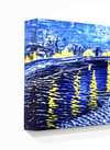

















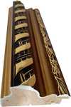









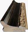







 对于任何边长超过 105 厘米(约 41 英寸)的艺术品或复制品,画框将以拆解后的组件形式发货。此方法可确保安全送达并防止运输过程中的损坏。


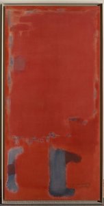
A Symphony of Crimson and Ochre: Decoding Mark Rothko’s Multiform 2
Mark Rothko's "Multiform 2," painted in 1948, stands as a cornerstone of Abstract Expressionism—a movement that sought to liberate painting from representational constraints and delve into the realm of emotion. This monumental canvas embodies Rothko’s signature Color Field technique, prioritizing color over form to evoke profound psychological responses within the viewer. The artwork's genesis lies in Rothko’s formative years grappling with displacement and loss – experiences that fueled his relentless pursuit of artistic expression as a conduit for confronting existential anxieties.- Subject Matter: The painting eschews recognizable imagery, presenting instead two expansive rectangles of color—a dominant crimson hue punctuated by flashes of orange—that merge seamlessly into one another. This deliberate simplification aims to bypass intellectual analysis and tap directly into the subconscious mind.
- Style & Technique: Rothko’s method involved applying thin layers of pigment onto canvas, creating a hazy, luminous surface that diffuses light and enhances the color saturation. The subtle gouged lines etched into the paint—a technique he pioneered—add textural complexity while simultaneously disrupting the perceived flatness of the rectangles.
- Historical Context: Created during the Second World War, “Multiform 2” reflects the pervasive atmosphere of uncertainty and trauma that characterized the period. Rothko’s work aligns with a broader artistic impulse to explore themes of spirituality and human experience in response to global upheaval. It emerged from a milieu where artists were actively questioning traditional conventions and seeking new ways to communicate profound emotions.
- Symbolism: The color palette itself is laden with symbolic significance. Crimson represents passion, vitality, and perhaps even sacrifice—themes central to Rothko’s personal reflections on loss and suffering. Orange embodies warmth, optimism, and the promise of renewal, offering a counterpoint to the darker hues that dominate the composition.
- Emotional Impact: Viewing “Multiform 2” is intended to be an immersive experience – inviting contemplation and fostering introspection. Rothko’s aim was not merely to depict color but to evoke feelings—a meditative stillness punctuated by flashes of emotional resonance. The painting's enduring appeal resides in its ability to bypass verbal articulation and communicate directly with the viewer’s inner landscape.
Further Exploration: Similar Works & Artistic Influences
Rothko’s exploration of Color Field painting drew inspiration from artists like Wassily Kandinsky and Piet Mondrian, who championed abstraction as a means of accessing universal truths. Examining Rothko's oeuvre alongside these contemporaries illuminates the broader artistic currents shaping postwar American art. Consider exploring pieces such as “No. 5 No. 22” and “Four Darks in Red”—works that share similar compositional strategies and emotional depth—to gain a deeper appreciation for Rothko’s singular vision.Reproductions & Interior Design Considerations
A high-quality reproduction of "Multiform 2" can transform an interior space, introducing a sense of serenity and grandeur. When selecting a print, prioritize archival inks and canvas substrates to ensure the artwork retains its vibrancy and luminosity for generations to come. Its bold color palette complements minimalist aesthetics beautifully—particularly in neutral backgrounds—creating a focal point that stimulates conversation and evokes contemplation.常见问题与解答
马克·罗斯科 的《Multiform 2》 的色彩构图是如何构建的?
马克·罗斯科 的《Multiform 2》 的色彩分析呈现出一种 Serene 的对比与 Strong Color Unity 的和谐。
“Multiform 2”的作者是谁?
"Multiform 2" 由 马克·罗斯科 创作。本页面的信息旨在介绍 马克·罗斯科 的原作。
马克·罗斯科 的《Multiform 2》 是油画、素描还是版画?
马克·罗斯科 的《Multiform 2》 被归类为 WallArt。该类别描述了原作的艺术形式。
 实景预览

 分享
 分享
 详情
 指南


 下载作品
 相似作品
 X射线
 幻灯片播放
 问答
 统计数据