 分享
分享Variant/Adobe


从与原作比例一致的预设尺寸中进行选择。
您可以输入自定义尺寸,以适配特定的画框或空间。如果您选择的尺寸与原图比例不符,我们将对作品进行裁剪,或通过镜像填充/纯色填充边缘的方式来扩展图像。在开始制作之前,我们会向您发送一份数字效果图供您确认。
请注意,屏幕上的预览并不能反映实际的裁剪或扩展效果。只有效果图才能准确展示最终的构图。
虽然我们提供定制尺寸,但为了保持原图比例,我们建议您从预设列表中选择尺寸。


 玻璃选项仅适用于110厘米以下的尺寸。

Variant/Adobe
艺术微喷/版画
复制品尺寸
-


最终总价
-
藏品详情
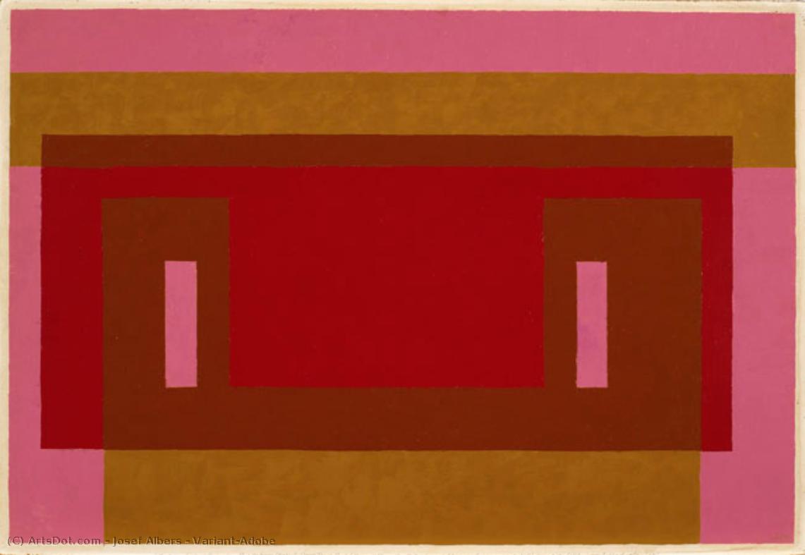
Josef Albers' "Variant/Adobe": A Study in Color Interaction
Josef Albers’ “Variant/Adobe,” created in 1948, is a captivating example of his renowned “Homage to the Square” series. This artwork isn't merely a composition; it's an exploration of color theory and perceptual phenomena, inviting viewers to contemplate how colors interact and influence one another. The piece exemplifies Albers’ commitment to understanding and demonstrating the relativity of color perception—how a color appears can be dramatically altered by its surrounding hues.
Composition and Geometric Precision
The artwork's structure is based on a precise geometric framework. A dominant red rectangle sits at the center, partially veiled by a slightly smaller brown rectangle positioned above it. These central forms are framed by horizontal bands of pink at the top and gold/yellow at the bottom, creating a layered effect. Two symmetrically placed vertical rectangles in a lighter pink shade further define the central area. The consistent use of straight lines emphasizes the artwork’s geometric precision and reinforces its sense of order. This deliberate arrangement isn't arbitrary; it's designed to create visual tension and harmony simultaneously.
Color Palette and Technique
Albers employs a restrained yet impactful color palette, primarily featuring shades of red, brown, pink, and yellow/gold. The colors are presented in their purest form—flat and unmodulated—avoiding gradients or shading techniques. This deliberate choice highlights the inherent qualities of each color and allows for a direct examination of their interaction. The technique itself is characterized by careful control; the paint appears to be applied evenly across the canvas, suggesting meticulous attention to detail and a desire to minimize textural variation. There's no visible brushwork or impasto, further emphasizing the flatness and clarity of the composition.
Historical Context and Symbolic Resonance
“Variant/Adobe” emerged from Albers’ time at Black Mountain College in the late 1940s, a period marked by experimentation and innovation in abstract art. The "Homage to the Square" series, to which this work belongs, was Albers' extended investigation into color relationships within a consistent geometric framework—the square. Symbolically, the artwork can be interpreted as representing patterns found in nature or reflecting the complexities of human perception. The repetition and variation of shapes suggest an underlying order while simultaneously acknowledging the subjective nature of visual experience. It aligns with principles of Minimalism and Concrete Art, prioritizing objective forms and emphasizing a reduction to essential elements.
Emotional Impact and Lasting Appeal
Despite its abstract nature, “Variant/Adobe” evokes a sense of calm, precision, and visual harmony. The carefully balanced composition and the deliberate color choices create a feeling of equilibrium. The artwork’s enduring appeal lies in its ability to engage viewers on both an intellectual and emotional level—it's a testament to Albers’ profound understanding of color theory and his skill in translating complex ideas into visually compelling forms.
艺术家简介
由材质铸就的一生:早年岁月与包豪斯时期的形成
约瑟夫·阿尔伯斯的艺术旅程并非始于名门学院那高雅脱俗的气息,而是源于德国博特罗普他父亲承包业务那务实的世界。出生于1888年的年轻约瑟夫,从底层工作中汲取了对材质的深厚敬畏——木工、水管工、粉刷匠——这些技能从根本上塑造了他的审美感官。这不仅仅是职业训练,更是一场对“创造”本质的沉浸式体验,让他理解了形式是如何具象化的,以及每种媒介所蕴含的固有特性。在全身心投入艺术之前,阿尔伯斯曾担任过五年的教师,磨炼了耐心与教学技巧——这些品质后来成为了他卓越教学生涯的基石。1913年至1915年间,他在柏林皇家艺术学院开始了正式的艺术训练,期间探索了版画、绘画,以及至关重要的彩色玻璃艺术。他早期的委约作品《神秘玫瑰,为我们祈祷》(Rosa Mystica Ora Pro Nobis, 1918)是一扇令人惊叹的彩绘玻璃窗,预示了他终生对光影与色彩交织的痴迷,并暗示了未来即将展开的抽象探索。这部早期作品并非单纯的装饰,它是一场关于光如何“转化”材质的研究,这一主题贯穿了他的整个艺术生涯。包豪斯的熔炉:作为主题的色彩
1922年是一个转折点,阿尔伯斯加入了包豪斯教职队伍,这所革命性的学校致力于统一所有的艺术学科。最初,他负责教授基础课程——《工作教学》(Werklehre,即工作坊实践)——并全身心投入到其核心原则中:功能主义、几何抽象和材质探索。这段时期具有变革意义。阿尔伯斯开始对色彩感知进行系统性的研究,从具象艺术转向了日益抽象的视觉语言。他感兴趣的不仅是色彩“是什么”,更是它们“如何”相互作用,如何彼此影响,以及我们的眼睛如何感知它们。虽然在他早期的作品中可以辨识出保罗·克利和瓦西里·康定斯基等包豪斯大师的影响,但阿尔伯斯开辟了一条独特的道路,他优先选择经验观察而非形而上学的诠释。他并非在色彩中寻求精神真理,而是在细致地记录其物理效应——这种科学的严谨性成为了他艺术方法的标志。这种对感知、对“如何看”而非“看到了什么”的关注,使他脱颖而出,并为他未来的探索奠定了基础。向正方形致敬:感知的实验室
在黑山学院任教期间,他培养了包括罗伯特·劳森伯格和西·托姆布莱在内的一代美国艺术家。随后,在1949年,阿尔伯斯开启了他最著名的系列作品:《向正方形致敬》。这个持续进行的计划由一系列嵌套的正方形组成,每一次迭代都在探索色彩关系的微妙变化。其前提看似简单得近乎轻率,实则隐藏着极其复杂且严谨的研究。该系列并非旨在颂扬几何学,而是一个研究色彩感知的实验室。阿尔伯斯细致地记录了他的实验,揭示了色彩并非静态的实体,而是通过内在逻辑相互支配的动态力量——这种逻辑往往会误导眼睛。一个看似更亮的方块可能会显得在后退,而一个较暗的方向则可能显得在前进,这挑战了直觉认知。这项研究最终汇集成他的开创性著作《色彩互动》(Interaction of Color, 1963),至今仍是艺术家和设计师必读的基础教材。这本书并非色彩理论的论述,而是一系列旨在证明我们的色彩感知是相对且具有情境性的练习——这见证了阿尔伯斯的信念:观看并非被动的接收,而是一个主动的诠释过程。传承与持久的影响力
约瑟夫·阿尔伯斯的影响力远超他的绘画本身。从1950年到1958年退休期间,他担任耶鲁大学设计系主任的经历,巩固了他作为深具影响力的教师的地位。他强调亲身实验、批判性观察以及对既定假设的不懈质疑。学生们学习的不仅仅是“画什么”,更是学习“如何看”——去分析、去解构、去理解支配视觉体验的底层原理。他的教学方法培养了独立思考的能力,并鼓励学生发展出自己独特的艺术语言。《色彩互动》 至今仍是艺术教育的基石,塑造着一代又一代人对色彩关系的理解。如今,阿尔伯斯被公认为抽象艺术发展的关键人物,特别是在几何抽象和极简主义美学领域。他的《向正方形致敬》系列因其对感知现象的探索而成为经典,证明了即使在看似简单的形式中,也存在着等待被发现的无限复杂性。1976年3月25日,他逝世于康涅狄格州纽黑文,留下了一份持续激励并挑战着艺术家、设计师和教育者的遗产——这是对观察、实验以及色彩永恒奥秘之力量的最好证明。代表作品
- 灰色器械 I 展望 (Gray Instrumentation I Prospectus, 1975): 一幅极简主义单色绘画,体现了几何平衡与微妙的色调变化。
- 向正方形致敬研究 – 放射 (Study for Homage to the Square – Beaming, 日期不详): 阿尔伯斯在嵌套正方形中探索色彩互动的经典范例,唤起了一种宁静感与空间深度。
- 神秘玫瑰,为我们祈祷 (Rosa Mystica Ora Pro Nobis, 1918): 他早期的彩绘玻璃委约作品,预示了他终生对光与色彩的痴迷。

约瑟夫·阿尔伯斯
1888 - 1976 , 德国
艺术家简介
- Artistic Movement Or Style: 几何抽象
- Artists Or Movements Influenced By This Artist:
- 极简主义
- 色域绘画
- Artists Who Influenced This Artist:
- 保罗·克利
- 瓦西里·康定斯基
- Date Of Birth: 1888年3月19日
- Date Of Death: 1976年3月25日
- Full Name: 约瑟夫·阿尔伯斯
- Nationality: 德裔美国人
- Notable Artworks:
- 向正方形致敬
- 灰色器械 I 展望
- 圣母玛利亚为我们祈祷
- Place Of Birth: 德国博特罗普
相关文章

Minimalist Masterpieces: 10 Artworks for Serene Home Decor | OriginalUniqueArt
Find serenity with 10 minimalist masterpieces! Explore Agnes Martin, Rothko & more. Discover the stories behind iconic abstract art, neutral palettes & calming designs. Museum-quality reproductions at OriginalUniqueArt.com – elevate your home decor today!
Josef Albers: A Homage to Color Interaction & the Foundations of Visual Perception
Explore Josef Albers's groundbreaking color theory & the 'Homage to the Square' series. Discover how his work revolutionized visual perception and influenced modern art movements like Minimalism & Op Art. Learn about his Bauhaus roots & lasting legacy.

Beyond Form & Color: Geometric Abstraction's Evolution in 20th/21st Century Art
Explore the evolution of geometric abstraction from Cubism to contemporary art. Discover key artists like Malevich & Mondrian, investment insights, and expert collecting advice at OriginalUniqueArt.

色域绘画:抽象表现主义的演变与色彩氛围探索
深入探索抽象表现主义色域绘画的演变与大师作品。OriginalUniqueArt.com提供专业艺术咨询、高品质油画复制及收藏投资建议,助您鉴赏与拥有珍品。

Ephemeral Dimensions: The Impact of Illumination on Perceptual Shifts in Contemporary Abstract Painting
Explore the profound impact of illumination on contemporary abstract painting. Expert insights into perceptual psychology, key artists & collecting valuable art. OriginalUniqueArt.

