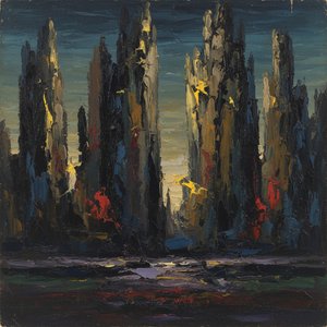
油画原件
 关于 Gray alphabets 的一切

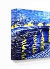
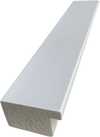
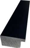
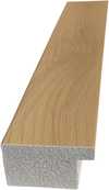
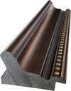
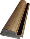
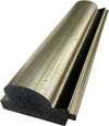
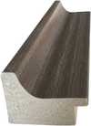
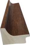
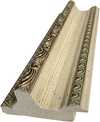
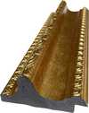
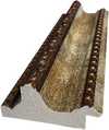
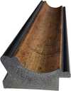
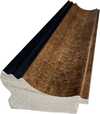
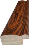
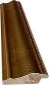
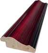
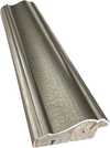
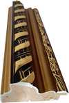
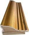
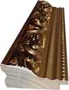
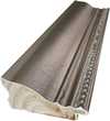
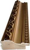
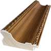
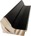
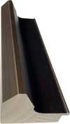
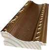
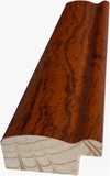
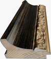
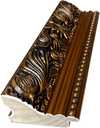
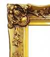
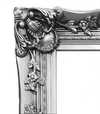
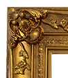
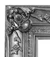


 对于任何边长超过 105 厘米(约 41 英寸)的艺术品或复制品,画框将以拆解后的组件形式发货。此方法可确保安全送达并防止运输过程中的损坏。


A Bold Exploration of Language and Form: Jasper Johns’ Gray Alphabets
Jasper Johns' "Gray Alphabets," created in 1956, stands as a cornerstone of American Pop Art and a fascinating testament to the artist’s innovative approach to visual representation. More than just a collection of letters arranged on paper—though undeniably striking in its simplicity—the painting embodies Johns’s deliberate challenge to conventions established by Abstract Expressionism, prioritizing recognizable imagery alongside formal experimentation.
- Subject Matter: The artwork centers around the alphabet itself – uppercase and lowercase letters meticulously positioned within a grid structure. This selection of familiar symbols reflects Johns' fascination with everyday objects and their ability to convey profound meaning beyond their literal form.
- Style & Technique: Executed in beeswax and oil on newspaper and paper on canvas, “Gray Alphabets” exemplifies Johns’s signature technique—a blend of encaustic painting (beeswax mixed with pigment) and collage. The subtle shading achieved through encaustic lends a tactile quality to the surface, enhancing the visual impact of the printed letters.
- Historical Context: Emerging in the wake of Abstract Expressionism's dominance, Pop Art sought to liberate art from emotional intensity, focusing instead on popular culture and accessible imagery. Johns’s decision to utilize the alphabet—a symbol of knowledge and communication—directly confronted the expressive concerns of its predecessors.
Decoding Ambiguity: Symbolism Within Geometric Precision
The gray color palette is crucial to understanding “Gray Alphabets.” Often associated with neutrality, balance, and even ambiguity, it serves as a counterpoint to the vibrant hues typically employed in Abstract Expressionist canvases. Johns deliberately avoids overt emotional expression, inviting viewers to engage in an intellectual process of decipherment—to consider what the arrangement of letters communicates beyond its surface appearance.
- Geometric Structure: The grid format itself is significant, harking back to architectural drawings and reinforcing the idea that Johns was exploring the relationship between language and visual order. This deliberate structuring mirrors the way words are organized in sentences, creating a parallel visual experience.
- Repetition & Rhythm: Johns’s meticulous repetition of letters—each positioned sequentially within the grid—creates a rhythmic pattern that draws attention to the fundamental building blocks of communication. The subtle variations in shading contribute to this rhythm, adding depth and nuance to the overall composition.
Legacy & Influence: A Quiet Revolution
"Gray Alphabets" represents a pivotal moment in Johns’s artistic trajectory—a move away from purely abstract exploration toward incorporating recognizable elements into his work. It solidified his position as a pioneer of Pop Art and influenced subsequent generations of artists who sought to redefine the boundaries of visual art. The painting continues to resonate today, prompting viewers to contemplate the power of symbols and the beauty found in simplicity.
- Connection to Flag: Like Johns’s iconic “Flag” painting—also executed in 1956—“Gray Alphabets” demonstrates his preoccupation with American iconography. Both works utilize a repetitive motif—the flag or the alphabet—to explore themes of identity and national consciousness.
- Continuing Relevance: The artwork's enduring appeal lies in its ability to provoke contemplation about how we perceive language and imagery, reminding us that art can communicate profound ideas through seemingly unassuming forms.
常见问题与解答
Gray alphabets是手绘的还是印刷的?
手工绘制:由受过专业训练的画家在亚麻画布上,以油画形式临摹 Gray alphabets。
Gray alphabets 我该选择什么尺寸?
尺寸范围从 38.7 x 25.9 cm (¥1337) 到 246.5 x 165.0 cm (¥10160);本页表格列出了主要步骤及其价格。
物流需要多长时间?
送货时间为 4 至 5 周,并提供全球免费快递服务;本页面还提供加急制作选项。您可以在 100 天内无条件退货并获得全额退款。
賈斯培·瓊斯 在创作《Gray alphabets》时使用了什么媒介?
Acrylic On Canvas
 实景预览

 分享
 分享
 详情
 详情页


 下载作品
 相似作品
 X射线
 幻灯片播放
 问答

 统计数据