分享
分享Sao


从与原作比例一致的预设尺寸中进行选择。
您可以输入自定义尺寸,以适配特定的画框或空间。如果所选尺寸与原图比例不符,我们将通过裁剪作品或添加手绘元素来扩展画面。数字样稿将在制作开始前发送给您确认。
请注意,屏幕预览无法准确反映实际的裁剪或扩展效果,只有样稿才能真实呈现最终的构图。
虽然我们提供定制尺寸服务,但为了保留原作比例,建议您从预设列表中选择尺寸。
下单后,OriginalUniqueArt.com 团队将通过电子邮件联系客户获取具体要求,并提供效果预览图。


 玻璃选项仅适用于110厘米以下的尺寸。

Sao
复制材质
复制品尺寸
-


最终总价
-
作品详情
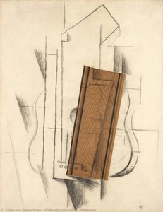
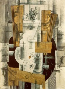
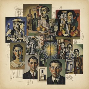
A Stark Dialogue with Form: Georges Braque’s *Sao*
Georges Braque's *Sao*, a deceptively simple monochrome drawing, isn’t merely an exercise in line and space; it’s a profound meditation on containment, fragmentation, and the very nature of representation. Executed around 1932, this work embodies the core tenets of Cubism while simultaneously hinting at the nascent explorations of collage that would soon redefine Braque's artistic trajectory. The piece immediately commands attention with its stark contrast: a dense, black void punctuated by a network of precise, white lines – a visual vocabulary that speaks volumes about the artist’s intent.
The composition centers on an abstracted human figure, roughly delineated within a large, encompassing circle. This isn't portraiture in the traditional sense; rather, it’s a deconstruction of the form, reduced to its essential elements – lines that suggest limbs, torso, and head, yet never fully resolve into recognizable features. The asymmetry inherent in the arrangement—the figure subtly off-center—introduces an element of dynamism, preventing the image from feeling static or overly formal. A smaller oval at the base adds a layer of ambiguity, perhaps representing legs or a lower body, further contributing to the sense of incompleteness and ongoing construction.
The Language of Line: Technique and Materiality
Braque’s masterful control of line is paramount to *Sao*'s impact. The lines aren't smooth or flowing; they possess a deliberate, almost hesitant quality, as if drawn with charcoal or chalk on a slightly textured surface. This gestural approach imbues the work with a sense of immediacy and spontaneity, contrasting sharply with the precision required for rendering a realistic image. The varying thickness and density of the lines create a subtle textural landscape, adding depth and visual interest without relying on shading or modeling – techniques that Braque would later abandon in favor of more fragmented approaches.
Considering the materials—likely charcoal or chalk on paper—the work’s longevity is remarkable. The monochrome palette amplifies the impact of the lines themselves, forcing the viewer to engage with their form and spatial relationships. It's a testament to Braque’s ability to create a powerful visual statement using minimal resources.
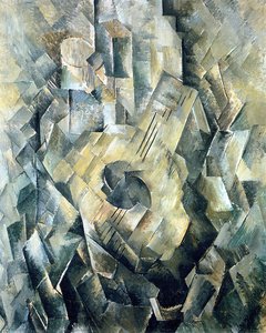
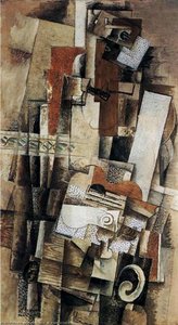
Cubism, Collage, and the Deconstruction of Reality
*Sao* firmly situates itself within the context of early Cubism, a movement that challenged traditional notions of perspective and representation. Like Picasso, Braque sought to depict objects from multiple viewpoints simultaneously, fracturing forms into geometric shapes and reassembling them on the canvas. However, *Sao* feels particularly prescient in its anticipation of collage – a technique that would soon become synonymous with Braque’s name. The very act of layering lines within a defined space echoes the principles of collage, suggesting an exploration of surface and texture.
The circle itself is a potent symbol—representing wholeness, containment, or perhaps even the cyclical nature of existence. Juxtaposed against the fragmented figure, it creates a compelling tension between order and chaos, stability and disintegration. The ambiguity surrounding the figure’s identity invites interpretation, prompting viewers to project their own emotions and experiences onto the image.
A Quiet Intensity: Emotional Resonance
Despite its apparent simplicity, *Sao* possesses a remarkable emotional depth. It's not a work that shouts for attention; rather, it whispers with an understated intensity. The stark contrast between black and white evokes feelings of isolation, introspection, and perhaps even melancholy. The fragmented figure suggests a sense of loss or incompleteness, while the enclosing circle offers a fragile promise of protection. *Sao* is a powerful reminder that art can communicate complex emotions through the most subtle means – a carefully considered line, a strategic placement, and a profound understanding of form.
艺术家简介
乔治·布拉克:立体主义的先驱与艺术革新的探索
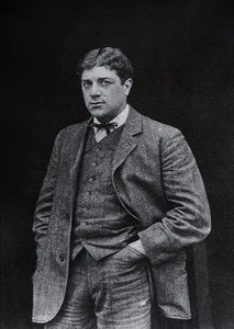
乔治·布拉克,1882年出生于法国阿尔居特维尔,是二十世纪最具影响力的画家之一。他的艺术生涯并非一蹴而就,而是经历了一系列深刻的转变和创新。早年在家乡勒阿弗尔,布拉克的父亲是一位房屋油漆匠,这使得他从小就接触了绘画材料和技巧,并培养了对形式与结构的敏感性。尽管最初也跟随父亲的脚步学习油漆技术,但艺术的天赋最终促使他进入勒阿佛尔美术学校深造。随后,他移居巴黎,在雨贝尔学院进修,在那里结识了玛丽·洛朗西和弗朗西斯·皮卡比亚等艺术家,为他早期的艺术发展奠定了基础。最初的作品受到印象派和后印象派的影响,但很快便受到了野兽主义的启发,这促使他在色彩运用上更加大胆奔放。从野兽主义到立体主义:艺术道路上的关键转折
1905年,布拉克开始尝试野兽主义风格,其特点是使用鲜艳、非自然的色彩和富有表现力的笔触。《耐心》等作品充分体现了这一时期的风格。他与亨利·马蒂斯和安德烈·德雷恩等人共同探索着艺术的边界。然而,布拉克的野兽主义并非简单的模仿,而是融入了他独特的思考方式,在保持色彩活力的同时,更加注重形式的结构和分析。1907年,他在巴黎秋季沙龙观看了保罗·塞尚的回顾展,塞尚对几何形态和多角度视角的强调,彻底改变了布拉克的艺术方向。塞尚的影响成为了布拉克艺术生涯中的一个重要转折点,也为他与毕加索共同开启立体主义奠定了基础。与毕加索的合作:立体主义的诞生与发展
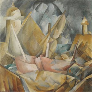
1907年之后,布拉克与巴勃罗·毕加索开始了密切的合作,两人共同开创了立体主义这一革命性的艺术运动。他们打破了传统的透视和空间表现手法,将物体分解成几何形状,并从多个角度同时呈现出来,挑战了人们对视觉空间的认知。《房屋于埃斯塔克》等作品便是立体主义早期风格的代表作,展现了布拉克对形式结构的高度关注。在这一阶段,布拉克的画作色彩变得更加沉静,强调形式而非色彩,力求表现物体的整体存在感。创新与实验:拼贴艺术的探索
随着立体主义的发展,布拉克和毕加索开始尝试拼贴(collage)技术,将现实世界中的材料,如报纸碎片、墙纸和布料等,融入到绘画创作中。这一创新打破了绘画与雕塑之间的界限,模糊了艺术与生活的边界。《小鱼》等作品便是拼贴技术的典范,展现了布拉克对材料质感和空间关系的探索。布拉克在拼贴艺术上的贡献在于他将广告标语等日常元素融入到画面中,预示着后来波普艺术等关注媒体文化批判的艺术潮流。晚年风格与持久的影响
一战爆发后,布拉克的艺术生涯经历了一段中断期。战争结束后,他的风格逐渐从立体主义的严格形式中解放出来,开始探索更加个人化和抒情的题材。他重新燃起了对静物的兴趣,并融入了古典构图的元素。晚年的作品色彩更加柔和,画面氛围也更加宁静祥和。《柠檬》等作品体现了他对色彩和谐与形式结构的精妙把握。布拉克始终致力于探索形式、空间和表现之间的基本原理,不断尝试新的材料和技巧,直至1963年去世。他的艺术成就不仅影响了后世无数的艺术家,更彻底改变了我们对世界及其视觉呈现方式的理解。重要作品与艺术遗产
- 房屋于埃斯塔克:立体主义早期风格的代表作。
- 小鱼:拼贴技术的典范。
- 柠檬:晚年作品,体现了对色彩和谐与形式结构的精妙把握。
乔治·布拉克
1882 - 1963 , 法国
艺术家简介
- 全名: 乔治·布拉克
- 出生地点: 法国阿尔内维尔
- 出生日期: 1882年5月13日
- 去世日期: 1963年
- 受影响的艺术家或运动:
- 巴勃罗·毕加索
- 现代艺术
- 国籍: 法国
- 影响艺术家:
- 亨利·马蒂斯
- 安德烈·德雷恩
- 保罗·塞尚
- 艺术运动或风格: 立体主义,野兽派
- 著名作品:
- 房屋在勒斯塔克
- 《耐心》
- 小提琴与调色板
- 曼多拉
相关文章
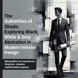
The Subtleties of Shade: Exploring Black, White & Gray Abstraction in Modern Interior Design
Explore the power of black, white & gray abstraction in modern interior design. Discover how minimalist art impacts spatial perception & creates sophisticated hotel spaces. Expert insights for designers.
Cubism's Revolution: 10 Masterpieces That Redefined Modern Art | OriginalUniqueArt
Explore 10 Cubist masterpieces by Picasso, Braque & more! Delve into the history of this revolutionary art movement. Find museum-quality reproductions and elevate your home decor with OriginalUniqueArt. Discover all masterpieces on OriginalUniqueArt.com
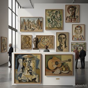
解析立体主义:十部巨作定义艺术史潮流
探索立体主义的艺术魅力!本文精选十部定义了这场革命性运动的杰作,带您深入了解毕加索、布拉克等大师的创作故事与技法。从几何抽象到现代风格,感受色彩与形式的无限可能。OriginalUniqueArt.com为您提供博物馆品质的艺术品复制和家居美学灵感!
Georges Braque: Pioneering Cubism & the Evolution of Modern Form
Explore the revolutionary art of Georges Braque, a pioneer of Cubism alongside Picasso. Discover his artistic evolution, key works, and lasting impact on modern art. A guide for discerning collectors.
乔治·布拉克:25幅大师杰作,重塑现代艺术与家居美学 | OriginalUniqueArt
探索乔治·布拉克25幅大师杰作,领略立体主义的魅力与现代艺术的精髓。从早期作品到经典油画,OriginalUniqueArt为您呈现法式优雅与家居装饰灵感。高清艺术复制品,点亮您的空间!立即在OriginalUniqueArt.com发现更多。