切换至版画销售渠道
 展开全文
展开全文



































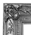


 对于任何边长超过 105 厘米(约 41 英寸)的艺术品或复制品,画框将以拆解后的组件形式发货。此方法可确保安全送达并防止运输过程中的损坏。


Catalog Cover: A Geometric Manifesto of Revolution
El Lissitzky’s ‘Catalog cover,’ produced in 1923, stands as a cornerstone of Constructivist design—a movement that sought to liberate art from representational illusion and forge it into the tool of social transformation. More than just an advertisement for a publication, this artwork embodies the core tenets of Constructivism: stark geometric abstraction, purposeful typography, and unwavering faith in technological progress.
- Composition & Form: The image presents a meticulously crafted arrangement dominated by large, overlapping rectangular letters – ‘EL’, ‘3’, and ‘Lissitzky’ – interwoven with vertical bars. These forms aren't merely decorative; they actively engage the viewer’s eye, creating an illusion of depth and dynamism within the monochrome palette. The absence of curves or organic shapes underscores Constructivism’s rejection of traditional artistic conventions.
- Typography & Language: Lissitzky skillfully utilizes sans-serif typeface to convey both visual impact and ideological commitment. Text in Cyrillic script—including “Schau der Arbeit” (“Look at Work”) and “Moskau”—further reinforces the artwork's central theme of labor and urban life, aligning with Constructivist ideals of industrial society and social reform.
- Technique & Material: The original painting was executed in oil or gouache on canvas—a deliberate choice reflecting Constructivism’s emphasis on materiality and craftsmanship. Photographic reproduction captures the smooth surface texture achieved through meticulous brushwork, highlighting Lissitzky's dedication to precision and artistic execution.
The artwork’s historical context is inextricably linked to Russia’s tumultuous years following the Bolshevik Revolution. Constructivism emerged as a reaction against Impressionism and Expressionism, rejecting subjective emotion in favor of objective representation—specifically geometric abstraction—as a means of communicating revolutionary ideas. Lissitzky envisioned art as an instrument for societal advancement, mirroring the broader ambitions of the Soviet state.
Beyond its formal qualities, ‘Catalog cover’ resonates with profound symbolic significance. The geometric forms represent stability and order amidst chaos – mirroring Constructivism's aspiration to rebuild society after the devastation of war. The bold lettering proclaims a manifesto of progress and defiance against artistic dogma. Lissitzky’s work continues to inspire designers and artists today, demonstrating the enduring power of abstraction to communicate complex concepts with clarity and conviction.
- Emotional Impact: Viewing ‘Catalog cover’ evokes a sense of intellectual stimulation and visual excitement. Its austere beauty speaks to the transformative potential of art—a belief that underpinned Lissitzky's entire artistic practice.
常见问题与解答
如何描述 埃尔·利西茨基 的《Catalog cover》 的意境?
“Catalog cover”营造出一种Minimalist的氛围。
哪里可以找到与 埃尔·利西茨基 的《Catalog cover》 风格相似的艺术品?
与“Catalog cover”相似的作品已列在艺术品的 相似作品 页面中。
埃尔·利西茨基 的《Catalog cover》 的色彩是鲜艳还是柔和?
埃尔·利西茨基 的《Catalog cover》 的色彩饱和度为 Muted,色彩强度为 Monochromatic。
 实景预览
实景预览
 分享
分享 分享
分享
 详情
详情 指南
指南

 下载作品
下载作品
 相似作品
相似作品 X射线
X射线 幻灯片播放
幻灯片播放 问答
问答 统计数据
统计数据