

Introduction
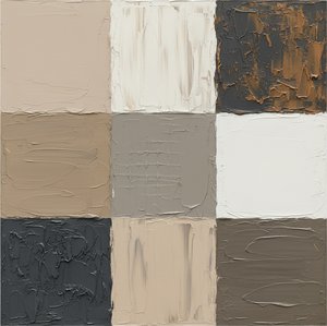
Step into a gallery where the vibrant, loud colors of the modern world fade into a quiet, sophisticated whisper. There is a profound, understated power in the palette of 'putty' tones—those muted, earthy neutrals, soft beiges, and desaturated greys that anchor the most iconic works in art history. While bright pigments often command immediate attention, it is this subtle spectrum of neutral hues that provides the structural soul of a masterpiece, offering a sense of timelessness and atmospheric depth that more aggressive colors simply cannot achieve.
Historically, the mastery of these muted tones emerged from a necessity to capture light, shadow, and the true essence of form. From the soft, luminous skin tones in Renaissance portraiture to the misty, atmospheric landscapes of the Impressionist era, artists have long used these neutral foundations to create realism and emotional resonance. These colors do not shout; they breathe. They allow the viewer to focus on the delicate interplay of light across a surface, the weight of a fabric, or the somber mood of a twilight sky.
In our contemporary spaces—from high-end hotel lobbies to minimalist corporate offices—these tones remain deeply meaningful. They offer a sense of calm, professional elegance and a neutral backdrop that integrates seamlessly with modern architecture. To study these paintings is to understand how restraint can lead to greater impact, proving that the most enduring legacies are often painted in the softest shades.
As we journey through this curated selection, prepare to encounter ten extraordinary works where the 'putty' palette takes center stage. We will explore how these subtle tones define composition, evoke profound emotion, and continue to influence the aesthetic standards of the world's most prestigious interiors.
Guernica - Pablo Picasso
 Guernica - Pablo Picasso
What if I told you that Guernica by Pablo Picasso was born from a moment of profound rebellion—a visceral stroke of defiance against the darkness of war? This is not merely a painting; it is a monumental manifesto of human suffering. Its inclusion in our selection of top paintings dominated by 'putty' tones is essential, as Picasso eschews vibrant color for a stark, monochromatic palette of greys, blacks, and muted whites. These desaturated, neutral shades amplify the raw, journalistic impact of the Cubist forms, stripping away distraction to focus entirely on the emotional weight of the composition.
The fragmented figures and sharp, angular lines create an atmosphere of overwhelming chaos that remains as impactful today as in 1937. At OriginalUniqueArt.com, we believe such powerful history should be accessible for your professional or personal environments. Imagine this masterpiece commanding a corporate lobby or a refined study; it transforms a simple wall into a profound statement of resilience and strength. Bringing this iconic work into your space ensures your decor is not just an aesthetic choice, but a timeless conversation piece.
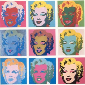
Marilyn Diptych - Andy Warhol
 Marilyn Diptych - Andy Warhol
Acquiring a piece inspired by the Marilyn Diptych by Andy Warhol represents a profound investment in both cultural legacy and sophisticated taste. As a cornerstone of the Pop Art movement, this work stands at the pinnacle of our list due to its unparalleled influence on the global art market and its ability to command any space it inhabits. While the left panel vibrates with saturated, artificial hues, the right side transitions into muted, desaturated tones—a masterful use of putty-colored shadows and fading black-and-white imagery that evokes a sense of mortality and historical decay.
The repetition of Monroe’s visage through Warhol's signature silkscreen technique creates a rhythmic, hypnotic effect that explores the commodification of fame. For the modern decorator or procurement manager, integrating a high-quality reproduction of this masterpiece into luxury interiors provides an immediate sense of aesthetic authority. Whether placed in a corporate lobby or a high-end hospitality suite, the work's balance of vibrant energy and somber, neutral tones offers a timeless graphic presence that elevates the surrounding architectural environment.
Frida Kahlo - `The Two Fridas` - Frida Kahlo
 Frida Kahlo - `The Two Fridas` - Frida Kahlo
In 1939, amidst the profound heartbreak of her divorce from Diego Rivera, Frida Kahlo channeled her internal tempest into The Two Fridas . While many focus on the vibrant Tehuana attire, the true emotional weight lies in the muted, putty-toned shadows and the somber, overcast sky that anchors the composition. This masterwork utilizes a palette of desaturated neutrals to bridge the gap between the two identities: one resilient and traditional, the other vulnerable and European.
The technical brilliance of this piece is found in its heavy, textured brushstrokes and the visceral symbolism of the exposed hearts connected by a single, pulsing artery. The way the neutral, fleshy tones of the skin interact with the dark, turbulent clouds creates a sense of quiet prestige and profound depth. For the modern professional, displaying such a powerful exploration of duality can transform a home office or study into a space of deep reflection and focused ambition, mirroring the strength required to navigate complex personal and professional landscapes.
Composition VIII - Wassily Wassilyevich Kandinsky
 Composition VIII - Wassily Wassilyevich Kandinsky
Wassily Kandinsky’s 1923 masterpiece, Composition VIII , stands as a monumental pillar of abstract expressionism, marking the moment where art moved beyond representation into the realm of pure, spiritual vibration. As a key entry in our exploration of paintings dominated by 'putty' tones, this work utilizes a muted, neutral background to provide a stable stage for its energetic dance of geometric forms. This pale, desaturated foundation allows the sharp blacks, vibrant yellows, and deep blues to resonate without overwhelming the viewer.
The painting’s placement in our selection highlights Kandinsky’s ability to use a restrained palette to balance chaos with order. The interplay of circles and intersecting lines creates a visual rhythm akin to a musical score, inviting us to contemplate how structure can emerge from abstraction. For the modern collector or professional decorator, integrating such a sophisticated arrangement of geometry and neutral tones offers a way to introduce intellectual depth and movement into corporate or hospitality spaces, fostering an environment of thoughtful, timeless elegance.
The Night - Max Beckmann
 The Night - Max Beckmann
In Max Beckmann’s 1919 masterpiece, The Night , the 'putty' tones of the palette do not merely decorate; they suffocate. Within this claustrophobic, post-war vision, the muted ochres, ashen grays, and fleshy, desaturated flesh tones serve to anchor the viewer in a state of profound existential dread. These neutral, clay-like hues provide the essential foundation for Beckmann’s Neue Sachlichkeit style, creating a landscape of skin and shadow that feels both visceral and decaying.
As you move through this gallery of the soul, notice how the lack of vibrant color intensifies the psychological weight of the distorted figures. The heavy, desaturated tones wrap around the chaotic scene like a shroud, emphasizing the fragmentation of modern life. This isn't just a study in color; it is a sensory immersion into the trauma of a generation. To possess such a work is to surround yourself with the raw, unvarnished truth of history, transforming your space into a profound reflection of human resilience and shadow.
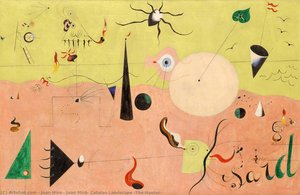
Joan Miró- Catalan Landscape (The Hunter) - Joan Miró
 Joan Miró- Catalan Landscape (The Hunter) - Joan Miró
What if I told you that Catalan Landscape (The Hunter) by Joan Miró was born from a moment of rebellion—a stroke of defiance against the ordinary? This 1924 masterpiece does not merely depict a landscape; it serves as a surrealist manifesto, where the familiar terrain of Catalonia is reimagined through a dreamlike lens of biomorphic forms and symbolic abstraction.
Its inclusion in our selection of paintings dominated by 'putty' tones is essential for understanding how muted, earthy neutrals can anchor a composition. Miró masterfully utilizes desaturated ochres, clay-like terracottas, and soft, putty-colored washes to provide a grounded foundation for his more vibrant bursts of pink and blue. This balance of neutral stability and surrealist energy redefines how we perceive light and shadow in modern art.
At OriginalUniqueArt.com, we believe such profound emotional depth should be accessible for your professional or personal environments. Imagine this piece as a focal point in a corporate lobby or a refined home office—turning a standard wall into a window to the subconscious and ensuring your space remains a powerful, sophisticated statement.
Woman I - Willem de Kooning
 Woman I - Willem de Kooning
Willem de Kooning’s Woman I exists as a visceral storm of emotion, where the boundaries between figure and chaos dissolve into a singular, haunting presence. As one of the most significant works in our selection of famous paintings dominated by putty tones, it demonstrates how muted, fleshy neutrals can anchor even the most violent abstraction. While the palette erupts with jarring reds and greens, it is the underlying layers of bone-white, pale ochre, and heavy, putty-like greys that provide the structural weight necessary to convey post-war anxiety.
The painting’s immortality lies in its tactile intensity; the thick impasto creates a landscape of ridges and valleys that catch the light, making the canvas feel alive with movement. For the modern collector, integrating such a powerful piece into a professional or residential space offers an unparalleled focal point. The interplay of neutral foundations and aggressive brushwork provides a sophisticated tension, bringing a sense of historical depth and raw, intellectual energy to contemporary architectural interiors.
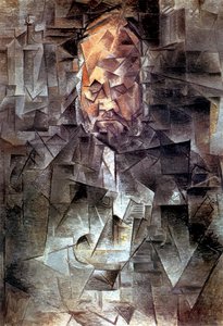
Portrait of Ambroise Vollard - Pablo Picasso
 Portrait of Ambroise Vollard - Pablo Picasso
What if I told you that Portrait of Ambroise Vollard by Pablo Picasso was born from a moment of rebellion—a stroke of defiance against the ordinary? This masterpiece does not merely depict an art dealer; it serves as a manifesto of Analytical Cubism, shattering traditional perception into a complex network of geometric planes. Its inclusion in our selection of paintings dominated by putty tones is essential, as Picasso utilizes a muted, sophisticated palette of ochre, gray, and earthy browns to focus entirely on the structural deconstruction of his subject.
The painting’s strength lies in its subtle, desaturated textures that evoke a sense of intellectual weight and somber contemplation. There is no vibrant distraction here, only the masterful interplay of light and shadow across fragmented surfaces. At OriginalUniqueArt.com, we believe such profound history should be part of your daily environment. Imagine this revolutionary work anchoring a corporate suite or a modern study, turning a neutral wall into a powerful architectural statement. It is more than decor; it is an invitation to view the world through a reconstructed lens.
Le bonheur de vivre (The Joy of Life) - - Henri Matisse
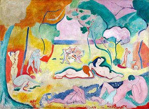 Le bonheur de vivre (The Joy of Life) - - Henri Matisse
When Henri Matisse first unveiled Le bonheur de vivre at the 1906 Salon des Indépendants, the art world was not merely surprised; it was scandalized by his radical departure from reality. While many critics recoiled at his 'wild beast' use of color, this masterpiece stands as a foundational pillar of Fauvism. Within this expansive landscape, Matisse masterfully balances vibrant, energetic hues with grounding, neutral undertones. The strategic use of putty tones and muted earth pigments provides a necessary visual anchor, preventing the brilliant yellows and pinks from overwhelming the composition.
This technical genius lies in his ability to use desaturated, neutral shades to create depth and structural harmony amidst the chromatic chaos. The way these subtle, sandy tones interact with the lush greenery creates a sophisticated equilibrium that is both stimulating and serene. For the modern professional, incorporating such a balanced masterpiece into a home office or study can foster an atmosphere of focused creativity—a space where bold innovation meets grounded, disciplined thought.
Man at the Window - Gustave Caillebotte
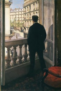 Man at the Window - Gustave Caillebotte
In Gustave Caillebotte’s 1875 masterpiece, Man at the Window , there is a gaze that follows you—not with judgment, but with understanding . This painting serves as a profound study in the 'putty' tones of urban life, where muted grays, desaturated browns, and somber blacks converge to create an atmosphere of quiet introspection. The composition is anchored by these neutral, stone-like hues, which mirror the architectural weight of Haussmann’s Paris.
This isn’t merely a portrait; it is a mirror . As you observe the figure lost in thought, the subdued palette reflects the stillness of a private moment amidst a changing world. The strategic splash of a red chair provides the only rhythmic break in an otherwise monochromatic, melancholic landscape. Its spot in our list of top paintings dominated by neutral tones is a testament to its power to make the invisible visible. Now, imagine that gaze in your space. Not watching you, but reminding you : you are seen. You are part of the story.
Conclusion
As the light fades on our journey through these muted, evocative tones, we are reminded that greatness does not always require a roar; often, it is found in the quietest whispers of color. These masterpieces, defined by their subtle putty hues and soft, earthen depths, do more than merely occupy space—they breathe within it. They are not static relics of a bygone era held behind museum glass, but living presences that possess the power to anchor a room, soften a silhouette, and invite a moment of profound stillness into the rush of modern life.
To bring these works into your own environment is to invite a timeless dialogue between history and the present. Whether it is the tactile weight of an impasto brushstroke or the gentle, atmospheric glow of a landscape, these paintings serve as daily reminders of the grace and resilience of human creativity. They transform walls into windows, offering a sanctuary of texture and emotion that evolves with the light of each passing day. We invite you to explore our full collection and find the piece that speaks to your soul, allowing these enduring echoes of beauty to become a permanent part of your personal story.