

 Preverite v realnem okolju
 Pošlji kot čestitko
 Deli
Deli
 Podrobnosti
 Priročnik

 Prenesi
 Podobni artefakti
 Rentgenski posnetek
 Predvajaj diaporama
 Statistika
Oppositions 5, 6, 7, 8
 Acrylic On Canvas
- WallArt
- Oppositions Architecture
 1975
1975 61.0 x 61.0 cm
 Vignelli Center for Design Studies
 Preberi več
Umetniška dela, prikazana na tej strani, so zaščitena z avtorskimi pravicami, kar pomeni, da po zakonu ne moremo ustvarjati ali prodajati identičnih reprodukcij. Ta zaščita se izvaja v skladu z mednarodnimi sporazumi, kot so Bernska konvencija in po nacionalnih zakonih, vključno s tistimi, ki jih določa Zakon o avtorskih pravicah ZDA – naslov 17.
Ta način v celoti upošteva zakonodajo o avtorskih pravicah, saj ne vključuje kopiranja ali podvajanja zaščitena umetniškega dela. Namesto tega gre za kreativno preinterpretacijo – novo sliko, ki je navdihnjen rezultat originala, vendar ni z njim identična.
Giclée tisk / Umetniški tisk
Giclée ali platnati odtis muzejske kakovosti z hitro proizvodnjo in prilagodljivimi možnostmi končne obdelave. ( Naročite ročno slikano reprodukcijo Preklop na digitalno sliko)




P118B €10

P118H €10

P118W €10

P438Z €10

P508JH €12

P508YH €12

P805H €10

P805Z €10

P919BZ €10

P919G €10

P919XJ €10

P959ZH €10

P968JZ €12

W106C €8

W218G €10

W218JH €8

W218Y €10

W307PJ €10

W316G €10

W316PJ €8

W316Y €10

W398PJ €8

W4111J €10

W500HY €15

W500JH €15

W692G €12

W849H €8

W940BG €15

W953PJ €8

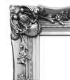

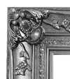
Izberite eno od naših vnaprej določenih velikosti, ki ustrezajo prvotnim proporcijam umetničkega dela.

Vnesite širino in višino, ki jih potrebujete za svoj okvir ali steno. Tiskanje se lahko le odreže, vendar ga ni mogoče narediti večjega od slike, zato format z drugačno obliko pomeni izgubo dela slike. Pred tiskanjem vam pošljemo digitalni predogled za potrditev. Slika, prikazana na tej strani, ne prikazuje dejanskega izrezkov — le predogled to omogoča.
Globalna dostava () v 2 tednih namesto standardnih 4/5 tednov. (23 oktober)

Brezplačna ekspresna dostava po vsem svetu

Visokokakovostno laneno platno

Popolno zavarovanje pošiljke

Garancija povračila carine in uvoznih davkov

Garancija popolnega barvnega ujemanja

Politika vračila v 100 dneh (le v primeru okvar)

Garancija 100% povračila denarja

Popust pri večjem naročilu
 Možnost stekla je na voljo le za velikosti pod 110 cm

Oppositions 5, 6, 7, 8
Giclée tisk / Umetniški tisk
Velikost reprodukcije
-


Skupna cena
€ 70
The Genesis of a Dialogue: Massimo Vignelli’s “Oppositions”
Massimo Vignelli's "Oppositions 5, 6, 7, 8," created in 1975 for the Institute for Architecture and Urban Studies (IAUS), isn’t merely a poster; it’s a carefully constructed visual argument. Born from a period of intense architectural theory and critique – a time grappling with the shifting landscape of urban design and the role of the architect – this work embodies the IAUS's commitment to fostering rigorous debate and challenging established norms. The piece, designed by Vignelli himself, immediately establishes a sense of controlled chaos, a deliberate juxtaposition of seemingly disparate elements that speaks volumes about the journal’s core mission: to explore the tensions and contradictions within contemporary architecture.
The design's stark simplicity is its most striking feature. A grid-based layout, dominated by bold, sans-serif typography – Vignelli’s signature choice – presents a list of book titles, each meticulously arranged against a muted background. The numbers 5 through 8 are not simply identifiers; they function as anchors, grounding the viewer within the specific issues addressed in that particular iteration of the journal. The subtle use of crossed-out books hints at critical engagement and the inherent limitations of any single perspective – a key tenet of the IAUS’s approach.
A Masterclass in Graphic Minimalism
Vignelli's genius lies not just in his aesthetic choices, but in their profound impact. The limited color palette—primarily shades of gray and white—forces the viewer to focus entirely on the content and the arrangement of the text. The geometric precision of the layout mirrors the principles of modernist architecture, reflecting a belief in clarity, functionality, and rational design. This isn’t decoration; it's an exercise in visual communication, prioritizing information delivery over superfluous embellishment. The use of Helvetica, a typeface chosen for its legibility and neutrality, further reinforces this commitment to clarity – a deliberate rejection of the ornate typography prevalent at the time.
The poster’s design also reflects Vignelli's broader philosophy regarding graphic design: that it should be invisible, serving as a vehicle for the content rather than competing with it. He famously stated, “Design is not about making things beautiful; it’s about making things useful.” This principle is perfectly embodied in "Oppositions," where the visual elements are subordinate to the intellectual discourse they represent.
Historical Context and Architectural Critique
To understand the significance of “Oppositions,” one must consider the context in which it was created. The 1970s were a turbulent period for architecture, marked by debates surrounding postmodernism, deconstructivism, and the role of the architect in shaping urban environments. The IAUS, founded by Peter Eisenman, served as a vital forum for these discussions, bringing together leading architects, theorists, and critics to challenge conventional thinking. “Oppositions” functioned as a visual representation of this intellectual ferment – a condensed distillation of the complex ideas being explored within the journal.
The inclusion of figures like Kenneth Frampton, Mario Gandelsonas, and David Morton highlights the diverse range of perspectives engaged in by the IAUS. These were architects and thinkers who questioned established hierarchies and advocated for a more critical approach to design. The crossed-out books subtly acknowledge that even within this vibrant intellectual community, there would inevitably be disagreements and competing viewpoints.
Symbolism and Enduring Legacy
Beyond its immediate function as a promotional piece, “Oppositions” carries a deeper symbolic weight. The arrangement of the book titles—each representing a specific issue—suggests a complex web of interconnected ideas. The use of numbers creates a sense of order and structure, while the crossed-out books represent the inherent contradictions and unresolved questions within architectural theory. Ultimately, the poster invites viewers to engage in their own critical analysis – to consider the challenges facing architecture and to formulate their own perspectives on the future of design.
Today, “Oppositions 5, 6, 7, 8” stands as a testament to Massimo Vignelli’s enduring legacy. His minimalist aesthetic continues to influence graphic designers worldwide, while his commitment to clarity and intellectual rigor remains remarkably relevant in an increasingly complex world. Reproductions of this iconic poster offer a powerful reminder of the importance of critical thinking and the transformative potential of design.
Vprašanja in odgovori
Kje lahko prenesem "Oppositions 5, 6, 7, 8" avtorja Massimo Vignelli, Vignelli Associates?
Digitalno sliko dela "Oppositions 5, 6, 7, 8" avtorja Massimo Vignelli, Vignelli Associates lahko prenesete na strani za prenos umetninine Prenos: prenos digitalne slike visoke ločljivosti.
Kakšna je med barvami dela "Oppositions 5, 6, 7, 8" medsebojna skladnost?
Barve v delu "Oppositions 5, 6, 7, 8" avtorja Massimo Vignelli, Vignelli Associates prikazujejo Strong Color Unity harmonijo. Harmonija opisuje odnos barv med seboj.
Ali so barve dela "Oppositions 5, 6, 7, 8" močne ali nežne?
Barve v delu "Oppositions 5, 6, 7, 8" avtorja Massimo Vignelli, Vignelli Associates imajo Vivid intenzivnost.
Biografija umetnika
Življenje posvečeno obliki: Svet Massima Vignellija
Rod v Milanu leta 1931, je pot Massima Vignellija bila pot neomajne predanosti načelom modernističnega oblikovanja. Že od mladega sta v njem izražala vroče razumevanje vizualne komunikacije, ko je svoje formalno izobraževanje v arhitekturi začel na Politecnico di Milano in ga nadaljeval na Università Iuav di Venezia. Vendar pa je šele pripravništvo pri prestižnih bratov Castiglioni – pionirih v italijanskem industrijskem oblikovanju – v njem v Živo vžgalo strast do oblikovanja sveta skozi premišljeno ustvarjanje. Ta zgodnji stik mu je vdelestvo v funkcionalnost, preprostost in moč elegantnih rešitev za vsakdanje težave. Ni oblikoval le predmetov; on je oblikoval izkušnje, izpopoljeval interakcije in običajno preživljanje dvignil v nekaj nepozabnega. To obdobje oblikovanja je postavilo temelje za kariero, ki bo ponovno definirala vizualno kulturo na več kontinentov.Od Italije do New Yorka: Transatlantski vidik
Vignellijeva pot ga je leta 1966 vodila v Ameriko, kjer je igral ključno vlogo pri ustanovitvi newyorškega urada podjetja Unimark International. To je bil prelomni trenutek, ne le za njegovo kariero, temveč tudi za celotno pokrajino ameriškega oblikovanja. Unimark se je hitro vznesel na vrh, Vignellijevi prispevki – najbolj opazni pa je trajen logotip za American Airlines – pa so utrdili njegov ugled mojstra korporativnega identiteta. Vendar pa ga je vse večja razlika v kreativni filozofiji spodbudila k samostojnemu podvagu. Leta zględ 1971 je skupaj s svojo ženo in življenjsko sodelavko, Lello Vignelli, ustanovil podjetje Vignelli Associates. To partnerstvo se je izkazalo za izjemno plodno in je postalo sinonim za sofisticirana oblikovalna rešitve, ki so obsegala grafično oblikovanje, oblikovanje notranjih prostorov, izdelkov in arhitekturo. Etos podjetja je bil utemeljen v prepričanju, da mora biti dobra oblika dostopna, brezčasna in globoko uporabna – načeli, ki jih so dosledno zastopali skozi celotno svojo kariero.Ikonična ustvarjalnost: Dedstvo jasnosti
Vignellijev vpliv je vpleten v tkivo sodobnega življenja. Morda njegovo najbolj prepoznavno dosežek je redesign zemljevoda metro v New Yorku leta 1972. Čeprav je bil sprva kontroverzen zaradi odstopanja od stroge geografske natančnosti, je predstavljal drzen izkaz jasnosti in uporabnosti. Vignelli je prednost dali čitljivosti in intuitivni navigaciji nad dobesedno predstavitvijo, s čimer je ustvaril diagramski zemljevod, ki še danes vsakodnevno vodi milijone potnikov. Ta projekt je zrcal pri njegovi jedrni filozofiji oblikovanja: postavljanju komunikacije na prvo mesto. Poleg zemljevoda metro je Vignelli Associates pustil neizbrisno sled številnim blagovnim znamkam in institucijam. Njihovo del za Bloomingdale’s – vključno z ikonično rjavo papirnato vrečko z preprostim belim logotipom – je izkušnjo nakupovanja spremenilo v izjava o slogu. Oblikovali so pohištvo za Knoll, embalažo za Heller in korporativne identitete, ki so postali takoj prepoznavni simboli kakovosti in inovacije. Njegova *Heller Rainbow Dinnerware* linija kot pričevanje stoji za njegovo minimalistično estetiko, kjer vibrirajoče barve izstopajo znotraj čistih geometričnih oblik. Poster *Tredicesima Triennale di Milano* prikazuje njegovo drzne uporabo barv in oblik, medtem ko okrov *Knoll Design* dokazuje njegovo sposobnost ustvarjanja osupljivih vizualnih vsebin za svetovno znane blagovne znamke.Trajen vpliv: Več kot le estetika
Vignellijev vpliv sega daleč presega posamezne projekte; on je temeljito preoblikoval način, kako dojemamo samo oblikovanje. Bil je vztrajen zagovornik tipografske discipline in je slavno zagovarjal omejeno paleto pisav – verjel je, da prava kreativnost ne leži v neskončnih možnostih, temveč v mojstrski izvedbi z premišljeno izbranimi orodji. Njegova knjiga, *The Vignelli Canon*, je postala manifest za oblikovalce, ki je izločila njegove načele jasnosti, preprostosti in trajne elegance. Ni ustvarjal le vizualno prijetnih predmetov; trudil se je ustvariti red iz kaosa, učinkovito komunicirati in dvigniti človeško izkušnjo skozi premišljeno oblikovanje. Njegovo del še vedno navdihuje generacije oblikovalcev in jih opominja, da prava inovacija leži v odstranjevanju nepotrebnega in osredotočanju na bistvo. Vignelli Center for Design Studies na Rochester Institute of Technology služi kot trajen spomnik na njegovo dediščino, saj ohranja obsežen arhiv njegovega dela in spodbuja nadaljnje raziskovanje njegovih revolucionarnih idej. Umrl je leta 2014, vendar njegove zasnove ostajajo močno prisotne in oblikujejo naš svet s svojo trajno eleganco ter neomajno predanostjo jasnosti.
Massimo Vignelli, Vignelli Associates
1931 - 2014 , Italija
Ključne informacije
- Artistic Movement Or Style: Modernizem, Minimalizem
- Date Of Birth: 10. januar 1931
- Date Of Death: 27. maj 2014
- Full Name: Massimo Vignelli
- Nationality: Italijan
- Notable Artworks:
- Heller Rainbow Dinnerware
- Tredicesima Triennale di Milano
- Knoll Design (ovitek)
- Place Of Birth: Milano, Italija
Sorodni članki
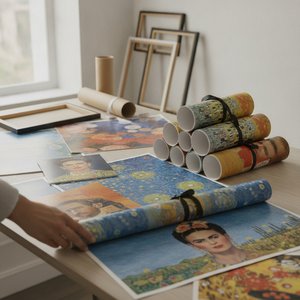
OriginalUniqueArt.com F.A.Q.: Premium Art Poster Prints – Vivid Colors & Versatile Sizing
Discover OriginalUniqueArt.com's premium art poster prints. Featuring 12-color archival pigments for vivid color fidelity and versatile sizing for bespoke decor. Expertly crafted museum-quality reproductions designed for discerning collectors and professional decorators.


