- Acasă

- Imagine digitală
- Josef Albers
- Variant/Adobe
 Trimite
Variant/Adobe


Achiziționați o imagine digitală îmbunătățită și de înaltă rezoluție, mult superioară previzualizării online.
Fiecare fișier este pregătit cu meticulozitate de specialiștii noștri interni, utilizând instrumente avansate și retușare manuală expertă. Ne asigurăm că fiecare imagine beneficiază de o claritate excepțională, o acuratețe precisă a culorilor și detalii fine.
Fișierul final este livrat prin e-mail în termen de 72 de ore, optimizat pentru utilizare imediată în medii profesionale, editoriale și de imprimare. Aceasta este aceeași calitate în care au încredere studiouri de design, edituri și galerii de top.
Imagine Digitală
Descărcați un fișier la rezoluție înaltă pentru afișare personală, imprimare și proiecte creative.
Inclus în fiecare comandă de imagini digitale
Livrare digitală de expertiză, garantată
Când alegeți OriginalUniqueArt.com, nu primiți doar o simplă imagine – primiți o operă de artă digitală îmbunătățită profesional, creată cu precizie și susținută de o garanție de satisfacție. Iată tot ceea ce primești odată cu comanda ta, în mod automat:

Livrare rapidă prin e-mail
Fișierul imaginii digitale la rezoluție înaltă vă va fi trimis prin e-mail în termen de 72 de ore de la finalizarea comenzii – gata pentru utilizare imediată.

Fișier digital optimizat prin IA
Opera ta de artă este optimizată profesional prin intermediul unor instrumente AI avansate și al editării manuale, asigurând un nivel maxim de detalii, claritate și acuratețe a culorilor.

Retransmitere gratuită pe viață
Ai șters sau ai pierdut din greșeală fișierul? Nu îți face griji – ți-l vom retrimite oricând, gratuit.

Fără taxe de import – Întotdeauna
Bucură-te instant de opera ta de artă, fără taxe vamale, taxe de import sau costuri de livrare – descărcările digitale sunt întotdeauna fără taxe.

Garanția acurateței culorilor
Asigurăm că imaginea ta digitală reflectă culorile originale cât mai fidel posibil, utilizând instrumente profesionale și procese de gestionare a culorii.

Garanție de satisfacție de 60 de zile
Dacă nu sunteți mulțumit de imaginea digitală achiziționată, o vom revizui sau vă vom returna 100% în termen de 60 de zile – fără nicio explicație necesară.

Garanție de returnare 100% a banilor
Nu ești mulțumit? Obține o rambursare completă în termen de 60 de zile de la primirea fișierului tău digital – fără întrebări.

Reduceri pentru comenzi multiple
Cumpără 3 imagini, economisește 10% - Cumpără 5, economisește 15% - Cumpără 10+, economisește 20%. Ideal pentru proiecte creative, galerii și agenții.
Descrierea obiectului de colecție
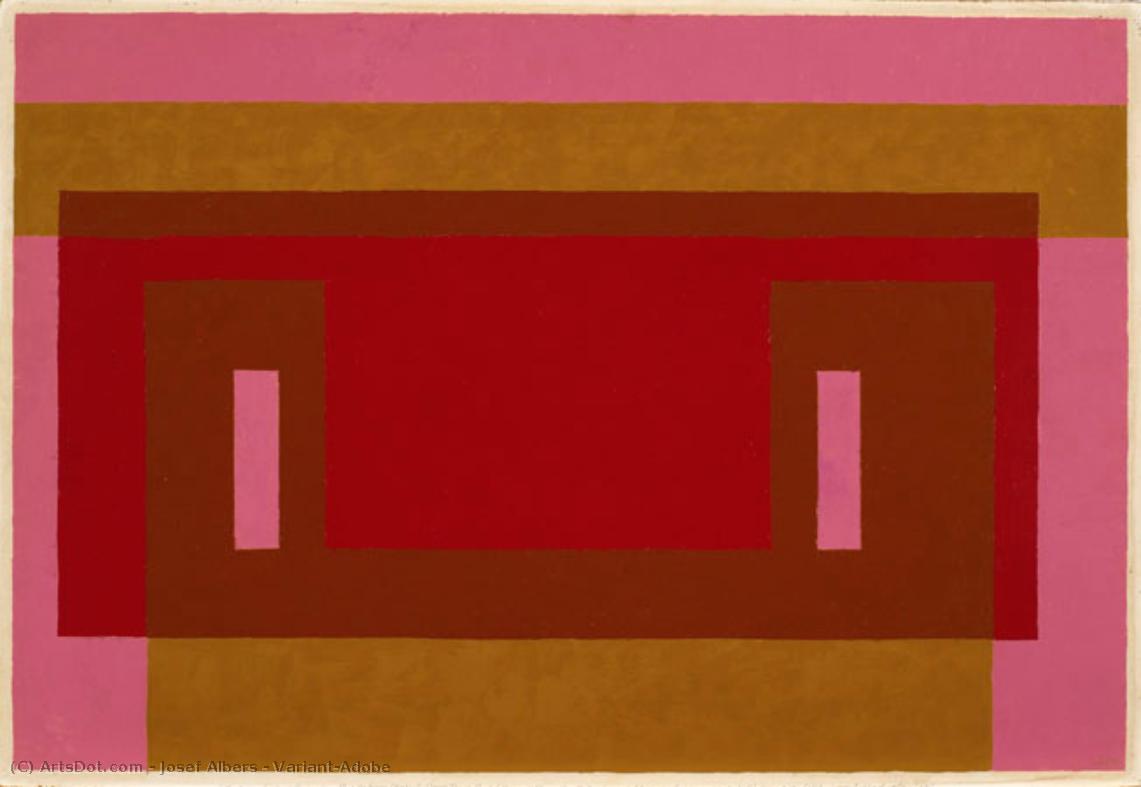
Josef Albers' "Variant/Adobe": A Study in Color Interaction
Josef Albers’ “Variant/Adobe,” created in 1948, is a captivating example of his renowned “Homage to the Square” series. This artwork isn't merely a composition; it's an exploration of color theory and perceptual phenomena, inviting viewers to contemplate how colors interact and influence one another. The piece exemplifies Albers’ commitment to understanding and demonstrating the relativity of color perception—how a color appears can be dramatically altered by its surrounding hues.
Composition and Geometric Precision
The artwork's structure is based on a precise geometric framework. A dominant red rectangle sits at the center, partially veiled by a slightly smaller brown rectangle positioned above it. These central forms are framed by horizontal bands of pink at the top and gold/yellow at the bottom, creating a layered effect. Two symmetrically placed vertical rectangles in a lighter pink shade further define the central area. The consistent use of straight lines emphasizes the artwork’s geometric precision and reinforces its sense of order. This deliberate arrangement isn't arbitrary; it's designed to create visual tension and harmony simultaneously.
Color Palette and Technique
Albers employs a restrained yet impactful color palette, primarily featuring shades of red, brown, pink, and yellow/gold. The colors are presented in their purest form—flat and unmodulated—avoiding gradients or shading techniques. This deliberate choice highlights the inherent qualities of each color and allows for a direct examination of their interaction. The technique itself is characterized by careful control; the paint appears to be applied evenly across the canvas, suggesting meticulous attention to detail and a desire to minimize textural variation. There's no visible brushwork or impasto, further emphasizing the flatness and clarity of the composition.
Historical Context and Symbolic Resonance
“Variant/Adobe” emerged from Albers’ time at Black Mountain College in the late 1940s, a period marked by experimentation and innovation in abstract art. The "Homage to the Square" series, to which this work belongs, was Albers' extended investigation into color relationships within a consistent geometric framework—the square. Symbolically, the artwork can be interpreted as representing patterns found in nature or reflecting the complexities of human perception. The repetition and variation of shapes suggest an underlying order while simultaneously acknowledging the subjective nature of visual experience. It aligns with principles of Minimalism and Concrete Art, prioritizing objective forms and emphasizing a reduction to essential elements.
Emotional Impact and Lasting Appeal
Despite its abstract nature, “Variant/Adobe” evokes a sense of calm, precision, and visual harmony. The carefully balanced composition and the deliberate color choices create a feeling of equilibrium. The artwork’s enduring appeal lies in its ability to engage viewers on both an intellectual and emotional level—it's a testament to Albers’ profound understanding of color theory and his skill in translating complex ideas into visually compelling forms.
Biografie Artist
A Life Forged in Material: The Early Years and Bauhaus Formation
Josef Albers’s artistic journey began not amidst the rarefied air of established academies, but within the pragmatic world of his father’s contracting business in Bottrop, Germany. Born in 1888, young Josef absorbed a deep respect for materials – carpentry, plumbing, house-painting – skills that would fundamentally shape his aesthetic sensibility. This wasn't merely vocational training; it was an immersion into the very essence of making, understanding how forms materialized and the inherent qualities within each medium. He learned to appreciate the subtle textures of wood, the precise angles of metal, the transformative power of color applied to surfaces – experiences that would later inform his abstract explorations. Before dedicating himself fully to art, Albers spent five years as a schoolteacher, honing patience and pedagogical skill—attributes that would later define his influential teaching career. Formal artistic training commenced at the Königliche Kunstschule in Berlin between 1913 and 1915, where he explored printmaking, painting, and, crucially, stained glass. His early commission, “Rosa Mystica Ora Pro Nobis” (1918), a stunning stained-glass window for a church in Berlin, foreshadowed his lifelong fascination with the interplay of light and color, hinting at the abstract explorations to come. This initial work wasn’t simply decorative; it was an investigation into how light *transformed* material, a theme that would resonate throughout his career – a fundamental shift from representational art towards a deeper understanding of visual perception.The Bauhaus Crucible: Color as Subject
A pivotal moment arrived in 1922 when Albers joined the faculty of the Bauhaus, a revolutionary school seeking to unify all artistic disciplines under Walter Gropius’s visionary leadership. Initially tasked with teaching the preliminary course – *Werklehre* (workshop practice) – he immersed himself in its core principles: functionalism, geometric abstraction, and material exploration. This period proved transformative. Albers quickly recognized that the Bauhaus offered a radical departure from traditional art education, emphasizing hands-on experimentation and a holistic approach to design. He began a systematic investigation into color perception, moving away from representational art towards an increasingly abstract vocabulary – not seeking to *copy* nature, but to understand its underlying principles. He wasn’t interested merely in *what* colors were, but *how* they interacted, how they influenced each other, and how our eyes perceived them. The influence of fellow Bauhaus masters like Paul Klee and Wassily Kandinsky is discernible in his early work, yet Albers charted a unique course, prioritizing empirical observation over metaphysical interpretation. He wasn’t seeking spiritual truths through color; he was meticulously documenting its physical effects – a scientific rigor that became the hallmark of his artistic method. This focus on perception, on how we *see*, rather than what is *seen*, set him apart and laid the groundwork for his future explorations. The Bauhaus environment fostered a spirit of collaboration and innovation, encouraging Albers to push the boundaries of traditional art practices.Homage to the Square: A Laboratory of Perception
Following a period teaching at Black Mountain College – where he fostered a generation of American artists including Robert Rauschenberg and Cy Twombly – Albers embarked on what would become his most iconic series in 1949: “Homage to the Square.” This ongoing project consisted of paintings featuring nested squares within squares, each iteration exploring subtle variations in color relationships. It’s a deceptively simple premise, but one that belies an incredibly complex and rigorous investigation. Albers meticulously documented his experiments, revealing how colors aren't static entities but dynamic forces governing each other through internal logic – often misleading to the eye. A seemingly brighter square might appear to recede while a darker one advances, defying intuitive understanding. The series wasn’t intended as a celebration of geometry; rather, it was a laboratory for studying color perception. Albers’s approach involved creating a vast number of small paintings, each with slightly different color combinations and arrangements. He then systematically observed how these colors interacted with each other, documenting the resulting visual effects in detailed notes. This painstaking process revealed that our perception of color is not based on objective measurement but on subjective interpretation – influenced by factors such as surrounding colors, lighting conditions, and individual differences in vision. The culmination of this research was his seminal book, “Interaction of Color” (1963), a foundational text still studied by artists and designers today.Legacy and Enduring Influence
Josef Albers’s impact extends far beyond his paintings. His tenure as head of the design department at Yale University, from 1950 until his retirement in 1958, cemented his reputation as a profoundly influential teacher. He emphasized hands-on experimentation, critical observation, and relentless questioning of assumptions. Students weren't simply taught *what* to paint; they were taught *how* to see – to analyze, to deconstruct, and to understand the underlying principles governing visual experience. Albers’s teaching methods fostered independent thinking and encouraged students to develop their own unique artistic voices. “Homage to the Square” remains iconic for its exploration of perceptual phenomena, demonstrating that even within seemingly simple forms, there exists an infinite complexity waiting to be discovered. He died on March 25, 1976, in New Haven, Connecticut, leaving behind a legacy that continues to inspire and challenge artists, designers, and educators alike – a testament to the power of observation, experimentation, and the enduring mystery of color. His work is exhibited worldwide, celebrated for its intellectual rigor and profound insights into the nature of perception.
Josef Albers
1888 - 1976 , Germania
Detalii rapide
- Artistic Movement Or Style: Abstract geometrică
- Artists Or Movements Influenced By This Artist:
- Minimalism
- Câmpuri de culoare
- Artists Who Influenced This Artist:
- Klee
- Kandinsky
- Date Of Birth: 19 martie 1888
- Date Of Death: 25 martie 1976
- Full Name: Josef Albers
- Nationality: German-American
- Notable Artworks:
- Homage la pătrat
- Interacțiunea culorilor
- Place Of Birth: Bottrop, Germania

