- Início

- Impressão em tela
- bob brighton
- Turquoise Squares

 Enviar
Turquoise Squares
 Painting
- Abstract Art
 2009
2009- Contemporary
 46.0 x 46.0 cm
 Sheffield Central Library
Giclê / Impressão de Arte
Impressão giclée ou em tela de qualidade de museu, com produção rápida e opções flexíveis de acabamento.


Escolha entre os nossos tamanhos pré-definidos que respeitam as proporções originais da obra de arte.
Você pode inserir suas próprias dimensões para se ajustar a uma moldura ou espaço específico. Se o tamanho selecionado não corresponder às proporções da imagem original, iremos recortar a obra de arte ou estender a imagem com uma borda espelhada ou preenchimento sólido. Um mockup digital será enviado para sua aprovação antes do início da produção.
Por favor, observe que a visualização na tela não reflete o recorte ou a extensão real. Apenas o mockup mostrará com precisão a composição final.
Embora tamanhos personalizados estejam disponíveis, recomendamos selecionar uma dimensão da lista predefinida para preservar as proporções originais.
Entrega mundial () em 2 semanas, em vez das 4/5 semanas padrão. (26 Julho)

Envio Expresso Gratuito para todo o Mundo

Tela de Linho Premium

Seguro de envio completo

Garantia de Reembolso de Impostos Alfandegários

Garantia de Fidelidade de Cores

Política de Devolução de 60 Dias (Apenas para Defeitos)

Garantia de 100% de Reembolso

Desconto para múltiplas unidades
 A opção de vidro está disponível apenas para tamanhos inferiores a 110 cm

Turquoise Squares
Giclê / Impressão de Arte
Dimensões da Reprodução
-


Preço Total Final
-
Descrição da Obra
The Rhythmic Dance of Geometry
In the captivating realm of abstract expressionism, few works achieve the hypnotic clarity found in Bob Brighton’s Turquoise Squares. Created in 2009, this piece serves as a masterclass in visual rhythm, inviting the viewer into a meticulously structured world where color and form exist in perfect equilibrium. The painting presents a mesmerizing checkerboard of blue squares set against a lush, verdant background. Each square is delicately framed by a crisp white border, a technique that creates an illusion of depth and architectural precision. This interplay of light and boundary transforms a flat surface into a vibrant, pulsating mosaic, drawing the eye into a continuous loop of discovery across its 46 x 46 cm canvas.
The brilliance of this work lies in its sophisticated use of color theory. Brighton does not merely use blue; he orchestrates a symphony of cerulean, cyan, and deep turquoise, each shade layered to provide a sense of movement and vitality. The contrasting green backdrop acts as a grounding force, providing a rich, organic counterpoint to the cool, geometric precision of the squares. This tension between the structured, man-made appearance of the grid and the fluid, natural essence of the colors evokes a profound emotional response—one of calm stability intertwined with unexpected energy. For the collector or interior designer, this piece offers a unique ability to anchor a room, providing a focal point that is both intellectually stimulating and aesthetically soothing.
A Legacy of Structure and Soul
To truly appreciate Turquoise Squares, one must understand the hands that guided the brush. Bob Brighton’s artistic journey was deeply informed by his early years as a carpenter in Hastings, East Sussex. This background in craftsmanship instilled in him a profound respect for structure, balance, and the inherent beauty of geometric order. His transition from working with wood to working with pigment allowed him to translate the tactile precision of carpentry into the ethereal language of abstraction. In this painting, we see the "geometric soul" of an artist who sought to impose a beautiful, rhythmic order upon the chaos of the world.
For those seeking to adorn a contemporary living space or a professional gallery, a high-quality reproduction of this work brings with it a sense of timelessness. The painting transcends mere decoration; it is an exploration of how simple shapes can evoke complex emotions. Whether placed in a minimalist modern setting or a more eclectic, textured interior, Turquoise Squares acts as a window into a world of organized beauty. It remains a testament to Brighton’s ability to find the profound within the simple, making it an essential acquisition for anyone moved by the power of color and the elegance of the square.
Biografia do Artista
The Geometric Soul of Bob Brighton
Bob Brighton, a name now synonymous with the captivating world of geometric squares and abstract color fields, wasn’t initially destined for the art world. Born in 1936 in Hastings, East Sussex, his early life was rooted in the practicalities of carpentry – a trade he learned from his father, a skilled craftsman. This foundational experience, working with wood and understanding its inherent structure, would profoundly influence his later artistic explorations. Brighton’s journey into art began somewhat unexpectedly, driven by a desire to create order out of chaos, a need to impose visual rhythm on the seemingly random. He initially experimented with collage techniques, but it wasn't until he discovered the power of simple geometric forms – primarily squares – that his unique style truly emerged. This shift represents a deliberate move away from representational art and towards an intensely focused exploration of color, shape, and composition.Early Influences and Artistic Evolution
Brighton’s artistic development wasn't entirely solitary; he drew inspiration from a diverse range of sources. The reductive aesthetic of Piet Mondrian, with its emphasis on primary colors and orthogonal lines, undoubtedly played a significant role in shaping his approach to composition. However, Brighton’s work transcends mere mimicry. He developed a distinctly personal vocabulary within this framework, prioritizing the interplay of color and the dynamic tension between positive and negative space. The influence of Josef Albers' "Homage to the Square" is also evident – Albers’ exploration of how colors interact when placed adjacent to each other served as a crucial guide for Brighton, demonstrating that the meaning of a color isn’t inherent but rather emerges from its relationship with others. Furthermore, his background in carpentry instilled an appreciation for structure and precision, which he translated into the deliberate arrangement of his squares. Early works often featured muted palettes and subtle variations in tone, gradually evolving towards bolder, more saturated colors as his style matured.The Rise of the Squares: Technique and Process
Brighton’s technique was remarkably consistent yet subtly nuanced. He typically began with a large sheet of paper – often watercolor paper – and would meticulously draw a grid of squares using a ruler and pencil. The size, spacing, and orientation of these squares were determined intuitively, reflecting his subconscious state at the time. He then applied acrylic paint directly to the surface, building up layers of color through a process of controlled layering and blending. Crucially, he avoided brushes, preferring instead to use sponges, rags, and other tools to manipulate the paint and create textures and variations in tone. This hands-on approach resulted in a tactile quality to his work – a sense that the paintings are not merely flat surfaces but rather three-dimensional entities. The repetition of squares creates a mesmerizing visual rhythm, while the subtle shifts in color and value maintain a dynamic tension within each composition. His process was deeply meditative; he often worked for extended periods, losing himself in the act of creation.Themes and Interpretations
While Brighton resisted offering definitive interpretations of his work, it’s clear that his paintings explore fundamental concepts such as order, chaos, balance, and harmony. The squares themselves can be seen as symbols of stability and structure, while the vibrant colors evoke a sense of energy and vitality. Critics have noted parallels between his work and Zen Buddhist philosophy, suggesting that he sought to capture the essence of emptiness – the space between things – through the repetition of simple forms. The paintings are not about depicting anything specific but rather about creating an experience—a visual meditation for the viewer. The seemingly random arrangement of squares can be interpreted as a reflection of the complexities and uncertainties of life, while the bold colors represent the potential for joy and beauty.Legacy and Recognition
Bob Brighton’s work gained significant recognition in the late 1980s and early 1990s, establishing him as a leading figure in British abstract art. His paintings have been exhibited widely throughout the UK and internationally, and are held in numerous public collections, including those of the Tate Gallery, Sheffield City Council, and Brighton & Hove Museums. He continued to paint until his death in 2017, consistently refining his style and exploring new approaches to color and composition. Despite eschewing overt self-promotion, Brighton’s influence on contemporary abstract artists is undeniable. His dedication to simplicity, his masterful control of color, and his profound understanding of visual rhythm have left an enduring legacy—a testament to the power of geometric abstraction to evoke emotion and stimulate contemplation. His work remains a vibrant reminder that beauty can be found in the most unexpected places, even within the repetition of squares.
bob brighton
1936 - 2017
Informações Rápidas
- Artistic Movement Or Style: Geometric squares
- Artists Or Movements Influenced By This Artist: ['None known']
- Artists Who Influenced This Artist:
- Minimalist Art
- Color Field Painting
- Date Of Birth: 1936
- Date Of Death: 2017
- Full Name: Bob Brighton
- Nationality: British
- Notable Artworks:
- Four
- Purple Squares
- Yellow Blue 1
- Small Squares 1
- Place Of Birth: WahooArt, UK
Artigos Relacionados
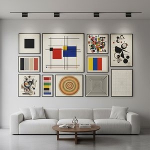
Abstração Geométrica: 10 Obras-Primas que Moldaram a Arte Moderna | OriginalUniqueArt.com
Descubra as 10 obras-primas da Abstração Geométrica que revolucionaram a arte moderna! Explore Kandinsky, Mondrian e outros artistas icônicos. Encontre reproduções de alta qualidade para decorar sua casa com OriginalUniqueArt.com.
Kandinsky: As 25 Obras-Primas que Definem o Abstracionismo | OriginalUniqueArt
Descubra as 25 obras-primas de Wassily Kandinsky, pioneiro da arte abstrata! Explore a história, cores e significado por trás de cada pintura. Encontre reproduções de alta qualidade e inspire sua decoração em OriginalUniqueArt.com.
As 10 Obras Mais Famosas em Tons de Azul Ardósia | OriginalUniqueArt.com
Descubra as 10 pinturas mais emblemáticas em tons de azul ardósia! Explore a história, artistas como Monet e Van Gogh, e o significado da cor na arte. Encontre reproduções de alta qualidade para decorar sua casa com OriginalUniqueArt.com.
Beyond Form & Color: Geometric Abstraction's Evolution in 20th/21st Century Art
Explore the evolution of geometric abstraction from Cubism to contemporary art. Discover key artists like Malevich & Mondrian, investment insights, and expert collecting advice at OriginalUniqueArt.
Kazimir Malevich: As 25 Obras-Primas Essenciais da Arte Abstrata | OriginalUniqueArt
Descubra as 25 obras-primas de Kazimir Malevich, pioneiro do suprematismo e da arte abstrata. Explore a história por trás de 'Black Square' e outras pinturas icônicas. Encontre reproduções de alta qualidade para transformar sua casa com OriginalUniqueArt.com!

