Zobacz w skali 1:1
 Wyślij
 Udostępnij
 Szczegóły
 Przewodnik

 Pobierz plik obrazu
 Podobne obiekty
 RTG
RTG Pokaz slajdów
 Statystyki
Forget it! Forget me!
 Acrylic On Canvas
- WallArt
- Pop Art
 1962
1962- Early Medieval
 203.0 x 172.0 cm
 Czytaj więcej
Dzieło sztuki prezentowane na tej stronie podlega ochronie prawem autorskim, co oznacza, że nie mamy prawa do tworzenia ani sprzedaży jego identycznej reprodukcji. Ochrona ta jest egzekwowana na mocy umów międzynarodowych, takich jak Konwencja berneńska oraz przez przepisy prawa krajowego, w tym te określone w Prawo autorskie USA – Tytuł 17.
Jako pełną szacunku i legalną alternatywę oferujemy personalizowane, malowane ręcznie dzieła sztuki inspirowane oryginałem. Nasi wykwalifikowani i profesjonalni artyści starannie analizują styl, nastrój oraz artystyczną esencję pierwowzoru, aby stworzyć nowe, unikalne dzieło, które przywołuje te same emocje – pozostając jednocześnie w pełni oryginalną kreacją.
Metoda ta jest w pełni zgodna z przepisami prawa autorskiego, ponieważ nie polega na kopiowaniu ani powielaniu chronionego dzieła. Stanowi ona kreatywną reinterpretację – nowy obraz, który czerpie inspirację z oryginału, ale nie jest z nim tożsamy.
Ręcznie malowana reprodukcja olejowa
Ręcznie malowany obraz olejny na płótnie, wykonany na zamówienie przez naszych artystów w wybranym przez Ciebie wymiarze i oprawie. ( Przełącz na wersję drukowaną Przełącz na wersję cyfrową)




P118B zł10

P118H zł10

P118W zł10

P438Z zł10

P508JH zł12

P508YH zł12

P805H zł10

P805Z zł10

P919BZ zł10

P919G zł10

P919XJ zł10

P959ZH zł10

P968JZ zł12

W106C zł8

W218G zł10

W218JH zł8

W218Y zł10

W307PJ zł10

W316G zł10

W316PJ zł8

W316Y zł10

W398PJ zł8

W4111J zł10

W500HY zł15

W500JH zł15

W692G zł12

W849H zł8

W940BG zł15

W953PJ zł8




Wybierz spośród naszych standardowych rozmiarów, które zachowują oryginalne proporcje dzieła sztuki.

Wpisz wymaganą szerokość i wysokość, aby obraz pasował do Twojej ramy lub ściany. Ponieważ jest to dzieło malowane ręcznie, w przypadku rozmiaru o innym proporcji artysta może domalować nieco więcej wokół obrazu lub przyciąć fragmenty — wybór należy do Ciebie. Przed rozpoczęciem pracy prześlemy Ci cyfrową wizualizację do zatwierdzenia. Obraz widoczny na tej stronie nie przedstawia rzeczywistego efektu — jedynie wizualizacja oddaje realny rezultat.
Po złożeniu zamówienia zespół OriginalUniqueArt.com skontaktuje się z klientem drogą mailową w celu uzyskania instrukcji i prześle wizualizację projektu
Dostawa na całym świecie () w ciągu 3–4 tygodni zamiast standardowych 5 tygodni. (23 Październik). Bez kompromisów w kwestii jakości.

Bezpłatna ekspresowa wysyłka na cały świat

Wysokiej jakości płótno lniane

Pełne ubezpieczenie transportowe

Gwarancja zwrotu należności celnych i podatków importowych

Gwarancja idealnego odwzorowania barw

100-dniowy okres na zwrot dzieła w przypadku wykrycia wad produkcyjnych

Gwarancja 100% zwrotu pieniędzy

Oferta przy zakupie wielu sztuk
 Opcja ze szkłem jest dostępna wyłącznie w rozmiarach poniżej 110 cm

Forget it! Forget me!
Technika wykonania
Rozmiar reprodukcji
-


Suma do zapłaty
zł 1151
A Frozen Moment of Disconnection: Exploring “Forget it! Forget me!”
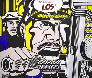
Roy Lichtenstein’s “Forget it! Forget me!”, painted in 1962, isn't merely a depiction of a comic book panel; it’s a carefully constructed meditation on the complexities of human connection and the often-disappointing reality beneath surface communication. This work, a cornerstone of the Pop Art movement, immediately grabs the viewer with its bold, almost jarring color palette – a vibrant clash of blues, yellows, and reds that feels both familiar and unsettlingly artificial. The scene itself is deceptively simple: a man in a blue shirt, seemingly engaged in a serious conversation with a woman sporting blonde hair, while a shadowy figure lurks just out of focus. Yet, within this apparent straightforwardness lies a potent sense of unease, mirroring the emotional distance that can exist even amidst spoken words.
Lichtenstein’s genius lay not in replicating reality but in distilling it to its most recognizable elements and then reassembling them with deliberate artistic intent. He deliberately chose imagery from popular culture – comic books, advertisements, everyday objects – elevating them to the status of fine art. “Forget it! Forget me!” exemplifies this perfectly; by borrowing directly from a comic book format, Lichtenstein critiques the very medium he’s utilizing, questioning its ability to truly convey genuine emotion or understanding.
The Language of Ben-Day Dots and Bold Lines
The painting's distinctive visual language is inextricably linked to Lichtenstein’s signature technique: the use of Ben-Day dots. These meticulously applied dots, mimicking the printing process used in mass-produced comic books, create a textured surface that simultaneously suggests depth and flatness. It’s a fascinating paradox – the image feels both dynamic, as if caught mid-conversation, and static, like a printed page frozen in time. The bold black outlines further emphasize this effect, defining the figures and creating a graphic, almost cartoonish quality. This deliberate simplification of form and color was revolutionary at the time, rejecting the traditional emphasis on realistic representation and embracing a more immediate, accessible style.
- Color Palette: The dominant blues and reds are deliberately heightened, amplifying their emotional impact.
- Ben-Day Dots: These create a unique textural quality and mimic the look of printed comic books.
- Bold Outlines: Define the figures and contribute to the painting’s graphic style.
A Dialogue on Communication and Disconnection
Beyond its technical brilliance, “Forget it! Forget me!” is a poignant commentary on the nature of relationships. The title itself – a dismissive declaration of abandonment – immediately sets a tone of frustration and disappointment. The woman’s attentive posture suggests she's listening, but the man’s averted gaze hints at a deeper disconnect. The shadowy figure in the background could represent unspoken anxieties or unresolved issues, adding another layer of complexity to the scene. Lichtenstein wasn’t simply depicting a conversation; he was exploring the gap between words and meaning, the potential for misunderstanding, and the vulnerability inherent in human interaction.
Considering its creation within the context of 1962, a period marked by rapid social change and increasing consumerism, “Forget it! Forget me!” can be interpreted as a reflection on the anxieties of modern life. The painting’s embrace of popular culture mirrored a broader shift in artistic sensibilities, challenging traditional notions of art and its role in society.
Bringing "Forget it! Forget me!" into Your Space
OriginalUniqueArt offers meticulously crafted hand-painted reproductions of Roy Lichtenstein's “Forget it! Forget me!”, allowing you to experience the power and beauty of this iconic artwork firsthand. Our reproductions faithfully capture the painting’s vibrant colors, distinctive Ben-Day dot technique, and emotional resonance. Available in a range of sizes, from smaller pieces suitable for individual display to larger formats that can command attention in any room, our high-quality prints are perfect for art collectors, interior designers, and anyone seeking to infuse their space with the spirit of Pop Art. Each reproduction is created by skilled artists using archival materials, ensuring its longevity and preserving the integrity of Lichtenstein’s original vision. Invest in a piece of art history – order your “Forget it! Forget me!” reproduction today.
Pytania i odpowiedzi
W jakiej technice wykonano „Forget it! Forget me!” autorstwa Roy Lichtenstein?
Roy Lichtenstein wykorzystał/a technikę Acrylic On Canvas w pracy "Forget it! Forget me!". Technika ta definiuje materię oryginalnego dzieła.
Jakie są rzeczywiste wymiary dzieła „Forget it! Forget me!” autorstwa Roy Lichtenstein?
Oryginalny utwór „Forget it! Forget me!” autorstwa Roy Lichtenstein ma wymiary 203 x 172 cm.
Jaki jest zalecany rozmiatr wydruku dla „Forget it! Forget me!” autorstwa Roy Lichtenstein?
Zalecanym rozmiarem wydruku dla dzieła "Forget it! Forget me!" jest Large. Dostępne są również inne rozmiary o tych samych proporcjach.
Biografia artysty
The Genesis of a Pop Visionary
Roy Fox Lichtenstein, born in the vibrant metropolis of New York City on October 27, 1923, indelibly altered the landscape of twentieth-century art. Emerging as a pivotal figure within the Pop Art movement, Lichtenstein didn’t simply reflect his era; he actively interrogated it, transforming commonplace imagery into compelling artistic statements. His upbringing in an upper-middle-class Jewish family fostered both a cultural awareness and an early artistic inclination. Childhood exposure to museums and concerts, coupled with a deep appreciation for jazz music, laid the groundwork for a creative spirit that would challenge conventional notions of fine art. Though initially drawn to realistic drawing and painting during his formative years, Lichtenstein’s formal training commenced at the Art Students League in 1939 under Reginald Marsh, followed by studies at Ohio State University – interrupted briefly by wartime service in the Army. These experiences provided a robust technical foundation that would later be brilliantly re-contextualized through the lens of mass culture and commercial aesthetics. The seeds of his signature style weren’t sown within the hallowed halls of artistic tradition but rather in the often-overlooked world of everyday imagery, particularly comic books and advertising.From Abstraction to Appropriation: A Pivotal Shift
Lichtenstein's early work demonstrated a clear engagement with Abstract Expressionism, mirroring the dominant aesthetic trends of the post-war period. Figures like Jackson Pollock and Willem de Kooning were significant influences during this phase, reflecting the dynamism and emotional intensity that characterized the movement. However, this phase proved transitional, a stepping stone towards his revolutionary style. A crucial moment arrived during his tenure at Rutgers University where he encountered Allan Kaprow, whose influence reignited Lichtenstein’s interest in proto-pop imagery – artists like Robert Rauschenberg were already experimenting with collage and assemblage. This encounter sparked a critical shift in his artistic trajectory, leading him to question the established boundaries between “high” and “low” art. He began looking beyond the subjective expression of Abstract Expressionism towards the objective language of popular culture – specifically, comic books and advertising. The year 1961 marked a turning point with *Look Mickey*, a work that boldly appropriated characters from Disney comics, signaling the beginning of his signature style. This wasn’t mere imitation; it was an act of artistic re-evaluation, elevating commonplace imagery to the status of fine art. He didn't simply copy comic strips; he meticulously recreated them using techniques mimicking commercial printing processes, a deliberate blurring of the lines between original artwork and mass production. This appropriation wasn’t about celebrating consumerism uncritically but rather examining its pervasive influence on American society and challenging traditional artistic hierarchies.The Language of Ben-Day Dots and Bold Lines
Lichtenstein's artistic vocabulary is instantly recognizable: bold, primary colors, thick black outlines, and most famously, Ben-Day dots – a technique borrowed directly from the mechanical reproduction of comic books. These dots weren’t merely decorative; they were integral to his conceptual framework, representing the very process of mass production and challenging the traditional emphasis on the artist's hand. His paintings often enlarged details from comic strips to monumental scale, forcing viewers to confront the aesthetic qualities of an art form typically dismissed as trivial. Works like *Whaam!* (1963), *Drowning Girl* (1963), and *Oh, Jeff…I Love You, Too…But…* (1964) became iconic representations of Pop Art, capturing the anxieties and desires of a rapidly changing consumer culture. These weren’t simply depictions of comic book scenes; they were commentaries on themes of war, romance, and societal expectations, filtered through the visual language of mass media. He aimed to strip away any pretense of artistic subjectivity, presenting his work as objective reflections of American society – a mirror held up to its own manufactured reality. The deliberate flatness and lack of painterly gesture further emphasized this detachment, mimicking the impersonal nature of commercial printing.Major Achievements and Lasting Impact
Roy Lichtenstein’s influence extends far beyond the realm of painting. His innovative use of commercial techniques and appropriation paved the way for new generations of artists exploring themes of consumerism, media saturation, and cultural identity. The sale of *Masterpiece* in 2017 for $165 million solidified his position as one of the most commercially successful American artists of all time, but his legacy is not solely defined by monetary value. He challenged traditional notions of artistic authorship and originality, forcing a re-evaluation of what constitutes “art” itself. His work continues to inspire graphic designers, illustrators, and visual artists across various disciplines.- Major Achievements: Pioneered Pop Art style; achieved international recognition with groundbreaking exhibitions.
- Notable Works: *Whaam!*, *Drowning Girl*, *Oh, Jeff…I Love You, Too…But…*, *Masterpiece*.
- Teaching Career: Influenced aspiring artists at SUNY Oswego and Rutgers University.

Roy Lichtenstein
1923 - 1997 , Stany Zjednoczone
Najważniejsze informacje
- Artistic Movement Or Style: Pop Art
- Artists Or Movements Influenced By This Artist:
- Graficy
- Ilustratorzy
- Artists Who Influenced This Artist:
- Reginald Marsh
- Allan Kaprow
- Date Of Birth: 27 października 1923
- Date Of Death: 29 września 1997
- Full Name: Roy Fox Lichtenstein
- Nationality: Amerykański
- Notable Artworks:
- Whaam!
- Drowning Girl
- Oh, Jeff...
- Masterpiece
- Place Of Birth: Nowy Jork, USA
Zobacz także powiązane artykuły
Roy Lichtenstein: 25 Arcydzieł Pop Artu dla Kolekcjonerów i Miłośników Sztuki
Odkryj 25 arcydzieł Roy Lichtensteina – ikony pop artu, które zrewolucjonizowały sztukę XX wieku. Poznaj historie, techniki i inspiracje za słynnymi obrazami. Reprodukcje najwyższej jakości na OriginalUniqueArt.com! Eksploruj pełną kolekcję online.
Dots & Screens: The Industrial Secrets Behind 1960s Pop Art Masterpieces
Explore the industrial secrets of 1960s Pop Art. Discover how Ben-Day dots and silk screening transformed mass media into masterpieces by Roy Lichtenstein. An in-depth look at the intersection of mechanical printing and fine art history for students and collectors.

Beyond the Dot: Exploring the Bold Impact of Ben-Day Dots in Modern Art
Dive into the vibrant world of Ben-Day dots. Explore how Roy Lichtenstein transformed mass media imagery into high art, redefining modern aesthetics through the iconic textures of Pop Art and its enduring impact on contemporary visual culture.

The Psychology of the Palette: Decoding Roy Lichtenstein's Bold Color Theory
Explore the psychological depth of Roy Lichtenstein's color theory. An expert analysis for art students and collectors on Ben-Day dots, primary palettes, and the intersection of Pop Art with mass media history.
Beyond the Ben-Day Dots: Roy Lichtenstein's Pop Art Revolution & Enduring Legacy
Explore Roy Lichtenstein's revolutionary Pop Art! Discover the story behind Ben-Day dots, iconic works like 'Whaam!', and investment insights for collectors. Expert analysis & high-quality reproductions at OriginalUniqueArt.