

 Zobacz w skali 1:1
 Wyślij
 Udostępnij
 Szczegóły
 Przewodnik

 Pobierz plik obrazu
 Podobne obiekty
 RTG
RTG Pokaz slajdów
 Statystyki
Oppositions 5, 6, 7, 8
 Acrylic On Canvas
- WallArt
- Oppositions Architecture
 1975
1975 61.0 x 61.0 cm
 Vignelli Center for Design Studies
 Czytaj więcej
Dzieło sztuki prezentowane na tej stronie podlega ochronie prawem autorskim, co oznacza, że nie mamy prawa do tworzenia ani sprzedaży jego identycznej reprodukcji. Ochrona ta jest egzekwowana na mocy umów międzynarodowych, takich jak Konwencja berneńska oraz przez przepisy prawa krajowego, w tym te określone w Prawo autorskie USA – Tytuł 17.
Metoda ta jest w pełni zgodna z przepisami prawa autorskiego, ponieważ nie polega na kopiowaniu ani powielaniu chronionego dzieła. Stanowi ona kreatywną reinterpretację – nowy obraz, który czerpie inspirację z oryginału, ale nie jest z nim tożsamy.
Giclée / Wydruk artystyczny
Wydruki giclée lub płótna o jakości muzealnej, szybka realizacja i szeroki wybór opcji wykończenia. ( Kup ręcznie malowany obraz Przełącz na wersję cyfrową)




P118B zł10

P118H zł10

P118W zł10

P438Z zł10

P508JH zł12

P508YH zł12

P805H zł10

P805Z zł10

P919BZ zł10

P919G zł10

P919XJ zł10

P959ZH zł10

P968JZ zł12

W106C zł8

W218G zł10

W218JH zł8

W218Y zł10

W307PJ zł10

W316G zł10

W316PJ zł8

W316Y zł10

W398PJ zł8

W4111J zł10

W500HY zł15

W500JH zł15

W692G zł12

W849H zł8

W940BG zł15

W953PJ zł8

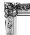

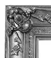
Wybierz spośród naszych standardowych rozmiarów, które zachowują oryginalne proporcje dzieła sztuki.

Wpisz wymaganą szerokość i wysokość, aby dopasować grafikę do ramy lub ściany. Wydruk można jedynie przyciąć, nigdy nie powiększając go poza oryginalny obraz, dlatego format o innym proporcji spowoduje utratę części kompozycji. Przed rozpoczęciem druku prześlemy Ci cyfrowy podgląd do zatwierdzenia. Obraz wyświetlany na tej stronie nie pokazuje rzeczywistego przycięcia — jedynie podgląd oddaje ten efekt.
Dostawa na cały świat () w ciągu 2 tygodni zamiast standardowych 4/5 tygodni. (22 Październik)

Bezpłatna ekspresowa wysyłka na cały świat

Wysokiej jakości płótno lniane

Pełne ubezpieczenie transportowe

Gwarancja zwrotu należności celnych i podatków importowych

Gwarancja idealnego odwzorowania barw

100-dniowy okres na zwrot dzieła w przypadku wykrycia wad produkcyjnych

Gwarancja 100% zwrotu pieniędzy

Oferta przy zakupie wielu sztuk
 Opcja ze szkłem jest dostępna wyłącznie w rozmiarach poniżej 110 cm

Oppositions 5, 6, 7, 8
Giclée / Wydruk artystyczny
Rozmiar reprodukcji
-


Suma do zapłaty
zł 307
The Genesis of a Dialogue: Massimo Vignelli’s “Oppositions”
Massimo Vignelli's "Oppositions 5, 6, 7, 8," created in 1975 for the Institute for Architecture and Urban Studies (IAUS), isn’t merely a poster; it’s a carefully constructed visual argument. Born from a period of intense architectural theory and critique – a time grappling with the shifting landscape of urban design and the role of the architect – this work embodies the IAUS's commitment to fostering rigorous debate and challenging established norms. The piece, designed by Vignelli himself, immediately establishes a sense of controlled chaos, a deliberate juxtaposition of seemingly disparate elements that speaks volumes about the journal’s core mission: to explore the tensions and contradictions within contemporary architecture.
The design's stark simplicity is its most striking feature. A grid-based layout, dominated by bold, sans-serif typography – Vignelli’s signature choice – presents a list of book titles, each meticulously arranged against a muted background. The numbers 5 through 8 are not simply identifiers; they function as anchors, grounding the viewer within the specific issues addressed in that particular iteration of the journal. The subtle use of crossed-out books hints at critical engagement and the inherent limitations of any single perspective – a key tenet of the IAUS’s approach.
A Masterclass in Graphic Minimalism
Vignelli's genius lies not just in his aesthetic choices, but in their profound impact. The limited color palette—primarily shades of gray and white—forces the viewer to focus entirely on the content and the arrangement of the text. The geometric precision of the layout mirrors the principles of modernist architecture, reflecting a belief in clarity, functionality, and rational design. This isn’t decoration; it's an exercise in visual communication, prioritizing information delivery over superfluous embellishment. The use of Helvetica, a typeface chosen for its legibility and neutrality, further reinforces this commitment to clarity – a deliberate rejection of the ornate typography prevalent at the time.
The poster’s design also reflects Vignelli's broader philosophy regarding graphic design: that it should be invisible, serving as a vehicle for the content rather than competing with it. He famously stated, “Design is not about making things beautiful; it’s about making things useful.” This principle is perfectly embodied in "Oppositions," where the visual elements are subordinate to the intellectual discourse they represent.
Historical Context and Architectural Critique
To understand the significance of “Oppositions,” one must consider the context in which it was created. The 1970s were a turbulent period for architecture, marked by debates surrounding postmodernism, deconstructivism, and the role of the architect in shaping urban environments. The IAUS, founded by Peter Eisenman, served as a vital forum for these discussions, bringing together leading architects, theorists, and critics to challenge conventional thinking. “Oppositions” functioned as a visual representation of this intellectual ferment – a condensed distillation of the complex ideas being explored within the journal.
The inclusion of figures like Kenneth Frampton, Mario Gandelsonas, and David Morton highlights the diverse range of perspectives engaged in by the IAUS. These were architects and thinkers who questioned established hierarchies and advocated for a more critical approach to design. The crossed-out books subtly acknowledge that even within this vibrant intellectual community, there would inevitably be disagreements and competing viewpoints.
Symbolism and Enduring Legacy
Beyond its immediate function as a promotional piece, “Oppositions” carries a deeper symbolic weight. The arrangement of the book titles—each representing a specific issue—suggests a complex web of interconnected ideas. The use of numbers creates a sense of order and structure, while the crossed-out books represent the inherent contradictions and unresolved questions within architectural theory. Ultimately, the poster invites viewers to engage in their own critical analysis – to consider the challenges facing architecture and to formulate their own perspectives on the future of design.
Today, “Oppositions 5, 6, 7, 8” stands as a testament to Massimo Vignelli’s enduring legacy. His minimalist aesthetic continues to influence graphic designers worldwide, while his commitment to clarity and intellectual rigor remains remarkably relevant in an increasingly complex world. Reproductions of this iconic poster offer a powerful reminder of the importance of critical thinking and the transformative potential of design.
Pytania i odpowiedzi
Gdzie mogę pobrać „Oppositions 5, 6, 7, 8” autorstwa Massimo Vignelli, Vignelli Associates?
Obraz „Oppositions 5, 6, 7, 8” autorstwa Massimo Vignelli, Vignelli Associates można pobrać ze strony Pobierz dzieła: wysokiej rozdzielczości cyfrowe zdjęcie do pobrania.
Jak kolory w dziele "Oppositions 5, 6, 7, 8" współgrają ze sobą?
Kolory dzieła „Oppositions 5, 6, 7, 8” autorstwa Massimo Vignelli, Vignelli Associates wykazują Strong Color Unity harmonię. Harmonia opisuje wzajemne relacje między kolorami.
Czy kolory w "Oppositions 5, 6, 7, 8" wydają się intensywne czy łagodne?
Kolory w „Oppositions 5, 6, 7, 8” autorstwa Massimo Vignelli, Vignelli Associates mają Vivid intensywność.
Biografia artysty
Życie poświęcone formie: Świat Massimo Vignelligiego
Urodzony w 1931 roku w Mediolanie, Massimo Vignelli przeszedł drogę naznaczoną niezłomnym oddaniem zasadom modernizmu. Od najmłodszych lat wykazywał wrodzone zrozumienie dla komunikacji wizualnej, rozpoczynając formalną edukację architektoniczną na Politecnico di Milano, a następnie kontynuując ją na Università Iuvan di Venezia. Jednak to właśnie praktyka u szanowanych braci Castiglioni – pionierów włoskiego designu przemysłowego – prawdziwie rozbudziła w nim pasję do kształtowania świata poprzez przemyślaną kreację. Ta wczesna ekspozycja zaszczepiła w nim głęboką wiarę w funkcjonalność, prostotę oraz moc eleganckich rozwiązań dla codziennych problemów. Nie projektował on jedynie przedmiotów; on tworzył doświadczenia, usprawniał interakcje i podnosił to, co pospolite, do rangi czegoś niezapomnianego. Ten formacyjny okres położył fundamenty pod karierę, która miała na zawsze przedefiniować kulturę wizualną na wielu kontynentach.Z Włoch do Nowego Jorku: Transatlantycka Wizja
Droga Vignelligiego zaprowadziła go do Ameryki w 1966 roku, gdzie odegrał kluczową rolę w założeniu nowojorskiego biura Unimark International. Był to moment przełomowy, nie tylko dla jego własnej kariery, ale także dla całego krajobrazu amerykańskiego designu. Firma Unimark szybko zdobyła uznanie, a dokonania Vignelligiego – z niezwykle trwałym logo American Airlines na czele – ugruntowały jego reputację jako mistrza identyfikacji korporacyjnej. Jednak narastające rozbieżności w filozofii twórczej skłoniły go do podjęcia niezależnej inicjatywy. W 1971 roku, wraz z żoną i dożywotnią współpracowniczką, Lellą Vignelli, założył Vignelli Associates. To partnerstwo okazało się niezwykle owocne, stając się synonimem wyrafinowanych rozwiązań projektowych obejmujących grafikę, projektowanie wnętrz, produkty oraz architekturę. Etyka firmy wyrastała z przekonania, że dobry design powinien być dostępny, ponadczasowy i głęboko użyteczny – zasad, których niezmiennie bronili przez całe swoje życie zawodowe.Trwały wpływ: Poza estetykę
Oddziaływanie Massimo Vignelligiego wykracza daleko poza pojedyncze projekty; on fundamentalnie zmienił sposób, w jaki postrzegamy sam design. Był zagorzałym zwolennikiem dyscypliny typograficznej, słynąc z postulowania ograniczonej palety krojów pisma – wierzył bowiem, że prawdziwa kreatywność nie polega na nieskończonym wyborze, lecz na mistrzowskiej egzekucji przy użyciu starannie dobranych narzędzi. Jego książka, *The Vignelli Canon*, stała się manifestem dla projektantów, nakreślającym zasady klarowności, prostoty i trwałej elegancji. Nie tworzył on jedynie estetycznych obiektów; dążył do zaprowadzenia porządku w chaosie, do skutecznej komunikacji i podniesienia ludzkiego doświadczenia poprzez przemyślaną formę. Jego praca nieustannie inspiruje kolejne pokolenia twórców, przypominając im, że prawdziwa innowacja tkwi w odrzuceniu tego, co zbędne, i skupieniu się na tym, co istotne. Vignelli Center for Design Studies na Rochester Institute of Technology stanowi trwały hołd dla jego dziedzictwa, przechowując bogate archiwum jego dokonań i wspierając dalsze badania nad jego przełomowymi ideami. Choć odszedł w 2014 roku, jego projekty pozostają niezwykle obecne, kształtując nasz świat swoją ponadczasową elegancją i niezachwianym dążeniem do jasności przekazu.
Massimo Vignelli, Vignelli Associates
1931 - 2014 , Włochy
Najważniejsze informacje
- Artistic Movement Or Style: Modernism
- Artists Or Movements Influenced By This Artist: ['Heinz Waibl']
- Artists Who Influenced This Artist:
- Achille Castiglioni
- Pier Giacomo Castiglioni
- Date Of Birth: 1931
- Full Name: Massimo Vignelli
- Nationality: Italian
- Notable Artworks:
- American Airlines logo
- NYC Subway map
- Bloomingdale's paper bag
- Place Of Birth: Milan, Italy
Zobacz także powiązane artykuły
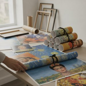
OriginalUniqueArt.com F.A.Q.: Premium Art Poster Prints – Vivid Colors & Versatile Sizing
Discover OriginalUniqueArt.com's premium art poster prints. Featuring 12-color archival pigments for vivid color fidelity and versatile sizing for bespoke decor. Expertly crafted museum-quality reproductions designed for discerning collectors and professional decorators.


