Oljeversjon
 Alt om Untitled

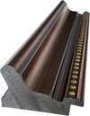
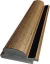

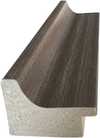
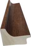
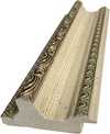
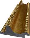
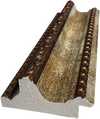
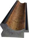
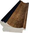
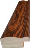
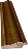

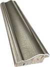
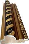

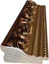
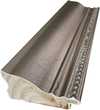

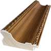
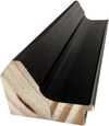
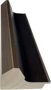
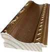
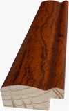
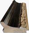
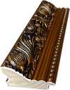
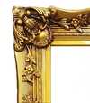
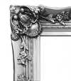

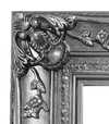


 For kunstverk eller reproduksjoner som er større enn 105 cm (ca. 41 tommer) på noen side, vil rammen bli sendt som et sett som må monteres. Denne metoden sikrer trygg levering og forhindrer skader under transport.


The Creation of Untitled by Mark Rothko
To understand Untitled, one must look toward the origins of Mark Rothko. He was born in 1903 in a place now known as Daugavpils, Latvia. His early years were shaped by the atmosphere of the Pale of Settlement, a region marked by political unrest and the constant shadow of pogroms. This sense of instability followed his family when they emigrated to the United States in 1913, eventually settling in Portland, Oregon. These formative experiences of displacement and loss became a quiet foundation for the man he would become.
By 1953, Rothko had moved into a period of profound abstraction. He painted Untitled during this time, a year that sits within his prolific New York period. The work emerged from a long transition away from the structured realism of his youth. He had moved past the depiction of urban scenes and portraits, seeking instead a way to express the weight of human experience without relying on the literal shapes of the physical world. This shift allowed him to focus on the internal landscape of emotion.
The artist continued to refine this language of color until his death in 1970. In Untitled, we see the result of this lifelong search for a direct encounter with the viewer. He stripped away titles that might suggest a specific narrative, leaving us to face the pigment itself. The canvas becomes a space for quiet, heavy presence, inviting a confrontation with the fundamental mysteries of existence.
Visual Composition and Color Fields
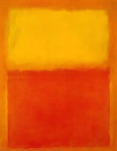
The canvas presents a large-scale encounter with two primary chromatic zones. A yellow background dominates the majority of the space, providing a luminous foundation for the composition. Overlaid upon this expanse is a section of red paint, which occupies a smaller area and is positioned toward the right side of the work. This arrangement creates a deliberate imbalance, drawing the eye across the field of color.
The interaction between these two sections is marked by a sense of quiet movement. In certain areas, the red pigment appears to be fading, which lends the surface a weathered quality. This subtle degradation suggests the passage of time, as if the colors are slowly receding into the canvas itself. The relationship between the expansive yellow and the concentrated red creates a tension that defines the visual structure of the piece.
Technique and Material Application
To understand this work, one must consider the patient, layered process Rothko employed. He utilized a method known as color field painting, moving away from the heavy, textured brushstrokes of traditional realism. Before any color was applied, he meticulously prepared the canvas with gesso, creating a smooth, receptive surface. This preparation allowed him to work with thin washes of oil paint, building the composition through a slow accumulation of pigment. Each layer was applied with a sense of lightness, allowing the colors to interact within the fibers of the cloth.
As the paint dried, it developed a characteristic matte sheen. This finish avoids the aggressive glare of high-gloss oils, instead offering a soft, diffused light that seems to emanate from within the canvas itself. The edges of the rectangular forms are never sharp or defined; they are intentionally blurred and soft. This technique allows the cadmium yellow and crimson to bleed into one another, creating a sense of depth and a breathing, permeable boundary between the hues.
Interpretations of Color and Form
The interaction between the two primary hues suggests a dialogue between opposing human states. The yellow field acts as a beacon, representing enlightenment and optimism. In contrast, the crimson section embodies passion, sacrifice, and primal emotion. These colors do not merely sit side by side; they meet in a way that suggests the tension inherent in the human condition.
The composition relies on the presence of these rectangular blocks to guide the viewer's internal experience. One might see these forms as the boundaries between consciousness and the unconscious. The scale of the canvas is intentional, designed to envelop the person standing before it. This immersion encourages a meditative state, where the viewer is no longer an observer but a participant in the space created by the pigment.
Related Works by Mark Rothko
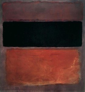
To understand the evolution of this period, one might look toward his later explorations of color and scale. In 1956, he produced Orange and yellow, a work that continues his investigation into how luminous hues interact within a defined space. His practice also moved toward more specific, numbered compositions, such as No. 5 No. 22, which demonstrate his commitment to the language of abstraction through the use of large, breathing rectangular forms.
The artist also engaged deeply with the architecture of specific environments. He developed the Seagram murals, a series of paintings intended for a New York restaurant, though he eventually chose to donate them to the Tate Gallery in London. Similarly, his interest in how color occupies a room led to the creation of the Harvard Mural series, designed for a dining room at the Holyoke Center. These large-scale projects show his desire to create an immersive atmosphere where the viewer is enveloped by the presence of the paint.
Where to See This Artwork Today
This specific canvas, created around 1953, resides within the permanent collection of the Guggenheim Museum Bilbao. Located in Bilbao, Spain, the museum provides a space where this work can be experienced in its intended scale. The institution is part of the Solomon R. Guggenheim Foundation and maintains a collection that spans the 20th and 21st centuries.
Visiting the museum allows for a direct encounter with the subtle shifts in color that define this piece. The architecture of the building provides a contemporary setting for such a significant work of the mid-twentieth century. It remains a central part of the museum's holdings, offering a quiet moment of reflection within the broader context of modern and contemporary art.
Spørsmål og svar
Er Untitled malt for hånd eller er det et trykk?
Håndmalt: en utdannet kunstner kopierer Untitled i olje på linlerret.
Hvilken størrelse bør jeg velge for Untitled?
Originalen måler 442 x 299 cm. Størrelsene varierer fra 25.9 x 38.6 cm (Nkr1859) til 165.2 x 246.2 cm (Nkr14132); tabellen på denne siden viser de viktigste alternativene og deres priser.
Hvor lang tid tar leveringen?
Levering tar 4 til 5 uker med gratis ekspressfrakt over hele verden; en mulighet for hurtigproduksjon tilbys på denne siden. Du kan returnere varen innen 100 dager for full refusjon, uten betingelser.
Hvor befinner originalen av Untitled seg?
Originalen er i samlingen til Guggenheim Museum Bilbao, Bilbao.
Hvilket medium brukte Mark Rothko for Untitled?
Oil On Canvas
 Forhåndsvisning

 Send
 Del
 Vis detaljer
 Faktablad


 Last ned bilde
 Liknende objekter
 Røntgenundersøkelse
 Lysbildefremvisning
 Spørsmål og svar

 Statistikk