Forhåndsvisning
 Send
Send Del
Del
 Vis detaljer
 Utskriftsvennlig guide

 Last ned bilde
 Liknende objekter
 Røntgenundersøkelse
 Lysbildefremvisning
 Q&A
Q&A Statistikk
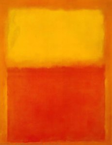
Ochre and Red on Red


 Vis hele teksten
Kunstverket som vises på denne siden er beskyttet av opphavsretten, noe som betyr at vi ikke har juridisk tillatelse til å lage eller selge identiske reproduksjoner. Denne beskyttelsen håndheves i henhold til internasjonale avtaler som for eksempel Bernerkonvensjonen og av nasjonale lover, inkludert de som er fastsatt i Amerikansk lov om opphavsrett – Tittel 17.
Som et respektfullt og lovlig alternativ tilbyr vi skreddersydde, håndmalte kunstverk inspirert av originalen. Våre dyktige og profesjonelle kunstnere studerer nøye originalens stil, stemning og kunstneriske essens for å skape et nytt og unikt verk som vekker den samme følelsen – samtidig som det forblir en original skapelse i seg selv.
Denne metoden er i fullt samsvar med opphavsrettslige regler, da den ikke innebærer kopiering eller duplisering av det beskyttede kunstverket. I stedet er det snakk om en kreativ nytolkning – et nytt maleri som er inspirert av originalen, men ikke identisk med den.
Håndlaget oljereproduksjon
Håndmalt olje på lerret i din valgte størrelse og ramme, laget på bestilling av våre kunstnere. ( Bytt til trykk Bytt til digitalt bilde)




P118B Nkr10

P118H Nkr10

P118W Nkr10

P438Z Nkr10

P508JH Nkr12

P508YH Nkr12

P805H Nkr10

P805Z Nkr10

P919BZ Nkr10

P919G Nkr10

P919XJ Nkr10

P959ZH Nkr10

P968JZ Nkr12

W106C Nkr8

W218G Nkr10

W218JH Nkr8

W218Y Nkr10

W307PJ Nkr10

W316G Nkr10

W316PJ Nkr8

W316Y Nkr10

W398PJ Nkr8

W4111J Nkr10

W500HY Nkr15

W500JH Nkr15

W692G Nkr12

W849H Nkr8

W940BG Nkr15

W953PJ Nkr8




Velg mellom våre forhåndsdefinerte størrelser som bevarer kunstverkets opprinnelige proporsjoner.

Skriv inn ønsket bredde og høyde for å tilpasse bildet til din ramme eller vegg. Siden dette er håndmalt, kan kunstneren male litt mer rundt motivet eller beskjære det noe dersom du velger et annet format — valget er ditt. Vi sender deg en digital mockup til godkjenning før maleriet påbegynnes. Bildet som vises på denne siden representerer ikke det faktiske resultatet — kun mockuppen viser det endelige uttrykket.
Etter bestilling vil OriginalUniqueArt.com-teamet sende e-post til kunden for instruksjoner og sende et utkast (mockup) som forhåndsvisning.
Verdensomspennende levering () på 3–4 uker i stedet for standard 5 uker. (29 October). Ingen kompromisser med kvaliteten.

Gratis ekspressfrakt over hele verden

Lerretsduk av lin av høy kvalitet

Full transportforsikring

Garanti for refusjon av toll og importavgifter

Garantert fargegjengivelse

100 dagers returrett ved fabrikasjonsfeil

100% pengene tilbake-garanti

Rabatt ved flere kjøp
 Glassalternativet er kun tilgjengelig i størrelser under 110 cm

Ochre and Red on Red
Trykkmetode
Størrelse på reproduksjon
-


Totalpris for valgte alternativer
Nkr 2879
A Symphony of Crimson and Amber
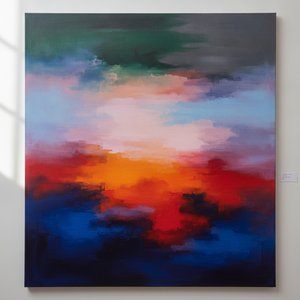
In the quiet, profound realm of Abstract Expressionism, few works command the soul quite like Mark Rothko’s Ochre and Red on Red. Created in 1954, this square composition serves as a masterful testament to the artist's lifelong pursuit of distilling the most complex human emotions into the purity of color. The painting immediately arrests the viewer with its striking, dualistic nature; a rich, terracotta ochre anchors the left side of the canvas, standing in powerful contrast against a field of fiery crimson. From the right, a luminous amber radiates a sense of warmth, creating a visual dialogue that feels both ancient and immediate. It is not merely a painting of pigment on canvas, but a meditative window into a deeper psychological state.
The technique employed here is a hallmark of the Color Field movement, where Rothko eschewed representational imagery to focus entirely on emotional resonance. Through the meticulous layering of thin, translucent washes of pigment, he achieved a velvety surface that seems to absorb light rather than reflect it. These soft, blurred boundaries between the blocks of color allow the hues to hover and breathe, creating an ethereal depth that invites the eye to wander endlessly. This method creates a sense of meditative stillness, where the edges of the shapes appear to vibrate against one another, pulling the spectator into a hypnotic rhythm.
Symbolism and the Human Experience
Beyond its visual splendor, Ochre and Red on Red is laden with profound symbolic weight. The deliberate juxtaposition of red and orange serves as a landscape of human consciousness. The deep reds evoke passion, vitality, and the primal intensity of life’s most visceral emotions—echoes of the artist's own experiences with loss and displacement. Conversely, the amber and ochre tones embody warmth, spiritual illumination, and a sense of optimism. Within this square format, these opposing forces—desire and serenity, suffering and hope—interact in a dynamic tension that reflects the inherent complexities of our existence.
For the collector or the interior designer, this artwork offers an unparalleled opportunity to introduce depth and emotional gravity into a space. Its muted yet vibrant palette lends itself beautifully to creating sanctuaries for contemplation, such as bedrooms or meditation rooms. When placed within a minimalist setting, perhaps paired with neutral tones like beige or gray, the painting acts as a focal point of profound introspection. To possess a high-quality reproduction of this work is to bring a piece of eternity into the home, allowing the transformative power of Rothko’s vision to resonate through the walls of one's private environment.
Spørsmål og svar
Hvor intense er fargene i "Ochre and Red on Red" av Mark Rothko?
Fargeintensiteten i "Ochre and Red on Red" er Vivid. Intensitet beskriver hvor sterke fargene fremstår.
Hva er dateringen til "Ochre and Red on Red" av Mark Rothko?
"Ochre and Red on Red" av Mark Rothko ble skapt i 1954.
Hvilken kunstretning tilhører "Ochre and Red on Red" av Mark Rothko?
"Ochre and Red on Red" er et verk innenfor Abstract Expressionism. Retningen angir den kunstneriske tradisjonen verket er en del av.
Om kunstneren
Early Life and the Seeds of Artistic Vision
Mark Rothko, born Markus Yakovlevich Rothkowitz in Dvinsk, Latvia, in 1903, carried within him from the outset a sense of displacement that would profoundly shape his artistic journey. His early years were marked by the anxieties of a Jewish family living within the Pale of Settlement, shadowed by pogroms and political unrest. This atmosphere instilled a deep sensitivity to human suffering, a theme that would resonate throughout his oeuvre. The 1913 immigration to Portland, Oregon, represented not just a geographical shift but a cultural upheaval for the young Rothko. While his father, a pharmacist and intellectual with socialist leanings, fostered a home filled with debate and learning, the loss of Jacob Rothkowitz shortly after their arrival cast a long shadow. This early experience of loss, coupled with the challenges of assimilation, fueled a lifelong exploration of existential themes – mortality, trauma, and the search for meaning in a chaotic world. Though he excelled academically at Yale University, Rothko found himself drawn more to the vibrant energy of New York City, abandoning formal studies to pursue his passion for art at the Art Students League. These formative years laid the groundwork for an artistic vision that would ultimately challenge conventional notions of painting and redefine the emotional power of color.From Figurative Beginnings to Abstract Expressionism
Rothko’s initial artistic explorations were firmly rooted in realism, depicting urban scenes and portraits with a keen eye for detail. However, these early works already hinted at the psychological depth that would become his hallmark. As the 1940s unfolded, and the world grappled with the horrors of World War II, Rothko’s art underwent a dramatic transformation. Influenced by Surrealism and mythology, he began to move away from representational imagery, seeking instead to express universal human emotions through symbolic forms. This period saw the emergence of multi-form paintings – canvases populated by ambiguous, biomorphic shapes that seemed to hover between figuration and abstraction. These works were not merely experiments in form; they were deeply felt responses to the anxieties and uncertainties of a world at war. By the late 1940s, Rothko had arrived at his signature style: large-scale canvases featuring rectangular blocks of color that appeared to float and resonate with one another. He stripped away all vestiges of recognizable imagery, focusing instead on the pure emotional impact of color and form. This marked a pivotal moment in the development of Abstract Expressionism, and established Rothko as a leading figure in this groundbreaking movement.The Color Field and the Pursuit of Transcendence
Rothko’s mature work is defined by what came to be known as “Color Field” painting – vast expanses of luminous color that envelop the viewer in an immersive experience. These paintings are not about *what* they depict, but rather *how* they make you feel. Rothko believed that art should engage the viewer viscerally, bypassing intellectual analysis and speaking directly to the emotions. He meticulously layered thin washes of paint, creating subtle variations in tone and texture that seemed to emanate from within the canvas. The edges of his rectangular forms are often blurred, allowing them to blend and interact with one another, creating a sense of depth and movement. Rothko deliberately avoided titles beyond numbers – “No. 1,” “No. 6” – encouraging viewers to confront the paintings without preconceived notions and allow their own emotional responses to guide their experience. He sought to create a space for contemplation, a sanctuary where viewers could connect with something larger than themselves. His ambition was nothing less than to evoke profound spiritual experiences through the language of color.Major Achievements and Lasting Legacy
Among Rothko’s most significant achievements are “No. 10 (1950),” a pivotal work that exemplifies his evolving style, and the Seagram Murals (1958). Commissioned for the Four Seasons Restaurant in New York City, these murals were ultimately rejected by Rothko, who felt they would be compromised by their intended environment. He instead donated them to the Tate Gallery in London, where they continue to inspire awe and contemplation. Perhaps his most ambitious project was the Rothko Chapel (1971) in Houston, Texas – a non-denominational sanctuary housing fourteen of his paintings. Designed as a space for quiet reflection, the chapel is considered a sacred place by many, embodying Rothko’s belief in the spiritual power of art. Rothko's influence on subsequent generations of artists has been immense. He paved the way for Minimalist art and continues to inspire contemporary painters who explore the emotional possibilities of abstraction. Despite struggling with depression throughout his life, culminating in his tragic suicide in 1970, Mark Rothko remains one of the most important and influential artists of the 20th century – a master of color whose work continues to resonate with audiences around the world. ## The Enduring Power of Emotional Resonance- Rothko’s paintings are celebrated for their ability to convey universal human emotions—tragedy, ecstasy, despair, and hope.
- His exploration of color as a vehicle for emotional expression revolutionized abstract painting.
- The Rothko Chapel stands as a testament to his belief in the spiritual power of art.
- He remains a pivotal figure in Abstract Expressionism and a major influence on contemporary artists.

Mark Rothko
1903 - 1970 , Latvia
Kort om kunstneren
- Artistic Movement Or Style: Color Field Painting
- Artists Or Movements Influenced By This Artist: ['Minimalism']
- Date Of Birth: September 25, 1903
- Date Of Death: February 25, 1970
- Full Name: Markus Yakovlevich Rothkowitz
- Nationality: Russisk Empire- Amerikansk (fra 1938)
- Notable Artworks:
- No. 10 (1950)
- Seagram Murals
- Rothko Chapel
- Place Of Birth: Dvinsk, Latvia
Relaterte artikler

The Sublimity of Color: Exploring the Emotional Landscapes of Mark Rothko's Abstract Expressionism
Explore the profound emotional depth of Mark Rothko's abstract expressionism. Discover the history, techniques & lasting impact of this pivotal Color Field painter. Expert insights for collectors and art enthusiasts.
Mark Rothkos 25 Mesterverk: Følelser i Farge – Kunst for Ditt Hjem | OriginalUniqueArt.no
Oppdag Mark Rothkos 25 mest ikoniske malerier! Fordyp deg i abstrakt ekspresjonisme, fargefeltmaling og emosjonell kunsthistorie. Finn inspirasjon til ditt hjem med museumskvalitets reproduksjoner på OriginalUniqueArt.com.
Kandinskys 25 Mesterverk: En Reise i Abstrakt Kunst og Fargeharmoni | OriginalUniqueArt.no
Utforsk Wassily Kandinskys 25 mest ikoniske malerier! Oppdag historien bak abstrakt kunst, ekspresjonisme og fargeharmoni. Finn inspirasjon til interiøret – museumskvalitet reproduksjoner på OriginalUniqueArt.com.
Topp 10 mesterverk fra abstrakt ekspresjonisme – Kunst for ditt hjem | OriginalUniqueArt.no
Oppdag de 10 mest ikoniske verkene fra abstrakt ekspresjonisme! Lær historien bak Jackson Pollock, Mark Rothko og andre mestere. Finn kunsttrykk av høy kvalitet for ditt hjem på OriginalUniqueArt.com – museumskvalitet & inspirasjon.
Color Field Painting: The Emotional Power of Pure Abstraction and Chromatic Depth
Explore the profound emotional depth of Color Field painting. Discover the history of mid-century abstraction, from Rothko to Newman, and learn how pure color transforms the viewer's experience through our expert art history guide.