

 Se i rommet
 Del som digitalt kort
 Del
Del
 Detaljer
 Studentguide

 Last ned
 Liknende objekter
 Røntgen
 Lysbildefremvisning
 Besøksstatistikk
Pillars
 Oil On Canvas
- WallArt
- Constructivism
 1928
1928- Modern
 61.0 x 61.0 cm
 Les mer
Kunstverket som vises på denne siden er beskyttet av opphavsretten, noe som betyr at vi ikke har juridisk tillatelse til å lage eller selge identiske reproduksjoner. Denne beskyttelsen håndheves i henhold til internasjonale avtaler som for eksempel Bernerkonvensjonen og av nasjonale lover, inkludert de som er fastsatt i Amerikansk opphavsrettslov – Tittel 17.
Denne metoden er i fullt samsvar med opphavsrettslige regler, da den ikke innebærer kopiering eller duplisering av det beskyttede kunstverket. I stedet er det snakk om en kreativ nytolkning – et nytt maleri som er inspirert av originalen, men ikke identisk med den.
Giclée / Kunsttrykk
Giclée- eller lerretsprint av museumskvalitet med rask produksjon og fleksible valgmuligheter for etterbehandling. ( Bestill håndmalt reproduksjon Gå til digitalt bilde)




P118B Nkr10

P118H Nkr10

P118W Nkr10

P438Z Nkr10

P508JH Nkr12

P508YH Nkr12

P805H Nkr10

P805Z Nkr10

P919BZ Nkr10

P919G Nkr10

P919XJ Nkr10

P959ZH Nkr10

P968JZ Nkr12

W106C Nkr8

W218G Nkr10

W218JH Nkr8

W218Y Nkr10

W307PJ Nkr10

W316G Nkr10

W316PJ Nkr8

W316Y Nkr10

W398PJ Nkr8

W4111J Nkr10

W500HY Nkr15

W500JH Nkr15

W692G Nkr12

W849H Nkr8

W940BG Nkr15

W953PJ Nkr8
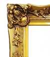
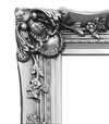

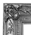
Velg mellom våre forhåndsdefinerte størrelser som bevarer kunstverkets opprinnelige proporsjoner.

Skriv inn bredden og høyden du trenger, slik at den passer til din ramme eller vegg. Et trykk kan kun beskjæres, aldri gjøres større enn bildet, så et format med en annen form vil miste en del av motivet. Vi sender deg en digital mockup for godkjenning før vi trykker noe som helst. Bildet som vises på denne siden viser ikke den faktiske beskjæringen — det er kun mockuppen som gjør det.
Verdensomspennende levering () på 2 uker i stedet for standard 4/5 uker. (22 October)

Gratis ekspressfrakt over hele verden

Lerretsduk av høykvalitets lin

Full transportforsikring

Garanti for refusjon av toll og importavgifter

Garantert fargeekthet

100 dagers returrett ved fabrikasjonsfeil

100% pengene tilbake-garanti

Mengderabatt
 Glassalternativet er kun tilgjengelig i størrelser under 110 cm

Pillars
Giclée / Kunsttrykk
Format på reproduksjon
-


Totalpris
Nkr 758
Josef Albers' Pillars: A Study in Order and Abstraction
Josef Albers’ "Pillars," created in 1928, is a striking example of early geometric abstraction that foreshadows the artist's later explorations of color theory. This artwork, measuring 61 x 61 cm, offers a compelling glimpse into Albers' artistic development during his time at the Bauhaus, a period marked by experimentation and a shift towards non-objective art.
Historical Context: The Bauhaus Influence
Albers’ journey as an artist was significantly shaped by his enrollment in the Bauhaus school in 1920. This progressive institution championed innovative educational ideas and fostered a climate of creative exploration. Initially studying painting at a traditional art school, Albers quickly gravitated towards the glass workshop within the Bauhaus, disregarding the prescribed wall painting class. It was here that he began creating "wall glass paintings"—assemblages of opaque glass—which served as precursors to his later color studies. “Pillars” reflects this early experimentation with form and material, demonstrating a move away from representational art towards pure abstraction.
Visual Analysis: Geometry, Color, and Composition
The artwork presents a meticulously structured composition characterized by vertical and horizontal lines arranged in a grid-like pattern. The color palette is restrained yet impactful, primarily featuring red, white, black, and grey tones with subtle variations. This deliberate choice of colors contributes to the overall sense of order and precision. The symmetrical arrangement emphasizes balance, while crisp, defined lines form rectangles and blocks that intersect, creating a complex visual texture. Notably, "Pillars" lacks traditional perspective or depth; it exists entirely on a flat, two-dimensional plane. The absence of recognizable objects or scenes reinforces the artwork’s purely abstract nature.
Style and Technique: Minimalism and Constructivism
“Pillars” aligns with both Minimalist and Constructivist aesthetics. Its emphasis on geometric forms, clean lines, and a limited color palette are hallmarks of Minimalism. Simultaneously, the structured grid and focus on construction evoke influences from Constructivism, an art movement that prioritized industrial materials and rational design principles. The technique employed appears to be precise painting, likely achieved through careful brushwork or potentially masking techniques to ensure sharp lines. The artwork is executed on canvas, as evidenced by the texture of the wooden backing.
Emotional Impact and Symbolism
While devoid of overt symbolism or emotional narrative, "Pillars" evokes a sense of order, precision, and intellectual rigor. Some viewers may perceive a slightly sterile or clinical aesthetic due to its geometric nature. However, the interplay of colors and forms creates a subtle visual rhythm that engages the viewer's perception. Ultimately, “Pillars” invites contemplation on the fundamental elements of art—line, shape, color—and their capacity to create compelling abstract compositions.
Spørsmål og svar
Er det mulig å laste ned "Pillars"?
Bildet av "Pillars" av Josef Albers kan lastes ned fra verkets Last ned-side: nedlasting av et digitalt bilde i høy oppløsning.
Hvor kan jeg finne statistikk om "Pillars" av Josef Albers?
Siden Statistikk for "Pillars" av Josef Albers presenterer offentlig besøksstatistikk: månedlige besøk for dette kunstverket, en sammenligning med kunstnerens mest viste verk, og hvor de besøkende kommer fra.
Hva er "Pillars" laget med, og i hvilken stil?
"Pillars" av Josef Albers kombinerer Oil On Canvas-teknikken med Constructivism-stilen. Teknikk og stilretning beskriver verkets utførelse og estetiske uttrykk.
Kunstnerbiografi
A Life Forged in Material: The Early Years and Bauhaus Formation
Josef Albers’s artistic journey began not amidst the rarefied air of established academies, but within the pragmatic world of his father’s contracting business in Bottrop, Germany. Born in 1888, young Josef absorbed a deep respect for materials – carpentry, plumbing, house-painting – skills that would fundamentally shape his aesthetic sensibility. This wasn't merely vocational training; it was an immersion into the very essence of making, understanding how forms materialized and the inherent qualities within each medium. Before dedicating himself fully to art, Albers spent five years as a schoolteacher, honing patience and pedagogical skill—attributes that would later define his influential teaching career. Formal artistic training commenced at the Königliche Kunstschule in Berlin between 1913 and 1915, where he explored printmaking, painting, and, crucially, stained glass. His early commission, “Rosa Mystica Ora Pro Nobis” (1918), a stunning stained-glass window, foreshadowed his lifelong fascination with the interplay of light and color, hinting at the abstract explorations to come. This initial work wasn’t simply decorative; it was an investigation into how light *transformed* material, a theme that would resonate throughout his career.The Bauhaus Crucible: Color as Subject
A pivotal moment arrived in 1922 when Albers joined the faculty of the Bauhaus, a revolutionary school seeking to unify all artistic disciplines. Initially tasked with teaching the preliminary course – *Werklehre* (workshop practice) – he immersed himself in its core principles: functionalism, geometric abstraction, and material exploration. This period proved transformative. Albers began a systematic investigation into color perception, moving away from representational art towards an increasingly abstract vocabulary. He wasn’t interested merely in *what* colors were, but *how* they interacted, how they influenced each other, and how our eyes perceived them. The influence of fellow Bauhaus masters like Paul Klee and Wassily Kandinsky is discernible in his early work, yet Albers charted a unique course, prioritizing empirical observation over metaphysical interpretation. He wasn’t seeking spiritual truths through color; he was meticulously documenting its physical effects – a scientific rigor that became the hallmark of his artistic method. This focus on perception, on how we *see*, rather than what is *seen*, set him apart and laid the groundwork for his future explorations.Homage to the Square: A Laboratory of Perception
Following a period teaching at Black Mountain College – where he fostered a generation of American artists including Robert Rauschenberg and Cy Twombly – Albers embarked on what would become his most iconic series in 1949: “Homage to the Square.” This ongoing project consisted of paintings featuring nested squares within squares, each iteration exploring subtle variations in color relationships. It’s a deceptively simple premise, but one that belies an incredibly complex and rigorous investigation. The series wasn't intended as a celebration of geometry; rather, it was a laboratory for studying color perception. Albers meticulously documented his experiments, revealing how colors aren't static entities but dynamic forces governing each other through internal logic – often misleading to the eye. A seemingly brighter square might appear to recede while a darker one advances, defying intuitive understanding. This research culminated in his seminal book, “Interaction of Color” (1963), a foundational text still studied by artists and designers today. The book isn’t a treatise on color theory; it's a series of exercises designed to demonstrate how our perception of color is relative and contextual – a testament to Albers’ belief that seeing is not passive, but an active process of interpretation.Chromatic Interactions and Legacy
Albers’s work transcended mere aesthetics; he sought to understand the very mechanisms of visual experience. His later paintings, such as “Gray Instrumentation,” demonstrated his mastery of subtle tonal shifts and spatial relationships, often employing a limited palette to amplify the impact of color interactions. Throughout his career, Albers remained committed to experimentation and rigorous observation, constantly challenging conventional notions of art and perception. He wasn’t simply creating beautiful images; he was constructing systems for understanding how we see. His influence extends far beyond the realm of painting, shaping approaches in graphic design, architecture, and even psychology. Josef Albers died on March 25, 1976, in New Haven, Connecticut, leaving behind a legacy that continues to inspire and challenge artists, designers, and educators alike – a testament to the power of observation, experimentation, and the enduring mystery of color.Notable Works
- Gray Instrumentation I Prospectus (1975): A minimalist monochrome painting exemplifying geometric balance and subtle tonal variations.
- Study for Homage to the Square – Beaming (Date Unknown): A classic example of Albers’s exploration of color interaction within nested squares, evoking a sense of calm and spatial depth.
- Rosa Mystica Ora Pro Nobis (1918): His early stained-glass commission, foreshadowing his lifelong fascination with light and color.

Josef Albers
1888 - 1976 , Tyskland
Kort om kunstneren
- Artistic Movement Or Style: Geometrisk abstraksjon
- Artists Or Movements Influenced By This Artist:
- Minimalisme
- Fargefeltmaleri
- Artists Who Influenced This Artist:
- Paul Klee
- Wassily Kandinsky
- Date Of Birth: 19. mars 1888
- Date Of Death: 25. mars 1976
- Full Name: Josef Albers
- Nationality: Tysk-Amerikansk
- Notable Artworks:
- Homage til Kvadrat
- Grå Instrumentering I
- Rosa Mystica
- Place Of Birth: Bottrop, Tyskland
Relaterte artikler

Beyond Representation: Decoding the Language of Shape and Form in Geometric Abstraction
Master the complexities of Geometric Abstraction. Our expert guide explores the evolution from Cubist deconstruction to Bauhaus precision, decoding the power of shape and form. Perfect for art students seeking deep historical context and academic insight into modern masterpieces.
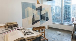
Beyond Form & Color: Geometric Abstraction's Enduring Legacy in Art History
Explore the captivating world of geometric abstraction! Discover its origins, key artists like Malevich & Mondrian, and why this movement remains highly valued by art collectors today. Expert insights at OriginalUniqueArt.

The Power of Less: A Definitive Guide to the Minimalism Movement and Geometric Abstraction
Explore the profound impact of Minimalism and Geometric Abstraction. From Mondrian to Malevich, discover how stripping art to its essential forms revolutionized modern aesthetics through our expert-led historical guide.
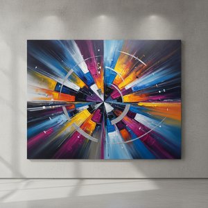
Neo-Abstract Art: The High-Impact Evolution of Modern Visual Energy and Geometric Sophistication
Discover the power of Neo-Abstract art. Explore how bold geometric forms and high-impact visual energy are redefining modern design. Learn to curate sophisticated, high-energy spaces with the latest trends in contemporary abstraction and structural color.
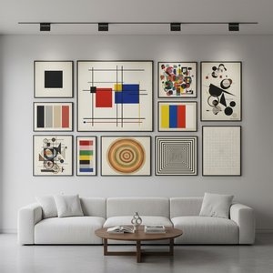
Geometrisk Abstraksjon: Topp 10 Mesterverk for Kunstelskere – OriginalUniqueArt.com
Utforsk de 10 mest innflytelsesrike verkene innen geometrisk abstraksjon! Oppdag historiene bak Mondrian, Kandinsky og Malevich. Finn inspirasjon til interiøret med OriginalUniqueArt.coms eksklusive reproduksjoner – museumskvalitet for ditt hjem. Utforsk samlingen online!