- Pradžia

- Skaitmeninis vaizdas
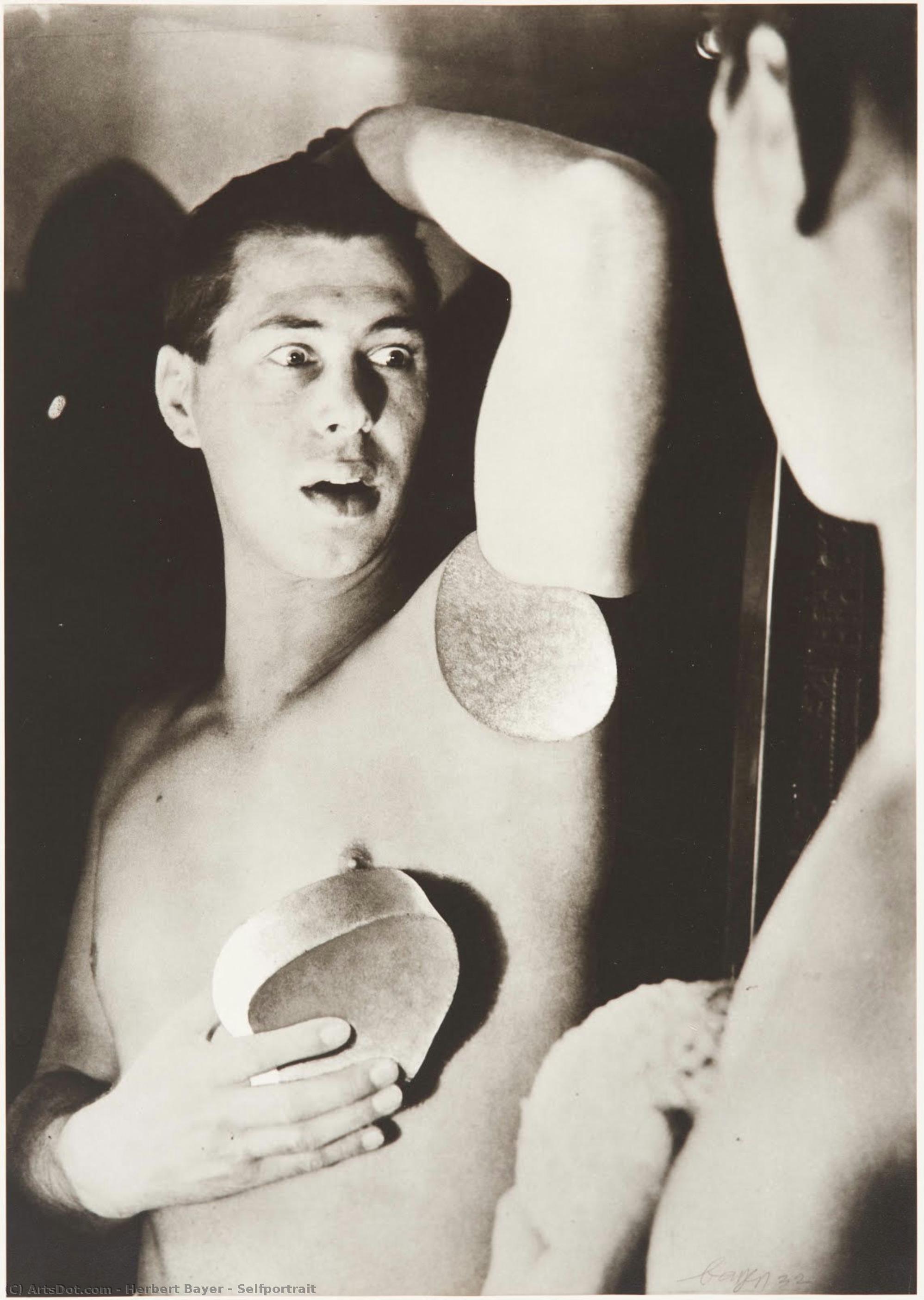
- Herbert Bayer
- Selfportrait
 Pasidalinti
Selfportrait
 1932
1932 5.0 x 28.0 cm
 Lentos Kunstmuseum Linz
Įsigykite aukštos skiriamosios raiškos, patobulintą skaitmeninį vaizdą, gerokai pranašesnį už internetinę peržiūrą.
Kiekvieną failą mūsų specialistai kruopščiai paruošia naudojant pažangias technologijas ir profesionalų rankinį retušavimą. Užtikriname, kad kiekvienas vaizdas pasižymėtų išskirtiniu aiškumu, tikslia spalvų atspalviu ir smulkiomis detalėmis.
Baigiamas failas el. paštu pristatomas per 72 valandas; jis optimizuotas nedelsiant naudojimui profesionalioje, redakcinėje ir spausdinimo aplinkoje. Tai ta pati kokybė, kuria pasitiki aukščiausios klasės dizaino studijos, leidyklos ir galerijos.
Skaitmeninis vaizdas
Atsisiųskite didelės raiškos failą asmeniniam naudojimui, spausdinimui ir kūrybiniams projektams.
Kiekvieną skaitinio vaizdo užsakymą papildė
Profesionalus skaitmeninis pristatymas, garantuotas
Pasirinkę OriginalUniqueArt.com, jūs ne tik gaunate paveikslėlį – jūs gaunate profesionaliai patobudintą skaitmeninį kūrinį, sukurtą itin tikniai ir užtikrinantį pasitenkinimą. Štai viską, kas automatiškai pritékia jūsų užsakymui:

Greitas siuntimas el. paštu
Jūsų aukštos raiškos skaitmeninis vaizdo failas bus išsiųstas jums el. paštu per 72 valaudas nuo užsakymo – paruoštas naudojimui be jokių papildomų veiksmų.

Skaitmeninis failas su dirbtiniu intelektu
Jūsų meno kūrinys profesionaliai optimizuojamas naudojant pažangius dirbtinio intelekto įrankius ir rankinį redagavimą, užtikrinant maksimalią detalę, aiškumą ir spalvų tikslumą.

Nemokamas visam laikui pakartotinis siuntimas
Atsitiktinai ištrytikote ar praradote savo failą? Nebijokite – bet kuriuo metu atsiųsime jį jums vėl nemokamai.

Jokio importo mokesčio – niekada
Mėgaukitės savo meno kūriniu akimirka – skaitiniai failai visada yra neapmokestinami, todėl nereikės mokėti muitinės, mokesčių ar pristatymo mokesčių.

Spalvų tikslumo garantija
Naudodami profesionalią įrangą ir spalvų valdymo sistemas, užtikriname, kad jūsų skaitmeninis vaizdas kuo tiksliau atspindėtų originalias spalvas.

60 dienų pasitenkinimo garantija
Jei nebuvate patenkinti savo skaitinio vaizdo, per 60 dienų jį pertaisysime arba grąkinsime 100% sumą – be jokių klausimų.

100% pinigų grąžinimo garantija
Nepat 만족inti? Gaukite visą sumokėtą sumą per 60 dienų nuo skaitmeninio failo gavimo – be jokių papildomų klausimų.

Nuolaidos dideliems užsakymams
Pirkti 3 nuotraukas – pasiūla 10% - Pirkti 5 – pasiūla 15% - Pirkti 10 ir daugiau – pasiūla 20%. Puikiai tinka kūrybiniams projektams, galerijoms bei agentūroms.
Autoriaus biografija
Herbert Bayer: Architect of a Minimalist Vision
Herbert Bayer (1900-1985) stands as a singular figure in 20th-century art and design, a pivotal bridge between the radical experimentation of the Bauhaus and the burgeoning modernism that shaped American culture. Born in The Hague, Croatia (though he later identified primarily with Austria), Bayer’s life was a testament to artistic reinvention, marked by a relentless pursuit of simplification and a profound impact on typography, architecture, and corporate identity. His journey from apprentice under Georg Schmidthammer to director of printing at the Bauhaus, then art director for *Vogue*, and finally as a key figure in shaping the visual language of Atlantic Richfield Company (ARCO), reveals an artist constantly adapting and pushing the boundaries of his craft.
Bayer’s early training at the Weimar Bauhaus was foundational. Immersed in the school's philosophy of “form follows function,” he quickly absorbed the principles of reductive design championed by Walter Gropius. However, it wasn’t merely adherence to established doctrine that defined his approach; Bayer possessed a uniquely intuitive sense for visual communication. He experimented with typography, rejecting traditional hierarchies and embracing a bold, all-lowercase sans-serif style – a deliberate departure from the conventions of the time. This “universal alphabet,” conceived in 1925 but never fully realized as a commercial typeface, remains a cornerstone of his legacy, influencing subsequent type designers like ITC Bauhaus and Architype Bayer.
The Bauhaus Legacy: Typography and Beyond
Bayer’s work at the Bauhaus was characterized by an unwavering commitment to clarity and efficiency. He meticulously redesigned publications for the school, utilizing a crisp, geometric sans-serif typeface that prioritized legibility and reduced visual clutter. This approach extended beyond typography; he explored graphic design principles, advocating for a minimalist aesthetic rooted in geometric abstraction. His designs were not merely decorative but served as tools for effective communication – a philosophy deeply ingrained within the Bauhaus ethos.
Leaving Germany in 1937 due to the rise of Nazism, Bayer found new opportunities in Berlin and later America. He joined *Vogue* magazine’s Berlin office, continuing his exploration of modern design principles. His time in the United States marked a shift towards corporate art direction, culminating in his influential role at ARCO. This period saw him transform the company's visual identity, establishing a sophisticated and instantly recognizable brand through a combination of striking typography, architectural designs, and memorable logos.
ARCO and the Corporate Art Collection
Bayer’s tenure as art director for Atlantic Richfield Company (ARCO) represents perhaps his most significant and enduring achievement. Recognizing the power of visual communication to shape corporate culture, he assembled one of the world's largest and most influential corporate art collections. He wasn’t simply purchasing artwork; he was curating an environment that reflected the company’s values – innovation, dynamism, and a forward-looking perspective.
His influence extended beyond mere selection; Bayer designed the ARCO Plaza headquarters in Los Angeles, incorporating his signature minimalist aesthetic into the building's architecture. He also created iconic visual elements for the company, including its logo and promotional materials. The “Double Ascension” fountain between the twin towers of ARCO Plaza stands as a testament to his creative vision and enduring legacy within the corporate world.
A Lasting Influence: Minimalism and Beyond
Herbert Bayer’s impact on 20th-century design is undeniable. His pioneering work in typography, particularly his development of the all-lowercase sans-serif typeface, continues to influence designers today. His reductive aesthetic—characterized by simplicity, clarity, and geometric abstraction—laid the groundwork for movements like Minimalism and Swiss Style.
Beyond specific techniques, Bayer’s approach to design – a focus on functionality, communication, and visual impact – remains remarkably relevant in our increasingly complex world. He demonstrated that good design isn't about ornamentation; it's about creating meaningful connections between ideas and audiences. His legacy endures not only through his iconic designs but also as an inspiration for generations of artists and designers seeking to shape a more visually compelling future.

Herbert Bayer
1900 - 1985 , Croatia
Trumpai apie šį kūrėją
- Artistic Movement Or Style: Bauhaus, Minimalist
- Artists Or Movements Influenced By This Artist:
- Bauhaus
- ITC Bauhaus
- Artists Who Influenced This Artist: ['Georg Schmidthammer']
- Date Of Birth: 1900
- Date Of Death: 1985
- Full Name: Herbert Bayer
- Nationality: Austrian-American
- Notable Artworks:
- God made the world...
- Aim High
- Shadow on the Steps
- Place Of Birth: The Hague, Croatia

