De Stijl · 1923
Composition (테오 반 되스버그, 1923)
테오 반 되스버그 (1883–1931) 작가의 Composition 1923년에 제작되었습니다. De Stijl 운동에 속합니다. Oil On Canvas(으)로 제작되었습니다. 크기는 41 × 33 cm입니다.
- 1923
- Oil On Canvas
- 41 × 33 cm

 미리보기

 수작업 유화 작품
 공유하기
 공유하기
 가이드 보기


 다운로드
 유사 작품 더 보기
 X-레이
 슬라이드 쇼 보기
 질의응답

 통계 정보
Composition: 핵심 정보
Composition은(는) 무엇을 묘사하고 있나요?
Identification of Composition by Theo van Doesburg
The canvas known as Composition emerges from the mind of Theo van Doesburg, a work that captures a specific moment in 1923. This piece exists as a precise arrangement of form and color, born from a period of intense creative focus. The artist, Theo van Doesburg, brings a sense of equilibrium to the surface, translating abstract thought into a tangible presence. It is a work that demands attention through its structural clarity and its commitment to the principles of the De Stijl movement.
The history of this object is tied to a specific circle of thinkers and patrons. Antony Kok commissioned the work, setting it on its path through the hands of those who shaped the modern era. From there, the painting finds its way into the hands of Bart de Ligt (1883–1938), who becomes its first owner. This transition marks the beginning of a long lineage of stewardship, as the work moves from the artist's studio into a private collection where its presence remains constant.
Every line and color choice within Composition reflects the artist's pursuit of a universal visual language. As we observe the work, we see the direct result of a vision that seeks to strip away the unnecessary to find a fundamental truth. The painting remains a vital part of the history of abstraction, holding the weight of its 1923 origins in every carefully placed rectangle and primary hue.
Visual Composition and Geometric Elements
The canvas unfolds as a precise grid of rectangles, where vertical and horizontal lines intersect to dictate the movement of the eye. There is a profound sense of equilibrium achieved through this arrangement, as non-representational forms find their place within a structured, rhythmic order. The eye moves across the surface, guided by the intersections of these straight lines, finding balance in the way the shapes occupy the space. It is a study in pure geometry, where the subject matter is stripped of any external reference, leaving only the essence of form and relation.
Color acts as the primary force within this structured environment. The palette relies on the fundamental strength of red, yellow, and blue, which anchor the composition. These primary hues interact with a supporting cast of black, white, and grey, creating a tension between the boldest tones and the more neutral shades. The colors appear solid and flat, avoiding any blending or shading, which emphasizes the stark, clean nature of the geometric arrangement. Each rectangle holds its own weight, contributing to a visual language that seeks a universal harmony through simplicity.
Provenance and History of the Object
The history of this work begins in the creative atmosphere of Paris, where it finds its way from the artist's studio into the hands of Bart de Ligt. This acquisition likely occurs in late 1923, marking the start of a long and steady lineage. De Ligt, a man deeply connected to the avant-garde circles of the time, holds the piece within his personal collection until his passing in 1938.
From that moment, the painting enters a quiet, private chapter. It remains within the same family, passing through the hands of descendants for nearly a century. This continuity preserves the work's integrity, keeping it sheltered within a single domestic line since 1923. The colors and forms remain as they were when they first left the artist's side, held in a state of careful preservation through the decades.
Documented Interpretations and Artistic Debates
The canvas captures a moment of profound transition, acting as a key work within the artist's entire oeuvre. It reveals a growing complexity within his purist style, where the rigid logic of geometry begins to dance with a more nuanced sense of equilibrium. One senses the tension between the absolute and the evolving, as the lines and colors find a new, sophisticated rhythm. This evolution suggests a mind moving beyond simple shapes toward a more intricate visual language.
A deep connection between the realm of architecture and the act of painting pulses through the work. The composition feels less like a mere arrangement of pigment and more like a blueprint for a structured reality. This link is no accident; the artist himself articulated the concept behind its creation in the magazine Architectura on 17th July 1923. The painting exists as a bridge, where the spatial logic of built environments meets the spiritual pursuit of pure abstraction.
Related Works by the Same Artist
The evolution of this geometric language unfolds through several other pieces that trace the artist's shifting focus. One can look back to Composition XX from 1920 to see the early movements of these shapes. Nearby in the timeline, the 1923 work Study for a Composition offers a glimpse into the creative process behind these structured arrangements. These works exist as part of a continuous search for balance and order within the frame.
As the years progress, the compositions grow more complex and dynamic. The 1925 Counter composition XIV introduces a different energy to the grid. Later, the Simultaneous Counter-Composition from 1929–1930 pushes the boundaries of the aesthetic even further. Each piece captures a specific moment in a lifelong pursuit of a new visual language, moving from the rigid to the more fluid and experimental.
고해상도 Composition
테오 반 되스버그, Composition (1923). 퍼블릭 도메인
Composition에 관한 질문
테오 반 되스버그의 "Composition" 복제본은 어떤 용도로 활용하기에 좋나요?
테오 반 되스버그의 "Composition"은(는) Geometry(으)로 활용하시기에 가장 좋습니다. 그 외에도 다양한 용도로 사용하실 수 있습니다.
테오 반 되스버그의 "Composition"의 색감은 채도가 높은 편인가요, 아니면 차분한 편인가요?
테오 반 되스버그의 "Composition"은(는) Balanced Soft의 채도로 표현되었습니다.
테오 반 되스버그의 "Composition"은 어느 시대의 작품인가요?
테오 반 되스버그의 "Composition"은(는) Modern 시대의 작품으로, 이 시기는 해당 작품의 역사적 배경을 잘 보여줍니다.
원작 테오 반 되스버그의 "Composition"의 크기는 어떻게 되나요?
테오 반 되스버그의 "Composition"의 원작 크기는 41 x 33 cm입니다. 복제화는 동일한 비율을 유지하면서 다른 크기로도 주문 가능합니다.
테오 반 되스버그의 "Composition" 작품은 어떤 공간에 잘 어울릴까요?
"Composition"의 복제본은 Office에 잘 어울립니다.
테오 반 되스버그의 "Composition"의 어떤 프린트 사이즈가 추천된 공간에 잘 어울릴까요?
Office 공간에는 테오 반 되스버그의 "Composition" 작품을 Small 크기로 인쇄하시는 것을 추천합니다.
테오 반 되스버그은(는) 몇 세에 "Composition"을(를) 제작했을까요?
테오 반 되스버그은(는) 40세에 "Composition"을(를) 제작했습니다. 작가는 1883년에 태어났으며, 이 작품의 제작 연도는 1923년입니다.
테오 반 되스버그의 "Composition"의 색채는 얼마나 강렬한가요?
"Composition"의 색채 강도는 Balanced입니다. 강도는 색상이 얼마나 선명하게 느껴지는지를 나타냅니다.
테오 반 되스버그의 "Composition" 작품에 권장되는 인쇄 설정은 무엇인가요?
테오 반 되스버그의 "Composition" 작품은 Portrait 방향의 Small 크기로 인쇄하는 것을 추천합니다.
아티스트 테오 반 되스버그 소개

1883–1931, 네덜란드
테오 반 되스버그
추상의 설계자: 기하학적 조화 속에 피어난 삶 1883년 네덜란드 위트레흐트에서 크리스티안 에밀 마리 퀴퍼라는 이름으로 태어난 테오 반 뒤스부르흐는 단순한 화가 그 이상이었습니다. 그는 현대 미술의 근간을 재편한 혁명적인 동력이었습니다. 그의 예술적 여정은 인상주의와 후기 인상주의의 잔향 속에서 시작되었으며, 초기에는 빈센트 반 고흐를 연상시키는 주제와 정서적 강렬함을 투영하기도 했습니다. 그러나 이 초기 단계는 그가 남긴 영원한 유산을 정의할 급진적인 변화를 향한 필수적인 디딤돌이자 중요한 서곡이었습니다.
테오 반 되스버그의 다른 작품들
 Counter composition XV1925
 Rhythm of a Russian Dance
 Troelstra1910
 Study for Composition VIII (The Cow)1918
Composition 관련 에세이
 The Geometry of Balance: Decoding Equilibrium and Rhythm in Mondrian’s Neo-PlasticismMaster the logic of Mondrian's Neo-Plasticism through expert analysis of balance and rhythm. Decode the geometry of modern art today.
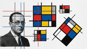 Theo van Doesburg: Pioneering De Stijl & the Evolution of Neo-PlasticismExplore the revolutionary De Stijl movement & Neo-Plasticism with our expert guide. Discover Piet Mondrian, Theo van Doesburg, and the last…
 기하학적 추상 미술을 정의한 명작 10가지 | OriginalUniqueArt.com몬드리안, 말레비치 등 거장들의 기하학적 추상 미술 명작 10선을 만나보세요. 각 작품의 예술사적 의미와 색채, 구성을 탐구하고 OriginalUniqueArt.com에서 고품질 아트 프린트를 소장하세요. 지금 바로 온라인 컬렉션을 확인하세요!