프린트 판매로 전환
 상세 보기
상세 보기




































 가로 또는 세로 중 어느 한 면이라도 105cm(약 41인치)를 초과하는 작품이나 복제화의 경우, 프레임은 분해된 키트 형태로 배송됩니다. 이는 안전한 배송을 보장하고 운송 중 발생할 수 있는 손상을 방지하기 위함입니다.


A Quiet Arrangement of Objects
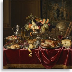
In this 1552 composition, we find ourselves looking closely at a collection of everyday items that seem to occupy the immediate foreground. A vase rests on the left, balanced by a bowl situated in the middle of the scene. Near the center-left area, a bottle is placed alongside a cup toward the right. At the top left corner, a piece of meat provides a heavy, tactile presence among the more delicate vessels. The arrangement feels deliberate, almost as if the objects were set down moments ago for our inspection.
Beyond these inanimate subjects, several people are present within the scene. Two individuals are located on the left side, while another person can be seen near the center-right area. A fourth person is visible towards the right edge of the painting. Their presence introduces a sense of life and depth to the composition, suggesting that this collection of objects exists within a larger, inhabited space.
Technique and Symbolic Resonance
The artist utilizes an oil on panel medium to render these textures with great care. The light catches the surfaces of the ceramic and glass, creating a sense of weight and volume. This approach belongs to the Northern Renaissance style, where the focus remains on the tangible reality of the physical world. Each object is rendered with enough detail to invite a closer look at its form and material. There is an underlying tension in how these elements are organized. The arrangement of items within such a still life often carries weight, representing the relationship between earthly possessions and deeper meanings. By placing human figures alongside these domestic objects, the work blurs the lines between a simple depiction of goods and a narrative involving the people who interact with them. It is a quiet study of presence and absence.
질의응답
피터르 아르트센의 "Still-Life"을(를) 홈 데코에 어떻게 활용할 수 있을까요?
"Still-Life"은(는) Accent 용도로 추천하며, Living Room 공간에 배치하기 좋습니다.
"Still-Life" 작품은 명암 대비가 강한 편인가요?
피터르 아르트센의 "Still-Life"의 대비 수준은 Statement입니다.
"Still-Life"의 색감을 고려했을 때, 어느 공간에 전시하는 것이 가장 좋을까요?
Earthy 색조를 담은 피터르 아르트센의 "Still-Life"는 Living Room에 배치하시길 추천드립니다. 이 작품의 색감이 이러한 제안의 이유이기도 합니다.
More about this painting
 실제 크기로 보기
 보내기
보내기 공유하기
공유하기
 상세 보기
상세 보기 가이드 보기

 이미지 다운로드
 유사 작품 더 보기
 X-레이
X-레이 슬라이드 쇼 보기
 Q&A
Q&A 통계 정보
통계 정보