프린트 판매로 전환
 더 보기
더 보기




































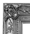


 가로 또는 세로 중 어느 한 면이라도 105cm(약 41인치)를 초과하는 작품이나 복제화의 경우, 프레임은 분해된 키트 형태로 배송됩니다. 이는 안전한 배송을 보장하고 운송 중 발생할 수 있는 손상을 방지하기 위함입니다.


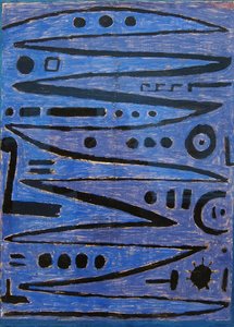
A Symphony in Crimson: The Rhythmic Soul of Paul Klee’s Wall Chart
To encounter Paul Klee’s Wall Chart is to step into a realm where the boundaries between sight and sound begin to dissolve. Painted around 1937, during the profound and transformative years of his Bauhaus period, this masterpiece serves as a captivating exploration of color, pattern, and geometric abstraction. At first glance, the viewer is met with a commanding field of crimson hues—a deliberate and emotive choice that speaks to Klee’s deep fascination with color theory. Yet, beneath this singular wash of red lies a complex, pulsating architecture of intersecting squares and rectangles. Each shape, subtly shaded and textured, contributes to a rhythmic core that feels less like a static image and more like a visual composition, echoing the artist's lifelong connection to musical arrangement.
The technique employed in Wall Chart reveals Klee’s meticulous approach to building depth and tactile presence. Utilizing acrylic paint on canvas, the artist masterfully layered thin, translucent washes of color with thicker, more deliberate impasto strokes. This method creates a palpable surface quality, where light seems to dance across the varying textures of the geometric grid. The result is a dynamic interplay of shadow and luminosity; some squares appear to recede into a dark, velvety abyss, while others emerge with a bright, energetic prominence. For the discerning collector or interior designer, this piece offers an unparalleled sense of movement, making it a sophisticated focal point that breathes life into any curated space.
Order Amidst Chaos: Historical and Symbolic Resonance
Beyond its striking aesthetic, Wall Chart carries a profound historical weight. Created during the tumultuous era leading up to World War II, the painting reflects the broader anxieties of a world on the brink of upheaval. In this period of immense societal instability, Klee sought solace in formal structures and geometric order. The intricate network of shapes can be viewed as an attempt to impose harmony upon chaos, a way to find a stable, rhythmic truth amidst the fragmentation of his time. There is a deep symbolism in this pursuit of balance—a reflection of Klee’s own philosophical inquiry into how art might serve as a sanctuary for the human spirit.
Despite the gravity of its historical context, the work never loses its inherent playfulness. Klee possessed a unique ability to infuse even his most abstract explorations with a sense of lightness and joy. This duality—the tension between structural rigor and spontaneous energy—is what makes Wall Chart so enduringly relevant. It invites the observer to contemplate the hidden rhythms of the universe, finding beauty in the precise alignment of form and the emotive power of pigment. Whether viewed as an academic study in design or a deeply personal expression of resilience, this artwork remains a cornerstone of modern abstraction, offering timeless inspiration for those who seek art that resonates with both intellect and emotion.
질의응답
"Wall Chart"의 주제가 폴 클레 작가의 평소 작업 세계와 어떤 연관이 있나요?
폴 클레의 주요 주제인 expressionist color theory, bauhaus aesthetic principles, symbolic visual language, geometric abstraction forms, exploring inner emotions 중에서도, "Wall Chart"은 geometric pattern, color exploration, red hue dominance, swiss art style, formal composition, abstract expression, visual texture에 독자적인 초점을 맞추고 있습니다.
"Wall Chart"은 어떤 색채와 어떤 감정을 담아내고 있나요?
폴 클레의 "Wall Chart"의 Dark 색조는 작품 특유의 Reflective 분위기와 조화를 이룹니다. 색채는 작품이 감정을 전달하는 핵심적인 요소 중 하나입니다.
폴 클레의 "Wall Chart"의 휘도는 어느 정도인가요?
폴 클레의 "Wall Chart"의 기록된 휘도는 Soft Shadow입니다.
이 작품에 대해 더 알아보기
 미리보기
미리보기
 공유하기
공유하기 공유하기
공유하기
 상세 정보
상세 정보 가이드 보기

 다운로드
다운로드
 유사 작품 더 보기
 X-레이
X-레이 슬라이드 쇼 보기
 질의응답
질의응답 통계 정보
통계 정보