프린트 판매로 전환
 더 보기

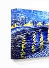


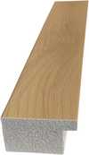



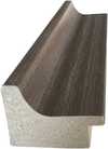

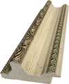
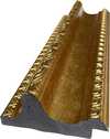
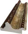
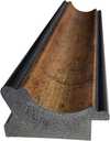
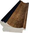




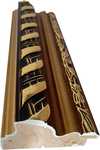

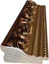


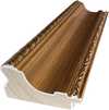
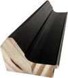








 가로 또는 세로 중 어느 한 면이라도 105cm(약 41인치)를 초과하는 작품이나 복제화의 경우, 프레임은 분해된 키트 형태로 배송됩니다. 이는 안전한 배송을 보장하고 운송 중 발생할 수 있는 손상을 방지하기 위함입니다.


Mark Rothko’s “Memory”: A Descent into Color and Emotion
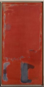
Mark Rothko's "Memory," painted in 1946, isn’t merely a depiction of a scene; it’s an immersion. This monumental abstract expressionist canvas, currently residing within the National Gallery of Art’s collection, invites viewers to confront the complexities of remembrance and the elusive nature of experience itself. Rothko, born Markus Yakovlevich Rothkowitz in Dvinsk, Latvia, carried with him from his early life a profound sense of displacement – a legacy shaped by the turbulent atmosphere of the Pale of Settlement and the subsequent immigration to Portland, Oregon. This inherent sensitivity to human suffering would become a defining characteristic of his work, informing his exploration of existential themes through color and form.
The painting’s foundation is deceptively simple: a vast field of crimson dominates the composition, punctuated by layered rectangles of muted blues and browns. However, this apparent simplicity belies an intricate web of emotional resonance. Rothko wasn't interested in literal representation; instead, he sought to evoke pure feeling through color fields. He described his process as “making blocks of color,” aiming to create a meditative space where the viewer could lose themselves within the painting’s depths. The red, often associated with passion, energy, and even violence – perhaps echoing the anxieties of his early life – acts as an anchor, grounding the composition while simultaneously radiating outward.
The Language of Color: Rothko's Technique
Rothko’s technique was revolutionary for its time. He applied paint in incredibly thin layers, often just a few coats, creating a luminous surface that seemed to glow from within. This layering process, known as “velvet,” resulted in an almost tactile quality – the viewer can practically feel the texture of the paint. The colors themselves are not blended; rather, they sit adjacent to one another, allowing them to bleed subtly into each other, creating a sense of atmospheric depth and movement. He meticulously controlled the edges of his rectangles, often leaving them slightly undefined, contributing to the painting’s ethereal quality. This deliberate lack of sharp boundaries encourages the eye to wander and explore, mirroring the way memories themselves can shift and morph over time.
Symbolism and the Evocation of Memory
While Rothko vehemently resisted any attempt to interpret his paintings literally, “Memory” undeniably speaks to the act of remembering. The layered rectangles can be seen as representing fragments of recollections – shards of experience that coalesce into a larger, more complex whole. The blues suggest melancholy and introspection, while the browns evoke a sense of grounding and stability. The central figure, often described as resembling a woman or an angel, isn’t explicitly defined but rather serves as a focal point for contemplation—a vessel through which the viewer can project their own memories and emotions. It's not about recalling a specific event, but about accessing the *feeling* of remembrance – that bittersweet blend of joy and sorrow that accompanies our recollections.
A Legacy of Emotional Resonance
“Memory” stands as a powerful testament to Rothko’s ability to translate profound emotional experiences into visual form. It's a painting that demands patience, contemplation, and an openness to feeling. Its enduring appeal lies in its capacity to resonate with each viewer on a deeply personal level, prompting us to reflect on our own memories and the complex tapestry of human experience. Today, high-quality reproductions of this iconic work offer art lovers the opportunity to bring Rothko’s evocative vision into their homes, creating spaces that are both visually stunning and emotionally resonant. Consider a hand-painted reproduction – a faithful recreation of Rothko's masterful use of color and texture, allowing you to experience the painting's profound impact in your own environment.
질의응답
"Memory"의 색감은 강렬한 편인가요, 아니면 부드러운 편인가요?
"Memory"의 색채 강도는 Vivid입니다. 강도는 색상이 얼마나 선명하게 느껴지는지를 나타냅니다.
마크 로스코의 "Memory" 작품은 어떤 크기로 프린트하는 것을 추천하시나요?
"Memory" 작품은 Large 크기로 인쇄하는 것을 권장합니다. 동일한 비율의 다른 사이즈로도 제작이 가능합니다.
"Memory"은(는) 마크 로스코의 다른 작품들과 어떤 공통점을 지니고 있나요?
"Memory"은(는) 마크 로스코의 Abstract Expressionism 시기 작품으로, 작가의 주요 주제로는 existentialism, trauma, memory, loss, meaning, jewish heritage, displacement, anxiety 등이 있습니다.
이 작품에 대해 더 알아보기
 미리보기

 공유하기
 공유하기
 상세 정보
 가이드 보기


 다운로드
 유사 작품 더 보기
 X-레이
 슬라이드 쇼 보기
 질의응답
 통계 정보