수작업 채색 복제본 주문하기
 더 보기

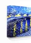
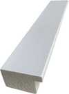
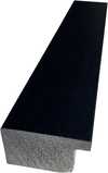
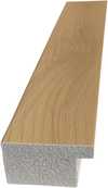



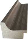
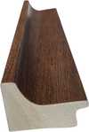
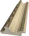


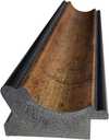















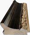




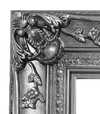


 가로 또는 세로 중 어느 한 면이라도 105cm(약 41인치)를 초과하는 작품이나 복제화의 경우, 프레임은 분해된 키트 형태로 배송됩니다. 이는 안전한 배송을 보장하고 운송 중 발생할 수 있는 손상을 방지하기 위함입니다.


A Kaleidoscope of Perception: Decoding Jasper Johns’ Untitled
Jasper Johns's *Untitled* is not merely a painting; it’s an invitation into a world where the familiar dissolves into abstraction, and perception itself becomes the subject. The artwork presents a vibrant tapestry woven from squares, each brimming with energetic stripes in hues of yellow, red, blue, and white. This isn’t a composition seeking to represent something *other* than itself; rather, it exists as a pure exploration of form, color, and the very act of seeing. The close-up view emphasizes the meticulous construction, hinting at countless hours dedicated to building this intricate visual puzzle. It's a work that demands attention, pulling the viewer in with its dynamic interplay of shapes and shades.
Echoes of Pop Art & Beyond
Born from the post-war American art scene, Johns emerged as a pivotal figure bridging Abstract Expressionism and the burgeoning Pop Art movement. While his predecessors sought emotional catharsis through gestural abstraction, Johns turned inward, questioning the foundations of representation. He famously employed everyday iconography – flags, targets, numbers – not to celebrate them, but to dissect their meaning and challenge our assumptions about what constitutes art. *Untitled* builds upon this legacy, moving away from recognizable symbols towards a more purely formal investigation. The grid-like structure, reminiscent of woven fabric or mosaic tiles, suggests a deliberate attempt to dismantle traditional notions of pictorial space. It’s a subtle rebellion against the perceived freedom of Abstract Expressionism, replacing spontaneity with calculated precision.
Technique and Tactility: A Layered Reality
Though seemingly simple in its premise, *Untitled* reveals layers of complexity upon closer inspection. Johns was renowned for his innovative techniques, often incorporating encaustic – a mixture of wax and pigment – into his oil paintings. While the specific medium used in this particular work remains unspecified, the vibrancy of the colors and the textured surface suggest a rich materiality. The stripes within each square aren’t merely painted; they appear to be built up, creating a subtle relief that catches the light and adds depth. This tactile quality is crucial to understanding Johns's artistic intent. He wasn’t interested in creating an illusionistic space but rather in emphasizing the physicality of the painting itself – its surface, its texture, its very presence as an object.
The Emotional Resonance of Ambiguity
What does *Untitled* mean? That is precisely the question Johns invites us to ponder. Unlike art that explicitly conveys a narrative or emotion, this work remains deliberately ambiguous. It doesn’t offer easy answers; instead, it encourages viewers to project their own interpretations onto its surface. The bright, cheerful colors might evoke feelings of optimism and energy, while the rigid structure could suggest order and control. However, these initial impressions are quickly complicated by the painting's inherent contradictions. Is it a celebration of pattern or a deconstruction of form? A playful exploration of color or a more profound meditation on perception? The beauty of *Untitled* lies in its ability to hold multiple meanings simultaneously, making it a truly captivating and enduring work of art.
질의응답
재스퍼 존스의 "Untitled"의 특징적인 기법과 화풍은 무엇인가요?
재스퍼 존스의 "Untitled"은 Acrylic On Canvas 기법과 Pop Art 양식이 결합된 작품입니다. 기법과 양식은 작품의 제작 방식과 예술적 스타일을 나타냅니다.
"Untitled"을(를) 완성한 예술가와 화풍은 무엇인가요?
재스퍼 존스은(는) Pop Art 운동의 흐름 속에서 "Untitled"을(를) 제작했습니다.
재스퍼 존스의 "Untitled"의 구성을 주도하는 색상은 무엇인가요?
"Untitled"에서 가장 돋보이는 색상은 Cobalt Violet (#495f7e)입니다. 작품의 주된 색상을 활용하면 인테리어와 더욱 조화롭게 연출할 수 있습니다.
이 작품에 대해 더 알아보기
 미리보기

 공유하기
 공유하기
 상세 정보
 가이드 보기


 다운로드
 유사 작품 더 보기
 X-레이
 슬라이드 쇼 보기
 질의응답
 통계 정보