수작업 채색 복제본 주문하기
 더 보기

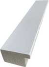
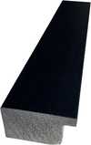
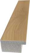
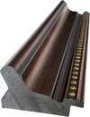
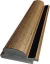
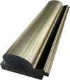
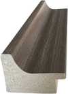
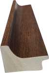
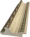
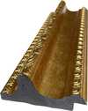
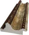
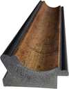
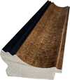
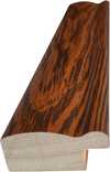
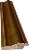
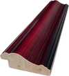
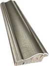
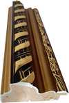
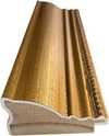
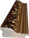
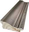
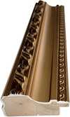
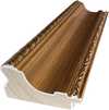
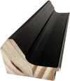
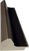
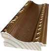
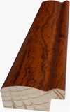
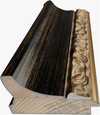
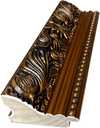

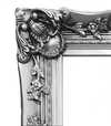
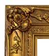
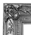


 가로 또는 세로 중 어느 한 면이라도 105cm(약 41인치)를 초과하는 작품이나 복제화의 경우, 프레임은 분해된 키트 형태로 배송됩니다. 이는 안전한 배송을 보장하고 운송 중 발생할 수 있는 손상을 방지하기 위함입니다.


Identification of The Reader by Honoré Daumier
The quiet intensity of The Reader meets the viewer through the focused gaze of its subject. Painted by Honoré Daumier, this work captures a moment of profound stillness. The piece emerges from around c. 1857, a time when the artist's hand moved with a particular sense of purpose and weight. It exists as a painting, a physical presence that holds the light and shadow of a private, contemplative world.
Honoré Daumier brings a sense of lived experience to this study. The figure remains lost in the pages of a book, oblivious to the world outside the frame. There is a weight to the atmosphere, a feeling of solitude that settles over the scene. The work carries the mark of its creation, a tangible connection to the era of its origin.
This specific painting, The Reader, remains a significant part of the artist's visual language. It avoids the distractions of a grand setting to focus entirely on the human condition in a state of deep engagement. Through this work, the act of reading becomes a heavy, significant event, frozen in time for those who stop to look.
Composition and Visual Elements
The composition follows a vertical orientation, drawing the eye immediately to the man positioned slightly off-center. He sits in a moment of profound stillness, his gaze directed steadily downwards toward the open book held in his hands. This downward focus creates a tight, intimate space around his head and shoulders. Behind him, a blurred object, perhaps a cushion or a potted plant, rests in the background, providing a sense of depth without pulling attention away from the central figure.
Soft, diffused light falls from an unseen source above and to the left, casting gentle shadows across the man's face. This lighting emphasizes his features and the texture of the pages before him, while the shallow perspective keeps the viewer's focus firmly on the interaction between the reader and his text. The atmosphere feels quiet and heavy with contemplation.
The color palette relies on a somber arrangement of earthy tones. Deep browns, ochres, and muted reds dominate the scene, grounding the subject in a warm but melancholic environment. These colors wrap around the figure, reinforcing the sense of solitude and the weight of the thoughts contained within the book.
Technique and Physical Materials
The oil paint clings to the panel with a palpable, heavy presence. Each stroke carries the weight of the artist's hand, applied with a loose and expressive energy that refuses to settle into stillness. You can see the evidence of layering, where colors are built upon one another to create a sense of depth and substance. These layers blend into one another, creating soft transitions that suggest the subtle shifts of light across a surface.
A visible roughness defines the texture of the work. The brushstrokes remain unpolished and direct, leaving a tactile quality that speaks to the immediacy of the moment. This ruggedness gives the surface a physical life, where the paint does not merely sit upon the panel but seems to emerge from it. The interplay of these thick applications and the careful blending of tones creates a surface that feels both spontaneous and deeply considered.
질의응답
오노레 도미에의 "The Reader"의 색감은 채도가 높은 편인가요, 아니면 차분한 편인가요?
오노레 도미에의 "The Reader"은(는) Balanced Soft의 채도로 표현되었습니다.
"The Reader"의 작가인 오노레 도미에는 다른 이름으로도 알려져 있나요?
오노레 도미에은(는) 오네레 빅토랭 도미에, 도미애, 도미에라는 이름으로도 활동하고 있습니다.
Office에 "The Reader" 작품을 어떤 사이즈로 배치하는 것이 가장 좋을까요?
Office 공간에는 "The Reader" 작품을 Small 크기로 인쇄하여 배치하는 것을 추천합니다.
이 작품에 대해 더 알아보기
 미리보기

 공유하기
 공유하기
 상세 정보
 가이드 보기


 다운로드
 유사 작품 더 보기
 X-레이
 슬라이드 쇼 보기
 질의응답
 통계 정보