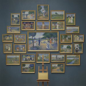
프린트 판매로 전환
 더 보기
더 보기






































 가로 또는 세로 중 어느 한 면이라도 105cm(약 41인치)를 초과하는 작품이나 복제화의 경우, 프레임은 분해된 키트 형태로 배송됩니다. 이는 안전한 배송을 보장하고 운송 중 발생할 수 있는 손상을 방지하기 위함입니다.


A Revolutionary Dot Dance: Unpacking Georges Seurat’s “Untitled (4589)”
Georges Pierre Seurat, born in Paris on December 2, 1859, stands as a monumental figure in the artistic landscape of late nineteenth-century France—a pioneer who irrevocably altered the course of painting and cemented his place amongst the titans of modern art. His brief but intensely productive career championed Pointillism, a groundbreaking technique rooted in scientific observation and driven by an unwavering commitment to capturing the essence of visual perception. More than just pigment on canvas; Seurat’s work embodies a profound intellectual curiosity and represents a decisive break from Impressionistic spontaneity, offering instead a meticulously crafted illusion of light and color that continues to fascinate scholars and artists alike.The Science Behind Brilliance: Chromoluminarism and Optical Mixing
Seurat didn't simply dab dots onto canvas; he embarked on a systematic investigation into how the human eye perceives color. Influenced by Henri Poincaré’s theories of optics, Seurat developed chromoluminarism—the concept that color is not inherent in an object but emerges from the interaction between light and pigment. Rather than blending colors physically on the palette, Seurat applied tiny dots of pure pigment – predominantly complementary hues like red and green – onto successive layers of canvas. This process, known as optical mixing, tricked the eye into perceiving blended colors where none existed, creating a shimmering surface that mimics the natural diffusion of light. It’s this scientific underpinning that distinguishes Pointillism from its Impressionist predecessors and elevates Seurat's artistic vision to something truly extraordinary.A Parisian Snapshot: Contextualizing “Untitled (4589)”
“Untitled (4589)” captures a quintessential scene of Parisian life—a sunlit terrace overlooking a bustling streetscape. Painted in 1886, during the height of Impressionism’s influence but firmly establishing Seurat's own distinctive style, the artwork reflects the optimism and dynamism characteristic of Belle Époque France. The composition is deliberately flattened, prioritizing tonal harmony over realistic depiction—a stylistic choice that aligns perfectly with Seurat’s pursuit of optical precision. Consider the figures themselves: three women engaged in conversation, bathed in warm sunlight, alongside a man seated quietly observing the activity below. These individuals are rendered with meticulous detail, yet their forms remain subtly ambiguous, contributing to the painting's contemplative mood.Symbolism Within Precision: The Significance of Color and Texture
Beyond its technical brilliance, “Untitled (4589)” possesses subtle symbolic resonance. Seurat’s deliberate use of complementary colors—particularly red and green—creates a visual tension that mirrors the complexities of human relationships and social interactions. The textured surface achieved through layering dots of pigment evokes the dappled light filtering through foliage, symbolizing tranquility and beauty amidst urban chaos. Furthermore, the inclusion of birds adds an element of spontaneity and freedom to the scene, hinting at aspirations beyond the confines of everyday life—a testament to Seurat’s belief in art's ability to transcend mere representation and communicate deeper emotional truths.An Enduring Legacy: The Emotional Impact of Light
Ultimately, “Untitled (4589)” succeeds in conveying a profound sense of serenity and contemplation. Despite the vibrant color palette and intricate textural detail, Seurat’s masterful control over light imbues the painting with an ethereal quality—a feeling that captures the fleeting beauty of a summer afternoon. It's this ability to evoke emotion through visual precision that secures Seurat’s place as one of the most influential artists of his era and ensures that “Untitled (4589)” continues to inspire admiration and wonder generations later. Explore a stunning reproduction today!질의응답
조르주 피에르 세라의 "untitled (4589)"의 구성을 주도하는 색상은 무엇인가요?
"untitled (4589)"에서 가장 돋보이는 색상은 Rosy Brown (#b0a281)입니다. 작품의 주된 색상을 활용하면 인테리어와 더욱 조화롭게 연출할 수 있습니다.
제 방에 "untitled (4589)"을(를) 어떤 사이즈로 프린트하는 것이 좋을까요?
Living Room 공간에는 "untitled (4589)" 작품을 Large 크기로 인쇄하여 배치하는 것을 추천합니다.
"untitled (4589)"의 색상들이 서로 어떻게 조화를 이루고 있나요?
조르주 피에르 세라의 "untitled (4589)"의 색채는 Softly Mixed Palette 조화를 보여줍니다. 여기서 조화란 색상들이 서로 어떻게 어우러지는지를 의미합니다.
이 작품에 대해 더 알아보기
 미리보기
미리보기
 공유하기
공유하기 공유하기
공유하기
 상세 정보
상세 정보 가이드 보기

 다운로드
다운로드
 유사 작품 더 보기
 X-레이
X-레이 슬라이드 쇼 보기
 질의응답
질의응답 통계 정보
통계 정보