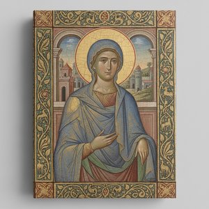
프린트 판매로 전환
 더 보기
더 보기







































 가로 또는 세로 중 어느 한 면이라도 105cm(약 41인치)를 초과하는 작품이나 복제화의 경우, 프레임은 분해된 키트 형태로 배송됩니다. 이는 안전한 배송을 보장하고 운송 중 발생할 수 있는 손상을 방지하기 위함입니다.


The Enigmatic Figure of Fra Carnevale and ‘The Crucifixion’
Fra Carnevale remains one of the most stubbornly elusive figures in the history of Quattrocento art, a painter whose legacy is often overshadowed by scarcity and persistent debate. Born around 1420 in Urbino, he entered the Dominican Order, embarking on a life dedicated to both piety and artistic creation – a combination that profoundly shaped his unique approach to painting. While only nine confirmed works definitively bear his name, each piece whispers of an artist deeply influenced by the burgeoning Renaissance spirit, yet simultaneously possessing a distinctly individual vision. ‘The Crucifixion,’ a tempera-on-panel work dating back to approximately 1450-60, housed within the Galleria Nazionale delle Marche in Urbino, serves as a compelling entry point into this fascinating and often perplexing artistic world.
What immediately strikes the viewer is not a conventional depiction of Christ’s suffering, but rather an architectural framework that dominates the composition. The central figure, undeniably Jesus, is framed by a meticulously rendered, almost claustrophobic space – a series of receding planes and geometric forms that seem to press in upon him. This isn't merely background; it’s a deliberate construction, reflecting Carnevale’s deep engagement with architectural principles, an influence heavily documented through his apprenticeship under Filippo Lippi and later, the study of Piero della Francesca. The perspective is subtly skewed, creating a sense of unease and drawing the eye into the depths of the scene, while simultaneously emphasizing the isolation of the central figure.
Technique and Materials: A Study in Tempera
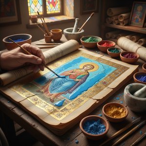
‘The Crucifixion’ exemplifies Carnevale's masterful use of tempera paint on panel. Tempera, a medium combining pigments with egg yolk or other binding agents, offered remarkable durability and color retention – qualities particularly valued by artists working during the Renaissance. Carnevale skillfully layered thin washes of pigment to build up complex textures and gradations of light and shadow, creating an astonishingly realistic effect despite the somewhat flattened appearance characteristic of tempera. The use of gold leaf accents, though subtle, adds a touch of opulence and draws attention to key elements within the composition – notably, the crown of thorns and the folds of Christ’s garment.
The panel itself, likely sourced from a local workshop, provides a sturdy foundation for this intricate work. The surface is prepared with gesso, creating a smooth, receptive layer for the tempera paint. Close examination reveals the artist's meticulous attention to detail, evident in the careful rendering of the textures of the wood and the subtle variations in color within the drapery.
Historical Context: Urbino and Renaissance Innovation
Understanding ‘The Crucifixion’ requires placing it within the context of 15th-century Urbino, a burgeoning center of artistic innovation. The city was experiencing a period of remarkable cultural and economic growth, fueled by the patronage of the Montefeltro family – particularly Federico da Montefeltro, who commissioned numerous works of art to enhance his court’s prestige. Carnevale's work reflects this atmosphere of intellectual curiosity and artistic experimentation, as he engaged with contemporary trends in perspective, architecture, and humanism.
The attribution of ‘The Crucifixion’ to Fra Carnevale has been a subject of scholarly debate for centuries. Initially dismissed by many as a minor artist, recent research – spearheaded by scholars like Giorgio Vasari and Luigi Lanzi – has convincingly established his role as a significant contributor to the artistic landscape of Urbino. His influence on later artists, including Bramante and Raphael, further solidifies his importance within the broader context of Renaissance art.
Symbolism and Emotional Impact
Beyond its technical merits, ‘The Crucifixion’ resonates with profound symbolic weight. The architectural setting serves not merely as a backdrop but as a metaphor for Christ's sacrifice – a structure built to contain and ultimately transcend suffering. The figure of Christ himself is presented with a quiet dignity, devoid of overt emotional display. This restrained portrayal invites contemplation rather than immediate empathy, prompting the viewer to engage in a deeper reflection on the themes of faith, mortality, and redemption.
Despite its somewhat austere appearance, ‘The Crucifixion’ possesses an undeniable power. The carefully constructed space draws the eye inward, creating a sense of intimacy and encouraging a meditative response. It is a work that rewards careful observation and invites repeated viewing – revealing new layers of meaning with each encounter.
질의응답
프라 카르나발레의 "The Crucifixion"의 작품 방향(가로/세로)은 어떻게 되나요?
프라 카르나발레의 "The Crucifixion"은(는) Portrait 구도로 이루어져 있습니다. 프린트 크기를 결정하시기 전에 비율을 확인해 보시는 것이 좋습니다.
프라 카르나발레의 "The Crucifixion"을 관통하는 주요 색조는 무엇인가요?
"The Crucifixion"은(는) Golden Yellow Range 톤이 주를 이룹니다.
"The Crucifixion"이(가) 공간에 어떤 분위기를 선사할까요?
Calm 분위기를 자아내는 "The Crucifixion"은(는) Living Room에 추천합니다.
이 작품에 대해 더 알아보기
 미리보기
미리보기
 공유하기
공유하기 공유하기
공유하기
 상세 정보
상세 정보 가이드 보기

 다운로드
다운로드
 유사 작품 더 보기
 X-레이
X-레이 슬라이드 쇼 보기
 질의응답
질의응답 통계 정보
통계 정보