프린트 판매로 전환
 더 보기
더 보기


































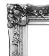




 가로 또는 세로 중 어느 한 면이라도 105cm(약 41인치)를 초과하는 작품이나 복제화의 경우, 프레임은 분해된 키트 형태로 배송됩니다. 이는 안전한 배송을 보장하고 운송 중 발생할 수 있는 손상을 방지하기 위함입니다.


A Symphony of Color and Perception
In the vibrant tapestry of twentieth-century art, few works capture the sheer joy of visual discovery quite like David Hockney’s “The Twelfth.” Painted in 1973, this masterpiece serves as a profound testament to the artist's lifelong commitment to capturing the essence of experience through a lens of brilliant color and simplified form. To gaze upon this composition is to enter a world where the boundaries between reality and abstraction dissolve into a rhythmic dance of shapes. Hockney does not merely seek to replicate the world; he seeks to translate the very feeling of sight itself, inviting the viewer to participate in a sensory celebration that mirrors the immediacy of human perception.
The painting presents an enchanting arrangement of geometric elements, where large, sweeping circles and smaller, scattered discs create a sense of celestial movement across the canvas. A central, vase-like silhouette anchors the composition, providing a structural heartbeat amidst the swirling blues and energetic accents of orange and yellow. This deliberate reduction of detail—a technique Hockney famously referred to as “joinery”—allows the viewer to focus on the pure emotional resonance of color. By stripping away the clutter of meticulous realism, Hockney achieves an uncanny sense of presence, evoking the warmth of sunlight filtering through a garden or the tranquil stillness of a summer afternoon.
The Legacy of British Pop and Modern Vision
Emerging from the burgeoning energy of the British Pop Art movement, “The Twelfth” embodies a pivotal moment in art history when creators began to reject the heavy intellectualism of Abstract Expressionism in favor of something more democratic and accessible. Drawing inspiration from the visual language of popular culture—from advertising to the bold graphics of comic books—Hockney infused his work with a vitality that felt both modern and deeply personal. This piece stands as a bridge between the structured traditions of his training at the Royal College of Art and the liberated, experimental spirit of the 1970s.
For the discerning collector or interior designer, this artwork offers much more than mere decoration; it provides a focal point of intellectual and aesthetic depth. The painting’s ability to harmonize cool, tranquil blues with sudden bursts of warmth makes it an incredibly versatile piece for sophisticated modern interiors. Whether placed in a sun-drenched gallery or a contemporary living space, “The Twelfth” radiates an aura of optimism and clarity. It is a work that does not demand attention through complexity, but rather commands it through its profound ability to inspire wonder and a renewed appreciation for the beauty found in simple, observed truths.
질의응답
데이비드 호크니의 "The twelfth"을 관통하는 주요 색조는 무엇인가요?
"The twelfth"은(는) Warm Sunset Tones 톤이 주를 이룹니다.
"The twelfth"의 색감을 고려했을 때, 어느 공간에 전시하는 것이 가장 좋을까요?
데이비드 호크니의 "The twelfth"의 Dark 색조는 추천 공간인 Living Room(으)로 완벽하게 어우러집니다.
데이비드 호크니의 "The twelfth"의 주요 색조는 무엇인가요?
데이비드 호크니의 "The twelfth"은(는) Dark 색조의 팔레트를 사용하며, Mahogany (#ae5817)이(가) 주된 색상을 이룹니다.
이 작품에 대해 더 알아보기
 미리보기
미리보기
 공유하기
공유하기 공유하기
공유하기
 상세 정보
상세 정보 가이드 보기

 다운로드
다운로드
 유사 작품 더 보기
 X-레이
X-레이 슬라이드 쇼 보기
 질의응답
질의응답 통계 정보
통계 정보