- მთავარი გვერდი

- ზეთის ტილოზე რეპროდუქცია
- მარკ როთკო
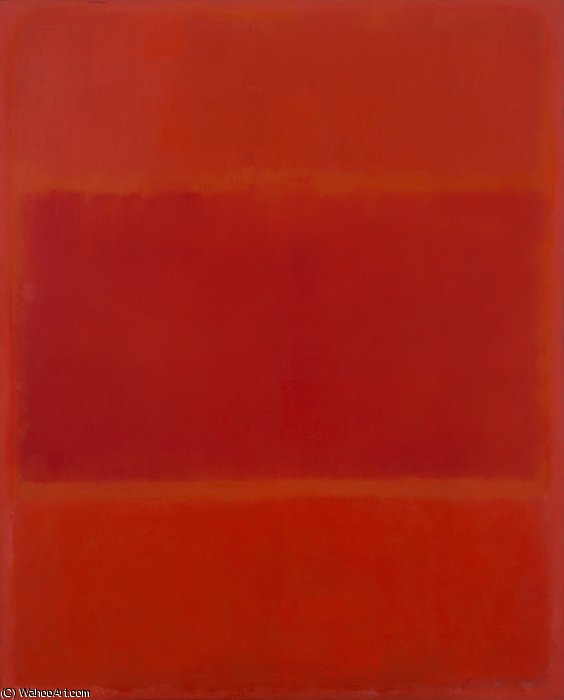
- Red and Orange
 გაგზავნა
Red and Orange


ხელით ნაკვეთი ზეთის ტილოს რეპროდუქცია
ტილოზე შესრულებული ფერწერიანი ზეთប្រდათი, თქვენთვის სასურველი ზომისა და ჩარჩოსთვის, ჩვენი ხელოვანების მიერ შეკვეთის საფუძველზე დამზადებული.


P118B $10

P118H $10

P118W $10

P438Z $10

P508JH $12

P508YH $12

P805H $10

P805Z $10

P919BZ $10

P919G $10

P919XJ $10

P959ZH $10

P968JZ $12

W106C $8

W218G $10

W218JH $8

W218Y $10

W307PJ $10

W316G $10

W316PJ $8

W316Y $10

W398PJ $8

W4111J $10

W500HY $15

W500JH $15

W692G $12

W849H $8

W940BG $15

W953PJ $8


აირჩიეთ ჩვენს მიერ წინასწარ განსაზღვრული ზომებიდან, რომლებიც ნაწარმოების ორიგინალურ პროპორციებს შეესაბამება.
თქვენ შეგიძლიათ მიუთითოთ თქვენთვის სასურველი ზომები კონკრეტული ჩარჩოს ან სივრცის შესაბამისად. თუ თქვენ მიერ არჩეული ზომა არ შეესაბამება ორიგინალი გამოსახულების პროპორციებს, ჩვენ ან შევაჭრებთ ნაწარმოებს, ან ტილოზე დავამატებთ ხელით მოხატულ ელემენტებს. წარმოების დაწყებამდე, დამტკიცებისთვის გამოგეგზავნებათ ციფრული მაკეტი.
გთხოვთ, გაითვალისწინოთ, რომ ეკრანზე ნაჩვენები წინასწარი შეხედულება არ ასახავს რეალურ შეჭრას ან გაფართოებას. საბოლოო კომპოზიციას ზუსტად მხოლოდ მაკეტი წარმოაჩენს.
მიუხედავად იმისა, რომ შესაძლებელია ინდივიდუალური ზომების შერჩევა, ორიგინალური პროპორციების შენარჩუნებისათვის გირჩევთ, გამოიყენოთ წინასწარ განსაზღვრული სიის ზომები.
შეკვეთის შემდეგ, OriginalUniqueArt.com გუნდი დაგიკავშირდებათ ელექტრონული ფოსტით ინსტრუქციებისთვის და გამოგიგზავნით წინასწარ ნახაზს (mockup).
მიწოდება მსოფლიო მასშტაბით -ში 3/4 კვირაში, სტანდარტული 5 კვირის ნაცვლად. (16 ივლისი). ხარისხზე კომპრომისის გაკეთება არ მოხდება.

უფასო ექსპრეს მიწოდება მთელ მსოფლიოში

საბამად მაღალი ხარისხის ტილო

სრული ტრანსპორტირების დაზღვევა

საბაჟო გადასახადების დაბრუნების გარანტია

ფერების სრული შესაბამისობის გარანტია

60-დღიანი დაბრუნების პოლიტიკა (მხოლოდ დეფექტის შემთხვევაში)

100% თანხის დაბრუნების გარანტია

ფასდაკლება დიდი რაოდენობით შეკვეთისას
 მინის ჩარჩოს არჩევანი ხელმისაწვდომია მხოლოდ 110 სმ-ზე ნაკლები ზომისთვის

Red and Orange
რეკლამაციის ტექნიკა
რეკლამაციის ზომა
-


საბოლოო ფასი
-
ნაწარმოების აღწერა
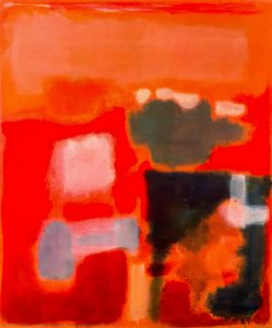
Red and Orange: A Journey Through Rothko’s Emotional Landscape
Mark Rothko, one of the towering figures of 20th-century art, didn't simply paint pictures; he crafted portals into the depths of human emotion. His work, particularly pieces like ‘Red and Orange,’ invites a profound engagement, demanding that we surrender to its quiet intensity rather than seeking immediate visual gratification. This painting, a cornerstone of his mature style, exemplifies Rothko’s revolutionary approach to color field abstraction – a deliberate move away from representational imagery towards pure feeling expressed through the luminous interaction of hues. It's a piece designed not to be ‘looked at,’ but *felt*. The genesis of ‘Red and Orange’ lies within the vibrant, yet turbulent, context of Abstract Expressionism, a movement that emerged in post-war America as artists sought new ways to grapple with the anxieties and uncertainties of the time. Rothko, however, forged his own distinct path within this broad movement. He wasn't interested in grand gestures or dramatic narratives; instead, he focused on distilling emotion into its most elemental form – color itself. His technique involved applying layers upon layers of oil paint, often mixed with turpentine to achieve a remarkable luminosity and subtle textural variations. The canvas isn’t merely a surface for pigment; it becomes an active participant in the creation of atmosphere, absorbing and reflecting light in ways that subtly shift the painting's mood throughout the day. Notice the delicate blending at the heart of the composition – a deliberate ambiguity that encourages contemplation rather than definitive interpretation. The painting’s structure is deceptively simple: two dominant rectangles of color—a rich, pulsating red on the left and an equally vibrant orange on the right—are juxtaposed within a larger field of muted tones. However, this apparent simplicity belies a complex interplay of visual and emotional forces. Rothko wasn't simply placing colors side-by-side; he was creating a dynamic tension between them, suggesting both harmony and discord. The red, often associated with passion, energy, and even danger, dominates the left portion of the canvas, while the orange—linked to warmth, optimism, and vitality—takes precedence on the right. This division isn’t rigid or absolute; rather, it creates a sense of movement and flow as the eye travels across the surface, drawn into the merging point where the two colors meet. The subtle gradations within each rectangle, achieved through meticulous layering and blending, add depth and complexity to the composition, preventing it from feeling flat or static. Rothko’s intention wasn't to depict a specific scene or object but to evoke universal human emotions – tragedy, ecstasy, doom—as he famously articulated in his writings. In ‘Red and Orange,’ the bold hues can be interpreted as symbols of these fundamental experiences. The intensity of the red might represent moments of profound sorrow or struggle, while the warmth of the orange suggests hope, joy, or a sense of transcendence. It’s important to recognize that Rothko deliberately avoided providing viewers with easy answers; he wanted them to project their own feelings and associations onto the canvas, creating a deeply personal experience. The painting becomes a mirror reflecting our own inner landscape. The legacy of ‘Red and Orange,’ and indeed of Mark Rothko's entire body of work, is undeniable. His color field paintings have profoundly influenced generations of artists, from abstract expressionists to contemporary painters exploring the expressive potential of color. Reproductions of this piece offer a remarkable opportunity to bring Rothko’s emotional intensity into any space, transforming interiors into contemplative sanctuaries. Consider how the rich hues interact with your existing décor – will they enhance the sense of warmth and tranquility, or add a touch of dramatic tension? The choice is yours, but one thing is certain: ‘Red and Orange’ remains a powerful testament to the transformative power of art.The Artistic Movement: Abstract Expressionism and Rothko's Place Within It
Rothko’s work stands as a pivotal contribution to Abstract Expressionism, a movement that fundamentally shifted the focus of American art away from representational imagery towards subjective experience and emotional expression. Emerging in the aftermath of World War II, Abstract Expressionism was characterized by its emphasis on spontaneity, gesture, and the artist's inner world. Artists like Jackson Pollock, Willem de Kooning, and Barnett Newman sought to capture the raw energy and anxieties of the post-war era through large-scale canvases and unconventional techniques. However, Rothko distinguished himself from his contemporaries with his deliberate restraint and focus on color as a primary means of communication. Unlike the gestural brushstrokes favored by Pollock or the fragmented figures of de Kooning, Rothko’s paintings are defined by their smooth, almost meditative surfaces. He rejected the notion of the artist's hand as a visible element in the work, striving instead to create an illusion of seamlessness and luminosity. This pursuit of pure color was deeply influenced by his interest in spirituality and Eastern philosophy, which he believed could provide access to profound emotional states. Rothko’s paintings aren’t about depicting something; they *are* the feeling itself – a distillation of experience rendered in pigment and light. The influence of earlier artistic traditions is also evident in Rothko's work. He drew inspiration from Byzantine icons, which are characterized by their flattened forms, luminous colors, and symbolic content. Similarly, he was fascinated by the color theories of Goethe, who proposed that colors could be understood as having specific psychological effects. Rothko’s use of complementary colors – red and orange in ‘Red and Orange,’ for example – is a deliberate attempt to create visual tension and evoke particular emotional responses. He wasn't simply arranging colors on a canvas; he was conducting an experiment in color psychology, seeking to harness the power of hue to communicate profound human experiences.The Painting: 'Red and Orange' - A Detailed Examination
‘Red and Orange’ is a prime example of Rothko’s distinctive technique and his unwavering commitment to expressing emotion through color. The painting measures approximately 39 ½ x 31 ¾ inches (100.5 x 80.6 cm), a size that allows the colors to dominate the viewer's field of vision, creating an immersive experience. As mentioned previously, the composition is built around two rectangular fields of color: a deep, saturated red on the left and a vibrant orange on the right. These rectangles are not sharply defined; rather, they bleed into one another at their edges, creating a sense of fluidity and ambiguity. The layering technique employed by Rothko is crucial to understanding the painting’s luminosity. He applied multiple thin layers of oil paint, often mixed with turpentine to achieve a translucent effect. This process allowed light to penetrate through the pigments, creating an almost ethereal glow. The texture of the canvas itself plays a significant role in this effect – it's subtly uneven and slightly rough, adding depth and complexity to the surface. Notice how the red seems to vibrate and pulsate within its rectangular frame, while the orange radiates warmth and vitality. The subtle variations in color intensity are also noteworthy. Rothko didn’t simply apply a uniform shade of red or orange; he carefully modulated the hues throughout each rectangle, creating areas of lighter and darker tones. This technique adds depth and dimension to the composition, preventing it from feeling flat or static. The blending at the point where the two colors meet is particularly intriguing – it creates a sense of ambiguity and suggests that the painting is in a state of constant flux. It’s as if the red and orange are merging and separating simultaneously, reflecting the complexities of human emotion.Emotional Resonance: Rothko's Pursuit of Universal Feeling
Rothko believed that color possessed the power to evoke profound emotional responses in viewers – tragedy, ecstasy, doom—as he himself articulated. He wasn’t interested in creating beautiful or aesthetically pleasing paintings; his primary goal was to communicate these fundamental human experiences directly and without mediation. This conviction stemmed from his belief that art could serve as a bridge between individuals, fostering empathy and understanding. The success of ‘Red and Orange,’ and indeed of Rothko's entire body of work, lies in its ability to tap into these universal emotions. The painting doesn’t require any specific interpretation or explanation; it simply *is* – a luminous field of color that invites the viewer to contemplate their own feelings and associations. It’s not uncommon for people to experience tears or a sense of profound emotion when viewing Rothko's paintings, suggesting that he has succeeded in creating works that resonate deeply with our shared human condition. Rothko’s approach was radical for its time, challenging traditional notions of art as representation and inviting viewers to engage with the work on an emotional level. His paintings are not meant to be ‘looked at’; they are meant to be *felt*. They are a testament to the transformative power of color and a profound exploration of the human psyche.მხატვრის ბიოგრაფია
მარკ როთკოს სიცოცხლე და შემოქმედება: ფერის გულმომტეხი სიმფონია
მარკ როთკო, დაბადებული მარკუს იაკოვლევისჩ როთკოვიც 1903 წლის 25 სექტემბერს დაუგავპილსში, ლატვიაში, იყო ამერიკელი აბსტრაქტული მხატვარი, რომელმაც საუკუნეების განმავლობაში შექმნა ფერის გულმომტეხი სიმფონია. მისი ადრეული წლები, რომლებიც რუსეთის იმპერიის ტერიტორიაზე მცხოვრებ یهودی ოჯახში გაატარა, აღნიშნეს პოლიტიკური არასტაბილურობითა და დევნებით, რაც მის შემოქმედებაში უდიდესი გავლენა მოახდინა. 1913 წელს მისი ოჯახი გადავიდა ამერიკის შეერთებულ შტატებში, პორტლანდში, ორეგონი, სადაც ახალგაზრდა მარკმა პირველად გააცნობა დასავლური კულტურა და დაიწყო მხატვრის გზაზე ნაბიჯები. თუმცა, სწავლის პარალელურად, ის უფრო მეტ დროს უთმობდა ხელოვნებას, რაც საბოლოოდ τον οδηγεί σε εγκατάλειψη της τυπικής εκπαίδευσης και αφοσίωση στην καλλιτεχνική του κλήση. ნიუ-იორკში გადასვლის შემდეგ, როთკო თავდაპირველად დაკავებული იყო ქალაქის პეიზაჟების და ადამიანთა გამოსახულებების შესრულებით, თუმცა მისი შემოქმედება თანდათანობით აბსტრაქტული ფორმებისაკენ დაიძრა.აბსტრაქციისკენ მოგზაურობა: სიმბოლოებიდან ფერამდე
მეოცე საუკუნის 40-იან წლებში, მეორე მსოფლიო ომის შთამნთქმელი რეალობის პარალელურად, როთკოს შემოქმედებაში რადიკალური ცვლილება მოხდა. სურრეალიზმისა და მითოლოგიური თემების გავლენით, მან დაიწყო წარმოსადგენლობითი გამოსახულებებიდან გადასვლა სიმბოლოებამდე, შემდეგ კი – ფერის უნივერსალურ ემოციურ გამოხატვამდე. მისი ადრეული აბსტრაქტული ნამუშევრები ხასიათდებოდა მორკინებული ფორმებით და სიმბოლური მნიშვნელობებით, რაც მის შემოქმედებაში ტრაგიკულ და არსებობრივ თემებს ასახავდა. 1940-იანი წლების ბოლოს როთკო მივიდა თავის გამომუშავებულ სტილამდე: დიდფორმატოვან ტილოებზე განთავსებული მართკუთხა ფერის უბნები, რომლებიც ჰქონდათ თითქმის დამოუკიდებელ არსებად. მან მოიშორა ნებისმიერი ცნობილი გამოსახულების კვალი და კონცენტრირდა მხოლოდ ფერის და ფორმის გულმომტეხი ემოციურ ზემოქმედებაზე, რაც აბსტრაქტული გამოხატვის მნიშვნელოვანი ნაბიჯი იყო.ფერის სიმფონია: ემოციის უმაღლესი ფორმა
როთკოს შემოქმედების განმავრცელებელია "ფერის გრუნდი" – ფერების დიდებული მასშტაბით გაშლილი სივრცე, რომელიც დამნაშეველს მთლიანად იცლება ემოციურ გამოცდილებაში. მისი ტილოები არ არის იმის შესახებ, რას წარმოადგენენ ისინი, არამედ იმის შესახებ, თუ რა გრძნობებს იწვევენ. როთკო თვლიდა, რომ ხელოვნებას უნდა ესაუბროს დამნაშეველს პირდაპირ ემოციებზე, საგონებების გარეშე. ის ფრთხილად στρώματα στρώματα στρώματα στρώματα στρώματα στρώματα στρώματα στρώματα στρώματα στρώματα στρώματα στρώματα στρώματα στρώματα στρώματα στρώματα στρώματα στρώματα στρώματα στρώματα στρώματα στρώματα στρώματα στρώματα στρώματα στρώματα στρώματα στρώματα στρώματα στρώματα στρώματα στρώματα στρώματα στρώματα στρώματα στρώματα στρώματα στρώματα στρώματα στρώματα στρώματα στρώματα στρώματα στρώματα στρώματα στρώματα στρώματα στρώματα στρώματα στρώματα στρώματα στρώματα στρώματα στρώματα στρώματα στρώματα στρώματα στρώματα στρώματα στρώματα στρώματα στρώματα στρώματα στρώματα στρώματα στρώματα στρώματα στρώματα στρώματα στρώματα στρώματα στρώματα στρώματα στρώματα στρώματα στρώματα στρώματα στρώματα στρώματα στρώματα στρώματα στρώματα στρώματα στρώματα στρώματα στρώματα στρώματα στρώματα στρώματα στρώματα στρώματα στρώματα στρώματα στρώματα στρώματα στρώματα στρώματα στρώματα στρώματα στρώματα στρώματα στρώματα στρώματα στρώματα στρώματα στρώματα στρώματα στρώματα στρώματα στρώματα στρώματα στρώματα στρώματα στρώματα στρώματα στρώματα στρώματα στρώματα στρώματα στρώματα στρώματα στρώματα στρώματα στρώματα στρώματα στρώματα στρώματα στρώματα στρώματα στρώματα στρώματα στρώματα στρώματα στρώματα στρώματα στρώματα στρώματα στρώματα στρώματα στρώματα στρώματα στρώματα στρώματα στρώματα στρώματα στρώματα στρώματα στρώματα στρώματα στρώματα στρώματα στρώματα στρώματα στρώματα στρώματα στρώματα στρώματα στρώματα στρώματα στρώματα στρώματα στρώματα στρώματα στρώματα στρώματα στρώματα στρώματα στρώματα στρώματα στρώματα στρώματα στρώματα στρώματα στρώματα στρώματα στρώματα στρώματα στρώματα στρώματα στρώματα στρώματα στρώματα στρώματα στρώματα στρώματα στρώματα στρώματα στρώματα στρώματα στρώματα στρώματα στρώματα στρώματα στρώματα στρώματα στρώματα στρώματα στρώματα στρώματα στρώματα στρώματα στρώματα στρώματα στρώματα στρώματα στρώματα στρώματα στρώματα στρώματα στρώματα στρώματα στρώματα στρώματα στρώματα στρώματα στρώματα στρώματα στρώματα στρώματα στρώματα στρώματα στρώματα στρώματα στρώματα στρώματα στρώματα στρώματα στρώματα στρώματα στρώματα στρώματα στρώματα στρώματα στρώματα στρώματα στρώματα στρώματα στρώματα στρώματα στρώματα στρώματα στρώματα στρώματα στρώματα στρώματα στρώματα στρώματα στρώματα στρώματα στρώματα στρώματα στρώματα στρώματα στρώματα στρώματα στρώματα στρώματα στρώματα στρώματα στρώματα στρώματα στρώματα στρώματα στρώματα στρώματα στρώματα στρώματα στρώματα στρώματα στρώματα στρώματα στρώματα στρώματα στρώματα στρώματα στρώματα στρώματα στρώματα στρώματα στρώματα στρώματα στρώματα στρώματα στρώματα στρώματα στρώματα στρώματα στρώματα στρώματα στρώματα στρώματα στρώματα στρώματα στρώματα στρώματα στρώματα στρώματα στρώματα στρώματα στρώματα στρώματα στρώματα στρώματα στρώματα στρώματα στρώματα στρώματα στρώματα στρώματα στρώματα στρώματα στρώματα στρώματα στρώματα στρώματα στρώματα στρώματα στρώματα στρώματα στρώματα στρώματα στρώματα στρώματα στρώματα στρώματα στρώματα στρώματα στρώματα στρώματα στρώματα στρώματα στρώματα στρώματα στρώματα στρώματα στρώματα στρώματα στρώματα στρώματα στρώματα στρώματα στρώματα στρώματα στρώματα στρώματα στρώ
მარკ როთკო
1903 - 1970 , ლატვია
მოკლე ინფორმაცია
- Artistic Movement Or Style: შემსრულებელი აბსტრაქტული ხელოვნება
- Artists Or Movements Influenced By This Artist:
- მინიმალიზმი
- შემსრულებელი აბსტრაქტული ხელოვნება
- Date Of Birth: 1903 წლის 25 სექტემბერი
- Date Of Death: 1970 წლის 25 თებერვალი
- Full Name: მარკ როთკო
- Nationality: ამერიკელი
- Notable Artworks:
- № 10 (1950)
- Seagram Murals
- Rothko Chapel
- White Center
- Place Of Birth (City And Country): დაუგავპილსი, ლატვია
დაკავშირებული სტატიები

The Sublimity of Color: Exploring the Emotional Landscapes of Mark Rothko's Abstract Expressionism
Explore the profound emotional depth of Mark Rothko's abstract expressionism. Discover the history, techniques & lasting impact of this pivotal Color Field painter. Expert insights for collectors and art enthusiasts.

Beyond Representation: Emotional Depth & Formal Innovation in Abstract Expressionism
Explore the profound emotional depth & formal innovation of Abstract Expressionism. Discover key artists, collecting insights, and investment potential with expert guidance. Learn more now.
შექსտროფული გამოხატვის აბსტრაქციზმის 10 შედევრი: ხელოვნება თქვენი სახლისთვის
აღმოფრთოვანდით აბსტრაქტული გამოხატვისმანიერიზმის 10 უმშვენიერეს შედევრთან! ვასელის, პოლ locks-ის და სხვა ცნობილი მხატვრების ისტორიები. შეიძინეთ მაღალი ხარისბის ხელოვნების რეპროდუქციები OriginalUniqueArt.com-ზე და შეცვალეთ თქვენი სახლი!
Beyond Representation: Exploring the Emotional Landscape of Abstract Expressionism
Explore the profound emotional world of Abstract Expressionism with OriginalUniqueArt. Discover key artists like Pollock & Rothko, learn about collecting, and find museum-quality reproductions to inspire your space.

Morris Louis: Pioneering Color Field Painting & Abstract Expressionism's Legacy
Explore the groundbreaking abstract expressionism of Morris Louis, a pioneer of Color Field painting. Discover his innovative techniques, influential series & lasting legacy in post-war American art. Learn more at OriginalUniqueArt.