プリント版に切り替え
 続きを読む
続きを読む

































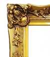
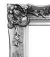

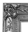


 いずれかの辺が105 cm(約41インチ)を超えるアートワークまたは複製画の場合、フレームは分解されたキットの状態でお届けいたします。この方法は、輸送中の破損を防ぎ、安全に配送するために採用しております。


A Quiet Arrangement of Objects
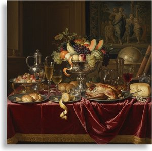
In this 1552 composition, we find ourselves looking closely at a collection of everyday items that seem to occupy the immediate foreground. A vase rests on the left, balanced by a bowl situated in the middle of the scene. Near the center-left area, a bottle is placed alongside a cup toward the right. At the top left corner, a piece of meat provides a heavy, tactile presence among the more delicate vessels. The arrangement feels deliberate, almost as if the objects were set down moments ago for our inspection.
Beyond these inanimate subjects, several people are present within the scene. Two individuals are located on the left side, while another person can be seen near the center-right area. A fourth person is visible towards the right edge of the painting. Their presence introduces a sense of life and depth to the composition, suggesting that this collection of objects exists within a larger, inhabited space.
Technique and Symbolic Resonance
The artist utilizes an oil on panel medium to render these textures with great care. The light catches the surfaces of the ceramic and glass, creating a sense of weight and volume. This approach belongs to the Northern Renaissance style, where the focus remains on the tangible reality of the physical world. Each object is rendered with enough detail to invite a closer look at its form and material. There is an underlying tension in how these elements are organized. The arrangement of items within such a still life often carries weight, representing the relationship between earthly possessions and deeper meanings. By placing human figures alongside these domestic objects, the work blurs the lines between a simple depiction of goods and a narrative involving the people who interact with them. It is a quiet study of presence and absence.
よくあるご質問
ピーター・アーツセン作「Still-Life」をインテリアとしてどのように活用できますか?
「Still-Life」はAccentに最適で、Living Roomへの飾るのがおすすめです。
「Still-Life」は、明暗のコントラストが強い作品ですか?
ピーター・アーツセン作「Still-Life」のコントラストレベルはStatementです。
その色彩を考慮すると、"Still-Life" はどの場所に飾るのがおすすめですか?
Earthyの色彩を纏ったピーター・アーツセン作「Still-Life」は、Living Roomに飾るのがおすすめです。その色使いこそが、この提案の理由のひとつです。
More about this painting
 設置イメージを確認
 送る
送る シェア
シェア
 詳細情報
詳細情報 ガイドを表示

 画像をダウンロード
 似ている作品
 X線調査
X線調査 スライドショー
 Q&A
Q&A 統計情報
統計情報