油彩画を購入
 Untitled 4の詳細

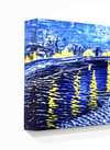



























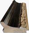







 いずれかの辺が105 cm(約41インチ)を超えるアートワークまたは複製画の場合、フレームは分解されたキットの状態でお届けいたします。この方法は、輸送中の破損を防ぎ、安全に配送するために採用しております。


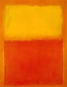
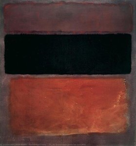
A Symphony in Color: Exploring Mark Rothko’s No. 4
The painting known simply as “No. 4” by Mark Rothko is more than just pigment on canvas; it's an invitation into a realm of profound contemplation and emotional resonance. Created in 1964 during his prolific period, this monumental work embodies the core tenets of Rothko’s signature style – Color Field Painting – a movement that revolutionized abstract art and continues to captivate audiences worldwide.- Subject Matter: At first glance, “No. 4” presents itself as deceptively simple. It consists of five rectangular blocks of color—primarily deep crimson, cadmium orange, and slate blue—layered atop one another. These rectangles are not sharply delineated; instead, they bleed into each other subtly, creating an ethereal haze that obscures precise boundaries.
- Style: Rothko’s approach transcends mere representation. He eschewed traditional artistic conventions, rejecting illusionistic depth and perspective altogether. Instead, he sought to convey emotion directly through color alone—a radical departure from the prevailing aesthetic sensibilities of his time.
Historical Context: Minimalism and Existential Anxiety
“No. 4” emerged during a period marked by significant cultural upheaval. The rise of Minimalism in the mid-1960s challenged the dominance of figurative art, advocating for austere compositions and unadorned surfaces as expressions of intellectual seriousness. Simultaneously, anxieties surrounding nuclear proliferation and the Cold War fueled existential concerns about humanity’s place in the cosmos—themes that resonated deeply with Rothko's artistic vision. He wasn’t attempting to depict a specific scene or narrative; rather, he aimed to tap into universal human experiences – grief, joy, transcendence – feelings conveyed through pure color.Symbolism and Emotional Impact
Rothko deliberately avoided explicit symbolism, believing that color itself possessed inherent expressive power. However, scholars have interpreted the hues within “No. 4” as representing a spectrum of emotions—crimson symbolizing passion and vulnerability, orange conveying warmth and optimism, and blue embodying serenity and contemplation. The layering effect contributes to this emotional depth, suggesting an unfolding process of feeling rather than a static depiction. Viewing No. 4 is said to induce a state of calm introspection; it encourages the viewer to surrender to the painting's immersive quality and allow themselves to be carried away by its evocative beauty.A Legacy of Color
“No. 4” stands as a testament to Rothko’s unwavering commitment to exploring the expressive potential of color—a legacy that continues to inspire artists and collectors alike. Its enduring appeal lies in its ability to bypass intellectual analysis altogether, communicating directly with the viewer's subconscious mind. A high-quality reproduction captures not only the visual splendor of this masterpiece but also its profound emotional core – a reminder that art can transcend language and offer access to realms of feeling beyond words.Q&A
Untitled 4は手描きですか、それともプリントですか?
手描きによる制作:熟練した画家が、リネンキャンバスに油彩でUntitled 4を模写します。
Untitled 4のサイズはどれを選べばよいですか?
サイズは36.5 x 27.4 cm (¥31676)から243.2 x 182.3 cm (¥259745)まで展開しております。こちらのページ内の表に、主な工程とそれぞれの価格を記載しています。
配送にはどのくらいの時間がかかりますか?
配送には4〜5週間を要し、世界中どこでも速達便にて無料でお届けいたします。また、本ページではお急ぎの方向けの特急制作オプションもご用意しております。商品は、理由を問わず100日以内であれば全額返金での返品が可能です。
マーク・ロスコはUntitled 4の制作にどのような画材(メディア)を使用しましたか?
Acrylic On Canvas
 設置イメージを表示

 シェアする
 シェアする
 詳細を見る
 解説シート


 ダウンロード
 似ている作品
 X線調査
 スライドショーを表示
 Q&A

 統計情報