- ホーム

- キャンバスプリント用
- マーク・ロスコ
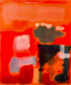
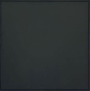
- Orange and Red on Red

 シェアする
シェアするOrange and Red on Red


P118B $10

P118H $10

P118W $10

P438Z $10

P508JH $12

P508YH $12

P805H $10

P805Z $10

P919BZ $10

P919G $10

P919XJ $10

P959ZH $10

P968JZ $12

W106C $8

W218G $10

W218JH $8

W218Y $10

W307PJ $10

W316G $10

W316PJ $8

W316Y $10

W398PJ $8

W4111J $10

W500HY $15

W500JH $15

W692G $12

W849H $8

W940BG $15

W953PJ $8


作品のオリジナル比率に合わせた、当店の規定サイズからお選びください。
特定のフレームやスペースに合わせて、ご自身でサイズを指定することも可能です。選択されたサイズが元の画像の比率と一致しない場合、作品をトリミングするか、鏡面反射または単色での塗りつぶしによって画像を拡張いたします。制作を開始する前に、ご確認用のデジタルモックアップをお送りいたします。
画面上のプレビューには、実際のトリミングや拡張は反映されませんのでご注意ください。最終的な構図を正確に確認できるのは、モックアップのみとなります。
カスタムサイズも承っておりますが、元の比率を維持するためには、あらかじめ用意されたリストからサイズを選択することをお勧めいたします。


 ガラスオプションは、110cm未満のサイズでのみご利用いただけます。

Orange and Red on Red
ジークレー/アートプリント
複製画のサイズ
-


合計金額
-
作品詳細説明
A Universe Within Hues: Exploring Mark Rothko’s “Orange and Red on Red”
Mark Rothko's "Orange and Red on Red" is not merely a painting; it’s an invitation into a realm of pure feeling, a visual poem rendered in the language of color. Emerging from the fervent artistic climate of post-war America, this work exemplifies Rothko’s signature Color Field style – a departure from representational art that sought to evoke profound emotional and spiritual responses through abstract forms. The canvas breathes with layers of luminous pigment, where shades of orange and red intermingle and subtly clash against a dominant crimson ground. There are no discernible shapes or figures, only the interplay of color itself, creating an immersive experience for the viewer. Rothko wasn’t interested in depicting *what* to think, but rather *how* to feel; he aimed to bypass intellectual analysis and connect directly with the subconscious.The Genesis of a Style: From Figurative Roots to Abstract Expressionism
Born Marcus Yakovlevich Rothkowitz in Latvia in 1903, Rothko’s journey toward abstraction was a gradual evolution. His early works reflected the influence of urban landscapes and figurative painting, demonstrating technical skill but lacking the emotional resonance that would later define his oeuvre. The upheaval of World War II proved pivotal, prompting him to explore mythological themes and Surrealism as a means of grappling with the anxieties of the era. However, it was in the late 1940s that Rothko truly found his voice, stripping away representational elements to focus on the expressive power of color. This period saw him experimenting with layering paint, creating atmospheric effects that hinted at vastness and depth. He wasn’t simply applying color; he was building luminous fields, allowing hues to float and vibrate against one another. This deliberate process aimed to create a meditative space for contemplation, mirroring his belief in art's capacity to address fundamental human emotions.Technique as Transcendence: The Alchemy of Pigment
Rothko’s technique was deceptively simple yet profoundly sophisticated. He didn’t blend colors on the palette but applied thin washes of pigment directly onto the canvas, allowing them to soak into the fabric and create a sense of luminosity from within. This staining process, rather than traditional brushwork, contributed to the ethereal quality of his paintings. The edges of the color blocks are soft and blurred, encouraging the eye to wander and lose itself in the interplay of hues. He often used unconventional pigments, experimenting with their properties to achieve specific effects. “Orange and Red on Red,” like many of his works, isn’t about precise lines or defined forms; it's about the subtle gradations of color and the emotional weight they carry. The texture of the canvas itself becomes an integral part of the experience, adding a tactile dimension to the visual feast.A Legacy of Emotion: Rothko’s Enduring Impact
Mark Rothko’s influence on modern art is undeniable. His Color Field paintings paved the way for a new generation of abstract artists and continue to inspire awe and contemplation today. The Rothko Chapel in Houston, Texas – a non-denominational sanctuary housing fourteen of his canvases – stands as a testament to his belief in art's spiritual potential. The chapel is designed to be a space for quiet reflection, where visitors can immerse themselves in the emotional power of Rothko’s work. “Orange and Red on Red,” while perhaps less monumental than the Chapel installations, shares that same capacity to evoke profound feelings – melancholy, joy, serenity, or even existential angst. It's a painting that demands to be experienced, not simply observed, inviting viewers to confront their own emotions and find meaning within its abstract depths.アーティストの略歴
マーク・ロスコ:色彩の深淵と魂の叫び
1903年、ラトビアのダウガフピルスでマルクス・ヤコヴレヴィチ・ロトコヴィッチとして生まれたマーク・ロスコは、その生涯を色彩という言葉で人間の存在と感情の深淵を探求することに捧げた。幼少期から政治不安や迫害に晒されたユダヤ人家庭環境は、彼の中に深い感受性と苦悩の種を植え付けた。1913年のアメリカへの移民は、新たな文化との出会いをもたらす一方で、故郷との断絶という喪失感も与えた。ポートランドでの生活を経てニューヨークへ移り、当初は都市風景や人物を描いていたロスコだが、第二次世界大戦の激動期を迎え、その芸術は劇的な変貌を遂げる。
シュルレアリスムの影響を受けながら、ロスコは象徴的な形を通して普遍的な人間の感情を表現しようと試みた。1940年代後半には、彼の画業における転換点となる、純粋な色彩領域による作品群が誕生する。それらは単なる色の配置ではなく、深遠な精神性を帯びた、瞑想的な空間へと誘う力を持っていた。次第に、ロスコは具象表現から完全に脱却し、巨大なキャンバス上に不規則な矩形の色面を配置することで、見る者を圧倒的な色彩の海へと引き込むような作品を生み出した。このスタイルこそが、後のカラーフィールド絵画と呼ばれるものであり、抽象表現主義運動における重要な位置を占める。
色彩の交響曲:ロスコの芸術的探求
ロスコの成熟期作品は、色彩そのものが感情と直接的に結びつくという信念に基づいている。彼は、色の微妙なニュアンスや重ね合わせによって、喜び、悲しみ、絶望、希望といった人間の複雑な感情を表現しようとした。彼の絵画は、しばしば静寂の中に潜む激しいエネルギーを感じさせる。それは、色彩が互いに共鳴し合い、まるで音楽のように響き渡るかのような感覚である。ロスコは、作品にタイトルを与えることを避け、「No. 1」や「No. 6」といった番号のみを付与することで、鑑賞者が先入観なしに作品と向き合い、自身の感情を通して作品の意味を受け止めることを望んだ。
セagram美術館の壁画プロジェクトは、ロスコにとって重要な出来事であった。しかし、彼の作品が単なる装飾品として扱われることへの嫌悪感から、依頼を断り、これらの作品を Tate Gallery に寄贈した。この行為は、彼が芸術を商業主義から切り離し、純粋な精神的価値を守ろうとした姿勢を示すものだった。そして、ヒューストンにあるロスコ礼拝堂は、彼の芸術的探求の集大成と言えるだろう。14枚の絵画が配置されたこの聖域は、静寂と瞑想の中で、人間の魂を深く揺さぶる体験を提供する。
遺産:抽象表現主義を超えた影響力
マーク・ロスコの死後も、彼の作品は世界中の人々に深い感銘を与え続けている。彼の芸術は、ミニマリズムや現代絵画に多大な影響を与え、色彩を通して感情を表現する可能性を広げた。ロスコの作品は、単なる視覚的な体験を超え、鑑賞者の内面へと深く入り込み、自己と向き合い、存在の意味を探求することを促す力を持っている。彼の遺産は、抽象表現主義という芸術史上の重要な潮流を代表するだけでなく、人間の感情と精神性を探求する普遍的な芸術の力を体現していると言えるだろう。
ロスコの作品群は、色彩が持つ無限の可能性を示し、私たちに心の奥底にある感情と向き合う勇気を与えてくれる。それは、言葉では表現できない、人間の魂の叫びであり、永遠に人々の心に響き続けるであろう。

マーク・ロスコ
1903 - 1970 , ラトビア
基本情報
- フルネーム: マーク・ロスコ
- 主な作品:
- No. 10 (1950)
- セagramの壁画
- ロスコ礼拝堂
- 出生地: ラトビア、ダウガフピルス
- 国籍: アメリカ合衆国
- 影響を与えたアーティスト: ['ミニマリズム']
- 死亡年月日: 1970年2月25日
- 生年月日: 1903年9月25日
- 芸術運動またはスタイル: 抽象表現主義、カラーフィールド
関連記事

The Sublimity of Color: Exploring the Emotional Landscapes of Mark Rothko's Abstract Expressionism
Explore the profound emotional depth of Mark Rothko's abstract expressionism. Discover the history, techniques & lasting impact of this pivotal Color Field painter. Expert insights for collectors and art enthusiasts.

Gene Davis: Chromatic Explorations of Color Field Painting & the Washington Color School
Explore the vibrant world of Gene Davis and the Washington Color School. Discover his iconic stripe paintings, innovative techniques, and lasting impact on American abstract art. A deep dive for collectors & enthusiasts.

Carl Newman: Exploring Abstraction's Spiritual Resonance Through Color Field Painting
Explore the profound spiritual resonance of Color Field Painting with insights into Rothko, Newman & Still. Discover the techniques & legacy of this influential abstract art movement.
Paul Jenkins: Abstraction, Color Field Painting & the Pursuit of Lyrical Expression
Explore the captivating world of Paul Jenkins, a pioneer of abstract expressionism & color field painting. Discover his unique ‘Phenomena’ series and investment potential for art collectors. Expert insights at OriginalUniqueArt.
Henri Matisse: A Revolutionary Use of Color and Form in Modern Art
Explore the revolutionary art of Henri Matisse! Discover his bold use of color, Fauvist origins, and lasting impact on modern painting. A comprehensive guide for art enthusiasts.