プリント版に切り替え
 続きを読む
続きを読む







































 いずれかの辺が105 cm(約41インチ)を超えるアートワークまたは複製画の場合、フレームは分解されたキットの状態でお届けいたします。この方法は、輸送中の破損を防ぎ、安全に配送するために採用しております。


The Enigmatic Still Life of Juriaen van Streeck
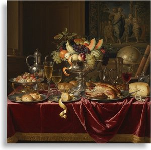
Juriaen van Streeck’s “Still-Life,” a remarkably preserved panel dating from the mid-17th century, offers a captivating glimpse into the world of Dutch Golden Age painting. More than simply a depiction of objects—a bowl of fruit, a porcelain ewer, and a scattering of silverware—it's an intricate meditation on light, texture, and the fleeting nature of beauty itself. The painting resides within the Bavarian State Painting Collections, a testament to its enduring quality and artistic merit.
Van Streeck’s style is deeply rooted in the traditions established by Willem Kalf, yet possesses a subtle individuality. He masterfully employs chiaroscuro—the dramatic contrast between light and shadow—to imbue each object with a palpable sense of volume and realism. The artist doesn't merely represent; he sculpts with light, creating an illusion of depth that draws the viewer into the scene. Notice how the folds of the velvet cloth seem to ripple in the reflected light, or how the sheen on the porcelain gleams with an almost ethereal quality.
A Symphony of Objects and Symbolism
The composition itself is a carefully orchestrated arrangement of seemingly disparate elements. The central focus rests upon a rich still life featuring a blue and white Wan-li bowl, overflowing with luscious peaches, a vibrant lemon, and an orange – each rendered with meticulous detail. A porcelain ewer and vase, alongside a gleaming silver knife, complete the tableau. But these are not merely decorative objects; they carry layers of symbolic meaning deeply embedded within the context of 17th-century Dutch society.
The inclusion of fruit, particularly peaches and oranges, was a deliberate reference to prosperity and abundance – hallmarks of the burgeoning merchant class that dominated the Netherlands at the time. The porcelain ewer, with its intricate floral patterns, speaks to the appreciation for luxury goods imported from the East. Even the loaf of bread, partially consumed, subtly alludes to the transient nature of earthly pleasures, a common theme in Dutch Golden Age art reflecting on mortality and the vanity of worldly possessions. The two butterflies fluttering amongst the objects further enhance this sense of ephemeral beauty.
The Painter’s Technique and Historical Context
Van Streeck's skill lies not just in his ability to render objects with photographic accuracy, but also in his understanding of how light interacts with different surfaces. He demonstrates a remarkable control over brushwork, creating subtle gradations of tone that mimic the way light would fall upon these materials. The painting’s palette is restrained yet sophisticated, dominated by rich browns, golds, and deep reds – colors that evoke the opulence of the Dutch merchant elite.
Created during a period of immense artistic innovation, “Still-Life” reflects the broader cultural trends of the time. The rise of the middle class fueled a demand for art depicting domestic life and luxurious objects, while artists like Van Streeck continued to explore themes of beauty, mortality, and the complexities of human experience. The painting’s provenance – its acquisition by the Princeton University Art Museum in 1954 – underscores its historical significance and enduring appeal.
A Timeless Appeal: Reproduction and Beyond
Reproductions of “Still-Life” offer a remarkable opportunity to bring this exquisite work into your home or office. The meticulous detail, the masterful use of light, and the profound symbolism combine to create a piece that is both visually stunning and intellectually stimulating. Consider pairing it with pieces that evoke similar themes – perhaps a richly textured rug, a vintage silver tray, or a collection of antique ceramics – to create an interior space that reflects your appreciation for beauty, history, and the enduring power of art.
よくあるご質問
Juriaen van Streeck作「Still-Life」はどのような種類の作品ですか?
カタログ内では、Juriaen van Streeck作「Still-Life」はWallArtとして分類されています。このカテゴリーを活用することで、類似の作品を探すことができます。
Juriaen van Streeck作「Still-Life」の色調は、鮮やかですか、それとも落ち着いていますか?
Juriaen van Streeck作「Still-Life」の色調は、Mutedの彩度とMonochromaticの強さを備えています。
Juriaen van Streeck作「Still-Life」の色彩の彩度はどの程度ですか?
「Still-Life」のパレットは、彩度がMutedです。
More about this painting
 設置イメージを確認
 送る
送る シェア
シェア
 詳細情報
詳細情報 ガイドを表示

 画像をダウンロード
 似ている作品
 X線調査
X線調査 スライドショー
 Q&A
Q&A 統計情報
統計情報